# @dash-ui/design-system
> A design system starter pack for @dash-ui
Latest version **0.1.2** (published 2020-08-10) · MIT license · 0 weekly downloads
## Install
```sh
npm install @dash-ui/design-system
pnpm add @dash-ui/design-system
yarn add @dash-ui/design-system
bun add @dash-ui/design-system
```
Provides the command `create-design-system`.
## Health
**Score 15/100 (F)** — status: abandoned.
Positive: no vulnerabilities.
Warnings: low downloads; no types; no esm support; pre 1.0.
Negative: abandoned; low maintenance score.
## Facts
| | |
|---|---|
| Version | 0.1.2 |
| Published | 2020-08-10 |
| First published | 2020-08-09 |
| Weekly downloads | 0 |
| License | MIT |
| TypeScript types | none |
| Module format | CommonJS |
| Dependencies | 2 |
| Unpacked size | 173.8 KB |
| Known vulnerabilities | 0 |
| Install scripts | no |
| GitHub stars | 0 |
| Author | Jared Lunde |
| Maintainers | jaredlunde |
## Links
- npm: https://www.npmjs.com/package/@dash-ui/design-system
- Repository: https://github.com/dash-ui/design-system
- Homepage: https://github.com/dash-ui/design-system#readme
- Issues: https://github.com/dash-ui/design-system/issues
- npm.io page: https://npm.io/package/@dash-ui/design-system
## Dependencies (2)
- [@lunde/inst-utils](https://npm.io/package/@lunde/inst-utils.md) ^1.0.7
- [@inst-cli/template-utils](https://npm.io/package/@inst-cli/template-utils.md) ^1.0.7
## Recent versions
- 0.1.2 (latest) — 2020-08-10
- 0.1.1 — 2020-08-09
- 0.1.0 — 2020-08-09
## README
 > A command line tool for creating design systems with [Dash](https://github.com/dash-ui) and [Storybook](https://github.com/storybookjs)
```sh
# Using npx
npx @dash-ui/design-system my-design-system
# OR using a global install
yarn global add @dash-ui/design-system
create-design-system my-design-system
# Start Storybook in the design system directory
cd my-design-system
yarn storybook
```
## Preview
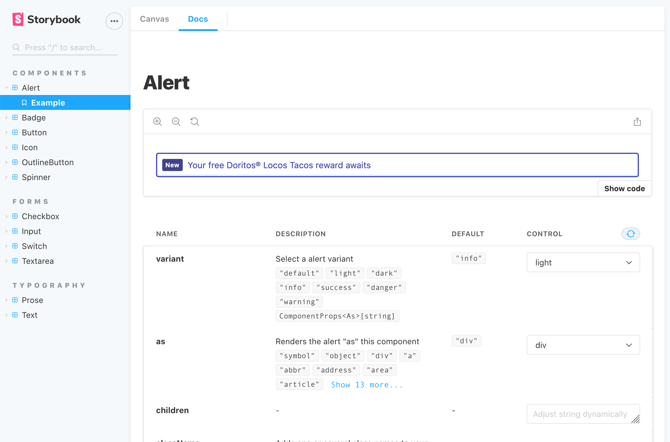
- Check out the [Storybook stories](https://dash-design-system.now.sh) generated by the default design system created by this command
- View an [example of the library](https://github.com/dash-ui/examples/tree/master/design-system) created by this command
## What's in the box?
- [x] **UI component starter pack** Alerts, badges, buttons, checkboxes, switches,
and spinners, inputs, textareas, and icons.
- [x] **Layout components** exported from [`@dash-ui/react-layout`](https://github.com/dash-ui/react-layout):
Box, Grid, Row, Column, and more!
- [x] [**Tailwind**](https://tailwindcss.com/) design tokens
- [x] **Beautiful typography** out of the box
- [x] **Responsive props and styles** from [`@dash-ui/responsive`](https://github.com/dash-ui/responsive)
- [x] **Modern CSS reset**
- [x] **Accessibility**
- [x] **Auto-documentation** with [Storybook](https://github.com/storybookjs)
- [x] **Semantic versioning**
- [x] **Strongly typed** with TypeScript
- [x] **Modern build system** automatically generates ESM, UMD, CJS, modules, and types based
upon the `"exports"` field in the package.json
### Build tools
The design system comes with a variety of build tools that allow you to release with confidence
| Tool | Description |
| ------------------------------------------------------------------------------ | -------------------------------------------------------------------------------------------------------------------------------- |
| React | This starter pack is built in React |
| TypeScript | Your design system should have strong types and autocomplete |
| Storybook | Write your documentation as you code and build bulletproof UI components |
| Yarn | Because I said so |
| Jest + [@testing-library](https://github.com/testing-library) | For testing components and hooks |
| Prettier | For formatting code, READMEs, and configs |
| ESLint | For linting the design system |
| [Standard Version](https://github.com/conventional-changelog/standard-version) | Semantic releases made easy |
| [Commitlint](https://github.com/conventional-changelog/commitlint) | Lints your commit messages |
| Lundle | A build tool that automatically generates UMD, ESM, CJS, modules, and types based upon the `"exports"` field in the package.json |
| Travis CI | (Optional) For continuous integration |
## Usage
#### `create-design-system [--user=githubUsername] [--org=githubOrg] [--scope=npmOrg] [--no-git]`
| Argument | Type | Required | Description |
| -------- | --------- | -------- | --------------------------------------------------------------------------------------------------------------- |
| name | `string` | Yes | The name of the package you're creating. This is also the name of the directory the package will be created in. |
| user | `string` | No | Your GitHub username |
| org | `string` | No | A GitHub organization name where the repo should live |
| scope | `string` | No | An npm organization |
| no-git | `boolean` | No | Create the package without initializing a `git` repo |
## LICENSE
MIT
---
_Source: https://npm.io/package/@dash-ui/design-system · Machine-readable twin of the npm.io package page. Health data is recomputed on every publish._