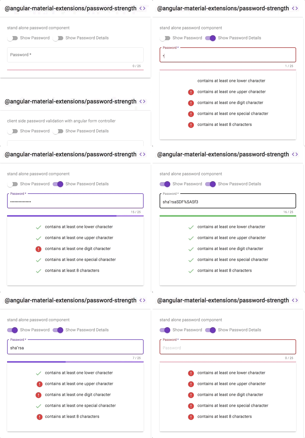
# @angular-material-extensions/password-strength - Material password strength meter to indicate how secure is the provided password - Angular V12 supported incl. schematics
[](https://badge.fury.io/js/%40angular-material-extensions%2Fpassword-strength)
[](https://angular-material-extensions.github.io/password-strength)
[](https://angular-material-extensions.github.io/password-strength/doc/index.html)
[](https://gitter.im/angular-material-extensions/Lobby?utm_source=badge&utm_medium=badge&utm_campaign=pr-badge&utm_content=badge)
[](https://circleci.com/gh/angular-material-extensions/password-strength)
[](https://travis-ci.org/angular-material-extensions/password-strength)
[](https://codecov.io/gh/angular-material-extensions/password-strength)
[](https://david-dm.org/angular-material-extensions/password-strength)
[](https://david-dm.org/angular-material-extensions/password-strength#info=devDependencies)
[](https://greenkeeper.io/)
[](https://github.com/angular-material-extensions/password-strength/blob/master/LICENSE)
[](https://github.com/gdi2290/awesome-angular)
## Built by and for developers :heart:
Do you have any question or suggestion ? Please do not hesitate to contact us!
Alternatively, provide a PR | open an appropriate issue [here](https://github.com/angular-material-extensions/password-strength/issues)
If you like this project, support [angular-material-extensions](https://github.com/angular-material-extensions)
by starring :star: and sharing it :loudspeaker:
## Table of Contents
- [Demo](#demo)
- [Components](#components)
- [Dependencies](#dependencies)
- [Installation](#installation)
- [API](#api)
- [Usage](#usage)
- [Run Demo App Locally](#run-demo-app-locally)
- [Development](#development)
- [Other Angular Libraries](#other-angular-libraries)
- [Support](#support)
- [License](#license)
## [Demo](https://angular-material-extensions.github.io/password-strength)
View all the directives and components in action at [https://angular-material-extensions.github.io/password-strength](https://angular-material-extensions.github.io/password-strength)
## Library's components
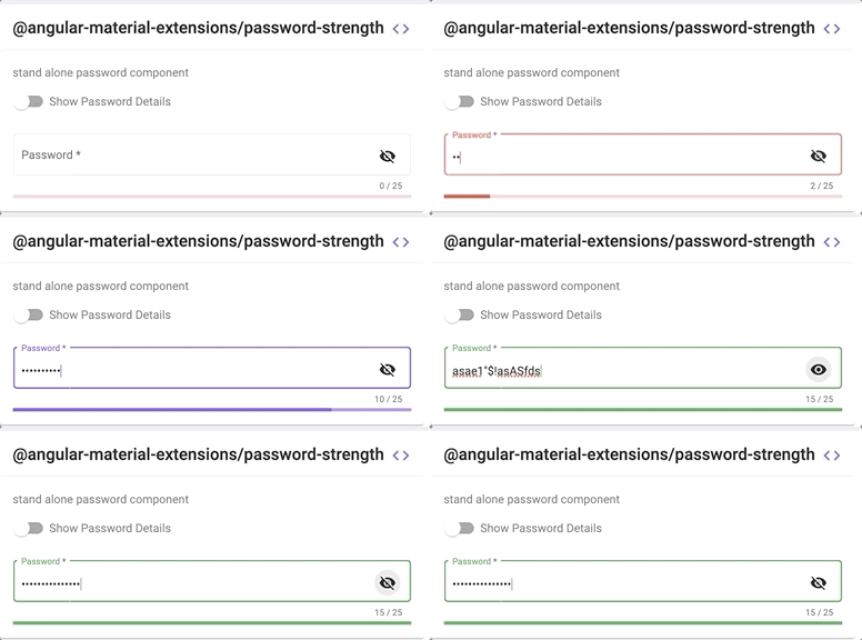
- `` used to calculate and display the strength of a provided password
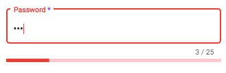
1. strength score <= 20%
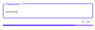
2. strength score <= 80%
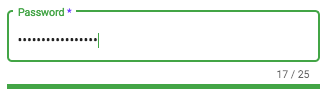
1. strength score > 80%
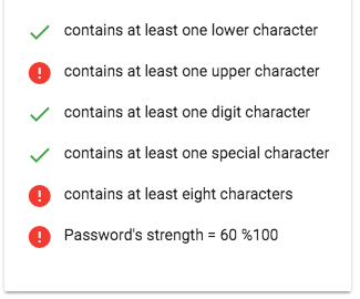
- `` used to display more information about the strength of a provided password
- `` used to show/hide the password provided in the input element
---
## Dependencies
* [Angular](https://angular.io) developed and tested with `12.x`
---
## [Installation](https://angular-material-extensions.github.io/password-strength/getting-started)
## 1. Install via _ng add_. (Recommended)
If Angular Material Design is not setup, just run `ng add @angular/material` [learn more](https://material.angular.io/guide/getting-started)
Now add the library via the `angular schematics`
```shell
ng add @angular-material-extensions/password-strength
```
## 2. Install via _npm_. (Alternative)
Now install `@angular-material-extensions/password-strength` via:
```shell
npm install --save @angular-material-extensions/password-strength
```
---
##### SystemJS
> **Note**:If you are using `SystemJS`, you should adjust your configuration to point to the UMD bundle.
> In your systemjs config file, `map` needs to tell the System loader where to look for `@angular-material-extensions/password-strength`:
```js
{
'@angular-material-extensions/password-strength';: 'node_modules/@angular-material-extensions/password-strength/bundles/password-strength.umd.js',
}
```
`-> follow the instructions` [here](https://github.com/angular-material-extensions/password-strength/tree/master/docs/INSTRUCTIONS.md)
---
## Import the library
Once installed you need to import the main module:
```js
import { MatPasswordStrengthModule } from "@angular-material-extensions/password-strength";
```
The only remaining part is to list the imported module in your application module. The exact method will be slightly
different for the root (top-level) module for which you should end up with the code similar to (notice ` MatPasswordStrengthModule .forRoot()`):
```js
import { MatPasswordStrengthModule } from '@angular-material-extensions/password-strength';
@NgModule({
declarations: [AppComponent, ...],
imports: [MatPasswordStrengthModule.forRoot(), ...],
bootstrap: [AppComponent]
})
export class AppModule {
}
```
Other modules in your application can simply import `MatPasswordStrengthModule`:
```js
import { MatPasswordStrengthModule } from '@angular-material-extensions/password-strength';
@NgModule({
declarations: [OtherComponent, ...],
imports: [MatPasswordStrengthModule, ...],
})
export class OtherModule {
}
```
## API
### `` used to calculate and display the strength of a provided password - [see the demo examples](https://angular-material-extensions.github.io/password-strength/examples)
| option | bind | type | default | description |
| :------------------------ | :--------: | :-------: | :-----: | :------------------------------------------------------------------------------- |
| password | `Input() ` | string | - | the password to calculate its strength |
| customValidator | `Input() ` | RegExp | - | custom regex validator |
| externalError | `Input() ` | `boolean` | `false` | used to change the color of the password to warn if an external error occurs |
| enableLengthRule | `Input() ` | `boolean` | `true` | whether to validate the length of the password |
| enableLowerCaseLetterRule | `Input() ` | `boolean` | `true` | whether a lowercase letter is optional |
| enableUpperCaseLetterRule | `Input() ` | `boolean` | `true` | whether a uppercase letter is optional |
| enableDigitRule | `Input() ` | `boolean` | `true` | whether a digit char is optional |
| enableSpecialCharRule | `Input() ` | `boolean` | true | whether a special char is optional |
| min | `Input() ` | `number` | 8 | the minimum length of the password |
| max | `Input() ` | `number` | 30 | the maximum length of the password |
| warnThreshold | `Input() ` | `number` | 21 | password strength less than this number shows the warn color |
| accentThreshold | `Input() ` | `number` | 81 | password strength less than this number shows the accent color |
| onStrengthChanged | Output() | `number` | - | emits the strength of the provided password in % e.g: 20%, 40%, 60%, 80% or 100% |
### `` used to display more information about the strength of a provided password - [see the demo examples](https://angular-material-extensions.github.io/password-strength/examples/mat-password-strength-info)
| option | bind | type | default | description |
| :---------------------- | :--------: | :-----------------------: | :---------------------------------------------------------: | :--------------------------------------------------------------------------------------------------------- |
| passwordComponent | `Input() ` | PasswordStrengthComponent | - | the password component used in the template in order to display more info related to the provided password |
| enableScoreInfo | `Input() ` | `boolean` | `false` | whether to show the password's score in % |
| lowerCaseCriteriaMsg | `Input() ` | `string` | contains at least one lower character | an appropriate msg for the lower case % |
| upperCaseCriteriaMsg | `Input() ` | `string` | contains at least one upper character | an appropriate msg for the upper case % |
| digitsCriteriaMsg | `Input() ` | `string` | contains at least one digit character | an appropriate msg for the digit case % |
| specialCharsCriteriaMsg | `Input() ` | `string` | contains at least one special character | an appropriate msg for the special case % |
| customCharsCriteriaMsg | `Input() ` | `string` | contains at least one custom character | an appropriate msg for the custom validator case % |
| minCharsCriteriaMsg | `Input() ` | `string` | contains at least \${this.passwordComponent.min} characters | an appropriate msg for the minimum `number` of chars % |
### `` used to show/hide the password provided in the input element
| option | bind | type | default | description |
| :-------- | :--------: | :-------: | :-----: | :-------------------------------------------------------------- |
| isVisible | `Input() ` | `boolean` | `false` | whether the password is visible or hidden |
| tabindex | `Input() ` | `string` | `null` | set the desired tabindex value of the toggle visibility button. |
---
## [Usage](https://angular-material-extensions.github.io/password-strength/getting-started)
add the `@angular-material-extensions/password-strength` element to your template:
```html
```
This will display only the material password strength meter in form of a progress without any input fields
or similar.
### In the following example, we integration a material input container with `@angular-material-extensions/password-strength` 's component.
NOTE: In order to repaint the mat-form-field correctly after changing the value of the password's strength, please consider
to change the detection strategy for the parent component -->
```typescript
import {
ChangeDetectionStrategy,
Component,
OnInit,
ViewEncapsulation,
} from "@angular/core";
import { Title } from "@angular/platform-browser";
import { MatSlideToggleChange } from "@angular/material";
import { MatPasswordStrengthComponent } from "@angular-material-extensions/password-strength";
@Component({
selector: "app-home",
templateUrl: "./home.component.html",
styleUrls: ["./home.component.scss"],
encapsulation: ViewEncapsulation.None,
changeDetection: ChangeDetectionStrategy.OnPush,
})
export class HomeComponent implements OnInit {}
```
```html
Password
{{password.value.length}} / 25
```
[learn more about mat-form-field](https://material.angular.io/components/input/overview)
### Example of how to use the emitted strength of the password in your template
```html
```
### Use the toggle visibility component
- add the `mat-pass-toggle-visibility` to your `mat-form-field`
- give it a name to use it in the html file like `toggle`
- set the type of the input to that value emitted from the `mat-pass-toggle-visibility` component ``
```html
Password
{{password.value.length}} / 25
```
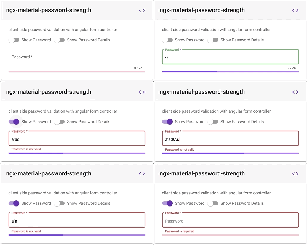
### Client Side password's validation using a built in angular formController
1. add an input element to your template with an appropriate @angular-material-extensions/password-strength's component
2. hold a reference of the @angular-material-extensions/password-strength's component by adding `passwordComponentWithValidation` (or whatever you want) inside the element
e.g:
```html
```
3. bind the form controller of the mat-password-strength to the input element
- you can access the form controller of @angular-material-extensions/password-strength using the chile view --> `passwordComponentWithValidation.passwordFormControl`
- bind the form controller to an input element --> `[formControl]="passwordComponentWithValidation.passwordFormControl"`
4. Full example - see below
```html
Password
{{passwordWithValidation.value.length}} / 25
Password is required
Password is not valid
```
this will looks like -->
---
### custom regex validation
please consider to use the `customValidator` input (see below)
```html
Show Password DetailsPassword
{{password.value.length}} / {{passwordComponent.max}}
```
```ts
pattern = new RegExp(/^(?=.*?[äöüÄÖÜß])/);
```
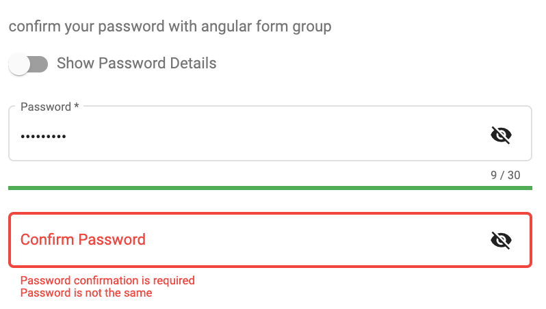
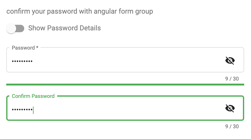
### Confirm the password with built in angular form controllers - [see the live example](https://angular-material-extensions.github.io/password-strength)
### Use always the green color for a strong password just by adding the `green` css class to the `mat-password-strength`
```html
```
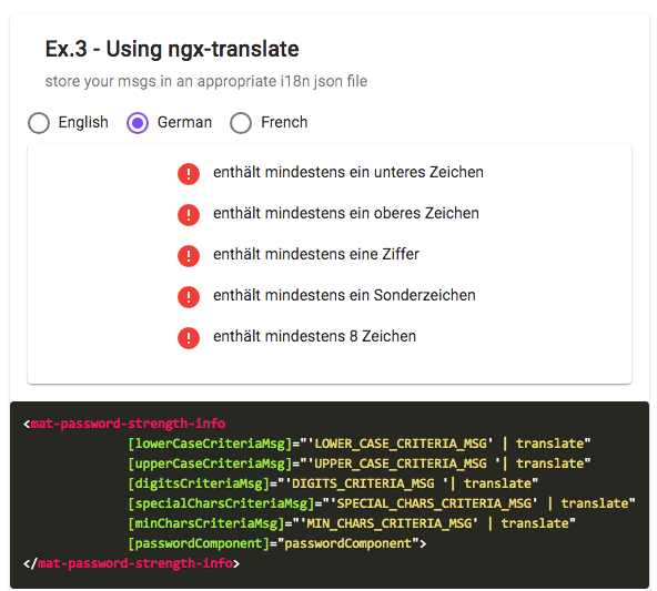
### Supporting custom messages and ngx-translate for the info component please check the example demo [here](https://angular-material-extensions.github.io/password-strength/examples/mat-password-strength-info)
for more examples please visit this URL : [(https://angular-material-extensions.github.io/password-strength/examples]((https://angular-material-extensions.github.io/password-strength/examples)
Please checkout the full documentation [here](https://angular-material-extensions.github.io//password-strength/doc/index.html)
or follow the official [tutorial](https://angular-material-extensions.github.io/password-strength/getting-started)
---
### [ Run Demo App Locally](https://github.com/angular-material-extensions/password-strength/tree/master/docs/INSTRUCTIONS_DEMO.md)
### [Development](https://github.com/angular-material-extensions/password-strength/tree/master/docs/INSTRUCTIONS_DEV.md)
## Other Angular Libraries
- [ngx-auth-firebaseui](https://github.com/AnthonyNahas/ngx-auth-firebaseui)
- [ngx-mailto](https://github.com/AnthonyNahas/ngx-mailto)
- [ngx-linkifyjs](https://github.com/AnthonyNahas/ngx-linkifyjs)
- [@angular-material-extensions/google-maps-autocomplete](https://github.com/angular-material-extensions/google-maps-autocomplete)
- [@angular-material-extensions/select-country](https://github.com/angular-material-extensions/select-country)
- [@angular-material-extensions/select-icon](https://github.com/angular-material-extensions/select-icon)
- [@angular-material-extensions/fab-menu](https://github.com/angular-material-extensions/fab-menu)
- [@angular-material-extensions/link-preview](https://github.com/angular-material-extensions/link-preview)
- [@angular-material-extensions/pages](https://github.com/angular-material-extensions/pages)
- [@angular-material-extensions/contacts](https://github.com/angular-material-extensions/contacts)
- [@angular-material-extensions/faq](https://github.com/angular-material-extensions/faq)
- [@angular-material-extensions/combination-generator](https://github.com/angular-material-extensions/combination-generator)
---
## Support
- Drop an email to: [Anthony Nahas](mailto:anthony.na@hotmail.de)
- or open an appropriate [issue](https://github.com/angular-material-extensions/password-strength/issues)
- let us chat on [Gitter](https://gitter.im/angular-material-extensions/Lobby)
Built by and for developers :heart: we will help you :punch:
---

This project is supported by [jetbrains](https://www.jetbrains.com/) with 1 ALL PRODUCTS PACK OS LICENSE incl. [webstorm](https://www.jetbrains.com/webstorm)
---
## License
Copyright (c) 2019-2021 [Anthony Nahas](https://github.com/AnthonyNahas). Licensed under the MIT License (MIT)
---
_Source: https://npm.io/package/@digitalhurricane/password-strength · Machine-readable twin of the npm.io package page. Health data is recomputed on every publish._