# @financial-times/o-grid
> A 12 column responsive, flexbox-based grid system for laying out documents, templates and components.
Latest version **6.1.9** (published 2026-02-26) · MIT license · 0 weekly downloads
## Install
```sh
npm install @financial-times/o-grid
pnpm add @financial-times/o-grid
yarn add @financial-times/o-grid
bun add @financial-times/o-grid
```
## Health
**Score 50/100 (C)** — status: stable.
Positive: esm support; no vulnerabilities.
Warnings: low downloads; no types.
## Facts
| | |
|---|---|
| Version | 6.1.9 |
| Published | 2026-02-26 |
| First published | 2019-02-12 |
| Weekly downloads | 0 |
| License | MIT |
| TypeScript types | none |
| Module format | ESM |
| Dependencies | 0 |
| Unpacked size | 450.3 KB |
| Known vulnerabilities | 0 |
| Install scripts | no |
| Maintainers | the-ft, rowanmanning, chee, alexwilson, aendra, emmalewis, notlee, seraph2000, hamza.samih, robertboulton, robgodfrey |
| Keywords | page, grid, layout, columns, rows |
## Links
- npm: https://www.npmjs.com/package/@financial-times/o-grid
- Homepage: https://registry.origami.ft.com/components/o-grid
- Issues: https://github.com/Financial-Times/origami/issues/new?labels=o-grid,components
- npm.io page: https://npm.io/package/@financial-times/o-grid
## Alternatives
- [@lexical/table](https://npm.io/package/@lexical/table.md) — 3.0M weekly downloads
- [mantine-datatable](https://npm.io/package/mantine-datatable.md) — 98.2K weekly downloads
- [react-native-collapsible-tab-view](https://npm.io/package/react-native-collapsible-tab-view.md) — 70.6K weekly downloads
- [@handsontable/vue3](https://npm.io/package/@handsontable/vue3.md) — 16.1K weekly downloads
- [vuewordcloud](https://npm.io/package/vuewordcloud.md) — 7.2K weekly downloads
## Recent versions
- 6.1.9 (latest) — 2026-02-26
- 6.0.0-beta.0 (prerelease) — 2021-04-29
- 6.1.8 — 2023-10-27
- 6.1.7 — 2023-07-13
- 6.1.6 — 2023-07-13
- 6.1.5 — 2022-01-24
- 6.1.4 — 2022-01-24
- 6.1.3 — 2022-01-13
- 6.1.2 — 2021-12-24
- 6.1.1 — 2021-12-09
- 6.1.0 — 2021-11-24
- 6.0.2 — 2021-11-10
- 6.0.1 — 2021-09-21
- 6.0.0 — 2021-06-17
- 5.2.12 — 2021-05-27
- … 25 more at https://npm.io/package/@financial-times/o-grid/versions
## README
# o-grid
A 12 column responsive, flexbox-based grid system for laying out documents, templates and components.
- [Usage](#usage)
- [Quick Start](#quick-start)
- [Grid dimensions](#grid-dimensions)
- [General settings](#general-settings)
- [Layout sizes](#layout-sizes)
[Handover notes](#handover-notes)
- [Markup](#markup)
- [Utility classes](#utility-classes)
- [Responsive columns](#responsive-columns)
- [Examples](#examples)
- [Sass](#sass)
- [Options](#options)
- [Advanced usage](#advanced-usage)
- [Utilities](#utilities)
- [JavaScript Helpers](#javascript-helpers)
- [Grid Bookmarklet](#grid-bookmarklet)
- [Migration](#migration)
- [Contact](#contact)
- [Licence](#licence)
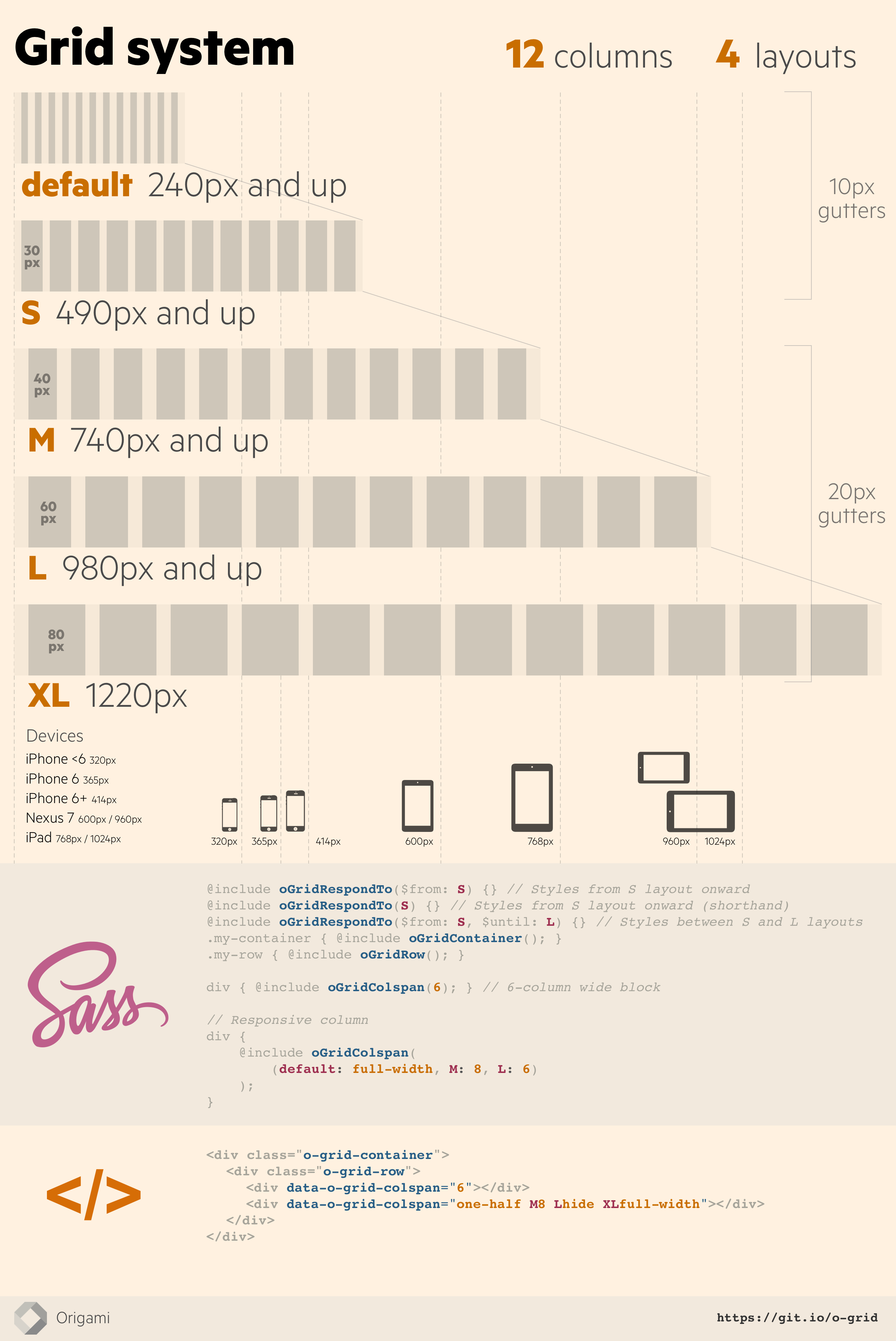
This component is a collection of Sass styles to build a 12 column grid system, with a few JavaScript helpers.
Our grid consists of:
- 12 columns, of equal size.
- 5 layouts (breakpoints) to support devices of various sizes.
- Gutters of variable width, that adjust according to the current layout.
- A maximum page width of 1220px, by default.
[](https://raw.githubusercontent.com/Financial-Times/origami/main/components/o-grid/img/grid-system.png)
## Usage
Check out [how to include Origami components in your project](https://origami.ft.com/documentation/components/#including-origami-components-in-your-project) to get started with `o-grid`.
## Quick Start
```scss
// your-app/main.scss
@import '@financial-times/o-grid/main';
@include oGrid();
```
```js
// your-app/main.js
// Return the current layout (e.g. default, S, M, L, XL)
import oGrid from '@financial-times/o-grid';
let currentLayout = oGrid.getCurrentLayout();
console.log(currentLayout);
// Return the current gutter (e.g. 10px, 20px)
import oGrid from '@financial-times/o-grid';
let currentGutter = oGrid.getCurrentGutter();
console.log(currentGutter);
```
## Grid dimensions
### General settings
- Minimum width: 240px
- Maximum width: 1220px
- Gutter widths (space between columns):
- 10px on small screens
- 20px on larger screens
- Number of columns: 12
### Layout sizes
- **Default** 240px - …
- **Small (S)** 490px - 739px
- **Medium (M)** 740px - 979px
- **Large (L)** 980px to 1219px
- **Extra large (XL)** 1220px
## Handover notes
Engineers may choose to use the o-grid Origami component to build a web based project to our grid, and respond to layout changes, but this may not be technically appropriate in every scenario particularly where it is appropriate to fallback to a simpler layout for older browsers.
It is important not to make assumptions about the devices our users are using or the most common screen-size, as these change. It is better to focus on the content of your design and adapt as needed when the space available to the design changes, rather than waiting to hit a specific breakpoint.
## Markup
### Utility classes
```html
A div, 8 columns wide
Another div, 4 columns wide
```
### Responsive columns
Set a number of columns per layout:
```html
Half by default, then 8 columns wide on Large layout and up
Half by default, then 4 columns wide on Large layout and up
```
```scss
div {
@include oGridContainer();
> div {
@include oGridRow();
}
}
.first-column {
// Half by default, then 8 columns wide on Large layout and up
@include oGridColspan((default: 6, L: 8));
}
.second-column {
// Half by default, then 4 columns wide on Large layout and up
@include oGridColspan((default: 6, L: 4));
}
```
#### Using numbers
- `{0-12}` - number of columns to span by default
- `S{0-12}` - number of columns to span at the small layout and up
- `M{0-12}` - number of columns to span at the medium layout and up
- `L{0-12}` - number of columns to span at the large layout and up
- `XL{0-12}` - number of columns to span at the extra large layout and up
```html
```
```scss
div { @include oGridColspan((default: 6, L: 8)); }
```
#### Using keywords
- `hide`
- `one-half`
- `one-third`, `two-thirds`
- `one-quarter`, `three-quarters`
```html
```
```scss
div { @include oGridColspan((default: one-half, L: two-thirds)); }
```
### Examples
A full width column for all sizes except large screens and up, where it spans on 9 columns:
```html
```
```scss
div { @include oGridColspan((default: full-width, L: 9)); }
```
A half width column that becomes full-width on medium screens and up:
```html
```
```scss
div { @include oGridColspan((default: one-half, M: 12)); }
```
A column which gradually takes up a greater portion of horizontal space as the screen gets smaller:
```html
```
```scss
div { @include oGridColspan((default: 4, M: 3, L: 2, XL: 1)); }
```
A column which has `width: auto` on small screens, and then takes half the available space on medium screens and up:
```html
```
```scss
div { @include oGridColspan((M: 6)); }
```
## Sass
To include all styles call the `oGrid` mixin.
```scss
@include oGrid();
```
### Options
`o-grid` css may be included granularly by passing options to the `oGrid` mixin.
```scss
@include oGrid($opts: (
'bleed': true,
'shuffle-selectors': true,
'friendly-selectors': true,
'surface': ('current-layout', 'layout-sizes'),
'rows': ('compact')
));
```
If you would not like to use `o-grid` markup at all, the styles for the `surface` option may be included independently to enable JavaScript features:
```scss
// Surface current breakpoint and gutter size information to JavaScript.
// Supports `getGridBreakpoints` and `enableLayoutChangeEvents`
// JavaScript methods.
@include oGridSurfaceLayoutSizes();
// Surface grid breakpoints to JavaScript.
// Supports the `getCurrentLayout` and `getCurrentGutter` JavaScript methods.
@include oGridSurfaceCurrentLayout();
```
## Advanced usage
### Utilities
#### Hiding elements
`hide` the column, show it again at Large (`L`) layout size, and hide it at the largest (`XL`) layout size:
```html
```
```scss
div { @include oGridColspan((default: hide, L: 12, XL: hide)); }
```
#### Centering a column
`center` the column and `uncenter` it at Large (`L`) layout size:
```html
```
```scss
.my-column {
@include oGridCenter;
@include oGridRespondTo(L) {
@include oGridUncenter;
}
}
```
#### Push and pull columns
```html
```
```scss
// Content is first in the source
.content {
@include oGridColspan(8);
@include oGridPush(4); // outputs left: -33.333333333%;
}
// Sidebar comes second in the source but appears first on the left
.sidebar {
@include oGridColspan(4);
@include oGridPull(8); // outputs right: -66.666666667%;
}
```
Responsively:
```html
```
```scss
// Content is first in the source
.content {
@include oGridColspan((L: 8));
@include oGridRespondTo(L) {
@include oGridPush(4); // outputs left: -33.333333333%;
}
}
// Sidebar comes second in the source but appears first on the left
.sidebar {
@include oGridColspan((L: 4));
@include oGridRespondTo(L) {
@include oGridPull(8); // outputs right: -66.666666667%;
}
}
```
#### Add space before a column
```html
```
```scss
div {
@include oGridColspan(8);
@include oGridOffset(4); // outputs margin-left: 33.333333333%;
}
div {
@include oGridColspan((L: 8));
@include oGridRespondTo(L) {
@include oGridOffset(4); // outputs margin-left: 33.333333333%;
}
}
```
#### Compact (gutterless) rows
To remove gutters from in between columns in a row, use the `o-grid-row--compact` class or the `oGridRowCompact()` mixin:
```html
Look 'ma, no gutters
Look 'pa, no gutters here either
```
```scss
div {
@include oGridContainer();
> div {
@include oGridRow();
@include oGridRowCompact('.column');
}
.column {
@include oGridColspan((default: full-width, S: 3));
}
}
```
#### Full bleed container
To remove gutters from the left and right sides of the grid container, use the `o-grid-container--bleed` class. Note that it is not possible to remove the outer gutters for an individual row, instead you need to start a new container.
```html
Look 'ma, no gutters
Look 'pa, no gutters here either
```
#### Responsive column helper
For simplicity, examples below don't show the output code that brings support for Internet Explorer.
##### Give column properties to an element
```scss
el { @include oGridColspan(); }
```
Outputs:
```css
// Fallbacks for Internet Explorer omitted in this example
el {
position: relative;
float: left;
box-sizing: border-box;
flex: 1 1 0%;
padding-left: 10px;
}
@media (min-width: 46.25em) {
el {
padding-left: 20px;
}
}
```
##### Give a width to an element
```scss
el { @include oGridColspan($span: 4); }
```
Outputs:
```css
el {
position: relative;
float: left;
box-sizing: border-box;
flex: 1 1 0%;
padding-left: 10px;
display: block;
flex-basis: 33.33333%;
min-width: 33.33333%;
max-width: 33.33333%;
width: 33.33333%;
}
@media (min-width: 46.25em) {
el {
padding-left: 20px;
}
}
```
##### Responsive width for different layouts
```scss
el {
@include oGridColspan((
default: full-width,
M: 6
));
}
```
Outputs:
```css
el {
position: relative;
float: left;
box-sizing: border-box;
flex: 1 1 0%;
padding-left: 10px;
display: block;
flex-basis: 100%;
min-width: 100%;
max-width: 100%;
width: 100%;
}
@media (min-width: 46.25em) {
el {
display: block;
flex-basis: 50%;
min-width: 50%;
max-width: 50%;
padding-left: 20px;
}
}
```
#### Responsive layout helper
```scss
@include oGridRespondTo($from, $until) {
// Styles
}
```
To create styles that respond to the same breakpoints as the grid, this Sass mixin can be used to wrap the styles in the appropriate media query. It should be passed `S`, `M`, `L` or `XL` depending on which layout size the style should apply to e.g.
```scss
@include oGridRespondTo(S) {
.o-example-module .item-subheading {
font-size: 0.5em;
}
}
.o-example-module .item-subheading {
@include oGridRespondTo(XL) {
color: red;
}
}
.o-example-module .item-subheading {
@include oGridRespondTo($until: L) {
width: auto;
}
}
```
It relies on [Sass MQ](http://git.io/sass-mq) to output mobile-first @media queries.
`$from` is inclusive but `$until` is _exclusive_ – e.g. `@include oGridRespondTo(S, L)` matches the breakpoints `S` and `M`, but not `L`.
#### Gutters
```scss
el {
margin-left: oGridGutter();
@include oGridRespondTo(L) {
margin-left: oGridGutter(L);
}
}
```
Outputs:
```css
el {
margin-left: 10px;
}
@media (min-width: 61.25em) {
el {
margin-left: 20px;
}
}
```
#### _Unstyle_ a row or a column
```scss
.un-rowify {
@include oGridResetRow;
}
.de-columnify {
@include oGridResetColumn;
}
```
#### Variables
Some of the variables used by the grid (see [_variables.scss](https://github.com/Financial-Times/o-grid/blob/master/src/scss/_variables.scss)) can be used to customise the grid system.
Here are the most useful ones:
```scss
// Show the currently active breakpoint and output loaded settings
$o-grid-debug-mode: true;
// Gutters (distance between 2 columns), in pixels
$o-grid-gutters: (default: 10px, M: 20px);
// Grid mode
// - fluid: full width up to the largest layout's width
// - snappy fluid width until the layout defined in $o-grid-start-snappy-mode-at (default: M),
// and then snaps into a larger fixed layout at each breakpoint
// - fixed: always fixed-width with the layout defined by
// $o-grid-fixed-layout (default: L)
$o-grid-mode: fluid (default) | snappy | fixed;
// Default layouts
$o-grid-layouts: (
S: 490px,
M: 740px,
L: 980px,
XL: 1220px,
);
```
#### Adding a layout
Products who need to add other breakpoints/layouts should use the helper `oGridAddLayout()`:
```scss
@import '@financial-times/o-grid/main';
// Add various layouts
@include oGridAddLayout(
$layout-name: XS,
$layout-width: 360px
);
@include oGridAddLayout(
$layout-name: P,
$layout-width: 600px,
$gutter-width: 24px
);
// Layouts are now:
// XS: 360px,
// S: 490px,
// P: 600px,
// M: 740px,
// L: 980px,
// XL: 1220px
// Include all o-grid styles, including:
// - Surface the layout currently displayed to make it readable in JS
// - Generate grid helpers classes and data attributes.
@include oGrid();
```
#### Snappy mode
The container size can snap between fixed-widths as the viewport gets larger:
```html
…
…
```
#### Debug mode
Enable debug mode to see the currently active breakpoint in the top-right corner of the page (based on [sass-mq's show-breakpoints](https://github.com/sass-mq/sass-mq#seeing-the-currently-active-breakpoint) feature).
```scss
$o-grid-debug-mode: true;
```

## JavaScript Helpers
### `getCurrentLayout()`
Returns the name of the layout currently displayed.
```js
import oGrid from '@financial-times/o-grid';
console.log(oGrid.getCurrentLayout());
// > default | S | M | L | XL
```
CSS must be included so JavaScript can retrieve layout information. If using [Sass](#sass) and the `oGrid` mixin, ensure the `surface` [option](#options) includes `current-layout`; or include the `oGridSurfaceCurrentLayout` mixin if your project is not using any o-grid markup.
### `getCurrentGutter()`
Returns the width of the gutter currently displayed.
```js
import oGrid from '@financial-times/o-grid';
console.log(oGrid.getCurrentGutter());
// > 10px | 20px
```
CSS must be included so JavaScript can retrieve layout information. If using [Sass](#sass) and the `oGrid` mixin, ensure the `surface` [option](#options) includes `current-layout`; or include the `oGridSurfaceCurrentLayout` mixin if your project is not using any o-grid markup.
### `getGridBreakpoints()`
Returns the sizes of all grid breakpoints available.
```js
import oGrid from '@financial-times/o-grid';
console.log(oGrid.getGridBreakpoints());
// > { "layouts": { "S": "490px", "M": "740px", "L": "980px", "XL": "1220px" } }
```
CSS must be included so JavaScript can retrieve layout information. If using [Sass](#sass) and the `oGrid` mixin, ensure the `surface` [option](#options) includes `layout-sizes`; or include the `oGridSurfaceLayoutSizes` mixin if your project is not using any o-grid markup.
### `enableLayoutChangeEvents()`
Enable matchMedia queries that fire an `o-grid.layoutChange` event upon layout change.
```js
import oGrid from '@financial-times/o-grid';
oGrid.enableLayoutChangeEvents();
```
CSS must be included so JavaScript can retrieve layout information. If using [Sass](#sass) and the `oGrid` mixin, ensure the `surface` [option](#options) includes `layout-sizes`; or include the `oGridSurfaceLayoutSizes` mixin if your project is not using any o-grid markup.
## Grid Bookmarklet
1. Create a new Bookmark with this URL:
```js
javascript:(function(){var s=document.createElement("script");s.src="https://unpkg.com/@financial-times/o-grid@^6.0.0/bookmarklet/bookmarklet.js";document.head.appendChild(s);}());
```
2. Load a website
3. Click the bookmarklet (the overlay should appear)
4. Check the alignment of the layout on the grid

## Migration
| State | Major Version | Last Minor Release | Migration guide |
|:-------------:|:-------------:| :---: |:------------------------------------------------------------:|
| ✨ active | o3 | N/A | [migrate to o3](MIGRATION.md#migrating-from-v6-to-origami-3) |
| ⚠ maintained | 6 | N/A | [migrate to v5](MIGRATION.md#migrating-from-v5-to-v6) |
| ╳ deprecated | 5 | N/A | [migrate to v5](MIGRATION.md#migrating-from-v4-to-v5) |
| ╳ deprecated | 4 | 4.5 | [migrate to v4](MIGRATION.md#migrating-from-v3-to-v4) |
| ╳ deprecated | 3 | 3.2 | - |
| ╳ deprecated | 2 | 2.4 | - |
| ╳ deprecated | 1 | 1.4 | - |
## Contact
If you have any questions or comments about this component, or need help using it, please either [raise an issue](https://github.com/Financial-Times/o-grid/issues), visit [#origami-support](https://financialtimes.slack.com/messages/origami-support/) or email [Origami Support](mailto:origami-support@ft.com).
***
## Licence
Copyright (c) 2016 Financial Times Ltd. All rights reserved.
This software is published under the [MIT licence](http://opensource.org/licenses/MIT).
---
_Source: https://npm.io/package/@financial-times/o-grid · Machine-readable twin of the npm.io package page. Health data is recomputed on every publish._