# @flockcover/react-native-chooser
> Simple Cross platform SELECT tag for React-Native
Latest version **1.0.1** (published 2018-10-23) · MIT license · 0 weekly downloads
## Install
```sh
npm install @flockcover/react-native-chooser
pnpm add @flockcover/react-native-chooser
yarn add @flockcover/react-native-chooser
bun add @flockcover/react-native-chooser
```
## Health
**Score 15/100 (F)** — status: abandoned.
Positive: no vulnerabilities.
Warnings: low downloads; no types; no esm support.
Negative: abandoned; low maintenance score.
## Facts
| | |
|---|---|
| Version | 1.0.1 |
| Published | 2018-10-23 |
| First published | 2018-10-22 |
| Weekly downloads | 0 |
| License | MIT |
| TypeScript types | none |
| Module format | CommonJS |
| Dependencies | 0 |
| Unpacked size | 340.3 KB |
| Known vulnerabilities | 0 |
| Install scripts | no |
| GitHub stars | 152 |
| Author | Azhar |
| Maintainers | apolishc, cfothergill, ci-deployment-flockcover, cmansel, davidflock, mcleary |
| Keywords | react-native, chooser, select, picker |
## Links
- npm: https://www.npmjs.com/package/@flockcover/react-native-chooser
- Repository: https://github.com/gs-akhan/react-native-chooser
- Homepage: https://github.com/gs-akhan/react-native-chooser#readme
- Issues: https://github.com/gs-akhan/react-native-chooser/issues
- npm.io page: https://npm.io/package/@flockcover/react-native-chooser
## Recent versions
- 1.0.1 (latest) — 2018-10-23
- 1.0.0 — 2018-10-22
## README
# Reason for fork:
The original of this package was here: https://github.com/gs-akhan/react-native-chooser
However, it was no longer maintained, and we needed this bug: https://github.com/gs-akhan/react-native-chooser/issues/43 fixed for react native 0.57.1 support
# React Native Chooser
Simple DropDown menu for React Native App! Your Select Tag for React Native. Fully Customizable too.
## Introduction
React Native Chooser is simple, customizable and easy to use dropdown in React Native. It has been tested on both Android and IOS and works like a charm.
## Installation
```
npm i react-native-chooser --save
```
## Usage
```js
import React, { Component } from 'react';
import {Select, Option} from "react-native-chooser";
import {
AppRegistry,
StyleSheet,
Text,
View
} from 'react-native';
export default class AwesomeProject extends Component {
constructor(props) {
super(props);
this.state = {value : "Select Me Please"}
}
onSelect(value, label) {
this.setState({value : value});
}
render() {
return (
);
}
}
```
### Props
#### Props for Select
| Prop Name | Data Type | Default Values | Description |
|-----------------|-----------|-----------------|--------------------------------------------------|
| onSelect | function | null | function that executes on selection of an option |
| defaultText | string | Click To Select | Text to show as default text |
| style | object | null | To style the select box. |
| backdropStyle | object | null | To style the overlay |
| textStyle | object | null | To style the text shown in the box |
| optionListStyle | object | null | To style the selection box |
| transparent | boolean | false | To set the transparent prop on Modal |
| animationType | string | "none" | To set the animationType prop on Modal |
| indicator | string | "none", "up" or "down" | "none" | To enable an indicator arrow |
| indicatorColor | string | "black" | The color of the indicator arrow |
| indicatorSize | number | 10 | The size of the indicator arrow |
| indicatorStyle | object | null | To style the indicator arrow |
| indicatorIcon | react element | null | Show the indicator icon |
| selected | string | null | Give it same value as you give to Option |
| selectedStyle | object | null | Apply styles to the selected Option |
#### Functions for Select
| Function Name | Description |
|-----------|-----------|
| setSelectedText(text) | Set default text in the select option, often used to reset text.|
#### Props for Option
| Prop Name | Data Type | Default Values | Description |
|-----------|-----------|----------------|---------------------------------------|
| style | object | null | To style each option |
| styleText | object | null | To style the text shown in the option |
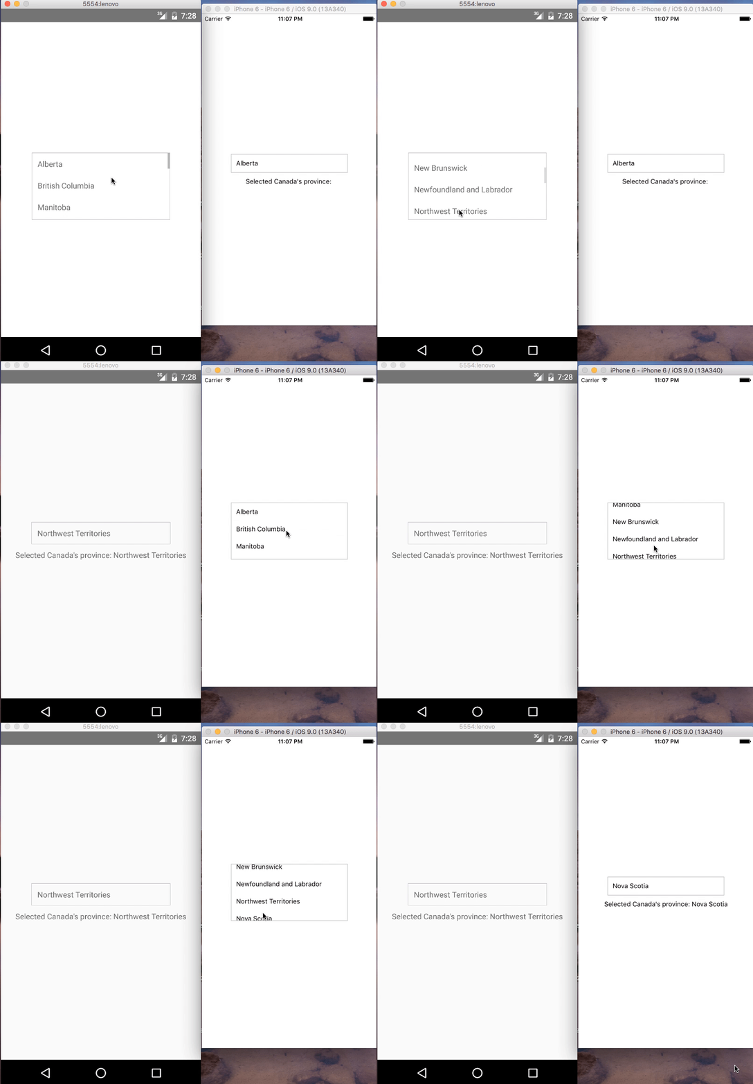
## Demo
### IOS and Android:
## Contributions
Your contributions and suggestions are heartily♡ welcome. (✿◠‿◠)
---
_Source: https://npm.io/package/@flockcover/react-native-chooser · Machine-readable twin of the npm.io package page. Health data is recomputed on every publish._