# @hawjs/progress

> progress ui component for react

Latest version **3.4.6** (published 2023-04-03) · MIT license · 0 weekly downloads

## Install

```sh
npm install @hawjs/progress
pnpm add @hawjs/progress
yarn add @hawjs/progress
bun add @hawjs/progress
```

## Health

**Score 30/100 (F)** — status: abandoned.

Positive: has types; esm support; no vulnerabilities; high quality score.

Warnings: low downloads.

Negative: abandoned; low maintenance score.

## Facts

| | |
|---|---|
| Version | 3.4.6 |
| Published | 2023-04-03 |
| First published | 2023-04-03 |
| Weekly downloads | 0 |
| License | MIT |
| TypeScript types | bundled |
| Module format | ESM + CommonJS |
| Dependencies | 3 |
| Unpacked size | 42.1 KB |
| Known vulnerabilities | 0 |
| Install scripts | no |
| GitHub stars | 0 |
| Author | hawjs |
| Maintainers | zhaoy1959 |
| Keywords | react, react-component, react-progress, progress |

## Links

- npm: https://www.npmjs.com/package/@hawjs/progress
- Repository: https://github.com/hawjs/progress
- Homepage: http://github.com/hawjs/progress
- Issues: http://github.com/hawjs/progress/issues
- npm.io page: https://npm.io/package/@hawjs/progress

## Dependencies (3)

- [rc-util](https://npm.io/package/rc-util.md) ^5.16.1
- [classnames](https://npm.io/package/classnames.md) ^2.2.6
- [@babel/runtime](https://npm.io/package/@babel/runtime.md) ^7.10.1

## Alternatives

- [mobx-react](https://npm.io/package/mobx-react.md) — 2.8M weekly downloads
- [rc-tree](https://npm.io/package/rc-tree.md) — 2.6M weekly downloads
- [@react-oauth/google](https://npm.io/package/@react-oauth/google.md) — 1.3M weekly downloads
- [@wagmi/connectors](https://npm.io/package/@wagmi/connectors.md) — 877.0K weekly downloads
- [vee-validate](https://npm.io/package/vee-validate.md) — 836.4K weekly downloads

## Recent versions

- 3.4.6 (latest) — 2023-04-03

## README

# rc-progress

Progress Bar.

[![NPM version][npm-image]][npm-url] [![dumi](https://img.shields.io/badge/docs%20by-dumi-blue?style=flat-square)](https://github.com/umijs/dumi) [![build status][github-actions-image]][github-actions-url] [![Test coverage][coveralls-image]][coveralls-url] [![npm download][download-image]][download-url] [![bundle size][bundlephobia-image]][bundlephobia-url]

[npm-image]: http://img.shields.io/npm/v/rc-progress.svg?style=flat-square
[npm-url]: http://npmjs.org/package/rc-progress
[github-actions-image]: https://github.com/react-component/progress/workflows/CI/badge.svg
[github-actions-url]: https://github.com/react-component/progress/actions
[circleci-image]: https://img.shields.io/circleci/react-component/progress/master?style=flat-square
[circleci-url]: https://circleci.com/gh/react-component/progress
[coveralls-image]: https://img.shields.io/coveralls/react-component/progress.svg?style=flat-square
[coveralls-url]: https://coveralls.io/r/react-component/progress?branch=master
[david-url]: https://david-dm.org/react-component/progress
[david-image]: https://david-dm.org/react-component/progress/status.svg?style=flat-square
[david-dev-url]: https://david-dm.org/react-component/progress?type=dev
[david-dev-image]: https://david-dm.org/react-component/progress/dev-status.svg?style=flat-square
[download-image]: https://img.shields.io/npm/dm/rc-progress.svg?style=flat-square
[download-url]: https://npmjs.org/package/rc-progress
[bundlephobia-url]: https://bundlephobia.com/result?p=rc-progress
[bundlephobia-image]: https://badgen.net/bundlephobia/minzip/rc-progress

## Example

https://progress.react-component.vercel.app/

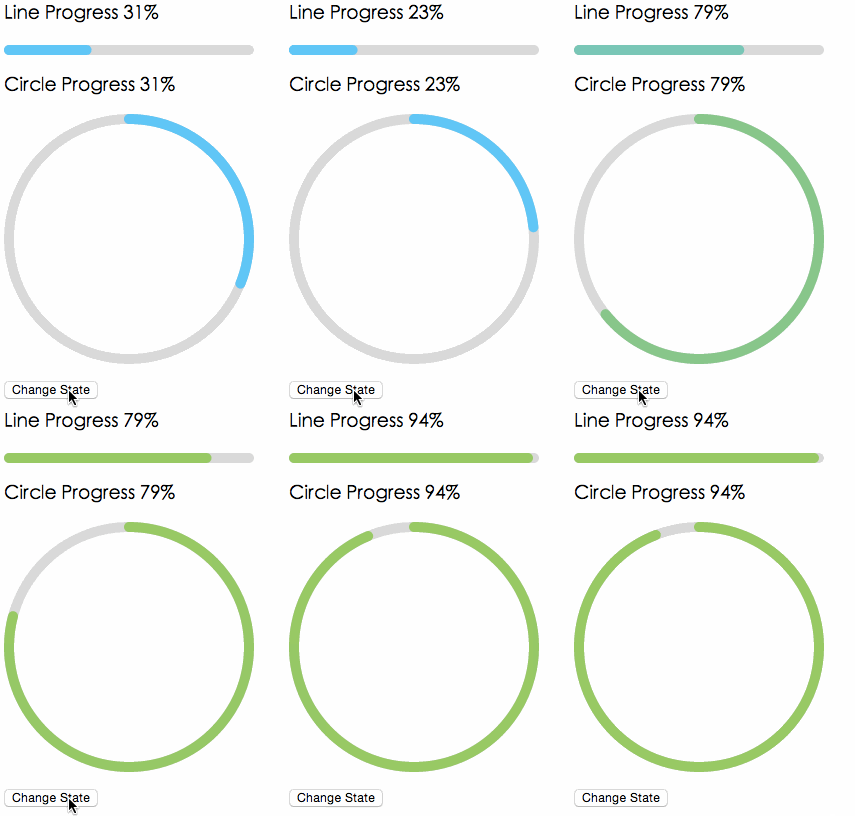
## Screenshots

<img src="https://t.alipayobjects.com/images/T12p8gXjpgXXXXXXXX.gif" />

## Browsers

* support IE9+, Chrome, Firefox, Safari

## Install

[![rc-progress](https://nodei.co/npm/rc-progress.png)](https://npmjs.org/package/rc-progress)

## Usage

```js
import { Line, Circle } from 'rc-progress';

export default () => (
  <>
     <Line percent={10} strokeWidth={4} strokeColor="#D3D3D3" />
     <Circle percent={10} strokeWidth={4} strokeColor="#D3D3D3" /> 
  </>
);
```

## Compatibility

| [<img src="https://raw.githubusercontent.com/alrra/browser-logos/master/src/edge/edge_48x48.png" alt="IE / Edge" width="24px" height="24px" />](http://godban.github.io/browsers-support-badges/)<br>IE / Edge | [<img src="https://raw.githubusercontent.com/alrra/browser-logos/master/src/firefox/firefox_48x48.png" alt="Firefox" width="24px" height="24px" />](http://godban.github.io/browsers-support-badges/)<br>Firefox | [<img src="https://raw.githubusercontent.com/alrra/browser-logos/master/src/chrome/chrome_48x48.png" alt="Chrome" width="24px" height="24px" />](http://godban.github.io/browsers-support-badges/)<br>Chrome | [<img src="https://raw.githubusercontent.com/alrra/browser-logos/master/src/safari/safari_48x48.png" alt="Safari" width="24px" height="24px" />](http://godban.github.io/browsers-support-badges/)<br>Safari | [<img src="https://raw.githubusercontent.com/alrra/browser-logos/master/src/electron/electron_48x48.png" alt="Electron" width="24px" height="24px" />](http://godban.github.io/browsers-support-badges/)<br>Electron |
| --- | --- | --- | --- | --- |
| IE11, Edge | last 2 versions | last 2 versions | last 2 versions | last 2 versions |

## API

### props

<table class="table table-bordered table-striped">
  <thead>
  <tr>
    <th style="width: 100px;">name</th>
    <th style="width: 50px;">type</th>
    <th style="width: 50px;">default</th>
    <th>description</th>
  </tr>
  </thead>
  <tbody>
    <tr>
      <td>strokeWidth</td>
      <td>Number</td>
      <td>1</td>
      <td>Width of the stroke. Unit is percentage of SVG canvas size.</td>
    </tr>
    <tr>
      <td>strokeColor</td>
      <td>String</td>
      <td>#2db7f5</td>
      <td>Stroke color.</td>
    </tr>
    <tr>
      <td>trailWidth</td>
      <td>Number</td>
      <td>1</td>
      <td>Width of the trail stroke. Unit is percentage of SVG canvas size. Trail is always centered relative to actual progress path. If trailWidth is not defined, it is the same as strokeWidth.</td>
    </tr>
    <tr>
      <td>trailColor</td>
      <td>String</td>
      <td>#D9D9D9</td>
      <td>Color for lighter trail stroke underneath the actual progress path.</td>
    </tr>
    <tr>
      <td>strokeLinecap</td>
      <td>String</td>
      <td>'round'</td>
      <td>The shape to be used at the end of the progress bar: can be `butt`, `square` or `round`.</td>
    </tr>
    <tr>
      <td>prefixCls</td>
      <td>String</td>
      <td>rc-progress</td>
      <td>prefix className for component</td>
    </tr>
    <tr>
      <td>className</td>
      <td>String</td>
      <td></td>
      <td>customized className</td>
    </tr>
    <tr>
      <td>style</td>
      <td>Object</td>
      <td></td>
      <td>style object will be added to svg element</td>
    </tr>
    <tr>
      <td>percent</td>
      <td>Number | Number[]</td>
      <td>0</td>
      <td>the percent of the progress</td>
    </tr>
    <tr>
      <td>gapDegree</td>
      <td>Number</td>
      <td>0</td>
      <td>the gap degree of half circle, 0 - 360</td>
    </tr>
    <tr>
      <td>gapPosition</td>
      <td>String</td>
      <td>top</td>
      <td>the gap position: can be `top`, `bottom`, `left`, or `right`. </td>
    </tr>
  </tbody>
</table>

## Installation

```
npm install --save rc-progress
```

## Development

```
npm install
npm start
```

## License

rc-progress is released under the MIT license.

---
_Source: https://npm.io/package/@hawjs/progress · Machine-readable twin of the npm.io package page. Health data is recomputed on every publish._