# @hdoc/react-toggle-theme

> A react button component for toggle the theme

Latest version **2.1.4** (published 2024-02-15) · MIT license · 0 weekly downloads

> **Deprecated.** This package is deprecated.

## Install

```sh
npm install @hdoc/react-toggle-theme
pnpm add @hdoc/react-toggle-theme
yarn add @hdoc/react-toggle-theme
bun add @hdoc/react-toggle-theme
```

## Health

**Score 10/100 (F)** — status: deprecated.

Negative: deprecated.

## Facts

| | |
|---|---|
| Version | 2.1.4 |
| Published | 2024-02-15 |
| First published | 2023-08-31 |
| Weekly downloads | 0 |
| License | MIT |
| TypeScript types | bundled |
| Module format | ESM + CommonJS |
| Node | >=13.2.0 |
| Dependencies | 0 |
| Unpacked size | 6.4 KB |
| Known vulnerabilities | 0 |
| Install scripts | no |
| GitHub stars | 1 |
| Author | Héctor Ochoa |
| Maintainers | hdoc |
| Keywords | react, react-component, theme, theme-toggle, dark, light |

## Links

- npm: https://www.npmjs.com/package/@hdoc/react-toggle-theme
- Repository: https://github.com/Hdoc1509/react-components
- Homepage: https://github.com/Hdoc1509/react-components/tree/master/packages/toggle-theme#readme
- Issues: https://github.com/Hdoc1509/react-components/issues
- npm.io page: https://npm.io/package/@hdoc/react-toggle-theme

## Alternatives

- [mobx-react](https://npm.io/package/mobx-react.md) — 2.8M weekly downloads
- [rc-tree](https://npm.io/package/rc-tree.md) — 2.6M weekly downloads
- [@react-oauth/google](https://npm.io/package/@react-oauth/google.md) — 1.3M weekly downloads
- [@wagmi/connectors](https://npm.io/package/@wagmi/connectors.md) — 877.0K weekly downloads
- [vee-validate](https://npm.io/package/vee-validate.md) — 836.4K weekly downloads

## Recent versions

- 2.1.4 (latest) — 2024-02-15
- 2.1.3 — 2024-02-01
- 2.1.2 — 2024-01-31
- 2.1.1 — 2023-09-29
- 2.1.0 — 2023-09-21
- 2.0.3 — 2023-09-20
- 2.0.2 — 2023-09-07
- 2.0.1 — 2023-09-02
- 2.0.0 — 2023-09-01
- 1.0.1 — 2023-08-31

## README

# @hdoc/react-toggle-theme

<p align="center">
  <a href="https://www.npmjs.com/package/@hdoc/react-toggle-theme">
    <img alt="npm" src="https://img.shields.io/npm/v/%40hdoc%2Freact-toggle-theme">
  </a>
  <img alt="npm bundle size" src="https://img.shields.io/bundlephobia/minzip/%40hdoc%2Freact-toggle-theme">
  <img alt="npm" src="https://img.shields.io/npm/dm/%40hdoc%2Freact-toggle-theme">
</p>

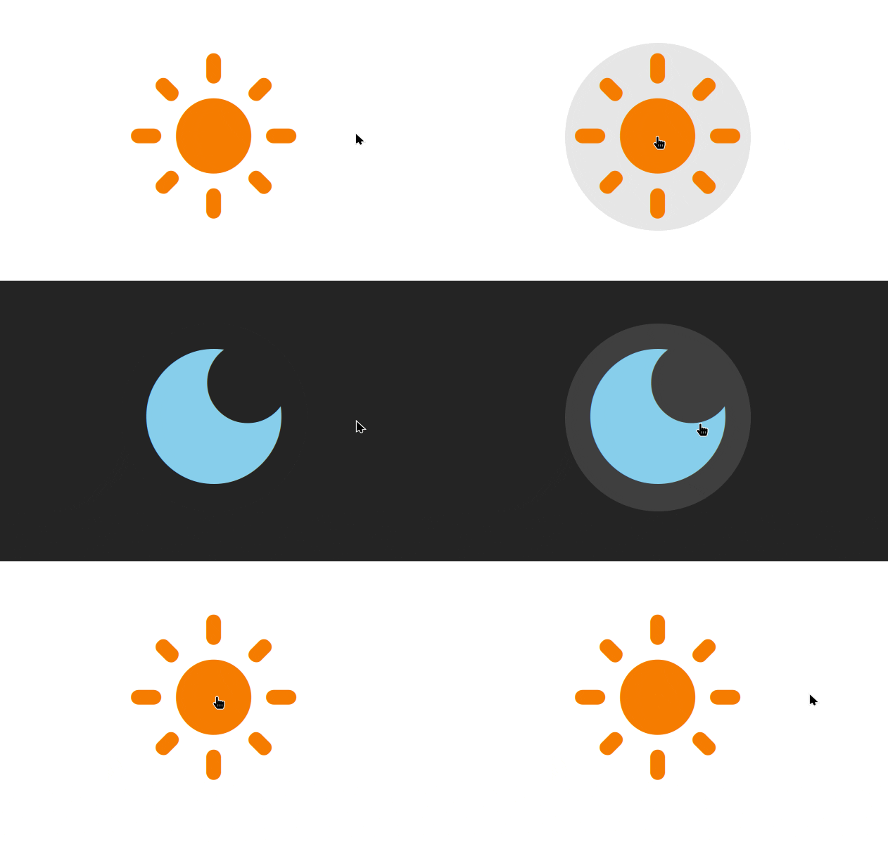
Simple button component for toggle between `light` and `dark` theme in your React app.
![Theme Button gif](https://github.com/Hdoc1509/react-components/assets/72316111/53cf9717-472c-41f5-95df-260d3dda009a)

## Installation

```bash
npm install @hdoc/react-toggle-theme
```

## Usage

First, import `load-theme.js` in your `index.html`:

```html
<script
  type="module"
  src="/path/to/@hdoc/react-toggle-theme/dist/load-theme.js"
></script>
```

Then, in your `App.jsx` or another file:

```js
import { ThemeButton } from "@hdoc/react-toggle-theme";

function App() {
  return (
    <>
      <ThemeButton
        lightElement={<span>Light</span>}
        darkElement={<span>Dark</span>}
        fullRounded
      />
    </>
  );
}
```

Finally, you will need to add your styles manually:

```css
/* For light theme: */
[data-theme="light"] { ... }
[data-theme="light"] .my-class { ... }

/* For dark theme: */
[data-theme="dark"] { ... }
[data-theme="dark"] .my-class { ... }
```

## Props

`lightElement`

Element to render when the theme is `light`.

Type: `ReactNode`

---

`darkElement`

Element to render when the theme is `dark`.

Type: `ReactNode`

---

`fullRounded`

Whether to render the button with rounded corners as a circle.

Type: `boolean`

## CSS classes

`theme-button`

Default class name

---

`theme-button--full-rounded`

Styles the button as a circle when `fullRounded=true`

## Customization

You can customize the background color of the button with the following CSS custom properties:

```css
.theme-button {
  --button-bg: #fff;
  --button-bg-hover: #eee;
  --button-bg-active: #ddd;
}

/* The same custom properties applies for dark theme. */
[data-theme="dark"] .theme-button {
  --button-bg: #333;
  --button-bg-hover: #444;
  --button-bg-active: #555;
}
```

---
_Source: https://npm.io/package/@hdoc/react-toggle-theme · Machine-readable twin of the npm.io package page. Health data is recomputed on every publish._

