# @jzolago/vuetify-number-input
> vuetify-number-input is a simple wrapper for the Vuetify Text Field UI component for incrementing and decrementing numerical input.
Latest version **0.4.0** (published 2018-12-20) · GPL-3.0-only license · 0 weekly downloads
## Install
```sh
npm install @jzolago/vuetify-number-input
pnpm add @jzolago/vuetify-number-input
yarn add @jzolago/vuetify-number-input
bun add @jzolago/vuetify-number-input
```
## Health
**Score 15/100 (F)** — status: abandoned.
Positive: no vulnerabilities.
Warnings: low downloads; no types; no esm support; pre 1.0.
Negative: abandoned; low maintenance score.
## Facts
| | |
|---|---|
| Version | 0.4.0 |
| Published | 2018-12-20 |
| First published | 2018-12-20 |
| Weekly downloads | 0 |
| License | GPL-3.0-only |
| TypeScript types | none |
| Module format | CommonJS |
| Dependencies | 4 |
| Unpacked size | 725.1 KB |
| Known vulnerabilities | 0 (+1 in 1 direct dependencies) |
| Install scripts | no |
| Maintainers | jzolago |
| Keywords | vue, vuetify, input, component |
## Links
- npm: https://www.npmjs.com/package/@jzolago/vuetify-number-input
- Homepage: https://github.com/mccabiles/vuetify-number-input
- npm.io page: https://npm.io/package/@jzolago/vuetify-number-input
## Dependencies (4)
- [vue](https://npm.io/package/vue.md) ^2.5.17
- [vuetify](https://npm.io/package/vuetify.md) ^1.3.0
- [roboto-fontface](https://npm.io/package/roboto-fontface.md) *
- [material-design-icons-iconfont](https://npm.io/package/material-design-icons-iconfont.md) ^3.0.3
## Recent versions
- 0.4.0 (latest) — 2018-12-20
- 0.3.0 — 2018-12-20
- 0.2.0 — 2018-12-20
- 0.1.0 — 2018-12-20
## README
# vuetify-number-input
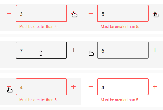
vuetify-number-input is a simple wrapper for the Vuetify Text Field UI component for incrementing and decrementing numerical input.
## Installation
Install the package from npm:
```
npm install --save @jzolago/vuetify-number-input
```
Add the package to your app entry point:
```
import Vue from 'vue'
import VuetifyNumberInput from '@jzolago/vuetify-number-input'
Vue.use(VuetifyNumberInput);
```
## Usage
Once the plugin has been installed, you can now use the `v-input-number` component in your templates.
Use `v-model` to bind to the value.
```
```
## The v-input-number component
The component extends the Vuetify `v-text-field` component.
### Props:
| Prop | description | type | default |
| ---- | ---- | ------- | --- |
| label | Set input label | String | '' |
| min | Sets minimum value | Number | 0 |
| max | Sets maximum value | Number | 9999 |
| maxLength | Sets maximum number of digits. Must align with `max` | Number | 4 |
| outline | Sets outline style to the input | Boolean | true |
| rules | An array of functions called for validation that should either return `true` or a String error message. See [Vuetify Text Field docs](https://vuetifyjs.com/en/components/text-fields) for details.| Array | [] |
| step | Sets amount to be added/subtracted when using +/- icons | Number | 1 |
| value | Input value | Number, String | undefined |
### Events:
`@input`: Emitted when value is changed using +/- icons or after user input.
---
_Source: https://npm.io/package/@jzolago/vuetify-number-input · Machine-readable twin of the npm.io package page. Health data is recomputed on every publish._