# @martinstf/ngx-commander-sidebar
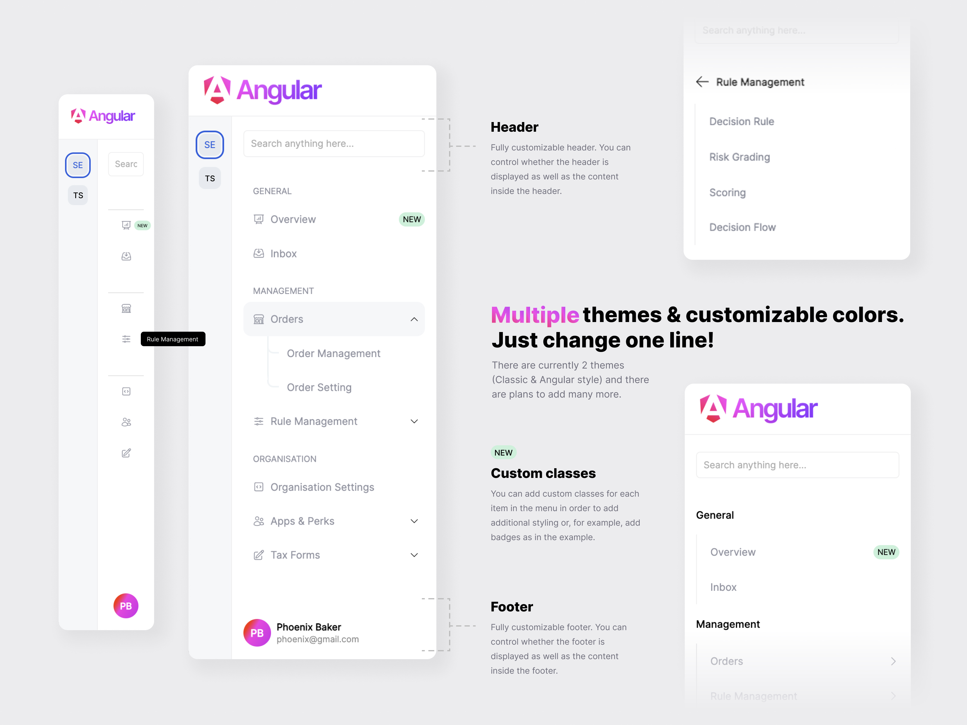
> 
Latest version **0.0.78** (published 2026-01-21) · 0 weekly downloads
## Install
```sh
npm install @martinstf/ngx-commander-sidebar
pnpm add @martinstf/ngx-commander-sidebar
yarn add @martinstf/ngx-commander-sidebar
bun add @martinstf/ngx-commander-sidebar
```
## Health
**Score 55/100 (C)** — status: stable.
Positive: has types; esm support; no vulnerabilities.
Warnings: low downloads; pre 1.0.
## Facts
| | |
|---|---|
| Version | 0.0.78 |
| Published | 2026-01-21 |
| First published | 2023-11-06 |
| Weekly downloads | 0 |
| TypeScript types | bundled |
| Module format | ESM + CommonJS |
| Dependencies | 1 |
| Unpacked size | 367.5 KB |
| Known vulnerabilities | 0 |
| Install scripts | no |
| GitHub stars | 0 |
| Author | Martin Stefanovic |
| Maintainers | martinstf |
## Links
- npm: https://www.npmjs.com/package/@martinstf/ngx-commander-sidebar
- Repository: https://github.com/martinstefanovic/ngx-commander
- Homepage: https://github.com/martinstefanovic/ngx-commander#readme
- Issues: https://github.com/martinstefanovic/ngx-commander/issues
- npm.io page: https://npm.io/package/@martinstf/ngx-commander-sidebar
## Dependencies (1)
- [tslib](https://npm.io/package/tslib.md) ^2.3.0
## Recent versions
- 0.0.78 (latest) — 2026-01-21
- 0.0.77 — 2024-01-09
- 0.0.76 — 2023-12-22
- 0.0.75 — 2023-12-22
- 0.0.74 — 2023-12-22
- 0.0.73 — 2023-12-22
- 0.0.72 — 2023-12-08
- 0.0.71 — 2023-12-08
- 0.0.7 — 2023-12-08
- 0.0.35 — 2023-11-28
- 0.0.3 — 2023-11-28
- 0.0.2 — 2023-11-15
- 0.0.17 — 2023-11-14
- 0.0.164 — 2023-11-07
- 0.0.163 — 2023-11-07
- … 11 more at https://npm.io/package/@martinstf/ngx-commander-sidebar/versions
## README
# Angular Sidebar

## Installation
First you need to install package for sidebar and icons:
```
npm i @martinstf/ngx-commander-sidebar @ng-icons/core @ng-icons/heroicons
```
In your module or standalone component you need to import `SidebarComponent`
```
imports: [
...
SidebarComponent,
...
],
```
Don't forget to include `NgIconsModule`. You can read more about it [here](https://www.npmjs.com/package/@ng-icons/core 'here')
## Usage
### Example
You can find example [here](https://github.com/martinstefanovic/ngx-commander/tree/main/projects/testing)
```
```
### Options
| Name | Type | Description | Default |
| :----------------------- | :------- | -------------------------------------------------------------------------------------------------------------------- | ----------- |
| height | `string` | Sidebar height. You can use any CSS unit here. |
| logoConfig | `object` | You can set logo options for expanded sidebar but also you can set different logo options when sidebar is collapsed. |
| smallSidebarConfig | `object` | Config contains `routes` key with list of small sidebar items. | `undefined` |
| smallSidebarDefaultIndex | `number` | Predefine selected item for small sidebar. | `undefined` |
| sidebarConfig | `object` | Config contains `routes` key with list of sidebar items and `title` for sidebar title if you need it. | `undefined` |
### Configuration
##### Theme
You have SidebarTheme enum with all suported themes for sidebar.
##### Layout
If you dont want to show sidebar (e.g. when you just want small sidebar) just dont provide `sidebarConfig` property to `` component.
You can adjust height of each sidebar part (header, body, footer) with CSS flex propery. Default values are shown in exaple below.
Also if you dont need header or footer in sidebar you can set show key to false. Default is true for all.
```
largeSidebar: LargeSidebarConfig = {
theme: SidebarTheme.Angular,
title: 'Sidebar example',
layout: {
header: {
show: true,
flex: 1,
},
body: {
flex: 8,
},
footer: {
show: false,
flex: 1,
},
},
routes: [...],
};
```
##### Small sidebar
If you dont want to show small sidebar just dont provide `smallSidebarConfig` property to `` component.
```
smallSidebar: SmallSidebarConfig = {
style: {
width: '55px',
},
routes: [...],
};
```
##### Logo config
If you dont want to show logo part of sidebar just dont provide `logoConfig` property to `` component.
`logo` config will be shown when sidebar is expanded and `collapsedLogo` when sidebar is colapsed.
```
logoConfig: SidebarLogoConfig = {
logo: {
url: './../assets/full-logo.png',
height: '50px',
width: 'auto'
},
collapsedLogo: {
url: './../assets/full-logo.png',
height: '30px',
width: 'auto'
}
}
```
##### Events
| Name | Description | Return |
| :---------- | :------------------------------------------------------------------------------- | ------------------------------------------------------------------------- |
| onItemClick | When item is selected. This include both small sidebar and regular sidebar items | `Object` of selected item with type of selected item and type of sidebar. |
### Sidebar item types
```
```
In routes you can pass diferent types of items.
#### Section title
```
{
title: 'General'
}
```
#### Single sidebar item
```
{
path: ['statistics','users'], // This array will be transformed to 'statistics/users'
title: 'Statistics',
icon: 'heroArrowTrendingUp', // Icon from @ng-icons/core
}
```
#### Sidebar dropdown
```
{
opened: false,
title: 'Customers',
type: 'dropdown',
icon: 'heroUsers',
children: [
...
{
path: ['users'],
title: 'Users',
icon: 'heroUsers',
},
...
]
}
```
### Custom content
You can add custom content instade of predefined to: small sidebar, header and footer.
Just use ng-container element with proper name:
```
Small sidebar custom content
Header custom content
Footer custom content
```
### Responsive
If you have additional styling or change positions of burger menu button on mobile you can target class `.CMND-mobile-sidebar-btn`
If you want to change icon for button you can do it like this:
```
```
### Colors
If you want different colors you can overide this CSS variables
```
:root {
// Small sidebar
--ngx-commander-small-sidebar-background: #f5f7f9;
--ngx-commander-small-sidebar-active-text: #215bde;
--ngx-commander-small-sidebar-text: black;
--ngx-commander-small-sidebar-item-active-background: #e6ebef;
--ngx-commander-small-sidebar-item-background: #e6ebef;
--ngx-commander-small-sidebar-active-border: #215bde;
--ngx-commander-small-sidebar-font: 'Inter', sans-serif;
// Large sidebar
--ngx-commander-large-sidebar-background: #fff;
--ngx-commander-large-sidebar-icon: #9194a1;
--ngx-commander-large-sidebar-active-icon: #215bde;
--ngx-commander-large-sidebar-active-text: #215bde;
--ngx-commander-large-sidebar-text: #9194a1;
--ngx-commander-large-sidebar-item-active-background: #f0f4f6;
--ngx-commander-large-sidebar-item-background: #fff;
--ngx-commander-large-sidebar-font: 'Inter', sans-serif;
--ngx-commander-large-sidebar-menu-btn-color: #215bde;
}
```
---
_Source: https://npm.io/package/@martinstf/ngx-commander-sidebar · Machine-readable twin of the npm.io package page. Health data is recomputed on every publish._