# @mindinventory/react-native-tab-bar-interaction
> A tabbar component for React Native
Latest version **3.0.1** (published 2025-05-09) · MIT license · 0 weekly downloads
## Install
```sh
npm install @mindinventory/react-native-tab-bar-interaction
pnpm add @mindinventory/react-native-tab-bar-interaction
yarn add @mindinventory/react-native-tab-bar-interaction
bun add @mindinventory/react-native-tab-bar-interaction
```
## Health
**Score 40/100 (D)** — status: stable.
Positive: esm support; no vulnerabilities.
Warnings: low downloads; no types.
Negative: stale.
## Facts
| | |
|---|---|
| Version | 3.0.1 |
| Published | 2025-05-09 |
| First published | 2018-08-08 |
| Weekly downloads | 0 |
| License | MIT |
| TypeScript types | none |
| Module format | ESM + CommonJS |
| Dependencies | 3 |
| Unpacked size | 142.8 KB |
| Known vulnerabilities | 0 |
| Install scripts | no |
| GitHub stars | 845 |
| Author | Mindinventory |
| Maintainers | ankit_prajapati, chirag.mi, pratikmi001, akash.patel.mi, keval-r, bmishra97, bhumi.goklani.mi, rahulgauswami, nikhilgohil007, maulik.togadiya |
| Keywords | react-native, basic-components, Tabbar, react-native-tabbar |
## Links
- npm: https://www.npmjs.com/package/@mindinventory/react-native-tab-bar-interaction
- Repository: https://github.com/Mindinventory/react-native-tab-bar-interaction
- Homepage: https://github.com/Mindinventory/react-native-tab-bar-interaction#readme
- Issues: https://github.com/Mindinventory/react-native-tab-bar-interaction/issues
- npm.io page: https://npm.io/package/@mindinventory/react-native-tab-bar-interaction
## Dependencies (3)
- [d3-shape](https://npm.io/package/d3-shape.md) ^3.2.0
- [react-native-svg](https://npm.io/package/react-native-svg.md) ^15.7.1
- [react-native-redash](https://npm.io/package/react-native-redash.md) ^18.1.3
## Recent versions
- 3.0.1 (latest) — 2025-05-09
- 3.0.0 — 2024-12-10
- 2.2.3 — 2022-05-25
- 2.2.2 — 2022-04-22
- 2.2.1 — 2022-01-06
- 2.2.0 — 2021-12-16
- 2.1.4 — 2021-08-09
- 2.1.3 — 2021-08-09
- 2.1.2 — 2021-08-09
- 2.1.1 — 2021-08-09
- 2.1.0 — 2021-08-07
- 2.0.10 — 2021-08-06
- 2.0.9 — 2021-08-06
- 2.0.8 — 2021-08-06
- 2.0.7 — 2021-08-06
- … 10 more at https://npm.io/package/@mindinventory/react-native-tab-bar-interaction/versions
## README
# React Native Tabbar Interaction [](https://www.npmjs.com/package/@mindinventory/react-native-tab-bar-interaction)
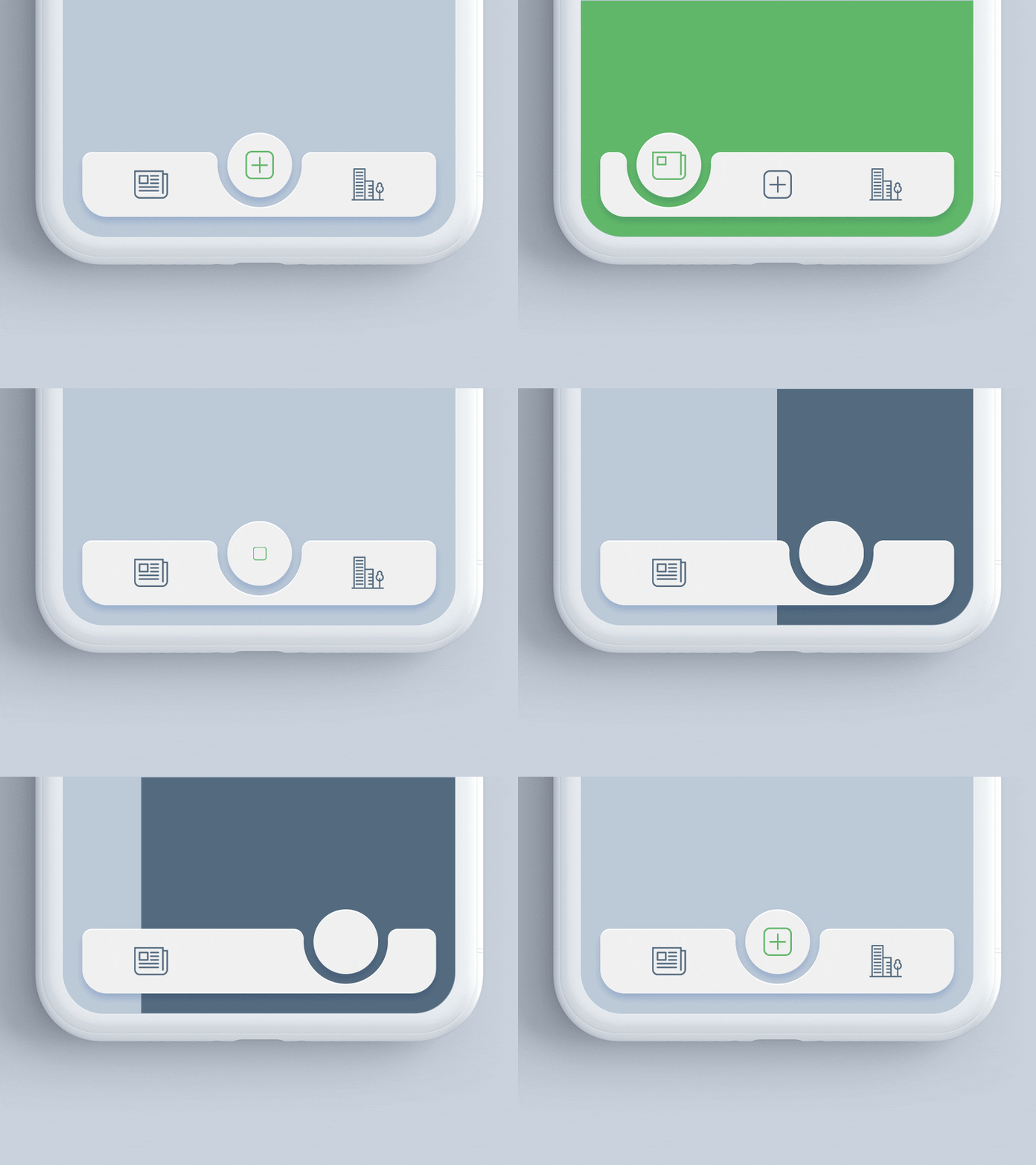
Beautiful Tabbar Interaction with Sliding Inset FABs,
made for React Native with RTL support.
Check it out on Béhance (https://www.behance.net/gallery/68043143/Tab-bar-interaction-with-animated-icons)
Check it out on Dribbble (https://dribbble.com/shots/4844696-Tab-bar-interaction-with-animated-icons)
 # Installation
using npm:
```
npm install @mindinventory/react-native-tab-bar-interaction
```
using yarn:
```
yarn add @mindinventory/react-native-tab-bar-interaction
```
## Dependencies
- `react-native-reanimated`
### Supported platform
- Android
- Ios
# Usage
```js
import {
TabBar,
TabsType,
} from "@mindinventory/react-native-tab-bar-interaction";
...
const tabs = [
{
name: 'Home',
activeIcon: ,
inactiveIcon:
},
{
name: 'list',
activeIcon: ,
inactiveIcon:
},
{
name: 'camera',
activeIcon: ,
inactiveIcon:
},
{
name: 'Notification',
activeIcon: ,
inactiveIcon:
},
{
name: 'Profile',
activeIcon: ,
inactiveIcon:
},
];
...
return (
console.log('Tab changed')}
/>
);
```
## Component props
### Tabbar
| prop | value | required/optional | description |
| -------------------------- | -------- | ----------------- | -------------------------------------------------------------------- |
| tabs | array | required | It is user for showing icon and label. |
| tabBarContainerBackground | string | optional | Use for change tabBar container color. |
| onTabChange | function | required | Use to perform any action when click on tab. |
| containerBottomSpace | number | optional | Use to add space between tabBar container and from bottom of screen. |
| containerWidth | number | required | Use for set width of tabBar container |
| containerTopRightRadius | number | optional | Use for add top right radius on tabBar container |
| containerTopLeftRadius | number | optional | Use for add top left radius on tabBar container |
| containerBottomLeftRadius | number | optional | Use for add bottom left radius on tabBar container |
| containerBottomRightRadius | number | optional | Use for add bottom right radius on tabBar container |
| defaultActiveTabIndex | number | optional | Use to set default active tab |
| transitionSpeed | number | optional | Use to set transition speed |
| circleFillColor | string | optional | Use to set background color for circle |
### tabs
| properties | value | required/optional | description |
| ------------ | --------- | ----------------- | -------------------------------------------- |
| name | string | required | use for showing tab label. |
| activeIcon | component | required | Use for showing tab active icon/image. |
| inactiveIcon | component | required | Use for showing tab inactiveIcon icon/image. |
# LICENSE!
React-native-tabbar-interaction is [MIT-licensed](https://github.com/Mindinventory/react-native-tabbar-interaction/blob/master/LICENSE).
# Let us know!
We’d be really happy if you send us links to your projects where you use our component. Just send an email to sales@mindinventory.com And do let us know if you have any questions or suggestion regarding our work.
---
_Source: https://npm.io/package/@mindinventory/react-native-tab-bar-interaction · Machine-readable twin of the npm.io package page. Health data is recomputed on every publish._
# Installation
using npm:
```
npm install @mindinventory/react-native-tab-bar-interaction
```
using yarn:
```
yarn add @mindinventory/react-native-tab-bar-interaction
```
## Dependencies
- `react-native-reanimated`
### Supported platform
- Android
- Ios
# Usage
```js
import {
TabBar,
TabsType,
} from "@mindinventory/react-native-tab-bar-interaction";
...
const tabs = [
{
name: 'Home',
activeIcon: ,
inactiveIcon:
},
{
name: 'list',
activeIcon: ,
inactiveIcon:
},
{
name: 'camera',
activeIcon: ,
inactiveIcon:
},
{
name: 'Notification',
activeIcon: ,
inactiveIcon:
},
{
name: 'Profile',
activeIcon: ,
inactiveIcon:
},
];
...
return (
console.log('Tab changed')}
/>
);
```
## Component props
### Tabbar
| prop | value | required/optional | description |
| -------------------------- | -------- | ----------------- | -------------------------------------------------------------------- |
| tabs | array | required | It is user for showing icon and label. |
| tabBarContainerBackground | string | optional | Use for change tabBar container color. |
| onTabChange | function | required | Use to perform any action when click on tab. |
| containerBottomSpace | number | optional | Use to add space between tabBar container and from bottom of screen. |
| containerWidth | number | required | Use for set width of tabBar container |
| containerTopRightRadius | number | optional | Use for add top right radius on tabBar container |
| containerTopLeftRadius | number | optional | Use for add top left radius on tabBar container |
| containerBottomLeftRadius | number | optional | Use for add bottom left radius on tabBar container |
| containerBottomRightRadius | number | optional | Use for add bottom right radius on tabBar container |
| defaultActiveTabIndex | number | optional | Use to set default active tab |
| transitionSpeed | number | optional | Use to set transition speed |
| circleFillColor | string | optional | Use to set background color for circle |
### tabs
| properties | value | required/optional | description |
| ------------ | --------- | ----------------- | -------------------------------------------- |
| name | string | required | use for showing tab label. |
| activeIcon | component | required | Use for showing tab active icon/image. |
| inactiveIcon | component | required | Use for showing tab inactiveIcon icon/image. |
# LICENSE!
React-native-tabbar-interaction is [MIT-licensed](https://github.com/Mindinventory/react-native-tabbar-interaction/blob/master/LICENSE).
# Let us know!
We’d be really happy if you send us links to your projects where you use our component. Just send an email to sales@mindinventory.com And do let us know if you have any questions or suggestion regarding our work.
---
_Source: https://npm.io/package/@mindinventory/react-native-tab-bar-interaction · Machine-readable twin of the npm.io package page. Health data is recomputed on every publish._