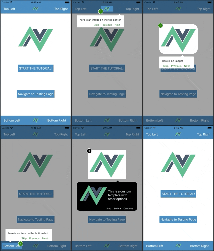
Step-by-step walkthrough for your Nativescript app!
#### Inspired by the awesome [React Native Copilot](https://github.com/mohebifar/react-native-copilot) plugin
Nativescript-Copilot is a component that is currently only suitable for NativeScript-Vue. If you'd like to see a Nativescript-Core or Nativescript-Angular implementation, then please submit a PR.
## Quick Start - Vue
```shell
npm install --save @nativescript-copilot/vue
```
## Main entry point
```js
import Copilot from '@nativescript-copilot/vue';
Vue.use(Copilot)
```
## Nativescript-Vue Usage
This can be used on a Page by Page basis. The primary way the tour is driven is by passing in a `ref` for each step. For example below, we have a `ref` named `step1` in the `Image` component.
```html
```
You can combine multiple `refs` to create a tour. You will need to create an object array that carries the config for the tour for a particular page. For example:
```js
this.steps = [
{
name: 'First',
text: 'here is some text',
order: 1,
target: this.$refs.step1.nativeView,
animated: true,
isFirstStep: true
},
{
name: 'Second',
text: 'here is some text with a rounded highlighted zone and padding',
order: 2,
target: this.$refs.step2.nativeView,
animated: true,
highlightBorderRadius: 10,
highlighPadding: 5,
},
{
name: 'Third',
text: 'here is some text that should hopefully be long enought to cause a wrap. What will happen if the text is too long. Find out!',
order: 3,
target: this.$refs.step3.nativeView,
animated: true
},
{
name: 'Fourth',
text: 'This has a veritcal offset of -5 which will push the step 5dp towards the top',
order: 4,
target: this.$refs.step4.nativeView,
animated: false,
verticalOffset: -5,
},
{
name: 'Fifth',
text: '',
order: 4,
target: this.$refs.step3.nativeView,
animated: false,
isCustom: true,
itemTemplate: '',
customBackgroundColor: 'black',
customBorderRadius: '15',
numberAccentColor: 'white',
numberBackgroundColor: 'green',
customTooltipStyle: {
fontFamily: 'Avenir-Bold',
tooltipFontSize: 12,
tooltipTextColor: 'white',
buttonFontSize: 12,
accentColor: 'white'
},
customLabels: {
skip: 'Stop',
previous: 'Before',
next: 'Continue',
finish: 'Done'
}
},
{
name: 'Sixth',
text: 'This will darken the whole page and center the tool tip',
order: 4,
target: this.$refs.step4.nativeView,
animated: false,
darkenWholePage: true,
isLastStep: true
}
]
```
There are several configuration items in a `Step` object:
| Name | Type | Description |
| -------------- | --------------| --------------- |
| name | string | Purely for decoration/organizational purposes |
| text | string | The descriptive text to display in the tooltip |
| order | number | which step this is in the page's tour |
| target | string | the specific component that you want the tour to stop at. This must be in the format of `this.$refs.step1.nativeView` where `step1` is the name of the actual `ref` |
| animated | boolean | Default is true, but if you don't want a step to animate to the next step, then set this and it will jump to the next location without any animation |
| verticalOffset | number | Use in case you need to vertically offset the area highlighted by the step. This can be a positive or negative number |
| isFirstStep | boolean | Used to tell the plugin which step is first so that it will hide the `Previous` button |
| isLastStep | boolean | Used to tell the plugin which step is last so that it will hide the `Next` button and show the 'Finish' button |
| isLastStep | boolean | Used to tell the plugin which step is last so that it will hide the `Next` button and show the 'Finish' button |
| darkenWholePage | boolean | Used to tell the plugin if a step has no highlighted value, to darken the whole screen, and center the text box vertically and horizontally |
| showNumber | boolean | Use in the case of not wanting to show the step number on a specific step |
| numberBackgroundColor | string | Used in the case of wanting a custom number background color on a specific step |
| numberAccentColor | string | Used in the case of wanting a custom number accent color on a specific step |
| customBackgroundColor | string | Use in the case of wanting a custom background tool tip color on a specific step |
| customBorderRadius | string | Use in the case of wanting a custom border radius for the tool tip on a specific step |
| highlightPadding | number | Use in the case of wanting a custom padding on the highlightedzone of the mask |
| highlightBorderRadius | number | Use in the case of wanting a custom border radius on the highlightedzone of the mask on a specific step *(**Warning**: when using border radius, with how this plugin functions, having too high of a border radius / too high of a border radius near the edge of the device will cause IOS UI to misfunction, it is suggested to descrease your border radius)* *(**Note**: using border radius will decrease your highlighted area, use padding to increase it again)* |
| isCustom | boolean | Use in the case of wanting a customized tool tip, along with the itemTemplate option |
| itemTemplate | string | Used if custom component is true on the step, pass in a string value of XML ( events and dynamic props do not work ) |
| customTooltipStyle | object | Used in the case of wanting a custom style for the tool tip on a specific step |
| customLabels | object | Used in the case of wanting a custom style for the tool tip on a specific step |
You will then pass the step config into the `Copilot` component as the `steps` prop. In the example below, we are using a computed property to feed the `steps` prop:
```html
```
There are several other props that can be passed into the `Copilot` component. They are:
| Name | Type | Default | Description |
| -------------- | --------------| --------------|--------------- |
| animationDuration | string | 300 | Number of `ms` the animation will take to move to the next step |
| labels | object | { skip: 'Skip', next: 'Next', previous: 'Previous', finish: 'Finish' } | The names of the four buttons used in the toolsip to move between tour steps. `Skip` will end the tour at any step while `Finish` will only end at the very last step. |
| tooltipStyle | object | { fontFamily: Avenir-Light, tooltipFontSize: 14, tooltipTextColor: 'black', buttonFontSize: 14, accentColor: 'green' } | Used to control the overall apperance of the tooltip |
| overlayColor | string | rgba(0, 0, 0, 0.4) | Used to control the overlay color|
| numberBackgroundColor | string | white | Used to set the default number background color |
| numberAccentColor | string | green | Used to set the default number accent color |
| toolTipBackgroundColor | string | white | Used to set the default tool tip background color |
| toolTipBorderRadius | string | '3' | Used to set the default tool tip border radius |
| highlightBorderRadius | number | 0 | Used to set the default highlight border radius on the mask *(**Warning**: when using border radius, with how this plugin functions, having too high of a border radius / too high of a border radius near the edge of the device will cause IOS UI to misfunction, it is suggested to descrease your border radius)* *(**Note**: using border radius will decrease your highlighted area, use padding to increase it again)*|
| highlightPadding | number | 5 | Used to set the default highlight padding on the mask|
An initialization example of the above options (done in typescript):
```js
private animationDuration: number = 300;
private androidStatusBarVisible: boolean = false;
private labels: object = {
skip: 'Skip',
previous: 'Previous',
next: 'Next',
finish: 'Finish'
};
private tooltipStyle: object = {
fontFamily: 'Avenir-Light',
tooltipFontSize: 14,
tooltipTextColor: 'black',
buttonFontSize: 14,
accentColor: 'green'
}
private overlayColor: string = 'rgba(0, 0, 0, 0.4)';
private numberAccentColor: string = 'green';
private numberBackgroundColor: string = 'white';
private toolTipBackgroundColor: string = 'white';
private toolTipBorderRadius: string = '3';
private highlightPadding: number = 5;
private highlightBorderRadius: number = 10;
```
There are several events emitted by the `Copilot` component:
| Name | Type | Description |
| -------------- | --------------| --------------- |
| step-change | object | Emitted when a step progresses forward or backward, emits an object containing stepLeaving and stepArriving |
| stop | -- | Emitted when the copilot is stopped |
| start | -- | Emitted when the copilot is started |
| not-ready | -- | Emitted when the copilot receives an invalid layout |
| highlight-tap | -- | Emitted when the copilot's highlightedzone is tapped |
You will call the event from the `Copilot` component as the name of the chosen event. In the example below, we are calling a function on the event:
```html
```
To start a tour on a particular page you will need to call the `Copilot` start function. An example of this is: `this.$refs.copilot.start();`
## Vue Demo project
Take a look at the demo project for a simplistic project that implements this plugin with many of the options discussed above.
---
_Source: https://npm.io/package/@nativescript-copilot/vue · Machine-readable twin of the npm.io package page. Health data is recomputed on every publish._