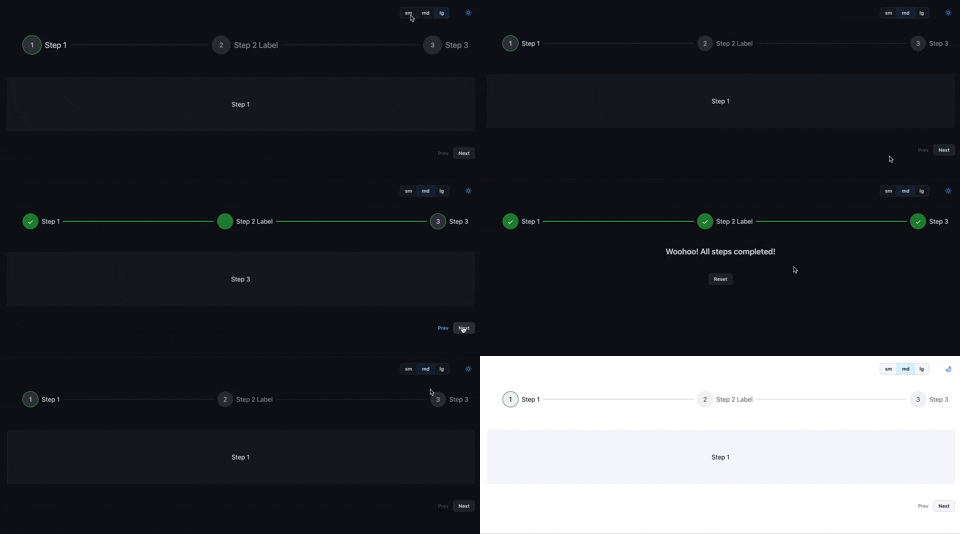
# @primer-steps/primer-steps

> Steps component, implemented with Github Primer. Inspired by Jean Verster's Chakra UI Steps, without the Chakra UI.

Latest version **0.0.7** (published 2023-06-25) · MIT license · 0 weekly downloads

## Install

```sh
npm install @primer-steps/primer-steps
pnpm add @primer-steps/primer-steps
yarn add @primer-steps/primer-steps
bun add @primer-steps/primer-steps
```

## Health

**Score 30/100 (F)** — status: abandoned.

Positive: has types; esm support; no vulnerabilities; high quality score.

Warnings: low downloads; pre 1.0.

Negative: abandoned; low maintenance score.

## Facts

| | |
|---|---|
| Version | 0.0.7 |
| Published | 2023-06-25 |
| First published | 2023-01-10 |
| Weekly downloads | 0 |
| License | MIT |
| TypeScript types | bundled |
| Module format | ESM + CommonJS |
| Dependencies | 7 |
| Unpacked size | 78.8 KB |
| Known vulnerabilities | 0 |
| Install scripts | no |
| Author | Matt Oliver |
| Maintainers | theemattoliver |
| Keywords | steps, stepper, primer, navigation, multi |

## Links

- npm: https://www.npmjs.com/package/@primer-steps/primer-steps
- Homepage: https://github.com/theemattoliver/primer-steps
- npm.io page: https://npm.io/package/@primer-steps/primer-steps

## Dependencies (7)

- [color2k](https://npm.io/package/color2k.md) ^2.0.0
- [classnames](https://npm.io/package/classnames.md) ^2.3.2
- [@primer/react](https://npm.io/package/@primer/react.md) ^35.16.0
- [lodash.mergewith](https://npm.io/package/lodash.mergewith.md) ^4.6.2
- [styled-components](https://npm.io/package/styled-components.md) ^5.3.6
- [@primer/octicons-react](https://npm.io/package/@primer/octicons-react.md) ^17.10.0
- [@types/styled-components](https://npm.io/package/@types/styled-components.md) ^5.1.26

## Alternatives

- [express-promise-router](https://npm.io/package/express-promise-router.md) — 736.1K weekly downloads
- [next-usequerystate](https://npm.io/package/next-usequerystate.md) — 29.8K weekly downloads
- [@bitkyc08/opencodex](https://npm.io/package/@bitkyc08/opencodex.md) — 4.6K weekly downloads
- [lynkr](https://npm.io/package/lynkr.md) — 575 weekly downloads
- [baremetal.js](https://npm.io/package/baremetal.js.md) — 42 weekly downloads

## Recent versions

- 0.0.7 (latest) — 2023-06-25
- 0.0.0-20230625164842 (snapshot) — 2023-06-25
- 0.0.0-20230625164256 — 2023-06-25
- 0.0.0-20230625163115 — 2023-06-25
- 0.0.0-20230625160414 — 2023-06-25
- 0.0.0-20230525034424 — 2023-05-25
- 0.0.0-20230525031717 — 2023-05-25
- 0.0.0-20230525030649 — 2023-05-25
- 0.0.0-20230525030241 — 2023-05-25
- 0.0.0-20230525025114 — 2023-05-25
- 0.0.6 — 2023-04-25
- 0.0.0-20230425025844 — 2023-04-25
- 0.0.0-20230425001942 — 2023-04-25
- 0.0.0-20230425001913 — 2023-04-25
- 0.0.5 — 2023-04-24
- … 18 more at https://npm.io/package/@primer-steps/primer-steps/versions

## README

<h1 style="font-weight: bold;">
  primer-steps
</h1>

<span>Steps component designed to work seamlessly with Github <a href="https://primer.style/" target="_blank">Primer React</a>.</span>

<span>Inspired by Jean Verster's <a href="https://jeanverster.github.io/chakra-ui-steps-site/" target="_blank">Chakra UI Steps</a>. All Chakra dependencies, Chakra components, and Chakra-dependent logic removed.</span>
<br />
<br />

<!-- [![MIT License](https://badgen.net/github/license/theemattoliver/primer-steps/primer-steps 'MIT License')](LICENSE.md)
[![npm - primer-steps](https://img.shields.io/npm/v/primer-steps 'primer-steps npm')](https://www.npmjs.com/package/primer-steps)
[![bundle size - primer-steps](https://badgen.net/bundlephobia/min/primer-steps)](https://bundlephobia.com/result?p=primer-steps)
[![bundle size - primer-steps](https://badgen.net/bundlephobia/minzip/primer-steps)](https://bundlephobia.com/result?p=primer-steps)
[![Total Downloads - primer-steps](https://badgen.net/npm/dt/primer-steps?color=blue 'primer-steps npm downloads')](https://www.npmjs.com/package/primer-steps) -->

<p align="center">
  <img src="https://media.giphy.com/media/ud039lZ0ITbpenJxXo/giphy.gif" alt="animated gif of steps component" />
</p>

## Features

- Multiple orientations
- Easily render step content
- Custom icons
- Size variants

## Installation

Yarn:

```bash
yarn add primer-steps
```

NPM:

```bash
npm i primer-steps
```

## Usage

In order to get started you will need to use the Primer React `ThemeProvider` component, like so:

```jsx
import { ThemeProvider } from '@primer/react';

export const App = () => {
  return (
    <ThemeProvider>
      <YourApp />
    </ThemeProvider>
  );
};
```

Then you can start using Primer Steps.

### Basic Example

```jsx
import { Step, Steps, useSteps } from 'primer-steps';
import { Box } from '@primer/react';
const content = (
  <Box py={4}>
    <LoremIpsum p={1} />
  </Box>
);

const steps = [
  { label: 'Step 1', content },
  { label: 'Step 2', content },
  { label: 'Step 3', content },
];

export const StepsExample = () => {
  const { nextStep, prevStep, setStep, reset, activeStep } = useSteps({
    initialStep: 0,
  });

  return (
    <Flex flexDir="column" width="100%">
      <Steps activeStep={activeStep}>
        {steps.map(({ label, content }) => (
          <Step label={label} key={label}>
            {content}
          </Step>
        ))}
      </Steps>
      {activeStep === steps.length ? (
        <Flex p={4}>
          <Button mx="auto" size="sm" onClick={reset}>
            Reset
          </Button>
        </Flex>
      ) : (
        <Flex width="100%" justify="flex-end">
          <Button
            isDisabled={activeStep === 0}
            mr={4}
            onClick={prevStep}
            size="sm"
            variant="ghost"
          >
            Prev
          </Button>
          <Button size="sm" onClick={nextStep}>
            {activeStep === steps.length - 1 ? 'Finish' : 'Next'}
          </Button>
        </Flex>
      )}
    </Flex>
  );
};
```

## Props

> Note: Both the `Step` and `Steps` component extend the Primer `Box` component so they accept all the default styling props.

### `Steps`

| Prop                   | Type                | Required | Description                                                                | Default    |
| ---------------------- | ------------------- | -------- | -------------------------------------------------------------------------- | ---------- |
| **`activeStep`**       | number              | yes      | Currently active step                                                      | 0          |
| **`orientation`**      | string              | no       | Sets the orientation of the Steps component                                | horizontal |
| **`responsive`**       | boolean             | no       | Sets whether the component auto switches to vertical orientation on mobile | true       |
| **`checkIcon`**        | React.ComponentType | no       | Allows you to provide a custom check icon                                  | undefined  |
| **`onClickStep`**      | () => void          | no       | If defined, allows you to click on the step icons                          | undefined  |
| **`labelOrientation`** | string              | no       | Switch between horizontal and vertical label orientation                   | undefined  |

### `Step`

| Prop                  | Type                | Required | Description                                                          | Default   |
| --------------------- | ------------------- | -------- | -------------------------------------------------------------------- | --------- |
| **`label`**           | string              | no       | Sets the title of the step                                           | ''        |
| **`description`**     | string              | no       | Provides extra info about the step                                   | ''        |
| **`icon`**            | React.ComponentType | no       | Custom icon to overwrite the default numerical indicator of the step | undefined |
| **`isCompletedStep`** | boolean             | no       | Individually control each step state, defaults to active step        | undefined |

---
_Source: https://npm.io/package/@primer-steps/primer-steps · Machine-readable twin of the npm.io package page. Health data is recomputed on every publish._