# @sreyaj/ng-shimmer
> Shimmer Placeholder for Angular Applications. Improve the User Experience on your application by using shimmer placeholders which was made popular by Facebook
Latest version **2.0.0** (published 2021-08-18) · Apache License 2.0 license · 0 weekly downloads
## Install
```sh
npm install @sreyaj/ng-shimmer
pnpm add @sreyaj/ng-shimmer
yarn add @sreyaj/ng-shimmer
bun add @sreyaj/ng-shimmer
```
## Health
**Score 25/100 (F)** — status: abandoned.
Positive: has types; esm support; no vulnerabilities.
Warnings: low downloads.
Negative: abandoned; low maintenance score.
## Facts
| | |
|---|---|
| Version | 2.0.0 |
| Published | 2021-08-18 |
| First published | 2019-09-01 |
| Weekly downloads | 0 |
| License | Apache License 2.0 |
| TypeScript types | bundled |
| Module format | ESM + CommonJS |
| Dependencies | 1 |
| Unpacked size | 70.4 KB |
| Known vulnerabilities | 0 |
| Install scripts | no |
| Author | Adithya Sreyaj |
| Maintainers | adi.sreyaj |
| Keywords | angular, shimmer, shimmer animation, angular shimmer, facebook shimmer |
## Links
- npm: https://www.npmjs.com/package/@sreyaj/ng-shimmer
- Homepage: https://github.com/adisreyaj/angular-shimmer-effect/
- Issues: https://github.com/adisreyaj/angular-shimmer-effect/issues
- npm.io page: https://npm.io/package/@sreyaj/ng-shimmer
## Dependencies (1)
- [tslib](https://npm.io/package/tslib.md) ^2.0.0
## Alternatives
- [@luma.gl/experimental](https://npm.io/package/@luma.gl/experimental.md) — 77.1K weekly downloads
- [persona-harness](https://npm.io/package/persona-harness.md) — 4.7K weekly downloads
- [@tsparticles/effect-bubble](https://npm.io/package/@tsparticles/effect-bubble.md) — 4.6K weekly downloads
- [f3d](https://npm.io/package/f3d.md) — 730 weekly downloads
- [spark-html-motion](https://npm.io/package/spark-html-motion.md) — 298 weekly downloads
## Recent versions
- 2.0.0 (latest) — 2021-08-18
- 1.0.0 — 2020-11-24
- 0.0.1 — 2019-09-01
## README
NG Shimmer - Content Placeholder



> Shimmer Animation for Angular Applications

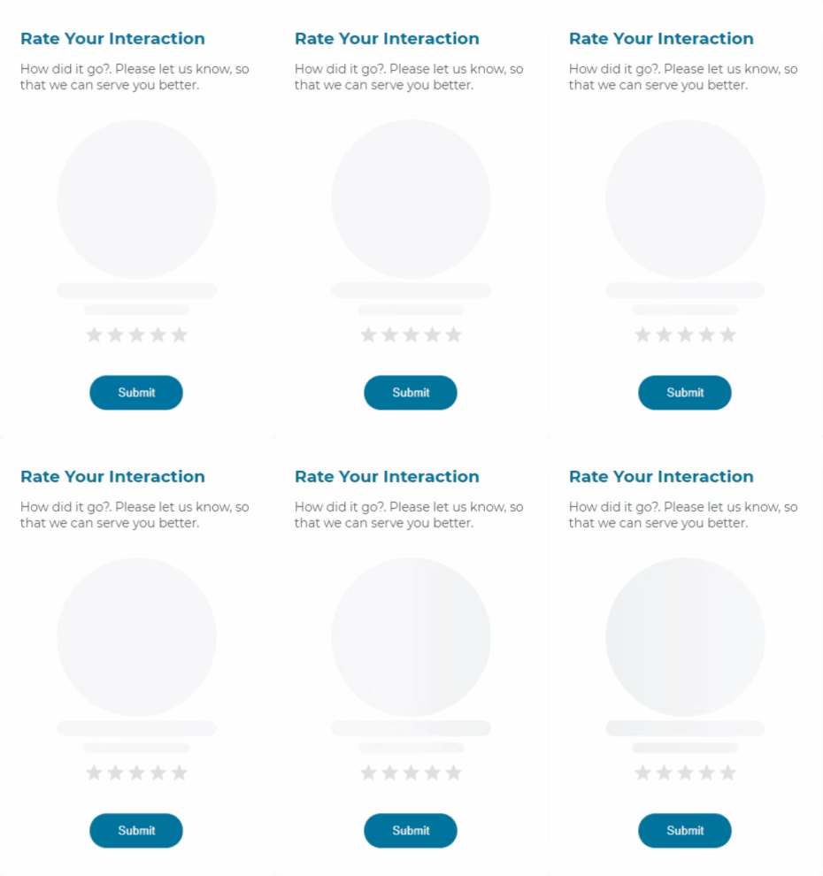
Simple and easy to user Shimmer Animation placeholder for your Angular applications. An application should be having a good User Experience inorder to succeed. Smaller things like adding a shimmer animation to let the users know that something is being loaded is a great way to improve the application's UX.

## Features
- Simple and Easy to Setup
- Ease to use
- CSS based super light
- Zero Dependencies
- Customizable
## How to Use the Component
#### Install the package using the command:
```
npm i @sreyaj/ng-shimmer
```
#### Import the StarRatingModule into your module
```ts
import { ShimmerModule } from '@sreyaj/ng-shimmer';
@NgModule({
...
imports: [ShimmerModule],
...
})
export class AppModule {}
```
#### Now you can use the component inside your application
```html
```
#### You can now customize it with the following attributes
Eg with few options:
```html
```
## Global Configuration
You can now configure the colors and animation durations for the whole application using the Injection token.
Default Options applied:
```js
{
width: '100%',
height: '16px',
borderRadius: '8px',
colors: {
background: '#edeef1',
1: '#edeef1',
2: '#f6f7f8',
3: '#f4f4f4',
4: '#edeef1',
},
duration: '1s',
}
```
### Override defaults
You can override the defaults like so:
```ts
@NgModule({
declarations: [],
imports: [BrowserModule, ShimmerModule],
providers: [
{
provide: SHIMMER_OPTIONS, // <-- provide the token
useValue: {
width: '100%',
height: '24px',
borderRadius: '8px',
colors: {
background: 'red',
1: '#edeef1',
2: '#f6f7f8',
3: '#f4f4f4',
4: '#edeef1',
},
duration: '4s',
},
},
],
bootstrap: [AppComponent],
})
export class AppModule {}
```
## Customizations
| Feature | Description | Attribute | Type | Default |
| --------------------- | ------------------------------------------------------------------- | ------------ | ------------------------------ | ------- |
| Type Of Shimmer | You can change the appearance of the shimmer | type | 'line' or 'circle' or 'square' | 'line |
| Width of the Shimmer | Shimmer width can be customized according to your need | width | string | '100%' |
| Height of the Shimmer | Shimmer height can be customized according to your need | height | string | '12px' |
| Animation Duration | Shimmer animation duration can be customized according to your need | duration | string | '1s' |
| Border Radius | Custom border radius values can be specified | borderRadius | string | - |
| Rounded | Shimmer corners can be rounded of for 'line' or 'square' type | rounded | boolean | false |
## Breaking Changes
- In v2, the extra div that is added by `shimmer` component is removed. Instead the styles are applied to the host directly
Feel free to open Issues and Pull Requests
---
_Source: https://npm.io/package/@sreyaj/ng-shimmer · Machine-readable twin of the npm.io package page. Health data is recomputed on every publish._