# @syncfusion/ej2-angular-buttons
> A package of feature-rich Essential JS 2 components such as Button, CheckBox, RadioButton and Switch. for Angular
Latest version **35.1.41** (published 2026-10-20) · SEE LICENSE IN license license · 0 weekly downloads
## Install
```sh
npm install @syncfusion/ej2-angular-buttons
pnpm add @syncfusion/ej2-angular-buttons
yarn add @syncfusion/ej2-angular-buttons
bun add @syncfusion/ej2-angular-buttons
```
## Health
**Score 65/100 (B)** — status: active.
Positive: has types; esm support; no vulnerabilities; recently updated; high maintenance score.
Warnings: low downloads.
## Facts
| | |
|---|---|
| Version | 35.1.41 |
| Published | 2026-10-20 |
| First published | 2018-09-11 |
| Weekly downloads | 0 |
| License | SEE LICENSE IN license |
| TypeScript types | bundled |
| Module format | ESM |
| Dependencies | 4 |
| Unpacked size | 219.5 KB |
| Known vulnerabilities | 0 |
| Install scripts | no |
| GitHub stars | 294 |
| Author | Syncfusion Inc. |
| Maintainers | syncfusionorg, essentialjs2, syncfusion-javascript |
| Keywords | angular, ng, ej2-ng-buttons, ng-button, ng-checkbox, ng-radiobutton, ng-switch, ng-fab, angular-fab, ng-speeddial, angular-speeddial, ng-smartpaste, angular-smartpaste |
## Links
- npm: https://www.npmjs.com/package/@syncfusion/ej2-angular-buttons
- Repository: https://github.com/syncfusion/ej2-angular-ui-components
- Homepage: https://www.syncfusion.com/angular-components
- Issues: https://github.com/syncfusion/ej2-angular-ui-components/issues
- npm.io page: https://npm.io/package/@syncfusion/ej2-angular-buttons
## Dependencies (4)
- [tslib](https://npm.io/package/tslib.md) ^2.3.0
- [@syncfusion/ej2-base](https://npm.io/package/@syncfusion/ej2-base.md) ~35.1.37
- [@syncfusion/ej2-buttons](https://npm.io/package/@syncfusion/ej2-buttons.md) 35.1.41
- [@syncfusion/ej2-angular-base](https://npm.io/package/@syncfusion/ej2-angular-base.md) ~35.1.41
## Alternatives
- [angular-pipes](https://npm.io/package/angular-pipes.md) — 5.6K weekly downloads
- [@ng-web-apis/midi](https://npm.io/package/@ng-web-apis/midi.md) — 2.6K weekly downloads
- [happn-3](https://npm.io/package/happn-3.md) — 1.6K weekly downloads
- [@opensip-cli/lang-go](https://npm.io/package/@opensip-cli/lang-go.md) — 1.2K weekly downloads
- [mongoose-typescript](https://npm.io/package/mongoose-typescript.md) — 85 weekly downloads
## Recent versions
- 35.1.41 (latest) — 2026-10-20
- 34.2.8-ngcc (ngcc) — 2026-09-15
- 21.1.42 (beta) — 2023-06-28
- 35.1.37 — 2026-09-29
- 34.2.8 — 2026-09-15
- 34.2.6 — 2026-09-01
- 34.2.6-ngcc — 2026-09-01
- 34.2.2 — 2026-08-05
- 34.2.2-ngcc — 2026-08-05
- 34.1.30 — 2026-07-09
- 34.1.30-ngcc — 2026-07-09
- 34.1.29 — 2026-07-06
- 34.1.29-ngcc — 2026-07-06
- 33.2.15 — 2026-06-23
- 33.2.15-ngcc — 2026-06-23
- … 284 more at https://npm.io/package/@syncfusion/ej2-angular-buttons/versions
## README
# Angular Buttons Components
> **Using this package with an AI coding agent**
>
> Before generating Syncfusion code, ask your AI coding agent to run the Syncfusion setup using the following prompt:
>
> ```text
> Set up this project for Syncfusion before generating code. Fetch
> and follow the official instructions at https://ai.syncfusion.com,
> then report the detected platform, installed skill pack, MCP
> status, and any required licensing action.
> ```
> The setup detects your project’s platform and loads the appropriate Syncfusion skill pack. No Syncfusion account or MCP key is required to install or read Syncfusion agent skills.
>
> **Platform reference:** [https://ai.syncfusion.com/angular/llms.txt](https://ai.syncfusion.com/angular/llms.txt)
## What's Included in the Angular Buttons Package
The Angular Buttons package includes the following list of components.
### Angular Button
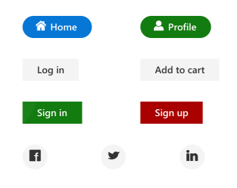
The [Angular Button](https://www.syncfusion.com/angular-components/angular-button?utm_source=npm&utm_medium=listing&utm_campaign=angular-button-npm) component is a custom HTML5 button component. It has several built-in features such as support for icons, predefined styles, different button types, different button sizes, and UI customization.
Getting Started .
Online demos .
Learn more
#### Key features
* [Types](https://ej2.syncfusion.com/angular/documentation/button/types-and-styles#button-types) - Provided with different types of Button.
* [Predefined styles](https://ej2.syncfusion.com/angular/documentation/button/types-and-styles#button-styles) - Provided with predefined styles of Button.
* [Sizes](https://ej2.syncfusion.com/angular/documentation/button/types-and-styles#button-size) - Provided with different sizes of Button.
* [Icons](https://ej2.syncfusion.com/angular/documentation/button/types-and-styles#icons) - Supports text and icon on the Button.
### Angular CheckBox
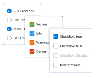
The [Angular CheckBox](https://www.syncfusion.com/angular-components/angular-checkbox?utm_source=npm&utm_medium=listing&utm_campaign=angular-button-npm) component is a custom checkbox-type HTML5 input component for selecting one or more options from a list of predefined choices. It supports an indeterminate state, different sizes, custom labels and positions, and UI customization.
Getting Started .
Online demos .
Learn more
#### Key features
* [States](https://ej2.syncfusion.com/angular/documentation/check-box/getting-started#change-the-checkbox-state) - Provided with different states of CheckBox.
* [Label](https://ej2.syncfusion.com/angular/documentation/check-box/label-and-size#label) - Supports label and its positioning.
* [Sizes](https://ej2.syncfusion.com/angular/documentation/check-box/label-and-size#size) - Provided with different sizes of CheckBox.
### Angular RadioButton
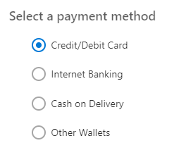
The [Angular RadioButton](https://www.syncfusion.com/angular-components/angular-radio-button?utm_source=npm&utm_medium=listing&utm_campaign=angular-button-npm) component is a custom radio-type HTML5 input component for selecting one option from a list of predefined choices. It supports different states, sizes, labels, label positions, and UI customizations.
Getting Started .
Online demos .
Learn more
#### Key features
* [States](https://ej2.syncfusion.com/angular/documentation/radio-button/getting-started#change-the-radiobutton-state) - Provided with different states of RadioButton.
* [Label](https://ej2.syncfusion.com/angular/documentation/radio-button/label-and-size#label) - Supports label and its positioning.
* [Sizes](https://ej2.syncfusion.com/angular/documentation/radio-button/label-and-size#size) - Provided with different sizes of RadioButton.
### Angular Switch
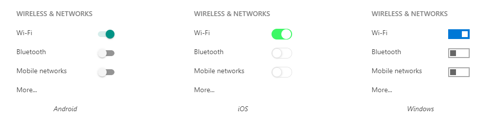
The [Angular Switch](https://www.syncfusion.com/angular-components/angular-toggle-switch-button?utm_source=npm&utm_medium=listing&utm_campaign=angular-button-npm) component is a custom HTML5 input-type component control that allows you to perform a toggle (on/off) action between checked and unchecked states. It supports different sizes, labels, label positions, and UI customization.
Getting Started .
Online demos .
Learn more
#### Key features
* [Text](https://ej2.syncfusion.com/angular/documentation/switch/getting-started#set-text-on-switch) - Supports text.
* [Sizes](https://ej2.syncfusion.com/angular/documentation/switch/how-to#change-size) - Provided with different sizes of Switch.
### Angular Floating Action Button
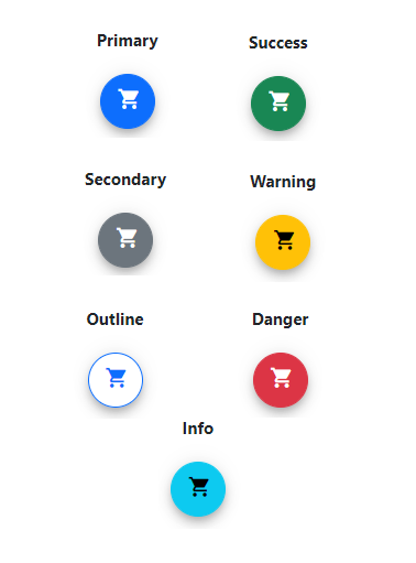
The [Angular Floating Action Button](https://www.syncfusion.com/angular-components/angular-fab?utm_source=npm&utm_medium=listing&utm_campaign=angular-buttons-npm) component performs the primary action that appears in front of all screen contents. It has several built-in features such as support for icons, predefined styles, positions, and UI customization.
Getting Started .
Online demos .
Learn more
#### Key features
* [Icons](https://ej2.syncfusion.com/angular/documentation/floating-action-button/icons) - Supports addition of both text and icon on the Button.
* [Predefined styles](https://ej2.syncfusion.com/angular/documentation/floating-action-button/styles) - Provided with predefined styles for the Floating Action Button.
* [Positions](https://ej2.syncfusion.com/angular/documentation/floating-action-button/positions) - Positioned anywhere on the target. If the target is not defined, then Floating Action Button is positioned based on the browser viewport.
### Angular Speed Dial
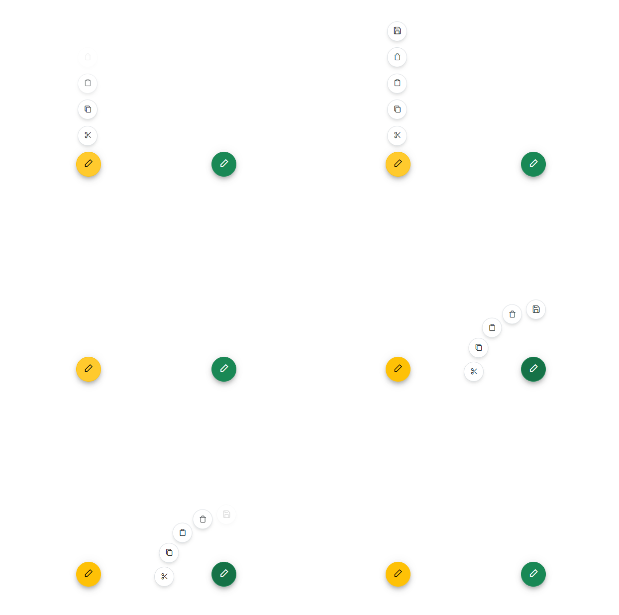
The [Angular Speed Dial](https://www.syncfusion.com/angular-components/angular-speed-dial?utm_source=npm&utm_medium=listing&utm_campaign=angular-buttons-npm) component is an extension of the floating action button that displays a list of action buttons when clicked. It has several built-in features such as support for items, predefined styles, positions, and UI customization.
Getting Started .
Online demos .
Learn more
#### Key features
* [Items](https://ej2.syncfusion.com/angular/documentation/speed-dial/items) - Provides different items support for the Speed Dial.
* [Predefined styles](https://ej2.syncfusion.com/angular/documentation/speed-dial/styles) - Provided with predefined styles for the Speed Dial.
* [Positions](https://ej2.syncfusion.com/angular/documentation/speed-dial/positions) - Positioned anywhere on the target. If the target is not defined, then Speed Dial is positioned based on the browser viewport.
* [Modes](https://ej2.syncfusion.com/angular/documentation/speed-dial/display-modes) - Supports display of items in both linear and radial display modes.
* [Modal](https://ej2.syncfusion.com/angular/documentation/speed-dial/modal) - Adds an overlay to prevent the background interaction.
* [Templates](https://ej2.syncfusion.com/angular/documentation/speed-dial/template) - Customize Speed Dial items and the popup content using templates.
Trusted by the world's leading companies

## Setup
To install `buttons` and its dependent packages, use the following command.
```sh
npm install @syncfusion/ej2-angular-buttons
```
## Supported frameworks
Button components are available in following list of frameworks.
| [ ](https://www.syncfusion.com/javascript-ui-controls?utm_medium=listing&utm_source=github)
[JavaScript](https://www.syncfusion.com/javascript-ui-controls?utm_medium=listing&utm_source=github) | [ ](https://www.syncfusion.com/react-ui-components?utm_medium=listing&utm_source=github)
[React](https://www.syncfusion.com/react-ui-components?utm_medium=listing&utm_source=github) | [ ](https://www.syncfusion.com/vue-ui-components?utm_medium=listing&utm_source=github)
[Vue](https://www.syncfusion.com/vue-ui-components?utm_medium=listing&utm_source=github) | [ ](https://www.syncfusion.com/aspnet-core-ui-controls?utm_medium=listing&utm_source=github)
[ASP.NET Core](https://www.syncfusion.com/aspnet-core-ui-controls?utm_medium=listing&utm_source=github) | [ ](https://www.syncfusion.com/aspnet-mvc-ui-controls?utm_medium=listing&utm_source=github)
[ASP.NET MVC](https://www.syncfusion.com/aspnet-mvc-ui-controls?utm_medium=listing&utm_source=github) |
| :-----: | :-----: | :-----: | :-----: | :-----: |
## Showcase samples
* Expanse Tracker - [Source](https://github.com/syncfusion/ej2-showcase-angular-expensetracker), [Live Demo](https://ej2.syncfusion.com/showcase/angular/expensetracker/#/dashboard?utm_source=npm&utm_campaign=button)
* Loan Calculator - [Source](https://github.com/syncfusion/ej2-showcase-angular-loancalculator), [Live Demo](https://ej2.syncfusion.com/showcase/angular/loancalculator/?utm_source=npm&utm_campaign=button)
## Resources
* [Documentation](https://ej2.syncfusion.com/angular/documentation/button/getting-started)
* [Theme Studio](https://ej2.syncfusion.com/themestudio/)
* [What's New](https://www.syncfusion.com/products/whatsnew/angular?utm_medium=listing&utm_source=github)
* [Road Map](https://www.syncfusion.com/products/roadmap/angular)
* [E-Books](https://www.syncfusion.com/succinctly-free-ebooks?searchkey=angular&type=all)
## Support
Product support is available through following mediums.
* [Support ticket](https://support.syncfusion.com/support/tickets/create) - Guaranteed Response in 24 hours | Unlimited tickets | Holiday support
* [Community forum](https://www.syncfusion.com/forums/angular-js2?utm_source=npm&utm_medium=listing&utm_campaign=angular-button-npm)
* [GitHub issues](https://github.com/syncfusion/ej2-angular-ui-components/issues/new)
* [Request feature or report bug](https://www.syncfusion.com/feedback/angular?utm_source=npm&utm_medium=listing&utm_campaign=angular-button-npm)
* Live chat
## Changelog
Check the changelog [here](https://github.com/syncfusion/ej2-angular-ui-components/blob/master/components/buttons/CHANGELOG.md). Get minor improvements and bug fixes every week to stay up to date with frequent updates.
## License and copyright
> This is a commercial product and requires a paid license for possession or use. Syncfusion® licensed software, including this component, is subject to the terms and conditions of Syncfusion® [EULA](https://www.syncfusion.com/eula/es/). To acquire a license for 140+ [Angular UI components](https://www.syncfusion.com/angular-components), you can [purchase](https://www.syncfusion.com/sales/products) or [start a free 30-day trial](https://www.syncfusion.com/account/manage-trials/start-trials).
> A free community [license](https://www.syncfusion.com/products/communitylicense) is also available for companies and individuals whose organizations have less than $1 million USD in annual gross revenue and five or fewer developers.
See [LICENSE FILE](https://github.com/syncfusion/ej2-angular-ui-components/blob/master/license) for more info.
© Copyright 2026 Syncfusion® Inc. All Rights Reserved. The Syncfusion® Essential Studio® license and copyright applies to this distribution.
---
_Source: https://npm.io/package/@syncfusion/ej2-angular-buttons · Machine-readable twin of the npm.io package page. Health data is recomputed on every publish._