# @syncfusion/ej2-angular-navigations
> A package of Essential JS 2 navigation components such as Tree-view, Tab, Toolbar, Context-menu, and Accordion which is used to navigate from one page to another for Angular
Latest version **35.1.42** (published 2026-10-27) · SEE LICENSE IN license license · 0 weekly downloads
## Install
```sh
npm install @syncfusion/ej2-angular-navigations
pnpm add @syncfusion/ej2-angular-navigations
yarn add @syncfusion/ej2-angular-navigations
bun add @syncfusion/ej2-angular-navigations
```
## Health
**Score 55/100 (C)** — status: active.
Positive: no vulnerabilities; recently updated; high maintenance score.
Warnings: low downloads; no types; no esm support.
## Facts
| | |
|---|---|
| Version | 35.1.42 |
| Published | 2026-10-27 |
| First published | 2018-09-11 |
| Weekly downloads | 0 |
| License | SEE LICENSE IN license |
| TypeScript types | none |
| Module format | CommonJS |
| Dependencies | 0 |
| Known vulnerabilities | 0 |
| Install scripts | no |
| GitHub stars | 294 |
| Author | Syncfusion Inc. |
| Maintainers | syncfusionorg, essentialjs2, syncfusion-javascript |
| Keywords | angular, ng, ng-template, ej2-ng-navigations, ej2-angular-navigations, angular-navigations, ng-navigations, angular-toolbar, ng-toolbar, angular-tab, ng-tab, angular-routing, ng-routing, angular-tab-routing, ng-tab-routing, ng-contextmenu, angular-contextmenu, angular-treeview, ng-tree, ng-treeview, angular tree, angular treeview, angular2-treeview, ng-menu, angular menu, angular menubar, angular breadcrumb, ng breadcrumb, angular carousel, ng carousel, angular appbar, ng appbar, angular stepper, ng stepper |
## Links
- npm: https://www.npmjs.com/package/@syncfusion/ej2-angular-navigations
- Repository: https://github.com/syncfusion/ej2-angular-ui-components
- Homepage: https://www.syncfusion.com/angular-components
- Issues: https://github.com/syncfusion/ej2-angular-ui-components/issues
- npm.io page: https://npm.io/package/@syncfusion/ej2-angular-navigations
## Alternatives
- [angular-pipes](https://npm.io/package/angular-pipes.md) — 5.6K weekly downloads
- [@ng-web-apis/midi](https://npm.io/package/@ng-web-apis/midi.md) — 2.6K weekly downloads
- [happn-3](https://npm.io/package/happn-3.md) — 1.6K weekly downloads
- [@opensip-cli/lang-go](https://npm.io/package/@opensip-cli/lang-go.md) — 1.2K weekly downloads
- [mongoose-typescript](https://npm.io/package/mongoose-typescript.md) — 85 weekly downloads
## Recent versions
- 35.1.42 (latest) — 2026-10-27
- 34.2.8-ngcc (ngcc) — 2026-09-15
- 28.2.3-1479479 (beta) — 2025-07-30
- 35.1.40 — 2026-10-13
- 35.1.39 — 2026-10-07
- 35.1.37 — 2026-09-29
- 34.2.8 — 2026-09-15
- 34.2.7 — 2026-09-08
- 34.2.7-ngcc — 2026-09-08
- 34.2.6 — 2026-09-01
- 34.2.6-ngcc — 2026-09-01
- 34.2.5 — 2026-08-25
- 34.2.5-ngcc — 2026-08-25
- 34.2.4 — 2026-08-18
- 34.2.4-ngcc — 2026-08-18
- … 462 more at https://npm.io/package/@syncfusion/ej2-angular-navigations/versions
## README
# Angular Navigation Components
> **Using this package with an AI coding agent**
>
> Before generating Syncfusion code, ask your AI coding agent to run the Syncfusion setup using the following prompt:
>
> ```text
> Set up this project for Syncfusion before generating code. Fetch
> and follow the official instructions at https://ai.syncfusion.com,
> then report the detected platform, installed skill pack, MCP
> status, and any required licensing action.
> ```
> The setup detects your project’s platform and loads the appropriate Syncfusion skill pack. No Syncfusion account or MCP key is required to install or read Syncfusion agent skills.
>
> **Platform reference:** [https://ai.syncfusion.com/angular/llms.txt](https://ai.syncfusion.com/angular/llms.txt)
## What's Included in the Angular Navigation Package
The Angular Navigation package includes the following list of components.
### Angular Accordion
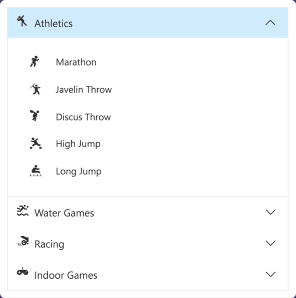
The [Angular Accordion](https://www.syncfusion.com/angular-components/angular-accordion?utm_source=npm&utm_medium=listing&utm_campaign=angular-navigation-npm) component is a container-based control with vertically collapsible panels (vertical accordion) and stacked headers that expand or collapse one or more panels at a time within the available space.
Getting Started .
Online demos .
Learn more
#### Key features
* [Rendering](https://ej2.syncfusion.com/angular/demos/?utm_source=npm&utm_medium=listing&utm_campaign=angular-navigation-npm#/bootstrap5/accordion/default) - Can be rendered based on the items collection and HTML elements.
* [Expand mode](https://ej2.syncfusion.com/angular/demos/?utm_source=npm&utm_medium=listing&utm_campaign=angular-navigation-npm#/bootstrap5/accordion/default) - Supports to define single or multiple expand mode for Accordion panels.
* RTL Support - Supports right-to-left alignment.
* [Accessibility](https://ej2.syncfusion.com/angular/documentation/accordion/accessibility) - Provides built-in compliance with the WAI-ARIA specifications and it is achieved through attributes. By default, it allows to interact with Accordion by using keyboard shortcuts.
### Angular AppBar
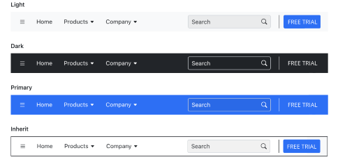
The [Angular AppBar](https://www.syncfusion.com/angular-components/angular-appbar?utm_source=npm&utm_medium=listing&utm_campaign=angular-navigation-npm) component displays information and actions related to the current application screen. It is used to show branding, screen titles, navigation, and actions.
Getting Started .
Online demos .
Learn more
#### Key features
* [Modes](https://ej2.syncfusion.com/angular/documentation/appbar/size-and-color) - Regular, Prominent, and Dense modes that define the AppBar height.
* [Content arrangement](https://ej2.syncfusion.com/angular/documentation/appbar/design) - Spacer and separator options can be used to align the content based on the UI requirement with minimal effort.
* [Color](https://ej2.syncfusion.com/angular/demos/?utm_source=npm&utm_medium=listing&utm_campaign=angular-navigation-npm#/bootstrap5/appbar/color) - Primary, Light, Dark, and Inherit options to customize the AppBar color.
* [Position](https://ej2.syncfusion.com/angular/documentation/appbar/position) - AppBars can be placed at the top or bottom of the screen. It can also be sticky.
### Angular Breadcrumb
The [Angular Breadcrumb](https://www.syncfusion.com/angular-components/angular-breadcrumb?utm_source=npm&utm_medium=listing&utm_campaign=angular-navigation-npm) component is a graphical user interface that serves as a navigation header for your web application or site. It helps to identify or highlight the current location within the hierarchical structure of a website. It has several built-in features such as templates, icons, binding to location, overflow mode, and UI customizations.
Getting Started .
Online demos .
Learn more

#### Key features
* [Icons](https://ej2.syncfusion.com/angular/documentation/breadcrumb/icons) - Icons can be specified in Breadcrumb items.
* [Template](https://ej2.syncfusion.com/angular/demos/?utm_source=npm&utm_medium=listing&utm_campaign=angular-navigation-npm#/bootstrap5/breadcrumb/template-and-customization) - Supports template for item and separator.
* [Bind to location](https://ej2.syncfusion.com/angular/demos/?utm_source=npm&utm_medium=listing&utm_campaign=angular-navigation-npm#/bootstrap5/breadcrumb/bind-to-location) - Supports items to be rendered based on the URL or current location.
* [Overflow mode](https://ej2.syncfusion.com/angular/demos/?utm_source=npm&utm_medium=listing&utm_campaign=angular-navigation-npm#/bootstrap5/breadcrumb/overflow-modes) - Used to limit the number of breadcrumb items to be displayed.
* [Accessibility](https://ej2.syncfusion.com/angular/documentation/breadcrumb/accessibility) - Provided with built-in accessibility support that helps to access all the Breadcrumb component features through the keyboard, screen readers, or other assistive technology devices.
### Angular Carousel
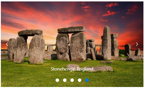
The [Angular Carousel](https://www.syncfusion.com/angular-components/angular-carousel?utm_source=npm&utm_medium=listing&utm_campaign=angular-navigation-npm) component allows users to display images with content, links, etc., like a slide show. Typical uses of carousels include scrolling news headlines, featured articles on home pages, and image galleries.
Getting Started .
Online demos .
Learn more
#### Key features
* [Rendering](https://ej2.syncfusion.com/angular/documentation/carousel/populating-items) - The Carousel component can be rendered based on the items collection and data binding.
* [Animation](https://ej2.syncfusion.com/angular/documentation/carousel/animations-and-transitions) - Supports animation effects for moving previous/next item of Carousel.
* [Template support](https://ej2.syncfusion.com/angular/demos/?utm_source=npm&utm_medium=listing&utm_campaign=angular-navigation-npm#/bootstrap5/carousel/templates) - The Carousel component items and buttons can also be rendered with custom templates.
* [Keyboard support](https://ej2.syncfusion.com/angular/demos/?utm_source=npm&utm_medium=listing&utm_campaign=angular-navigation-npm#/bootstrap5/carousel/keyboard-navigation) - By default, the Carousel allows interaction with commands by using keyboard shortcuts.
* [Accessibility](https://ej2.syncfusion.com/angular/documentation/carousel/accessibility) - The Carousel provides built-in compliance with the WAI-ARIA specifications and it is achieved through attributes.
### Angular ContextMenu
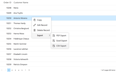
The [Angular ContextMenu](https://www.syncfusion.com/angular-components/angular-context-menu?utm_source=npm&utm_medium=listing&utm_campaign=angular-navigation-npm) component is a graphical user interface control that appears when the user right-clicks or performs a touch and hold action.
Getting Started .
Online demos .
Learn more
#### Key features
* [Separator](https://ej2.syncfusion.com/angular/demos/?utm_source=npm&utm_medium=listing&utm_campaign=angular-navigation-npm#/bootstrap5/context-menu/default) - Supports menu items grouping by using the Separator.
* [Icons and Navigations](https://ej2.syncfusion.com/angular/documentation/context-menu/icons-and-navigation) - Supports items to have Icons and Navigation URL's.
* [Template and Multilevel nesting](https://ej2.syncfusion.com/angular/documentation/context-menu/templates) - Supports template and multilevel nesting in ContextMenu.
* [Accessibility](https://ej2.syncfusion.com/angular/documentation/context-menu/accessibility) - Provided with built-in accessibility support that helps to access all the ContextMenu component features through the keyboard, screen readers, or other assistive technology devices.
### Angular Sidebar
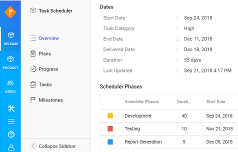
The [Angular Sidebar](https://www.syncfusion.com/angular-components/angular-sidebar?utm_source=npm&utm_medium=listing&utm_campaign=angular-navigation-npm) component is an expandable and collapsible component that typically acts as a side container to place primary or secondary content alongside the main content.
Getting Started .
Online demos .
Learn more
#### Key features
* [Target](https://ej2.syncfusion.com/angular/documentation/sidebar/custom-context) - The sidebar can be initialized in any HTML element other than the body element.
* [Types](https://ej2.syncfusion.com/angular/documentation/sidebar/types) - Provides complete control over the appearance of the sidebar component. The different types of the sidebar control give flexibility to view or hide the content (primary/secondary) over/above the main content by pushing, sliding, or overlaying it.
* [Left or right positions](https://ej2.syncfusion.com/angular/documentation/sidebar/types) - The sidebar control can be positioned to the left or right side of the main content area. This option allows placement of two sidebars in a page, at the left and right, to show primary content and secondary content, simultaneously.
* [Docking](https://ej2.syncfusion.com/angular/demos/?utm_source=npm&utm_medium=listing&utm_campaign=angular-navigation-npm#/bootstrap5/sidebar/docking-sidebar) - Docking lets the sidebar occupy a small vertical area in a page always and typically contains shortened view of navigation options.
* [Auto close](https://ej2.syncfusion.com/angular/documentation/sidebar/auto-close) - Auto closing the sidebar control’s content allows the main content area to be more readable based on screen resolution.
### Angular Tab
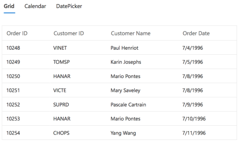
The [Angular Tab](https://www.syncfusion.com/angular-components/angular-tabs?utm_source=npm&utm_medium=listing&utm_campaign=angular-navigation-npm) component is a simple user interface (tabs UI) for organizing related content and occupying a compact space. The tabs are aligned horizontally, and each tab is associated with its header.
Getting Started .
Online demos .
Learn more
#### Key features
* [Rendering](https://ej2.syncfusion.com/angular/documentation/tab/adaptive) - Can be rendered based on the items collection and HTML elements.
* [Adaptive](https://ej2.syncfusion.com/angular/documentation/tab/adaptive) - Supports responsive rendering with scrollable Tabs and popup menu.
* [Customization](https://ej2.syncfusion.com/angular/documentation/tab/style) - Provides customization support for header with icons and orientation.
* [Animation](https://ej2.syncfusion.com/angular/documentation/tab/how-to/set-custom-animation) - Supports animation effects for moving previous/next contents of Tab.
* [Accessibility](https://ej2.syncfusion.com/angular/documentation/tab/accessibility) - Provides built-in compliance with the WAI-ARIA specifications and it is achieved through attributes. By default, it allows to interact with Tab headers by using keyboard shortcuts.
### Angular Toolbar
The [Angular Toolbar](https://www.syncfusion.com/angular-components/angular-toolbar?utm_source=npm&utm_medium=listing&utm_campaign=angular-navigation-npm) component is a feature-rich control that provides an interface for selecting a command from a collection of commands.
Getting Started .
Online demos .
Learn more

#### Key features
* [Scrollable](https://ej2.syncfusion.com/angular/documentation/toolbar/responsive-mode#scrollable) - Scrollable display mode displays Toolbar commands in a single line with horizontal scrolling enabled when the commands overflow available space.
* [Popup](https://ej2.syncfusion.com/angular/demos/?utm_source=npm&utm_medium=listing&utm_campaign=angular-navigation-npm#/bootstrap5/toolbar/popup) - Popup display mode displays commands in the popup when the commands overflow available space.
* [Template support](https://ej2.syncfusion.com/angular/demos/?utm_source=npm&utm_medium=listing&utm_campaign=angular-navigation-npm#/bootstrap5/toolbar/template) - The Toolbar component can also be rendered based on the given HTML element aside from item based collection rendering.
* [Keyboard support](https://ej2.syncfusion.com/angular/demos/?utm_source=npm&utm_medium=listing&utm_campaign=angular-navigation-npm#/bootstrap5/toolbar/keyboard-interaction) - By default, the Toolbar allows interaction with commands by using keyboard shortcuts.
* RTL Support - The Toolbar supports right-to-left alignment.
* [Accessibility](https://ej2.syncfusion.com/angular/documentation/toolbar/accessibility) - The Toolbar provides built-in compliance with the WAI-ARIA specifications and it is achieved through attributes.
### Angular TreeView
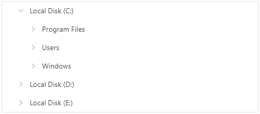
The [Angular TreeView](https://www.syncfusion.com/angular-components/angular-treeview?utm_source=npm&utm_medium=listing&utm_campaign=angular-navigation-npm) component is a graphical user interface control that to represents hierarchical data in a tree structure.
Getting Started .
Online demos .
Learn more
#### Key features
* [Data binding](https://ej2.syncfusion.com/angular/demos/?utm_source=npm&utm_medium=listing&utm_campaign=angular-navigation-npm#/bootstrap5/treeview/plain-data) - Binds the TreeView component with an array of JavaScript objects or DataManager.
* [CheckBox](https://ej2.syncfusion.com/angular/demos/?utm_source=npm&utm_medium=listing&utm_campaign=angular-navigation-npm#/bootstrap5/treeview/treeview-checkbox) - Allows you to select more than one node in TreeView without affecting the UI appearance.
* [Drag and drop](https://ej2.syncfusion.com/angular/demos/?utm_source=npm&utm_medium=listing&utm_campaign=angular-navigation-npm#/bootstrap5/treeview/drag-and-drop) - Allows you to drag and drop any node in TreeView.
* [Multi selection](https://ej2.syncfusion.com/angular/demos/?utm_source=npm&utm_medium=listing&utm_campaign=angular-navigation-npm#/bootstrap5/treeview/multiple-selection) - Allows you to select more than one node in TreeView.
* [Node editing](https://ej2.syncfusion.com/angular/demos/?utm_source=npm&utm_medium=listing&utm_campaign=angular-navigation-npm#/bootstrap5/treeview/node-editing) - Allows you to change the text of a node in TreeView.
* [Sorting](https://ej2.syncfusion.com/angular/documentation/treeview/how-to/sorting-treeview-level-wise) - Allows display of the TreeView nodes in an ascending or a descending order.
* [Template](https://ej2.syncfusion.com/angular/demos/?utm_source=npm&utm_medium=listing&utm_campaign=angular-navigation-npm#/bootstrap5/treeview/template) - Allows you to customize the nodes in TreeView.
* [Accessibility](https://ej2.syncfusion.com/angular/documentation/treeview/accessibility) - Provides built-in accessibility support that helps to access all the TreeView component features through the keyboard, on-screen readers, or other assistive technology devices.
### Angular Menu
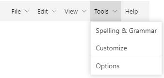
The [Angular Menu](https://www.syncfusion.com/angular-components/angular-menu-bar?utm_source=npm&utm_medium=listing&utm_campaign=angular-navigation-npm) component is a graphical user interface control that serves as a navigation header for your web application or site. It supports data binding, templates, icons, multilevel nesting, and horizontal and vertical menus.
Getting Started .
Online demos .
Learn more
#### Key features
* [Rendering](https://ej2.syncfusion.com/angular/documentation/menu/getting-started) - Supports to render based on the items collection (array of JavaScript objects) and HTML elements.
* [Separator](https://ej2.syncfusion.com/angular/documentation/menu/getting-started#group-menu-items-with-separator) - Supports menu items grouping by using the Separator.
* [Icons and Navigations](https://ej2.syncfusion.com/angular/documentation/menu/icons-and-sub-menu-items) - Supports items to have Icons and Navigation URL's.
* [Template and Multilevel nesting](https://ej2.syncfusion.com/angular/demos/?utm_source=npm&utm_medium=listing&utm_campaign=angular-navigation-npm#/bootstrap5/menu/template) - Supports template and multilevel nesting in Menu.
* [Hamburger Menu](https://ej2.syncfusion.com/angular/demos/?utm_source=npm&utm_medium=listing&utm_campaign=angular-navigation-npm#/bootstrap5/menu/hamburger-mode) - Supports Hamburger Menu that provides an adaptive view.
* [Accessibility](https://ej2.syncfusion.com/angular/documentation/menu/accessibility) - Provided with built-in accessibility support that helps to access all the Menu component features through the keyboard, screen readers, or other assistive technology devices.
### Angular Stepper
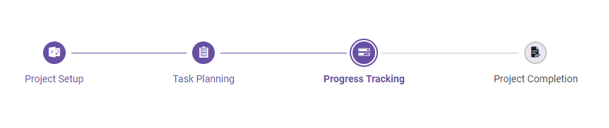
The [Angular Stepper](https://www.syncfusion.com/angular-components/angular-stepper?utm_source=npm&utm_medium=listing&utm_campaign=angular-navigation-npm) component enables users to navigate through a series of steps or stages in a process within a web application. Stepper displays a list of steps with the current step highlighted, allowing users to move between steps. It includes several built-in features, such as different step types, orientation, linear flow, label positions, and template customization.
Getting Started .
Online demos .
Learn more
#### Key features
* [Step Types](https://ej2.syncfusion.com/angular/documentation/stepper/steptypes) - Display steps with indicators and labels, only indicators, or only labels.
* [Orientation](https://ej2.syncfusion.com/angular/documentation/stepper/orientations) - A layout to display steps in a horizontal or vertical orientation.
* [Linear Flow](https://ej2.syncfusion.com/angular/documentation/stepper/linear-flow) - Enable a step-by-step progression, completing one step before moving on to the next.
* [Label Positioning](https://ej2.syncfusion.com/angular/documentation/stepper/steptypes#label-positions) - Show the label at the top, bottom, left, or right.
* [Tooltip](https://ej2.syncfusion.com/angular/documentation/stepper/tooltip) - Show additional information when users hover over a step, such as a label or customized text.
* [Templates](https://ej2.syncfusion.com/angular/documentation/stepper/template) - Customize the default appearance and content of each step using templates.
Trusted by the world's leading companies

## Setup
To install `navigations` and its dependent packages, use the following command.
```sh
npm install @syncfusion/ej2-angular-navigations
```
## Supported frameworks
Navigation components are also offered in following list of frameworks.
| [ ](https://www.syncfusion.com/javascript-ui-controls?utm_medium=listing&utm_source=github)
[JavaScript](https://www.syncfusion.com/javascript-ui-controls?utm_medium=listing&utm_source=github) | [ ](https://www.syncfusion.com/react-ui-components?utm_medium=listing&utm_source=github)
[React](https://www.syncfusion.com/react-ui-components?utm_medium=listing&utm_source=github) | [ ](https://www.syncfusion.com/vue-ui-components?utm_medium=listing&utm_source=github)
[Vue](https://www.syncfusion.com/vue-ui-components?utm_medium=listing&utm_source=github) | [ ](https://www.syncfusion.com/aspnet-core-ui-controls?utm_medium=listing&utm_source=github)
[ASP.NET Core](https://www.syncfusion.com/aspnet-core-ui-controls?utm_medium=listing&utm_source=github) | [ ](https://www.syncfusion.com/aspnet-mvc-ui-controls?utm_medium=listing&utm_source=github)
[ASP.NET MVC](https://www.syncfusion.com/aspnet-mvc-ui-controls?utm_medium=listing&utm_source=github) |
| :-----: | :-----: | :-----: | :-----: | :-----: |
## Showcase samples
* Expanse Tracker - [Source](https://github.com/syncfusion/ej2-showcase-angular-expensetracker), [Live Demo](https://ej2.syncfusion.com/showcase/angular/expensetracker/?utm_source=npm&utm_campaign=sidebar#/dashboard)
* Web Mail - [Source](https://github.com/syncfusion/ej2-showcase-angular-webmail), [Live Demo](https://ej2.syncfusion.com/showcase/angular/webmail/?utm_source=npm&utm_campaign=sidebar)
## Resources
* [Theme Studio](https://ej2.syncfusion.com/themestudio/)
* [What's New](https://www.syncfusion.com/products/whatsnew/angular?utm_medium=listing&utm_source=github)
* [Road Map](https://www.syncfusion.com/products/roadmap/angular)
* [E-Books](https://www.syncfusion.com/succinctly-free-ebooks?searchkey=angular&type=all)
## Support
Product support is available through following mediums.
* [Support ticket](https://support.syncfusion.com/support/tickets/create) - Guaranteed Response in 24 hours | Unlimited tickets | Holiday support
* [Community forum](https://www.syncfusion.com/forums/angular-js2?utm_source=npm&utm_medium=listing&utm_campaign=angular-navigation-npm)
* [GitHub issues](https://github.com/syncfusion/ej2-angular-ui-components/issues/new)
* [Request feature or report bug](https://www.syncfusion.com/feedback/angular?utm_source=npm&utm_medium=listing&utm_campaign=angular-navigation-npm)
* Live chat
## Changelog
Check the changelog [here](https://github.com/syncfusion/ej2-angular-ui-components/blob/master/components/navigations/CHANGELOG.md?utm_source=npm&utm_campaign=navigation). Get minor improvements and bug fixes every week to stay up to date with frequent updates.
## License and copyright
> This is a commercial product and requires a paid license for possession or use. Syncfusion® licensed software, including this component, is subject to the terms and conditions of Syncfusion® [EULA](https://www.syncfusion.com/eula/es/). To acquire a license for 140+ [Angular UI components](https://www.syncfusion.com/angular-components), you can [purchase](https://www.syncfusion.com/sales/products) or [start a free 30-day trial](https://www.syncfusion.com/account/manage-trials/start-trials).
> A free community [license](https://www.syncfusion.com/products/communitylicense) is also available for companies and individuals whose organizations have less than $1 million USD in annual gross revenue and five or fewer developers.
See [LICENSE FILE](https://github.com/syncfusion/ej2-angular-ui-components/blob/master/license?utm_source=npm&utm_campaign=navigation) for more info.
© Copyright 2026 Syncfusion® Inc. All Rights Reserved. The Syncfusion® Essential Studio® license and copyright applies to this distribution.
---
_Source: https://npm.io/package/@syncfusion/ej2-angular-navigations · Machine-readable twin of the npm.io package page. Health data is recomputed on every publish._