# @syncfusion/ej2-react-dropdowns
> Essential JS 2 DropDown Components for React
Latest version **35.1.37** (published 2026-09-29) · SEE LICENSE IN license license · 0 weekly downloads
## Install
```sh
npm install @syncfusion/ej2-react-dropdowns
pnpm add @syncfusion/ej2-react-dropdowns
yarn add @syncfusion/ej2-react-dropdowns
bun add @syncfusion/ej2-react-dropdowns
```
## Health
**Score 60/100 (C)** — status: active.
Positive: esm support; no vulnerabilities; recently updated; high maintenance score.
Warnings: low downloads; no types.
## Facts
| | |
|---|---|
| Version | 35.1.37 |
| Published | 2026-09-29 |
| First published | 2017-08-31 |
| Weekly downloads | 0 |
| License | SEE LICENSE IN license |
| TypeScript types | none |
| Module format | ESM + CommonJS |
| Dependencies | 3 |
| Unpacked size | 130 KB |
| Known vulnerabilities | 0 |
| Install scripts | no |
| Author | Syncfusion Inc. |
| Maintainers | syncfusionorg, essentialjs2, syncfusion-javascript |
| Keywords | react, react-dropdowns, ej2-react-dropdown, react-dropdownlist, react-autocomplete, react-multiselect, react-combobox, react-dropdowntree |
## Links
- npm: https://www.npmjs.com/package/@syncfusion/ej2-react-dropdowns
- Repository: https://github.com/syncfusion/ej2-react-ui-components
- Homepage: https://www.syncfusion.com/react-components
- Issues: https://github.com/syncfusion/ej2-react-ui-components/issues
- npm.io page: https://npm.io/package/@syncfusion/ej2-react-dropdowns
## Dependencies (3)
- [@syncfusion/ej2-base](https://npm.io/package/@syncfusion/ej2-base.md) ~35.1.37
- [@syncfusion/ej2-dropdowns](https://npm.io/package/@syncfusion/ej2-dropdowns.md) 35.1.37
- [@syncfusion/ej2-react-base](https://npm.io/package/@syncfusion/ej2-react-base.md) ~35.1.37
## Alternatives
- [mobx-react](https://npm.io/package/mobx-react.md) — 2.8M weekly downloads
- [rc-tree](https://npm.io/package/rc-tree.md) — 2.6M weekly downloads
- [@react-oauth/google](https://npm.io/package/@react-oauth/google.md) — 1.3M weekly downloads
- [@wagmi/connectors](https://npm.io/package/@wagmi/connectors.md) — 877.0K weekly downloads
- [vee-validate](https://npm.io/package/vee-validate.md) — 836.4K weekly downloads
## Recent versions
- 35.1.37 (latest) — 2026-09-29
- 25.2.7-130084 (beta) — 2024-06-06
- 34.2.8 — 2026-09-15
- 34.2.7 — 2026-09-08
- 34.2.6 — 2026-09-01
- 34.2.5 — 2026-08-25
- 34.2.4 — 2026-08-18
- 34.2.3 — 2026-08-11
- 34.2.2 — 2026-08-05
- 34.1.33 — 2026-07-28
- 34.1.32 — 2026-07-21
- 34.1.30 — 2026-07-09
- 34.1.29 — 2026-07-06
- 33.2.15 — 2026-06-23
- 33.2.12 — 2026-06-09
- … 398 more at https://npm.io/package/@syncfusion/ej2-react-dropdowns/versions
## README
# React DropDowns Components
> **Using this package with an AI coding agent**
>
> Before generating Syncfusion code, ask your AI coding agent to run the Syncfusion setup using the following prompt:
>
> ```text
> Set up this project for Syncfusion before generating code. Fetch
> and follow the official instructions at https://ai.syncfusion.com,
> then report the detected platform, installed skill pack, MCP
> status, and any required licensing action.
> ```
> The setup detects your project’s platform and loads the appropriate Syncfusion skill pack. No Syncfusion account or MCP key is required to install or read Syncfusion agent skills.
>
> **Platform reference:** [https://ai.syncfusion.com/javascript/llms.txt](https://ai.syncfusion.com/javascript/llms.txt)
Superset of HTML select box contains specific features such as data binding, grouping, sorting, filtering, and templates.
## What's Included in the React DropDown Package
The React DropDown package includes the following list of components.
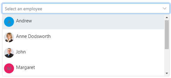
### React DropDownList
The [React DropdownList](https://www.syncfusion.com/react-components/react-dropdown-list?utm_source=npm&utm_medium=listing&utm_campaign=react-dropdown-npm) component is a quick replacement of the HTML select tags. It has a rich appearance and allows users to select a single value that is non-editable from a list of predefined values.
Getting Started .
Online demos .
Learn more
#### Key features
* [Data binding](https://ej2.syncfusion.com/react/demos/#/material/drop-down-list/data-binding) - Binds and accesses the list of items from the local or server-side data source.
* [Grouping](https://ej2.syncfusion.com/react/demos/#/material/drop-down-list/grouping-icon) - Groups the logically related items under a single or specific category.
* [Sorting](https://ej2.syncfusion.com/react/documentation/api/drop-down-list#sortorder) - Sorts the list items in alphabetical order (either ascending or descending).
* [Filtering](https://ej2.syncfusion.com/react/demos/#/material/drop-down-list/filtering) - Filters the list items based on a character typed in the search box.
* [Templates](https://ej2.syncfusion.com/react/demos/#/material/drop-down-list/template) - Customizes the list items, selected value, header, footer, category group header, and no records content.
* [Accessibility](https://ej2.syncfusion.com/react/documentation/drop-down-list/accessibility) - Provided with built-in accessibility support used to access all the DropDownList component features using keyboard, screen readers, or other assistive technology devices.
### React DropDownTree
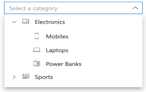
The [React DropDownTree](https://www.syncfusion.com/react-components/react-dropdown-tree?utm_source=npm&utm_medium=listing&utm_campaign=react-dropdown-npm) component is a textbox control that allows the user to select single or multiple values from hierarchical data in a tree-like structure. It has several out-of-the-box features, such as data binding, check boxes, templates, UI customization, accessibility, and preselected values.
Getting Started .
Online demos .
Learn more
#### Key features
* [Data binding](https://ej2.syncfusion.com/react/demos/?utm_source=npm&utm_medium=listing&utm_campaign=react-dropdown-npm#/bootstrap5/drop-down-tree/local-data) - Binds and accesses the list of items from the local or remote data source.
* [Checkbox](https://ej2.syncfusion.com/react/demos/?utm_source=npm&utm_medium=listing&utm_campaign=react-dropdown-npm#/bootstrap5/drop-down-tree/checkbox) - Built-in support for checkboxes, allowing users to select single or multiple items.
* [Template](https://ej2.syncfusion.com/react/demos/?utm_source=npm&utm_medium=listing&utm_campaign=react-dropdown-npm#/bootstrap5/drop-down-tree/template) - To change the appearance of the selection pop-up for tree items, plus the header and footer of the pop-up tree.
* [Filtering](https://ej2.syncfusion.com/react/demos/?utm_source=npm&utm_medium=listing&utm_campaign=react-dropdown-npm#/bootstrap5/drop-down-tree/filtering) - Filters the list items based on a character typed in the search box.
### React Mention
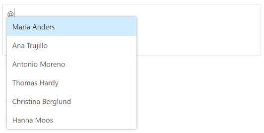
The [React Mention](https://www.syncfusion.com/react-components/react-mention?utm_source=npm&utm_medium=listing&utm_campaign=react-dropdown-npm) component is an autocomplete-like control to tag or select a user/group from the suggestion list. The control opens the suggestion list when a user starts typing with the character ‘@’ in popular social media sites such as Facebook, Twitter, and more. It supports several out-of-the-box features: Data binding, grouping, UI customization, accessibility, and more.
Getting Started .
Online demos .
Learn more
#### Key features
* [Sorting](https://ej2.syncfusion.com/react/documentation/mention/sorting) - Sorts the list items in alphabetical order (either ascending or descending).
* [Filtering](https://ej2.syncfusion.com/react/documentation/mention/filtering-data) - Filters the list items based on a character typed in the search box.
### React ComboBox
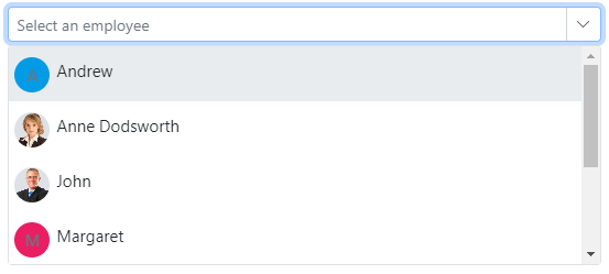
The [React ComboBox](https://www.syncfusion.com/react-components/react-combobox?utm_source=npm&utm_medium=listing&utm_campaign=react-dropdown-npm) component is a drop-down list with editable textbox that also allows users to choose an option from a predefined pop-up list.
Getting Started .
Online demos .
Learn more
#### Key features
* [Data binding](https://ej2.syncfusion.com/react/demos/#/material/combo-box/data-binding) - Binds and accesses the list of items from local or server-side data source.
* [Custom values](https://ej2.syncfusion.com/react/demos/#/material/combo-box/custom-value) - Sets user-defined values that is not in the pop-up list.
* [Grouping](https://ej2.syncfusion.com/react/demos/#/material/combo-box/grouping-icon) - Groups the logically related items under a single or specific category.
* [Sorting](https://ej2.syncfusion.com/react/documentation/api/combo-box#sortorder) - Sorts the list items in alphabetical order (either ascending or descending).
* [Filtering](https://ej2.syncfusion.com/react/demos/#/material/combo-box/filtering) - Filters the list items based on a character typed in the component.
* [Templates](https://ej2.syncfusion.com/react/demos/#/material/combo-box/template) - Customizes the list items, selected value, header, footer, category group header, and no records content.
* [Accessibility](https://ej2.syncfusion.com/react/documentation/combo-box/accessibility) - Provided with built-in accessibility support that helps to access all the ComboBox component features using the keyboard, screen readers, or other assistive technology devices.
### React AutoComplete
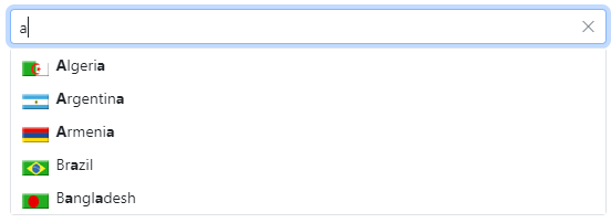
The [React AutoComplete](https://www.syncfusion.com/react-components/react-autocomplete?utm_source=npm&utm_medium=listing&utm_campaign=react-dropdown-npm) component is a textbox control that provides a list of suggestions to select from as the user types. It has several out-of-the-box features such as data binding, filtering, grouping, UI customization, accessibility, and more.
Getting Started .
Online demos .
Learn more
#### Key features
* [Data binding](https://ej2.syncfusion.com/react/demos/#/material/auto-complete/data-binding) - Binds and accesses the list of items from local or server-side data source.
* [Grouping](https://ej2.syncfusion.com/react/demos/#/material/auto-complete/grouping-icon) - Groups the logically related items under a single or specific category.
* [Sorting](https://ej2.syncfusion.com/react/documentation/api/auto-complete#sortorder) - Sorts the list items in alphabetical order (either ascending or descending).
* [Highlight search](https://ej2.syncfusion.com/react/demos/#/material/auto-complete/highlight) - Highlights the typed text in the suggestion list.
* [Templates](https://ej2.syncfusion.com/react/demos/#/material/auto-complete/template) - Customizes the list item, header, footer, category group header, no records, and action failure content.
* [Accessibility](https://ej2.syncfusion.com/react/documentation/auto-complete/accessibility) - Provided with built-in accessibility support that helps to access all the AutoComplete component features using keyboard, on-screen readers, or other assistive technology devices.
### React MultiSelect
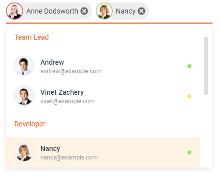
The [React MultiSelect Dropdown](https://www.syncfusion.com/react-components/react-multiselect-dropdown?utm_source=npm&utm_medium=listing&utm_campaign=react-dropdown-npm) component is a quick replacement for the HTML select tag for selecting multiple values. HTML MultiSelect Dropdown is a textbox control that allows the user to type or select multiple values from a list of predefined options.
Getting Started .
Online demos .
Learn more
#### Key features
* [Data binding](https://ej2.syncfusion.com/react/demos/#/material/multi-select/data-binding) - Binds and accesses the list of items from local or server-side data source.
* [Grouping](https://ej2.syncfusion.com/react/demos/#/material/multi-select/grouping) - Groups the logically related items under a single or specific category.
* [Templates](https://ej2.syncfusion.com/react/demos/#/material/multi-select/template) - Customizes the list items, selected value, header, footer, category group header, and no records content.
* [Sorting](https://ej2.syncfusion.com/react/documentation/api/multi-select#sortorder) - Sorts the list items in alphabetical order (either ascending or descending).
* [Filtering](https://ej2.syncfusion.com/react/demos/#/material/multi-select/filtering) - Filters the list items based on a character typed in the search box.
* [Custom value](https://ej2.syncfusion.com/react/demos/#/material/multi-select/custom-value) - Allows users to select a new custom value.
* [Accessibility](https://ej2.syncfusion.com/react/documentation/multi-select/accessibility) - Provided with built-in accessibility support that helps to access all the DropDownList component features using the keyboard, screen readers, or other assistive technology devices.
### React ListBox
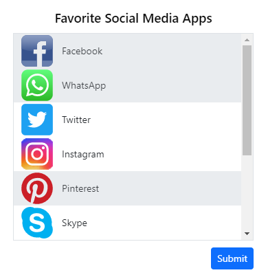
The [React ListBox](https://www.syncfusion.com/react-components/react-listbox?utm_source=npm&utm_medium=listing&utm_campaign=react-dropdown-npm) component is a graphical user interface for displaying a list of items with multi-selection options. It has a rich appearance and allows users to select one or more items from the list using checkboxes or keyboard interactions.
Getting Started .
Online demos .
Learn more
#### Key features
* [Data binding](https://ej2.syncfusion.com/react/documentation/list-box/data-binding) - Binds and accesses the list of items from local or server-side data source.
* [Dual listbox](https://ej2.syncfusion.com/react/demos/?utm_source=npm&utm_medium=listing&utm_campaign=react-dropdown-npm#/bootstrap5/list-box/dual-list-box) - Allows transferring and reordering the list item between two ListBoxes.
* [Drag and drop](https://ej2.syncfusion.com/react/demos/?utm_source=npm&utm_medium=listing&utm_campaign=react-dropdown-npm#/bootstrap5/list-box/drag-and-drop) - Allows drag and drop the list item with the same/multiple ListBox.
* [Grouping](https://ej2.syncfusion.com/react/documentation/list-box/sorting-and-grouping#grouping) - Groups the logically related items under a single or specific category.
* [Templates](https://ej2.syncfusion.com/react/demos/?utm_source=npm&utm_medium=listing&utm_campaign=react-dropdown-npm#/bootstrap5/list-box/template) - Customizes the list items.
* [Sorting](https://ej2.syncfusion.com/react/documentation/list-box/sorting-and-grouping) - Sorts the list items in alphabetical order (either ascending or descending).
* [Accessibility](https://ej2.syncfusion.com/react/documentation/list-box/accessibility) - Provided with built-in accessibility support that helps to access all the ListBox component features using the keyboard, screen readers, or other assistive technology devices.
Trusted by the world's leading companies

## Setup
To install `dropdowns` and its dependent packages, use the following command.
```
npm install @syncfusion/ej2-react-dropdowns
```
## Supported frameworks
DropDown components are also offered in the following list of frameworks.
| [ ](https://www.syncfusion.com/javascript-ui-controls?utm_medium=listing&utm_source=github)
[JavaScript](https://www.syncfusion.com/javascript-ui-controls?utm_medium=listing&utm_source=github) | [ ](https://www.syncfusion.com/angular-components/?utm_medium=listing&utm_source=github)
[Angular](https://www.syncfusion.com/angular-components/?utm_medium=listing&utm_source=github) | [ ](https://www.syncfusion.com/vue-ui-components?utm_medium=listing&utm_source=github)
[Vue](https://www.syncfusion.com/vue-ui-components?utm_medium=listing&utm_source=github) | [ ](https://www.syncfusion.com/aspnet-core-ui-controls?utm_medium=listing&utm_source=github)
[ASP.NET Core](https://www.syncfusion.com/aspnet-core-ui-controls?utm_medium=listing&utm_source=github) | [ ](https://www.syncfusion.com/aspnet-mvc-ui-controls?utm_medium=listing&utm_source=github)
[ASP.NET MVC](https://www.syncfusion.com/aspnet-mvc-ui-controls?utm_medium=listing&utm_source=github) |
| :-----: | :-----: | :-----: | :-----: | :-----: |
## Showcase samples
* Loan Calculator - [Source](https://github.com/syncfusion/ej2-showcase-react-loan-calculator), [Live Demo](https://ej2.syncfusion.com/showcase/react/loancalculator/?utm_source=npm&utm_medium=listing&utm_campaign=react-navigation-npm#/default)
## Resources
* [AI Coding Assistant](https://ej2.syncfusion.com/react/documentation/ai-coding-assistants/overview)
* [Theme Studio](https://ej2.syncfusion.com/themestudio/)
* [What's New](https://www.syncfusion.com/products/whatsnew/react?utm_medium=listing&utm_source=github)
* [Road Map](https://www.syncfusion.com/products/roadmap/react)
* [E-Books](https://www.syncfusion.com/succinctly-free-ebooks?searchkey=react&type=all)
## Support
Product support is available through the following mediums.
* [Support ticket](https://support.syncfusion.com/support/tickets/create) - Guaranteed Response in 24 hours | Unlimited tickets | Holiday support
* [Community forum](https://www.syncfusion.com/forums/react-js2?utm_source=npm&utm_medium=listing&utm_campaign=react-dropdown-npm)
* [GitHub issues](https://github.com/syncfusion/ej2-react-ui-components/issues/new)
* [Request feature or report bug](https://www.syncfusion.com/feedback/react?utm_source=npm&utm_medium=listing&utm_campaign=react-dropdown-npm)
* Live chat
## Changelog
Check the changelog [here](https://github.com/syncfusion/ej2-react-ui-components/blob/master/components/dropdowns/CHANGELOG.md). Get minor improvements and bug fixes every week to stay up to date with frequent updates.
## License and copyright
> This is a commercial product and requires a paid license for possession or use. Syncfusion® licensed software, including this component, is subject to the terms and conditions of Syncfusion® [EULA](https://www.syncfusion.com/eula/es/). To acquire a license for 140+ [React UI components](https://www.syncfusion.com/react-components), you can [purchase](https://www.syncfusion.com/sales/products) or [start a free 30-day trial](https://www.syncfusion.com/account/manage-trials/start-trials).
> A free community [license](https://www.syncfusion.com/products/communitylicense) is also available for companies and individuals whose organizations have less than $1 million USD in annual gross revenue and five or fewer developers.
See [LICENSE FILE](https://github.com/syncfusion/ej2/blob/master/license?utm_source=npm&utm_campaign=dropdown) for more info.
© Copyright 2026 Syncfusion® Inc. All Rights Reserved. The Syncfusion® Essential Studio® license and copyright applies to this distribution.
---
_Source: https://npm.io/package/@syncfusion/ej2-react-dropdowns · Machine-readable twin of the npm.io package page. Health data is recomputed on every publish._