# @umnico/react-date-range
> A React component for choosing dates and date ranges.
Latest version **1.0.0-alpha3** (published 2021-08-12) · MIT license · 0 weekly downloads
## Install
```sh
npm install @umnico/react-date-range
pnpm add @umnico/react-date-range
yarn add @umnico/react-date-range
bun add @umnico/react-date-range
```
## Health
**Score 15/100 (F)** — status: abandoned.
Positive: no vulnerabilities.
Warnings: low downloads; no types; no esm support.
Negative: abandoned; low maintenance score.
## Facts
| | |
|---|---|
| Version | 1.0.0-alpha3 |
| Published | 2021-08-12 |
| First published | 2021-08-12 |
| Weekly downloads | 0 |
| License | MIT |
| TypeScript types | none |
| Module format | CommonJS |
| Dependencies | 4 |
| Unpacked size | 194.3 KB |
| Known vulnerabilities | 0 |
| Install scripts | no |
| Author | umnico |
| Maintainers | justbenya, arthot |
| Keywords | react, date, range, datepicker, rangepicker |
## Links
- npm: https://www.npmjs.com/package/@umnico/react-date-range
- Repository: https://github.com/arthot/react-date-range
- Homepage: https://github.com/arthot/react-date-range/
- Issues: https://github.com/arthot/react-date-range/issues
- npm.io page: https://npm.io/package/@umnico/react-date-range
## Dependencies (4)
- [date-fns](https://npm.io/package/date-fns.md) ^1.29.0
- [classnames](https://npm.io/package/classnames.md) ^2.2.1
- [prop-types](https://npm.io/package/prop-types.md) ^15.5.10
- [react-list](https://npm.io/package/react-list.md) ^0.8.8
## Alternatives
- [mobx-react](https://npm.io/package/mobx-react.md) — 2.8M weekly downloads
- [rc-tree](https://npm.io/package/rc-tree.md) — 2.6M weekly downloads
- [@react-oauth/google](https://npm.io/package/@react-oauth/google.md) — 1.3M weekly downloads
- [@wagmi/connectors](https://npm.io/package/@wagmi/connectors.md) — 877.0K weekly downloads
- [vee-validate](https://npm.io/package/vee-validate.md) — 836.4K weekly downloads
## Recent versions
- 1.0.0-alpha3 (latest) — 2021-08-12
## README
# react-date-range
[](https://www.npmjs.com/package/react-date-range)

[]()
[](https://www.npmjs.com/package/react-date-range)
> ⚠️ Warning: the current branch represents the new pre-release version. [Legacy version](https://github.com/Adphorus/react-date-range/tree/v1) deprecated.
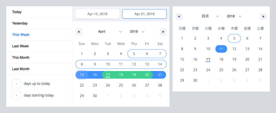
A date library agnostic React component for choosing dates and date ranges. Uses [date-fns](http://date-fns.org/) for date operations.
### Why should you use `react-date-range`?
- Stateless date operations
- Highly configurable
- Multiple range selection
- Based on native js dates
- Drag n Drop selection
- Keyboard friendly
**Live Demo :** [http://adphorus.github.io/react-date-range](http://adphorus.github.io/react-date-range)
## Getting Started
### Installation
```
yarn add react-date-range@next
```
If you don't use yarn
```
$ npm install --save react-date-range@next
```
## Usage
You need to import skeleton and theme styles first.
```javascript
import 'react-date-range/dist/styles.css'; // main style file
import 'react-date-range/dist/theme/default.css'; // theme css file
```
### `DatePicker`
```javascript
import { Calendar } from 'react-date-range';
class MyComponent extends Component {
handleSelect(date){
console.log(date); // native Date object
}
render(){
return (
)
}
}
```
### `DateRangePicker / DateRange`
```javascript
import { DateRangePicker } from 'react-date-range';
class MyComponent extends Component {
handleSelect(ranges){
console.log(ranges);
// {
// selection: {
// startDate: [native Date Object],
// endDate: [native Date Object],
// }
// }
}
render(){
const selectionRange = {
startDate: new Date(),
endDate: new Date(),
key: 'selection',
}
return (
)
}
}
```
### Options
Property | type | Default Value | Desctiption
-------------------------------------|-----------|------------------|-----------------------------------------------------------------
locale | Object | enUS from locale | you can view full list from [here](https://github.com/Adphorus/react-date-range/tree/next/src/locale/index.js). Locales directly exported from [`date-fns/locales`](https://date-fns.org/v2.0.0-alpha.7/docs/I18n#supported-languages).
className | String | | wrapper classname
months | Number | 1 | rendered month count
showSelectionPreview | Boolean | true | show preview on focused/hovered dates
rangeColors | String[] | | defines color for selection preview.
shownDate | Date | | initial focus date
minDate | Date | | defines minimum date. Disabled earlier dates
maxDate | Date | | defines maximum date. Disabled later dates
direction | String | 'vertical' | direction of calendar months. can be `vertical` or `horizontal`
scroll | Object | { enabled: false }| infinite scroll behaviour configuration. Checkout [Infinite Scroll](#infinite-scrolled-mode) section
showMonthArrow | Boolean | true | show/hide month arrow button
navigatorRenderer | Func | | renderer for focused date navigation area. fn(currentFocusedDate: Date, changeShownDate: func, props: object)
ranges | *Object[] | [] | Defines ranges. array of range object
moveRangeOnFirstSelection(DateRange) | Boolean | false | move range on startDate selection. Otherwise endDate will replace with startDate.
onChange(Calendar) | Func | | callback function for date changes. fn(date: Date)
onChange(DateRange) | Func | | callback function for range changes. fn(changes). changes contains changed ranges with new `startDate`/`endDate` properties.
color(Calendar) | String | `#3d91ff` | defines color for selected date in Calendar
date(Calendar) | Date | | date value for Calendar
showDateDisplay(DateRange) | Boolean | true | show/hide selection display row. Uses `dateDisplayFormat` for formatter
dateDisplayFormat(DateRange) | String | `MMM D,YYYY` | selected range preview formatter. checkout [date-fns's format option](https://date-fns.org/v2.0.0-alpha.7/docs/format)
staticRanges(`DefinedRange`, `DateRangePicker`) | Array | [default preDefined ranges](https://github.com/Adphorus/react-date-range/blob/master/src/defaultRanges.js) | -
inputRanges(`DefinedRange`, `DateRangePicker`) | Array | [default input ranges](https://github.com/Adphorus/react-date-range/blob/master/src/defaultRanges.js) | -
> *shape of range:
> ```js
> {
> startDate: PropTypes.object,
> endDate: PropTypes.object,
> color: PropTypes.string,
> key: PropTypes.string,
> autoFocus: PropTypes.bool,
> disabled: PropTypes.bool,
> showDateDisplay: PropTypes.bool,
> }
>```
#### Infinite Scrolled Mode
To enable infinite scroll set `scroll={{enabled: true}}` basically. Infinite scroll feature is affected by `direction`(rendering direction for months) and `months`(for rendered months count) props directly.
If you prefer, you can overwrite calendar sizes with `calendarWidth`/`calendarHeight` or each month's height/withs with `monthWidth`/`monthHeight`/`longMonthHeight` at `scroll` prop.
```js
// shape of scroll prop
scroll: {
enabled: PropTypes.bool,
monthHeight: PropTypes.number,
longMonthHeight: PropTypes.number, // some months has 1 more row than others
monthWidth: PropTypes.number, // just used when direction="horizontal"
calendarWidth: PropTypes.number, // defaults monthWidth * months
calendarHeight: PropTypes.number, // defaults monthHeight * months
}),
```
TODOs
- Make mobile friendly (integrate tap and swipe actions)
- Add complex booking customization example with exposed dayRenderer prop
- Add tests
- Improve documentation
---
_Source: https://npm.io/package/@umnico/react-date-range · Machine-readable twin of the npm.io package page. Health data is recomputed on every publish._