# @vuesimple/vs-alert
> A simple vue alert. Perfect for all your alert scenarios.
Latest version **3.1.7** (published 2026-08-27) · MIT license · 0 weekly downloads
## Install
```sh
npm install @vuesimple/vs-alert
pnpm add @vuesimple/vs-alert
yarn add @vuesimple/vs-alert
bun add @vuesimple/vs-alert
```
## Health
**Score 60/100 (C)** — status: active.
Positive: esm support; no vulnerabilities; recently updated; high maintenance score.
Warnings: low downloads; no types.
## Facts
| | |
|---|---|
| Version | 3.1.7 |
| Published | 2026-08-27 |
| First published | 2021-06-13 |
| Weekly downloads | 0 |
| License | MIT |
| TypeScript types | none |
| Module format | ESM + CommonJS |
| Dependencies | 0 |
| Unpacked size | 174.7 KB |
| Known vulnerabilities | 0 |
| Install scripts | no |
| GitHub stars | 34 |
| Author | Ashwin Shenoy |
| Maintainers | ashwinkshenoy |
| Keywords | vue, vuejs, alert, notification, front-end, popup, web, vue-js, alert, vue-js-alert, vue-alert, vs-alert |
## Links
- npm: https://www.npmjs.com/package/@vuesimple/vs-alert
- Repository: https://github.com/ashwinkshenoy/vue-simple
- Issues: https://github.com/ashwinkshenoy/vue-simple/issues
- npm.io page: https://npm.io/package/@vuesimple/vs-alert
## Alternatives
- [update-check](https://npm.io/package/update-check.md) — 4.0M weekly downloads
- [react-native-onesignal](https://npm.io/package/react-native-onesignal.md) — 134.5K weekly downloads
- [react-redux-toastr](https://npm.io/package/react-redux-toastr.md) — 33.7K weekly downloads
- [@nocobase/plugin-notification-manager](https://npm.io/package/@nocobase/plugin-notification-manager.md) — 2.0K weekly downloads
- [react-simple-toasts](https://npm.io/package/react-simple-toasts.md) — 1.9K weekly downloads
## Recent versions
- 3.1.7 (latest) — 2026-08-27
- 1.4.18 (v2-latest) — 2023-09-28
- 3.1.6 — 2026-03-27
- 3.1.5 — 2026-03-23
- 3.1.3 — 2025-11-13
- 3.1.2 — 2025-11-13
- 3.0.9 — 2025-01-08
- 3.0.8 — 2025-01-08
- 3.0.7 — 2024-06-27
- 3.0.6 — 2024-04-29
- 3.0.5 — 2023-10-19
- 3.0.4 — 2023-10-19
- 3.0.3 — 2023-10-19
- 3.0.2 — 2023-10-19
- 3.0.1 — 2023-10-19
- … 42 more at https://npm.io/package/@vuesimple/vs-alert/versions
## README
# Vue Simple Alert
#### 🗃 A simple vue alert. Perfect for all your alert scenarios.
A light weight vue plugin built groundup.
[](https://www.npmjs.com/package/@vuesimple/vs-alert)
[](https://img.shields.io/npm/dt/@vuesimple/vs-alert.svg)






### 📺 Live Demo
Demo: [Link](https://vuesimple.netlify.app)
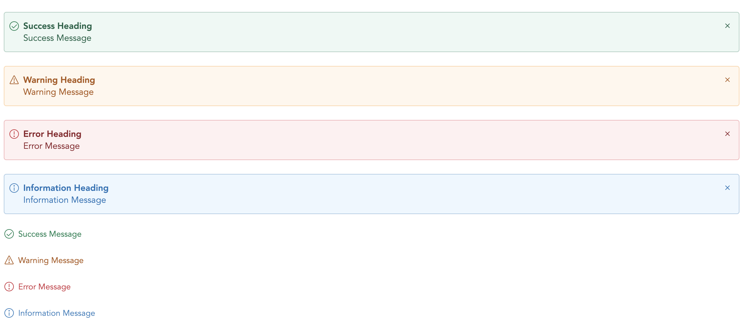
### 🛠 Install
```bash
npm i @vuesimple/vs-alert
```
### 🚀 Usage
```html
Success
```
### 🌎 CDN
```html
```
```javascript
// Main/Entry file
app.use(VsAlert.plugin);
```
```html
Success
```
### ⚙ Props
| Name | Type | Default | Description |
| --------- | ------- | ------- | --------------------------------------------------------------------- |
| variant | String | - | Type of alert to be shown. (success, warning, error, info, secondary) |
| title | String | - | The alert title (text only). For HTML, use the header slot. |
| showClose | Boolean | false | Show alert close icon |
| small | Boolean | false | Applies reduced padding |
| toast | Boolean | false | Applies toast design |
| noBg | Boolean | false | Remove background color |
### 🔥 Events
| Name | Description |
| ----- | ---------------------------------------------------------------------------- |
| close | Emitted when the alert close icons is clicked. Listen for it using `@close`. |
### 📎 Slots
You can define own item markup via slots:
| Name | Description |
| --------- | --------------------------------------------- |
| (default) | Holds the alert content and can contain HTML. |
| icon | Slot to add custom icon for type |
| title | Slot to add custom title |
---
_Source: https://npm.io/package/@vuesimple/vs-alert · Machine-readable twin of the npm.io package page. Health data is recomputed on every publish._