# @webileapps/rn-range-slider
> React Native Range Slider for Android and iOS
Latest version **0.0.11** (published 2019-11-21) · MIT license · 0 weekly downloads
## Install
```sh
npm install @webileapps/rn-range-slider
pnpm add @webileapps/rn-range-slider
yarn add @webileapps/rn-range-slider
bun add @webileapps/rn-range-slider
```
## Health
**Score 15/100 (F)** — status: abandoned.
Positive: no vulnerabilities.
Warnings: low downloads; no types; no esm support; pre 1.0.
Negative: abandoned; low maintenance score.
## Facts
| | |
|---|---|
| Version | 0.0.11 |
| Published | 2019-11-21 |
| First published | 2019-11-13 |
| Weekly downloads | 0 |
| License | MIT |
| TypeScript types | none |
| Module format | CommonJS |
| Dependencies | 0 |
| Unpacked size | 90.5 KB |
| Known vulnerabilities | 0 |
| Install scripts | no |
| Author | Tigran Sahakyan |
| Maintainers | durgaprasanna, rajivnarayana, rajivsingaseni |
| Keywords | react, native, react-native, react-component, react-native-component, android, ios, custom, range, slider, seekbar |
## Links
- npm: https://www.npmjs.com/package/@webileapps/rn-range-slider
- Repository: https://github.com/githuboftigran/rn-range-slider
- Issues: https://github.com/githuboftigran/rn-range-slider/issues
- npm.io page: https://npm.io/package/@webileapps/rn-range-slider
## Alternatives
- [mobx-react](https://npm.io/package/mobx-react.md) — 2.8M weekly downloads
- [rc-tree](https://npm.io/package/rc-tree.md) — 2.6M weekly downloads
- [@react-oauth/google](https://npm.io/package/@react-oauth/google.md) — 1.3M weekly downloads
- [@wagmi/connectors](https://npm.io/package/@wagmi/connectors.md) — 877.0K weekly downloads
- [vee-validate](https://npm.io/package/vee-validate.md) — 836.4K weekly downloads
## Recent versions
- 0.0.11 (latest) — 2019-11-21
- 0.0.10 — 2019-11-21
- 0.0.9 — 2019-11-17
- 0.0.8 — 2019-11-15
- 0.0.7 — 2019-11-15
- 0.0.6 — 2019-11-14
- 0.0.5 — 2019-11-14
- 0.0.4 — 2019-11-14
- 0.0.3 — 2019-11-14
- 0.0.1 — 2019-11-13
## README
# RangeSlider
A fully customizable high quality react native Slider component backed by custom native iOS and Android views with ability to select range of values.
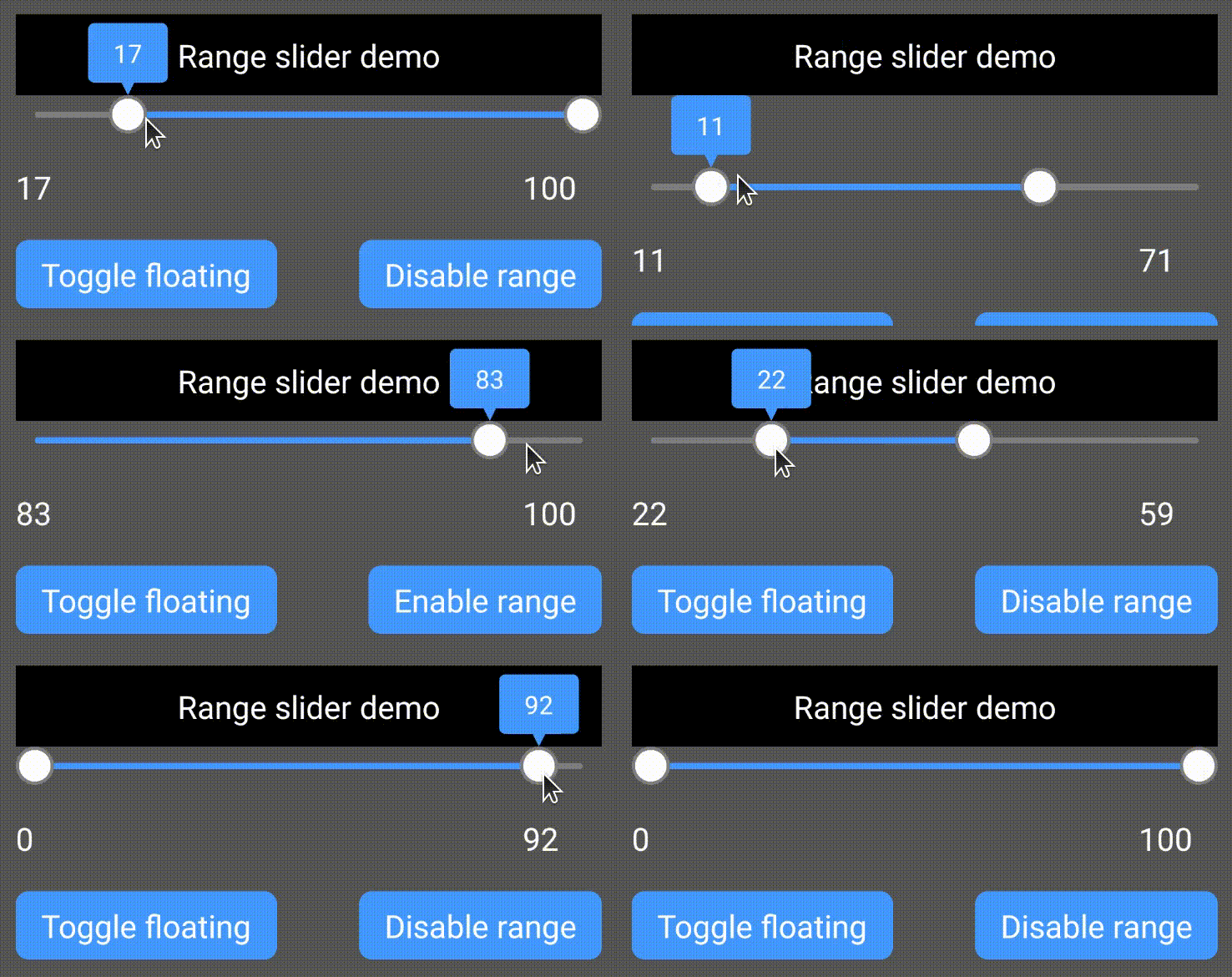
Demo app
## Installation
1. Add
* npm: `npm install --save rn-range-slider`
* yarn: `yarn add rn-range-slider`
2. Linking
##### For older React native versions ( < 0.60 ) you need to link the library:
- Run `react-native link rn-range-slider`
- If linking fails, follow the
[manual linking steps](https://facebook.github.io/react-native/docs/linking-libraries-ios.html#manual-linking)
##### For newer React native versions ( >= 0.60 ) you need to install pods for iOS:
- cd ios && pod install && cd ..
- For android everything works out of the box
## Usage
```RangeSlider``` should have fixed width and height.
```
import RangeSlider from 'rn-range-slider';
...
{
this.setState({rangeLow: low, rangeHigh: high})
}}/>
/>
...
```
### Properties
Supported color formats are: **#RGB**, **#RGBA**, **#RRGGBB**, **#RRGGBBAA**
| Name | Description | Type | Default Value |
|----------|-----------------------|------|:-------------:|
| disabled | If true user won't be able to move the slider | Boolean | **false** |
| rangeEnabled | Slider works as an ordinary slider with 1 control if false | Boolean | **true** |
| valueType | Type of slider values | String
Currently supported values:
- **number**
- **time** | **number** |
| lineWidth | Width of slider's line | Number | **4** |
| thumbRadius | Radius of thumb (including border) | Number | **10** |
| thumbBorderWidth | Border width of thumb | Number | **2** |
| textSize | Size of label text | Number | **16** |
| labelBorderWidth | Border width of label | Number | **2** |
| labelPadding | Padding of label (distance between border and text) | Number | **4** |
| labelBorderRadius | Border radius of label bubble | Number | **4** |
| labelTailHeight | Height of label bubble's tail | Number | **8** |
| labelGapHeight | Gap between label and slider | Number | **4** |
| textFormat | This string will be formatted with active value and shown in thumb.
If `valueType` is set to **time** this prop will be considered as date formatter.
Since this library uses native components and everything is rendered at native side, time on label text will be formatted by [`NSDateFormatter`](https://developer.apple.com/library/archive/documentation/Cocoa/Conceptual/DataFormatting/Articles/dfDateFormatting10_4.html) for iOS and [`SimpleDateFormat`](https://docs.oracle.com/javase/7/docs/api/java/text/SimpleDateFormat.html) for Android, so make sure you are passing valid format for both platforms. | String
**"Price: %d**" =>
"**Price: 75**"
if the current value is 75 | **%d**
(just the number) |
| labelStyle | Style of the label.
Label is not shown if **none** | String
Currently supported values:
- **none**
- **bubble** | **bubble** |
| gravity | Vertical gravity of drawn content | String
Currently supported values:
- **top**
- **bottom**
- **center** | **top** |
| selectionColor | Color of selected part | String | **#4286f4** |
| blankColor | Color of unselected part | String | **#ffffff7f** |
| thumbColor | Color of thumb | String | **#ffffff** |
| thumbBorderColor | Color of thumb's border | String | **#cccccc** |
| labelBackgroundColor | Color label's background | String | **#ff60ad** |
| labelBorderColor | Color label's border | String | **#d13e85** |
| labelTextColor | Color label's text | String | **#ffffff** |
| step | Step of slider. If `valueType` is set to **time**, this prop wil considered as milliseconds. | Number | **1** |
Props below may have different types depending on `valueType` prop.
If `valueType` is set to **number**, these props should be `Number`s (integer).
If `valueType` is set to **time**, these props may be `Number` (integer) or `Date` and if a `Number` is passed the value will be considered as timestamp.
| Name | Description | Type | Default Value |
|----------|-----------------------|------|:-------------:|
| min | Minimum value of slider | Depends on `valueType` | **0** |
| max | Maximum value of slider | Depends on `valueType` | **100** |
| initialLowValue | Initial value of lower thumb | Depends on `valueType` | **0** |
| initialHighValue | Initial value of higher thumb | Depends on `valueType` | **100** |
If `initialLowValue` ( or `initialHighValue`) is not provided, it's set to `min` (or `max`).
### Methods
To call methods of ```RangeSlider``` you need to have a reference to it's instance.
React native provides 2 ways to do it:
```
...
...
this.refs._rangeSlider.setLowValue(42);
...
```
or
```
...
this._rangeSlider = component } />
...
this._rangeSlider.setLowValue(42);
...
```
#### Available methods
| Name | Description | Params |
|---|---|---|
| setLowValue | Set low value of slider | value: `Number` (or Date, if `valueType` is set to **time**) |
| setHighValue | Set high value of slider | value: `Number` (or Date, if `valueType` is set to **time**) |
### Callbacks
| Name | Description | Params |
|----------|---------------------|--------|
| onValueChanged | A callback to be called when value was changed.
Type of _lowValue_ and _highValue_ will be `Number` if `valueType` is **number** and `Date` if `valueType` is **time**
_fromUser_ parameter is true if the value was changed because of user's interaction (not by calling __setLowValue__ or __setHighValue__ methods). Just like android's [OnSeekbarChangeListener](https://developer.android.com/reference/android/widget/SeekBar.OnSeekBarChangeListener). | lowValue: number
highValue: number
fromUser: boolean |
| onTouchStart | Nothing to explain I think :) | - |
| onTouchEnd | Nothing to explain here too | - |
## Known issues
* Label's corner radius is not working on iOS
---
_Source: https://npm.io/package/@webileapps/rn-range-slider · Machine-readable twin of the npm.io package page. Health data is recomputed on every publish._