# aim-data-grid-cells
> Extra cells for aim-data-grid
Latest version **1.2.2-beta.7** (published 2026-02-10) · MIT license · 0 weekly downloads
## Install
```sh
npm install aim-data-grid-cells
pnpm add aim-data-grid-cells
yarn add aim-data-grid-cells
bun add aim-data-grid-cells
```
## Health
**Score 60/100 (C)** — status: stable.
Positive: has types; esm support; no vulnerabilities; high quality score.
Warnings: low downloads.
## Facts
| | |
|---|---|
| Version | 1.2.2-beta.7 |
| Published | 2026-02-10 |
| First published | 2023-12-29 |
| Weekly downloads | 0 |
| License | MIT |
| TypeScript types | bundled |
| Module format | ESM + CommonJS |
| Dependencies | 4 |
| Unpacked size | 323.9 KB |
| Known vulnerabilities | 0 |
| Install scripts | no |
| GitHub stars | 5373 |
| Author | Graceji |
| Maintainers | grace_ji |
| Keywords | react, datagrid, data-grid, editor, reactjs, scrolling, data, table, cell, canvas |
## Links
- npm: https://www.npmjs.com/package/aim-data-grid-cells
- Repository: https://github.com/glideapps/glide-data-grid
- Homepage: https://github.com/glideapps/glide-data-grid/tree/main/cells
- Issues: https://github.com/glideapps/glide-data-grid/issues
- npm.io page: https://npm.io/package/aim-data-grid-cells
## Dependencies (4)
- [react-select](https://npm.io/package/react-select.md) ^5.2.2
- [aim-data-grid](https://npm.io/package/aim-data-grid.md) 1.3.0-beta.3
- [@toast-ui/editor](https://npm.io/package/@toast-ui/editor.md) 3.1.10
- [@toast-ui/react-editor](https://npm.io/package/@toast-ui/react-editor.md) 3.1.10
## Alternatives
- [@lexical/table](https://npm.io/package/@lexical/table.md) — 3.0M weekly downloads
- [mantine-datatable](https://npm.io/package/mantine-datatable.md) — 98.2K weekly downloads
- [react-native-collapsible-tab-view](https://npm.io/package/react-native-collapsible-tab-view.md) — 70.6K weekly downloads
- [@handsontable/vue3](https://npm.io/package/@handsontable/vue3.md) — 16.1K weekly downloads
- [vuewordcloud](https://npm.io/package/vuewordcloud.md) — 7.2K weekly downloads
## Recent versions
- 1.2.2-beta.7 (latest) — 2026-02-10
- 1.2.2-beta.6 — 2025-08-04
- 1.2.2-beta.5 — 2025-07-30
- 1.2.2-beta.4 — 2025-07-16
- 1.2.2-beta.3 — 2025-07-16
- 1.2.2-beta.2 — 2025-07-16
- 1.2.2-beta.1 — 2025-07-16
- 1.2.1-beta.4 — 2025-05-19
- 1.2.1-beta.3 — 2024-10-24
- 1.2.1-beta.2 — 2024-05-27
- 1.2.1-beta.1 — 2024-05-27
- 1.2.0-beta.10 — 2024-05-22
- 1.2.0-beta.9 — 2024-05-22
- 1.2.0-beta.8 — 2024-04-24
- 1.2.0-beta.7 — 2024-04-24
- … 13 more at https://npm.io/package/aim-data-grid-cells/versions
## README

Glide Data Grid Cells
Additional cells and features for Glide Data Grid
[](https://github.com/glideapps/glide-data-grid/releases)
[](https://reactjs.org)
[](https://bundlephobia.com/package/aim-data-grid-cells)
[](https://github.com/glideapps/glide-data-grid/blob/main/LICENSE)
[](https://www.glideapps.com/jobs)
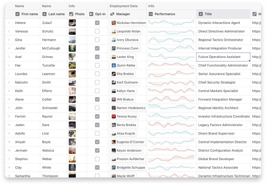
Current cells
- Star (Rating) Cell
- Sparklines
- Article
- Dropdown
- Range
- User profile
- Tags
# Usage
Step 1: Add the extra cells to your grid.
```tsx
import { useExtraCells } from "aim-data-grid-cells";
const Grid = () => {
const { customRenderers } = useExtraCells();
return ;
};
```
Step 2: Use the cells in your `getCellContent` callback
```ts
import type { StarCell } from "aim-data-grid-cells";
const getCellContent = React.useCallback(() => {
const starCell: StarCell = {
kind: GridCellKind.Custom,
allowOverlay: true,
copyData: "4 out of 5",
data: {
kind: "star-cell",
label: "Test",
rating: 4,
},
};
return starCell;
}, []);
```
## Note on ArticleCell
The ArticleCell uses `@toast-ui/editor` to provide its editor. To make sure it works correctly your project will need to import the css file it depends on.
```
import "@toast-ui/editor/dist/toastui-editor.css";
```
---
_Source: https://npm.io/package/aim-data-grid-cells · Machine-readable twin of the npm.io package page. Health data is recomputed on every publish._