# angular-cabinet-ui

> Simplifies the creation of user interface components that show or hide content when a trigger is invoked.

Latest version **0.1.8** (published 2015-08-30) · MIT license · 0 weekly downloads

## Install

```sh
npm install angular-cabinet-ui
pnpm add angular-cabinet-ui
yarn add angular-cabinet-ui
bun add angular-cabinet-ui
```

## Health

**Score 15/100 (F)** — status: abandoned.

Positive: no vulnerabilities.

Warnings: low downloads; no types; no esm support; pre 1.0.

Negative: abandoned; low maintenance score.

## Facts

| | |
|---|---|
| Version | 0.1.8 |
| Published | 2015-08-30 |
| First published | 2015-07-13 |
| Weekly downloads | 0 |
| License | MIT |
| TypeScript types | none |
| Module format | CommonJS |
| Dependencies | 0 |
| Known vulnerabilities | 0 |
| Install scripts | no |
| GitHub stars | 0 |
| Author | Jeffrey Hing |
| Maintainers | jeffhing |
| Keywords | angular, directive, ui, widget, component, interface, accordion, menus, navigation, sidebar, tabs |

## Links

- npm: https://www.npmjs.com/package/angular-cabinet-ui
- Repository: https://github.com/JeffHing/angular-cabinet-ui
- Issues: https://github.com/JeffHing/angular-cabinet-ui/issues
- npm.io page: https://npm.io/package/angular-cabinet-ui

## Alternatives

- [@sindresorhus/slugify](https://npm.io/package/@sindresorhus/slugify.md) — 3.7M weekly downloads
- [solid-js](https://npm.io/package/solid-js.md) — 2.7M weekly downloads
- [expo-glass-effect](https://npm.io/package/expo-glass-effect.md) — 2.5M weekly downloads
- [nanoassert](https://npm.io/package/nanoassert.md) — 780.8K weekly downloads
- [@ffmpeg/ffmpeg](https://npm.io/package/@ffmpeg/ffmpeg.md) — 529.5K weekly downloads

## Recent versions

- 0.1.8 (latest) — 2015-08-30
- 0.1.7 — 2015-08-14
- 0.1.6 — 2015-08-13
- 0.1.5 — 2015-07-13

## README

<!-- Copyright 2015. Author: Jeffrey Hing. All Rights Reserved. MIT License -->

# AngularCabinetUI

AngularCabinetUI is a set of directives that simplifies the creation of 
a variety of user interface components that share a simple trait: show
or hide content when a trigger is invoked.
Examples include accordions, menus, tabs, navigation sidebars, etc. 

By making it easy for you to create your own user interface components
rather than use off-the-shelf components, you can easily adapt your 
components (or create  new ones) to meet the demands of changing user 
interface requirements. As such, AngularCabinetUI does not provide a UI 
style, but rather provides the structure and behaviors needed to 
implement a component. It's entirely up to you what CSS rules are 
applied!

AngularCabinetUI is modeled after the structure of a cabinet of drawers,
which has the following properties:

* A cabinet contains one or more drawers.
* A drawer contains content.
* An open drawer shows the content. 
* A closed drawer hides the content. 

Applying CSS to this structure can emulate many existing user interface 
components, and allows for the creation of many others.

## Table of Contents

- [Features](#features)
- [Installation](#installation)
- [Example](#example)
- [Provided Examples](#provided-examples)
- [Usage](#usage)
    - [Factory Method](#factory-method)
    - [Cabinet Directive](#cabinet-directive)
    - [DrawerTrigger Directive](#drawertrigger-directive)
    - [DrawerContents Directive](#drawercontents-directive)
    - [DrawerClass Directive](#drawerclass-directive)
   
## Features

* Simplifies creation of user interface components that show or hide content.
* Provides a consistent API across multiple user interface components.
* Compatible with Angular 1.2.x and beyond.
* Compatible with CommonJS, AMD, and non-module build environments.

## Installation

To install the package:

    npm install angular-cabinet-ui
    
To require the package:    

```javascript
var cabinetDirective = require("angular-cabinet-ui");
```     

## Example

The easist way to understand AngularCabinetUI is to walk 
through a quick example of creating a "tabs" directive which allows the user 
to select from a horizontal list of tabs.

![alt tag](https://raw.githubusercontent.com/JeffHing/angular-cabinet-ui/master/readmeAssets/tabs.png)

### 1. Add the Directives

First, add the directives from AngularCabinetUI to an Angular module.
The directive names should reflect the purpose of the user interface component.
In this case, the  default directive names are renamed to use tab names:

```javascript
cabinetDirective('app', {
    oneAlwaysOpen: true,

    directiveNames: {
        cabinet: 'tabs',
        drawerTrigger: 'tabTrigger',
        drawerContents: 'tabContents',
        drawerClass: 'tabClass'
    }
});
```    

### 2. Create the HTML Structure

Next, create the HTML structure based upon the layout of the user 
interface component and the demands of CSS.

For tabs that appear at the top of the content, we need to specify the
tabTrigger directives before the tabContents directives.

```html
<div tabs>
    <a tab-trigger="0" href="">Tab 1</a>
    <a tab-trigger="1" href="">Tab 2</a>
    <a tab-trigger="2" href="">Tab 3</a>

    <div tab-contents="0">
        Lorem ipsum dolor sit amet...
    </div>
    <div tab-contents="1">
        Duis aute irure dolor in...
    </div>
    <div tab-contents="2">
        Sed ut perspiciatis unde...
    </div>
</div>
```

The optional drawer ids associated with the directives allows the elements to 
be moved around in any order but still maintain the correct relationship between
trigger and content.

### 3. Create the CSS

Lastly, create the CSS rules using the default class names. Every directive
(except drawerClass) automatically adds a class to its element based upon the
directive's name. For example, by default, the tabTrigger directive adds the 
'tab-trigger' class to the element. When the tab is open, the directive adds 
the 'tab-trigger-open' class to the element.

```css
.tab-trigger {
    border-top: 1px solid #d0d0d0;
    border-right: 1px solid #d0d0d0;
    border-left: 1px solid #d0d0d0;
    color: inherit;
    cursor: pointer;
    display: inline-block;
    padding: 6px;
    position: relative;
    text-align: center;
    text-decoration: none;
    top: 1px;
    width: 70px;
}

.tab-trigger-open {
    background-color: #f4f4f4;
}

.tab-contents {
    background-color: #f4f4f4;
    border: 1px solid #d0d0d0;
    display: none;
    padding: 10px;
}

.tab-contents-open {
    display: block;
    left: 0;
}
```

That's it. You're done.

## Provided Examples

Here are the examples that are available in
[AngularCabinetUI's](https://github.com/JeffHing/angular-cabinet-ui) GitHub 
project.

### Accordion
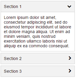
![alt tag](https://raw.githubusercontent.com/JeffHing/angular-cabinet-ui/master/readmeAssets/accordion.png)

* [Directive](https://github.com/JeffHing/angular-cabinet-ui/tree/master/src/directives/examples/accordion)
* [HTML](https://github.com/JeffHing/angular-cabinet-ui/tree/master/src/views/examples/accordion/view.html)

### Menus
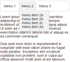
![alt tag](https://raw.githubusercontent.com/JeffHing/angular-cabinet-ui/master/readmeAssets/menus.png)

* [Directive](https://github.com/JeffHing/angular-cabinet-ui/tree/master/src/directives/examples/menus)
* [HTML](https://github.com/JeffHing/angular-cabinet-ui/tree/master/src/views/examples/menus/view.html)

### Sidebar
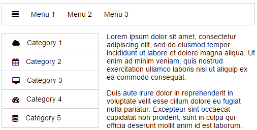
![alt tag](https://raw.githubusercontent.com/JeffHing/angular-cabinet-ui/master/readmeAssets/sidebar.png)

* [Directive](https://github.com/JeffHing/angular-cabinet-ui/tree/master/src/directives/examples/sidebar)
* [HTML](https://github.com/JeffHing/angular-cabinet-ui/tree/master/src/views/examples/sidebar/view.html)

### Tabs
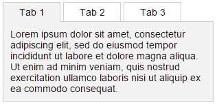
![alt tag](https://raw.githubusercontent.com/JeffHing/angular-cabinet-ui/master/readmeAssets/tabs.png)

* [Directive](https://github.com/JeffHing/angular-cabinet-ui/tree/master/src/directives/examples/tabs)
* [HTML](https://github.com/JeffHing/angular-cabinet-ui/tree/master/src/views/examples/tabs/view.html)

## Usage

### Factory Method

The `cabinetDirective()` factory method adds the AngularCabinetUI 
directives to an Angular module.

To add the directives, call `cabinetDirective()` with
the name of the Angular module, and the options:

```javascript
cabinetDirective('app', {
    openOnHover: <boolean>,
    oneAlwaysOpen: <boolean>,
    allowMultipleOpen: <boolean>,
    openStates: {
        <string>: <boolean>
    },
    directiveNames: {
        cabinet: <string>,
        drawerTrigger: <string>,
        drawerContents: <string>,
        drawerClass: <string>
    }
    directiveClasses: {
        cabinet: <string>,
        drawerTrigger: <string>,
        drawerContents: <string>
    }
});
```
#### Option Descriptions

Option            | Description                                       | Default
----------------- | ------------------------------------------------- | -------
openOnHover       | True to open the drawer when the mouse pointer hovers over the drawer trigger. | false
oneAlwaysOpen     | True to ensure one drawer is always open. By default, it opens the first drawer on startup. | false
allowMultipleOpen | True to allow multiple drawers to be open at the same time. | false
openStates        | Allows you to specify which drawers to initally open. The key of the object is the drawer id, and the value is true. | {}
directiveNames    | Allows you to rename the directives. The key of the object is the default directive name, and the value is the new directive name. | {}
directiveClasses  | Allows you to choose the CSS classes assigned to the directives. The key of the object is the default directive name, and the value is the CSS class name. | {}

### Cabinet Directive

The cabinet directive identifies the element as a cabinet which contains
one or more drawer directives. It is responsible for coordinating which
drawers should be opened or closed based upon the open states of the drawers
and the applied options. For applying CSS rules, it adds the 'cabinet' 
class to the element.

```html
<div cabinet>
    ...
    <a drawer-trigger href=""></a>
    <div drawer-contents></div>
    <div drawer-class></div>
    ...
</div>
```

The following options can be passed into the cabinet directive:

```html
<div cabinet="{
    openOnHover: <boolean>,
    oneAlwaysOpen: <boolean>,
    allowMultipleOpen: <boolean>,
    openStates: {
        <string>: <boolean>
    }
}">...</div>
```

The cabinet directive watches for changes in the options, which allows for the
options to be dynamically updated.

#### Option Descriptions

Option            | Description                                       | Default
----------------- | ------------------------------------------------- | -------
openOnHover       | True to open the drawer when the mouse pointer hovers over the drawer trigger. | false
oneAlwaysOpen     | True to ensure one drawer is always open. By default, it opens the first drawer on startup. | false
allowMultipleOpen | True to allow multiple drawers to be open at the same time. | false
openStates        | Allows you to specify which drawers to open or close.  The key of the object is the drawer id, and the value is a boolean indicating the open state of the drawer. | {}

These options will override the options passed into the `cabinetDirective()` 
factory method.

### Drawer Id

A drawer id can be assigned to the drawer directives described below. The drawer 
id can be any string or number. A number is automatically converted to a string.
Directives that are assigned the same drawer id, share and affect the open 
state of the same drawer.

### DrawerTrigger Directive

The drawerTrigger directive toggles the opening and closing of the
drawer. It adds mouse and focus handlers to the element
to know when the directive has been triggered. For applying CSS rules,
it adds a 'drawer-trigger' class to the element, and a
'drawer-trigger-open' class to the element when the drawer is opened.

The drawerTrigger directive is usually applied to an anchor or button element to 
ensure that keyboard navigation works properly, but it can be applied
to any element.

```html
<a drawer-trigger href=""></a>

```

To assign a drawer id to the directive:

```html
<a drawer-trigger="0" href=""></a>
```

If no drawer id is specified, it implictly indicates the start of a new drawer.

Multiple drawerTrigger directives can be assigned to the same drawer.

### DrawerContents Directive

The drawerContents directive contains the contents of the drawer.
For applying CSS rules, it adds a 'drawer-contents' class to the element,
and a 'drawer-contents-open' class to the element when the drawer 
is opened.

```html
<div drawer-contents></div>
```

To assign a drawer id to the directive:

```html
<div drawer-contents="0"></div>
```
If no drawer id is specified, the drawerContents directive assigns itself 
to the drawer of the preceding drawerTrigger directive.

Multiple drawerContents directives can be assigned to the same drawer.

#### Handler

To be notified when the contents of a drawer is shown or hidden, pass in a 
handler function to the drawerContents directive. The handler function will
be passed an open state of either 'open' or 'closed'. 

```html
<div drawer-contents="ctrl.myHandler">...</div>

```

You can prevent the drawer from  being closed by returning the value 
`false` from the handler function.

```javascript
angular.module('app', []).controller('MyController', function() {
    this.myHandler = function(state) {
        if (state === 'closed') {
            ...    
            // I'm not ready to be closed.
            return false;
        }
        ...
    }
});
```

If you need to specify both a drawer id and a handler function, 
use array notation:

```html
<div drawer-contents="[0, ctrl.myHandler]"></div>
```

### DrawerClass Directive

The drawerClass directive assigns a particular class to an element whenever
the open state of the drawer changes.

```html
<div drawer-class="['myOpenClass', 'myClosedClass']"></div>

```
An example of using the drawerClass directive is in the
[accordion](https://github.com/JeffHing/angular-cabinet-ui/tree/master/src/examples/accordionDirective).
It uses the drawerClass directive to change the Font Awesome chevron icon
to point right or down, depending upon the open state of the drawer:

```html
 <i class="fa" accordion-class="[
            'fa-chevron-down',
            'fa-chevron-right']"></i>
```

To assign a drawer id to the directive:

```html
<div drawer-class="[0, 'myOpenClass', 'myClosedClass']"></div>
```

If no drawer id is specified, the drawerClass directive assigns itself 
to the drawer of the preceding drawerTrigger directive.

Multiple drawerClass directives can be assigned to the same drawer.

---
_Source: https://npm.io/package/angular-cabinet-ui · Machine-readable twin of the npm.io package page. Health data is recomputed on every publish._
