# carousel-with-pagination-rn
> Custom carousel with pagination for React-Native
Latest version **1.1.8** (published 2023-03-02) · MIT license · 0 weekly downloads
## Install
```sh
npm install carousel-with-pagination-rn
pnpm add carousel-with-pagination-rn
yarn add carousel-with-pagination-rn
bun add carousel-with-pagination-rn
```
## Health
**Score 30/100 (F)** — status: abandoned.
Positive: has types; esm support; no vulnerabilities; high quality score.
Warnings: low downloads.
Negative: abandoned; low maintenance score.
## Facts
| | |
|---|---|
| Version | 1.1.8 |
| Published | 2023-03-02 |
| First published | 2023-02-08 |
| Weekly downloads | 0 |
| License | MIT |
| TypeScript types | bundled |
| Module format | ESM + CommonJS |
| Dependencies | 0 |
| Unpacked size | 81.5 KB |
| Known vulnerabilities | 0 |
| Install scripts | no |
| Author | veryrare104 |
| Maintainers | veryrare104 |
| Keywords | react-component, react-native, ios, android, swiper, custom-carousel, carousel |
## Links
- npm: https://www.npmjs.com/package/carousel-with-pagination-rn
- Homepage: https://github.com/dvijeniii05/carousel-with-pagination-rn/blob/main/README.md
- npm.io page: https://npm.io/package/carousel-with-pagination-rn
## Alternatives
- [adhdev](https://npm.io/package/adhdev.md) — 11.1K weekly downloads
- [react-slide-button](https://npm.io/package/react-slide-button.md) — 310 weekly downloads
- [better](https://npm.io/package/better.md) — 42 weekly downloads
- [react-native-swipe-image](https://npm.io/package/react-native-swipe-image.md) — 22 weekly downloads
- [nl.fokkezb.pulltorefresh](https://npm.io/package/nl.fokkezb.pulltorefresh.md) — 11 weekly downloads
## Recent versions
- 1.1.8 (latest) — 2023-03-02
- 1.1.7 — 2023-02-26
- 1.1.6 — 2023-02-23
- 1.1.5 — 2023-02-22
- 1.1.4 — 2023-02-15
- 1.1.3 — 2023-02-15
- 1.1.1 — 2023-02-10
- 1.1.0 — 2023-02-10
- 1.0.17 — 2023-02-10
- 1.0.16 — 2023-02-10
- 1.0.15 — 2023-02-10
- 1.0.14 — 2023-02-10
- 1.0.13 — 2023-02-10
- 1.0.12 — 2023-02-10
- 1.0.11 — 2023-02-10
- … 5 more at https://npm.io/package/carousel-with-pagination-rn/versions
## README
Carousel With Pagination RN



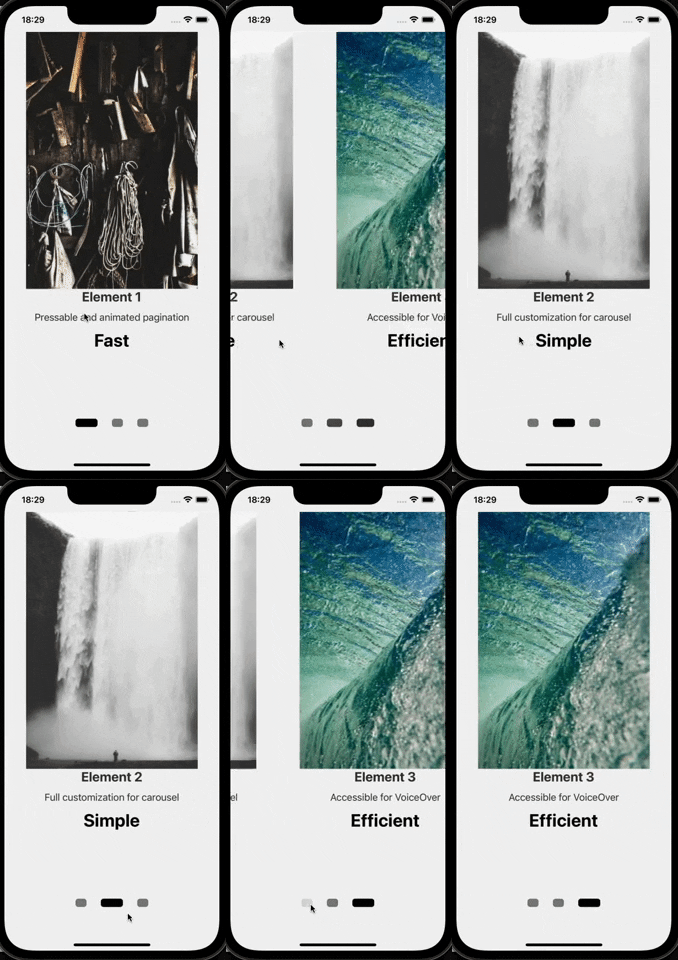
Performant and accessible Carousel component for React-Native that can be used with images or nested components. Built on top of the pure FlatList component with additional styling and added animations. The pagination indicators allow user to navigate to a specific element of the carousel with animated indicator transition. All elements within the carousel are accessible for the user using the VoiceOverText feature of their device (iOS and Android)
Nothing special, but might be useful 😶🌫️
## 🤳 Showcase:
## 🚀 Installation:
Install latest `carousel-with-pagination-rn` :
**yarn**:
```
yarn add carousel-with-pagination-rn
```
**npm**:
```
npm install carousel-with-pagination-rn
```
## 🎮 Usage:
**Import the default component:**
```javascript
import CustomCarousel from 'carousel-with-pagination-rn';
```
**Pass the required props `data` and `renderItem`:**
```javascript
const YourScreen = () => {
return(
}
/>
)
}
```
**Plug & Play example:**
```javascript
import CustomCarousel from 'carousel-with-pagination-rn';
const dummyData = [
{
id: 1,
img: 'https://picsum.photos/400/600?random=1',
title: 'Element 1',
description: 'Pressable and animated pagination',
price: 'Fast',
},
{
id: 2,
img: 'https://picsum.photos/400/600?random=2',
title: 'Element 2',
description: 'Full customization for carousel',
price: 'Simple',
},
{
id: 3,
img: 'https://picsum.photos/400/600?random=3',
title: 'Element 3',
description: 'Accessible for VoiceOver',
price: 'Efficient',
},
];
const {width} = Dimensions.get('screen');
const YourScreen = () => {
return (
{
return (
{item.title}
{item.description}
{item.price}
);
}}
/>
);
};
const styles = StyleSheet.create({
container: {
width,
height: 700,
alignItems: 'center',
},
image: {
flex: 0.8,
width: '100%',
},
content: {
flex: 0.4,
alignItems: 'center',
},
title: {
fontSize: 24,
fontWeight: 'bold',
color: '#333',
},
description: {
fontSize: 18,
marginVertical: 12,
color: '#333',
},
extraDesc: {
fontSize: 32,
fontWeight: 'bold',
},
});
export default YourScreen;
```
## 🥷 Properties:
| Prop | Description | Default | Type |
| -------------- | ----------- | ------- | ---- |
| **`data`** ❗Required | Used to pass in array of elements that should be rendere. The same as `data` prop in FlatList component | N/A | `Array` |
| **`renderItem`** ❗Required | Takes an item from data props and renders it as required. The same as `renderItem` prop in FlatList component | N/A | `ListRenderItem` |
| **`mainContainerStyle`** | Used to apply styling to the main container that wraps both: carousel and pagination | N/A | `StyleProp` |
| **`carouselContainerStyle`** | Equivalent to `style` prop in FlatList and has the same affect to the Carousel | N/A | `StyleProp` |
| **`carouselContentContainerStyle`** | Equivalent to `contentContainerStyle` prop in FlatList and has the same affect to the Carousel | N/A | `StyleProp` |
| **`paginationContainerStyle`** | Used to apply styling to the container that wraps the pagination | N/A | `StyleProp` |
| **`widthBoundaryForPagination`** | Is used to adjust inputRange of interpolated animations of pagination. Has to match to the `width` of `renderItem`. If not set, the device screen width will be used.| `Dimensions.get('window').width` | `number` |
| **`indicatorWidth`** | Is used to adjust dynamic width of each pagination indicator. Has to be an array of 3 numbers where the second element of array will be assigned to the height of the active indicator. Example: `indicatorWidth={[15,30,15]}`. If static width is required, pass an array of three equal numbers as: `[10,10,10]` | `[20,40,20]` | `Array` |
| **`indicatorHeight`** | Is used to adjust dynamic height of each pagination indicator. Has to be an array of 3 numbers where the second element of array will be assigned to the width of the active indicator. Example: `indicatorHeight={[15,30,15]}`. If static width is required, pass an array of three equal numbers as: `[10,10,10]` | `[15,15,15]` | `Array` |
| **`indicatorColor`** | Is used to adjust dynamic color of each pagination indicator. Has to be an array of 3 strings/colors where the second element of array will be assigned to color of the active indicator. Example: `indicatorColor={['grey', 'black', 'grey']}`. If static width is required, pass an array of three equal numbers as: `['grey', 'grey', 'grey']` | `['grey', 'black', 'grey']` | `Array` |
| **`inidicatorBorderRadius`** | Is used to adjust `borderRadius` of each pagination indicator | `5` | `number` |
| **`indicatorHorizontalPadding`** | Is used to adjust `horizontalPadding` of each pagination indicator | `10` | `number` |
| **`paginataionBackgroundColor`** | Is used to change `backgroundColor` of each pagination container | `transparent` | `string` |
| **`isEndReached`** | Will be called once the last element of the Carousel is displayed | `(endReached: boolean) => void` |
> ❗❗ It is important to pass a value to prop **`widthBoundaryForPagination`** if parent container within `renderItem` is not taking the full width of the screen. These values have to be the same.
## ⚙️ Methods attached to the Ref:
| Method | Description | Type |
| -------------- | ----------- | ---- |
| **`ref`** | Can be used to access two methods: `showNextItem()` & `showPreviousItem()`. These methods then can be used to access behavior of the carousel and define it manually i.e. move to the next item in the carousel or move to the previous one. The Example below should provide a bit more information on the use and the implementation of these methods. |`RefProps` |
**Explanation of use:**
This feature was added in `v1.1.5` following a feature request on the GitHub repository.
Now you can access the `ref` for CustomCarousel component, assign it as custom ref within your component using `useRef` and trigger two methods: `showNextItem()` AND `showPreviousItem()` to scroll trhough the Carousel using your custom component ( arrows as an example ).
**Showcase:**


Use of Ref methods with custom components that can be positioned anywhere.
**Example:**
```javascript
const CarouselScreen = () => {
let carouselRef = useRef(null); //RefProps interface can be imported from the library
const handleNextClick = () => {
carouselRef.current?.showNextItem(); //will scroll to the next item in carousel
};
const handlePreviousClick = () => {
carouselRef.current?.showPreviousItem(); //will scroll to the previous item in carousel
};
return (
Previous
Next
);
};
```
## 🪪 License & Sources:
* carousel-with-pagination-rn - MIT © [veryrare104](https://github.com/dvijeniii05)
* images used in **Plug & Play** example source - [Lorem Picsum](https://picsum.photos/)
* giphs created and sourced - [GIPHY](https://giphy.com/)
---
_Source: https://npm.io/package/carousel-with-pagination-rn · Machine-readable twin of the npm.io package page. Health data is recomputed on every publish._