# custom-bootstrap-card
> a responsive custom Bootstrap 4 card component with hover animation effects
Latest version **1.3.4** (published 2021-03-11) · ISC license · 0 weekly downloads
## Install
```sh
npm install custom-bootstrap-card
pnpm add custom-bootstrap-card
yarn add custom-bootstrap-card
bun add custom-bootstrap-card
```
## Health
**Score 15/100 (F)** — status: abandoned.
Positive: no vulnerabilities.
Warnings: low downloads; no types; no esm support; large bundle.
Negative: abandoned; low maintenance score.
## Facts
| | |
|---|---|
| Version | 1.3.4 |
| Published | 2021-03-11 |
| First published | 2021-02-03 |
| Weekly downloads | 0 |
| License | ISC |
| TypeScript types | none |
| Module format | CommonJS |
| Dependencies | 0 |
| Unpacked size | 28 MB |
| Known vulnerabilities | 0 |
| Install scripts | no |
| GitHub stars | 0 |
| Author | Terry Morse |
| Maintainers | terrymorse |
## Links
- npm: https://www.npmjs.com/package/custom-bootstrap-card
- Repository: https://github.com/terrymorse58/custom-bootstrap-card
- Homepage: https://github.com/terrymorse58/custom-bootstrap-card#readme
- Issues: https://github.com/terrymorse58/custom-bootstrap-card/issues
- npm.io page: https://npm.io/package/custom-bootstrap-card
## Recent versions
- 1.3.4 (latest) — 2021-03-11
- 1.3.3 — 2021-02-12
- 1.3.2 — 2021-02-12
- 1.3.0 — 2021-02-11
- 1.2.1 — 2021-02-11
- 1.2.0 — 2021-02-11
- 1.1.0 — 2021-02-09
- 1.0.2 — 2021-02-03
- 1.0.1 — 2021-02-03
## README
# custom-bootstrap-card
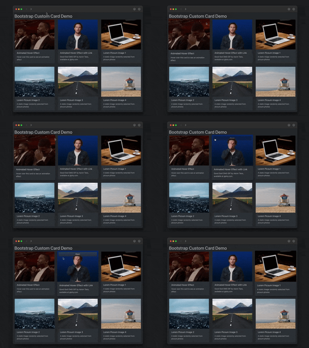
A responsive custom Bootstrap 4 card component with hover animation effects
---
## Features
* responds to window width and height
* responds to dark/light preference (optional)
* animates upon hover (zoom in with box shadow)
* animates upon touch on non-hover devices (iPhone, etc.)
* displays alternate image upon hover/touch (optional)
* displays Open link button upon hover/touch (optional)
## Usage
In HTML head:
```html
```
In HTML body:
```html
```
## Custom Styles
Override default styling by placing:
```html
```
in the document's `` section.
---
_Source: https://npm.io/package/custom-bootstrap-card · Machine-readable twin of the npm.io package page. Health data is recomputed on every publish._