# dp-data-table
> A simple and easy to customize data table with filter and sort functionalities. This component is build using React and can be directly used in static html as well.
Latest version **3.0.0** (published 2024-10-16) · MIT license · 0 weekly downloads
## Install
```sh
npm install dp-data-table
pnpm add dp-data-table
yarn add dp-data-table
bun add dp-data-table
```
## Health
**Score 15/100 (F)** — status: abandoned.
Positive: no vulnerabilities.
Warnings: low downloads; no types; no esm support.
Negative: abandoned; low maintenance score.
## Facts
| | |
|---|---|
| Version | 3.0.0 |
| Published | 2024-10-16 |
| First published | 2017-04-07 |
| Weekly downloads | 0 |
| License | MIT |
| TypeScript types | none |
| Module format | CommonJS |
| Dependencies | 3 |
| Unpacked size | 324.6 KB |
| Known vulnerabilities | 0 |
| Install scripts | no |
| GitHub stars | 1 |
| Author | daniepaul@gmail.com |
| Maintainers | daniepaul |
| Keywords | react-component, sortable table, data table, sortable data table, filterable data table, filterable table, filterable grid, easy data table, simple data table, dp-data-table |
## Links
- npm: https://www.npmjs.com/package/dp-data-table
- Repository: https://github.com/daniepaul/dp-data-table
- Homepage: https://github.com/daniepaul/dp-data-table#readme
- Issues: https://github.com/daniepaul/dp-data-table/issues
- npm.io page: https://npm.io/package/dp-data-table
## Dependencies (3)
- [lodash](https://npm.io/package/lodash.md) ^4.17.21
- [classnames](https://npm.io/package/classnames.md) ^2.5.1
- [prop-types](https://npm.io/package/prop-types.md) ^15.8.1
## Alternatives
- [@lexical/table](https://npm.io/package/@lexical/table.md) — 3.0M weekly downloads
- [mantine-datatable](https://npm.io/package/mantine-datatable.md) — 98.2K weekly downloads
- [react-native-collapsible-tab-view](https://npm.io/package/react-native-collapsible-tab-view.md) — 70.6K weekly downloads
- [@handsontable/vue3](https://npm.io/package/@handsontable/vue3.md) — 16.1K weekly downloads
- [vuewordcloud](https://npm.io/package/vuewordcloud.md) — 7.2K weekly downloads
## Recent versions
- 3.0.0 (latest) — 2024-10-16
- 2.0.0 — 2022-11-27
- 1.1.1 — 2017-09-04
- 1.1.0 — 2017-09-04
- 1.0.6 — 2017-05-02
- 1.0.5 — 2017-04-13
- 1.0.4 — 2017-04-09
- 1.0.3 — 2017-04-09
- 1.0.2 — 2017-04-07
- 1.0.1 — 2017-04-07
- 1.0.0 — 2017-04-07
## README
# dp-data-table
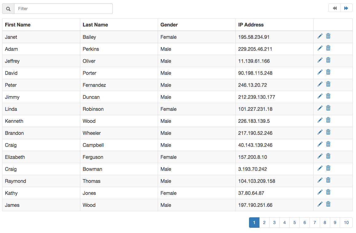
dp Data Table is a simple ready to integrate component made in React using bootstrap styling.
#### Screenshot
### [Demo Link](https://daniepaul.github.io/dp-data-table/)
## Integration
Here is a sample integration:
```js
```
React Integration:
```js
import React from 'react';
import DpDataTable from 'dp-data-table';
......
```
To have proper styling, include bootstrap.
## Options
The options are passed in as props when used as a React component.
Option | Type | Description
----------|------------|------------
items | array | Collection of items to bind to the grid
headers | array | array of keys and their matching Header names.```[{'first_name' : 'First Name'}]```
hidePagination | boolean | Boolean to hide the pagination values. Setting this to ```true``` will show all items in same page.
itemsPerPage | number | No of items per page. Default is 15.
isLoading | boolean | Boolean to show the loading icon over the grid.
iconClasses | object | An object with all the class names for the font icons used in the project. ```{LOADING: 'glyphicon glyphicon-refresh'}```. Available options to override: LOADING, EDIT, DELETE, PAGE_PREV, PAGE_NEXT, FILTER, SORT_NONE, SORT_ASC, SORT_DESC
showFilter | boolean | Boolean to show the filter input
filterableFields | array | Array of item property keys that can be made filterable. If not provided, all columns are filterable.
onFiltering | function | Override function for filter. ```onFiltering({items, filterString})```
showSort | boolean | Boolean to show column sort
sortableFields | array | Array of column keys which can be sorted.
showContextColor | boolean | Boolean to add context css to table row. Setting this to ```true``` will apply the ```__dp__contextCss``` property of item, to the row.
onSorting | function | Override function to sort```onDeleting({items, sortKey, sortOrder})```
onEditing | function | Event handler for editing a row. The edit icon is enabled only when a function is supplied to this option.```onEditing({item, index})```
onDeleting | function | Event handler for deleting a row. The delete icon is enabled only when a function is supplied to this option.```onDeleting({item, index})```
onView | function | Event handler for viewing details of a row. The view icon is enabled only when a function is supplied to this option.```onView({item, index})```
onItemsChange | function | Event handler to get all changes that happen within the component. ```onItemChange(e)```
## Development
* Development server `npm start`.
* Continuously run tests on file changes `npm run watch-test`;
* Run tests: `npm test`;
* Build `npm run build`;
---
_Source: https://npm.io/package/dp-data-table · Machine-readable twin of the npm.io package page. Health data is recomputed on every publish._