# ds-rc
> ### Install ``` npm i -S ds-rc ```
Latest version **3.0.6** (published 2019-11-27) · ISC license · 0 weekly downloads
## Install
```sh
npm install ds-rc
pnpm add ds-rc
yarn add ds-rc
bun add ds-rc
```
## Health
**Score 15/100 (F)** — status: abandoned.
Positive: no vulnerabilities.
Warnings: low downloads; no types; no esm support.
Negative: abandoned; low maintenance score.
## Facts
| | |
|---|---|
| Version | 3.0.6 |
| Published | 2019-11-27 |
| First published | 2017-03-21 |
| Weekly downloads | 0 |
| License | ISC |
| TypeScript types | none |
| Module format | CommonJS |
| Dependencies | 3 |
| Unpacked size | 144.6 KB |
| Known vulnerabilities | 0 |
| Install scripts | no |
| GitHub stars | 0 |
| Author | dsaco |
| Maintainers | ds-aco |
| Keywords | react, ui-kit, react-compontents, css |
## Links
- npm: https://www.npmjs.com/package/ds-rc
- Repository: https://github.com/dsaco/react-components
- Homepage: https://github.com/dsaco/react-components#readme
- Issues: https://github.com/dsaco/react-components/issues
- npm.io page: https://npm.io/package/ds-rc
## Dependencies (3)
- [react](https://npm.io/package/react.md) ^16.8.6
- [react-dom](https://npm.io/package/react-dom.md) ^16.8.6
- [react-spring](https://npm.io/package/react-spring.md) ^8.0.19
## Alternatives
- [@sveltejs/kit](https://npm.io/package/@sveltejs/kit.md) — 2.2M weekly downloads
- [@atlaskit/theme](https://npm.io/package/@atlaskit/theme.md) — 402.0K weekly downloads
- [@tangle-network/brand](https://npm.io/package/@tangle-network/brand.md) — 10.0K weekly downloads
- [seneca](https://npm.io/package/seneca.md) — 7.4K weekly downloads
- [@bsb/base](https://npm.io/package/@bsb/base.md) — 7.2K weekly downloads
## Recent versions
- 3.0.6 (latest) — 2019-11-27
- 3.0.5 — 2019-11-24
- 3.0.4 — 2019-11-24
- 3.0.3 — 2019-11-24
- 3.0.2 — 2019-11-16
- 3.0.1 — 2019-11-16
- 3.0.0 — 2019-11-16
- 2.0.5 — 2019-06-02
- 2.0.4 — 2019-05-16
- 2.0.3 — 2019-05-02
- 2.0.2 — 2019-04-30
- 2.0.1 — 2019-04-30
- 2.0.0 — 2019-04-30
- 1.3.17 — 2018-11-29
- 1.3.16 — 2018-11-28
- … 29 more at https://npm.io/package/ds-rc/versions
## README
# ds-rc
### Install
```
npm i -S ds-rc
```
- [x] [Message](#Message)
- [x] [Button](#Button)
- [x] [Img](#Img)
- [x] [Progress](#Progress)
- [x] [Modal](#)
- [x] [Ripple](#)
- [x] [Switch](#)
- [x] [Pagination](#Pagination)
- [ ] Select
- [ ] Input
- [ ] tagsInput
- [ ] Autocomplete
- [ ] Upload
- [ ] Tooltip
- [ ] 代码规范化eslint
- [ ] 代码优化
- [ ] 适配移动端
> 想从react-spring改为react-motion,但是不太合适,暂时放弃了
> 有任何问题请提issue
> 如果想全部引入,或者不需要按需加载,可以如下
```
import { Img, Button, Message, Progress } from 'ds-rc';
import 'ds-rc/lib/style.css';
```
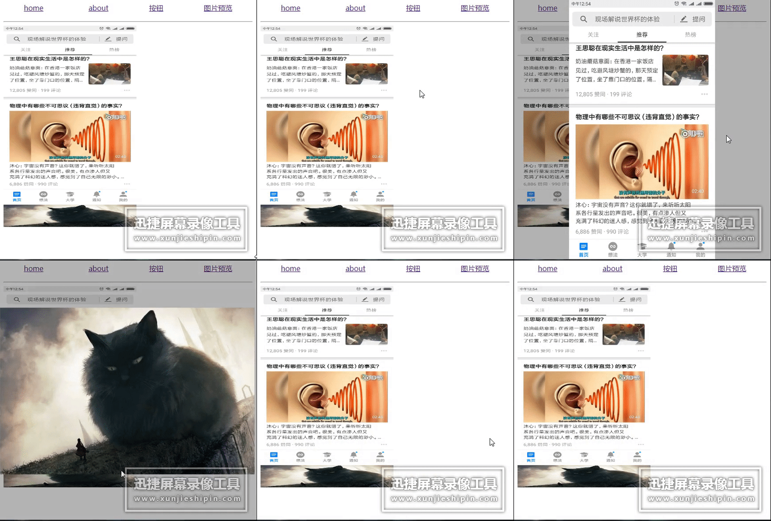
### Img
[codesandbox](https://codesandbox.io/s/ojxq05ywx9)
类似知乎网页端的图片查看效果,仅添加了一个点击事件,其他和普通img标签没有区别
```
import Img from 'ds-rc/lib/Img';
import 'ds-rc/lib/Img/style.css';
 ```
### Button
[codesandbox](https://codesandbox.io/s/qv08q61939)
仿material-ui 水涟漪效果按钮
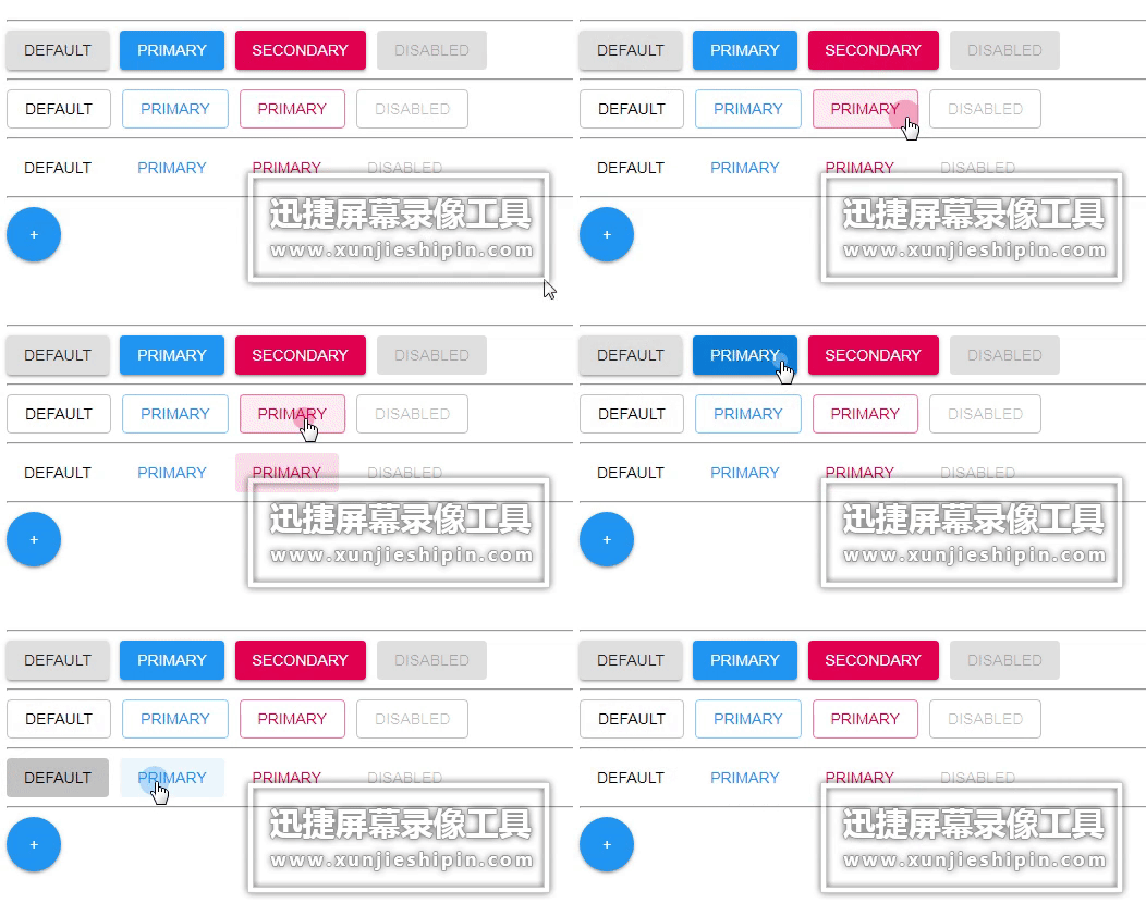
```
# color: ['primary', 'secondary', ''] default is ''
# variant: ['outline', 'text', 'default'] default is default
# disabled: Boolean default is false
import Message from 'ds-rc/lib/Button';
import 'ds-rc/lib/Button/style.css';
```
### Message (API)
[codesandbox](https://codesandbox.io/s/l935lryr2m)
仿ant-design message
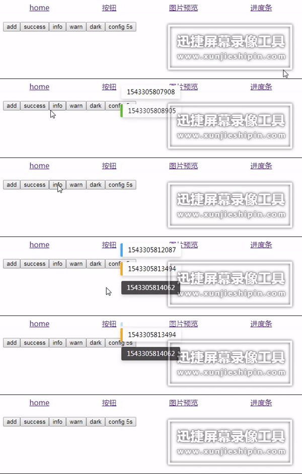
```
import Message from 'ds-rc/lib/Message';
import 'ds-rc/lib/Message/style.css';
Message.dark('dark');
Message.open('what');
Message.info('is');
Message.warn('your');
Message.error('name');
Message.success('?');
Message.error('errormsg', {duration: 5});
// default duration 2s;
Message.config({
duration: 3
})
```
### Progress (API)
仿nprogress

```
import Progress from 'ds-rc/lib/Progress';
import 'ds-rc/lib/Progress/style.css';
Progress.start();
Progress.done();
```
### Pagination
仿ant-design pagination

| propName | desc | default |
|:---:|:---:|:---:|
|total|总条数|required(必填)|
|defaultCurrent|默认索引|1|
|pageSize|每一页条数|15|
|onChange|回调函数|noop|
```
import Pagination from 'ds-rc/lib/Pagination';
import 'ds-rc/lib/Pagination/style.css';
console.log(current)} total={200} />
```
---
_Source: https://npm.io/package/ds-rc · Machine-readable twin of the npm.io package page. Health data is recomputed on every publish._
```
### Button
[codesandbox](https://codesandbox.io/s/qv08q61939)
仿material-ui 水涟漪效果按钮

```
# color: ['primary', 'secondary', ''] default is ''
# variant: ['outline', 'text', 'default'] default is default
# disabled: Boolean default is false
import Message from 'ds-rc/lib/Button';
import 'ds-rc/lib/Button/style.css';
```
### Message (API)
[codesandbox](https://codesandbox.io/s/l935lryr2m)
仿ant-design message

```
import Message from 'ds-rc/lib/Message';
import 'ds-rc/lib/Message/style.css';
Message.dark('dark');
Message.open('what');
Message.info('is');
Message.warn('your');
Message.error('name');
Message.success('?');
Message.error('errormsg', {duration: 5});
// default duration 2s;
Message.config({
duration: 3
})
```
### Progress (API)
仿nprogress

```
import Progress from 'ds-rc/lib/Progress';
import 'ds-rc/lib/Progress/style.css';
Progress.start();
Progress.done();
```
### Pagination
仿ant-design pagination

| propName | desc | default |
|:---:|:---:|:---:|
|total|总条数|required(必填)|
|defaultCurrent|默认索引|1|
|pageSize|每一页条数|15|
|onChange|回调函数|noop|
```
import Pagination from 'ds-rc/lib/Pagination';
import 'ds-rc/lib/Pagination/style.css';
console.log(current)} total={200} />
```
---
_Source: https://npm.io/package/ds-rc · Machine-readable twin of the npm.io package page. Health data is recomputed on every publish._