# expandable-node
> A library for creating a tree like node structure.
Latest version **1.1.5** (published 2021-11-21) · MIT license · 0 weekly downloads
> **Deprecated.** This package is deprecated.
## Install
```sh
npm install expandable-node
pnpm add expandable-node
yarn add expandable-node
bun add expandable-node
```
## Health
**Score 10/100 (F)** — status: deprecated.
Negative: deprecated.
## Facts
| | |
|---|---|
| Version | 1.1.5 |
| Published | 2021-11-21 |
| First published | 2019-08-07 |
| Weekly downloads | 0 |
| License | MIT |
| TypeScript types | bundled |
| Module format | ESM + CommonJS |
| Node | >=8.9 |
| Dependencies | 0 |
| Unpacked size | 202.5 KB |
| Known vulnerabilities | 0 |
| Install scripts | no |
| GitHub stars | 0 |
| Maintainers | mkolodiy |
| Keywords | typescript, expandable, node |
## Links
- npm: https://www.npmjs.com/package/expandable-node
- Repository: https://github.com/mkolodiy/expandable-node
- Homepage: https://github.com/mkolodiy/expandable-node#readme
- Issues: https://github.com/mkolodiy/expandable-node/issues
- npm.io page: https://npm.io/package/expandable-node
## Alternatives
- [@openai/codex-sdk](https://npm.io/package/@openai/codex-sdk.md) — 731.4K weekly downloads
- [babel-plugin-transform-react-jsx](https://npm.io/package/babel-plugin-transform-react-jsx.md) — 565.0K weekly downloads
- [babel-helper-remove-or-void](https://npm.io/package/babel-helper-remove-or-void.md) — 508.5K weekly downloads
- [@pnpm/store-controller-types](https://npm.io/package/@pnpm/store-controller-types.md) — 186.9K weekly downloads
- [react-native-signature-canvas](https://npm.io/package/react-native-signature-canvas.md) — 155.6K weekly downloads
## Recent versions
- 1.1.5 (latest) — 2021-11-21
- 1.1.4 — 2021-04-10
- 1.1.3 — 2021-01-03
- 1.1.2 — 2020-09-20
- 1.1.1 — 2020-08-15
- 1.1.0 — 2019-12-14
- 1.0.1 — 2019-08-07
## README
# expandable-node
A library for creating a tree like node structure.
```
npm i expandable-node
```
## Usage
* Include provided CSS styles
* Use JS API to create a new node
API documentation: https://mkolodiy.github.io/expandable-node/
### Options
Object containing values needed for creating a new node.
| Name | Optional | Description |
| --------- | :------: | -------------------------------------------------------------------------------- |
| container | ❎ | Defines id or class of a HTML element which should be used to create a new node. |
| callbacks | ✅ | Defines an object containing callbacks for all buttons defined for a node. |
| types | ✅ | Defines an array of types that can be used for a node. |
| nodes | ❎ | Defines an array of nodes. |
### Callbacks
| Name | Optional | Description |
| ----------- | :------: | -------------------------------------------------------- |
| deleteBtnCb | ✅ | Defines a callback function for the delete button. |
| editBtnCb | ✅ | Defines a callback function for the edit button. |
| expandBtnCb | ✅ | Defines a callback function for the expand button. |
| selectCb | ✅ | Defines a callback function for the selection of a node. |
### Types
Array containing type objects that might be used in a node.
| Name | Optional | Description |
| -------- | :------: | ----------------------------------------------------------------- |
| type | ❎ | Defines the name of the type. |
| cssClass | ❎ | Defines a css class that should be appended to a expendable node. |
### Nodes
Array containing node objects that should be displayed in the provided container.
| Name | Optional | Description |
| ------------- | :------: | ---------------------------------------------------------- |
| id | ❎ | Defines a unique id of a node. |
| description | ❎ | Defines a description of a node. |
| enableEditBtn | ✅ | Defines if the edit button should be shown for a node. |
| type | ✅ | Defines the name of the type. |
| childNodes | ✅ | Defines an array of child nodes that a node might contain. |
## Basic configuration
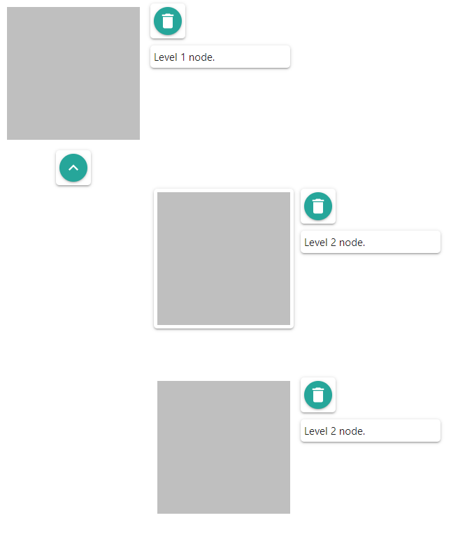
Following code snippet shows a simple configuration:
```javascript
import { ExpNode } from 'expandable-node';
const options = {
container: 'container',
nodes: [
{
id: 'node01',
description: 'Level 1 node.',
childNodes: [
{
id: 'node01-childNode01',
description: 'Level 2 node.'
},
{
id: 'node01-childNode02',
description: 'Level 2 node.'
}
]
}
]
};
ExpNode.create(options);
```
Using the configuration above you will get the following output:
## Full configuration
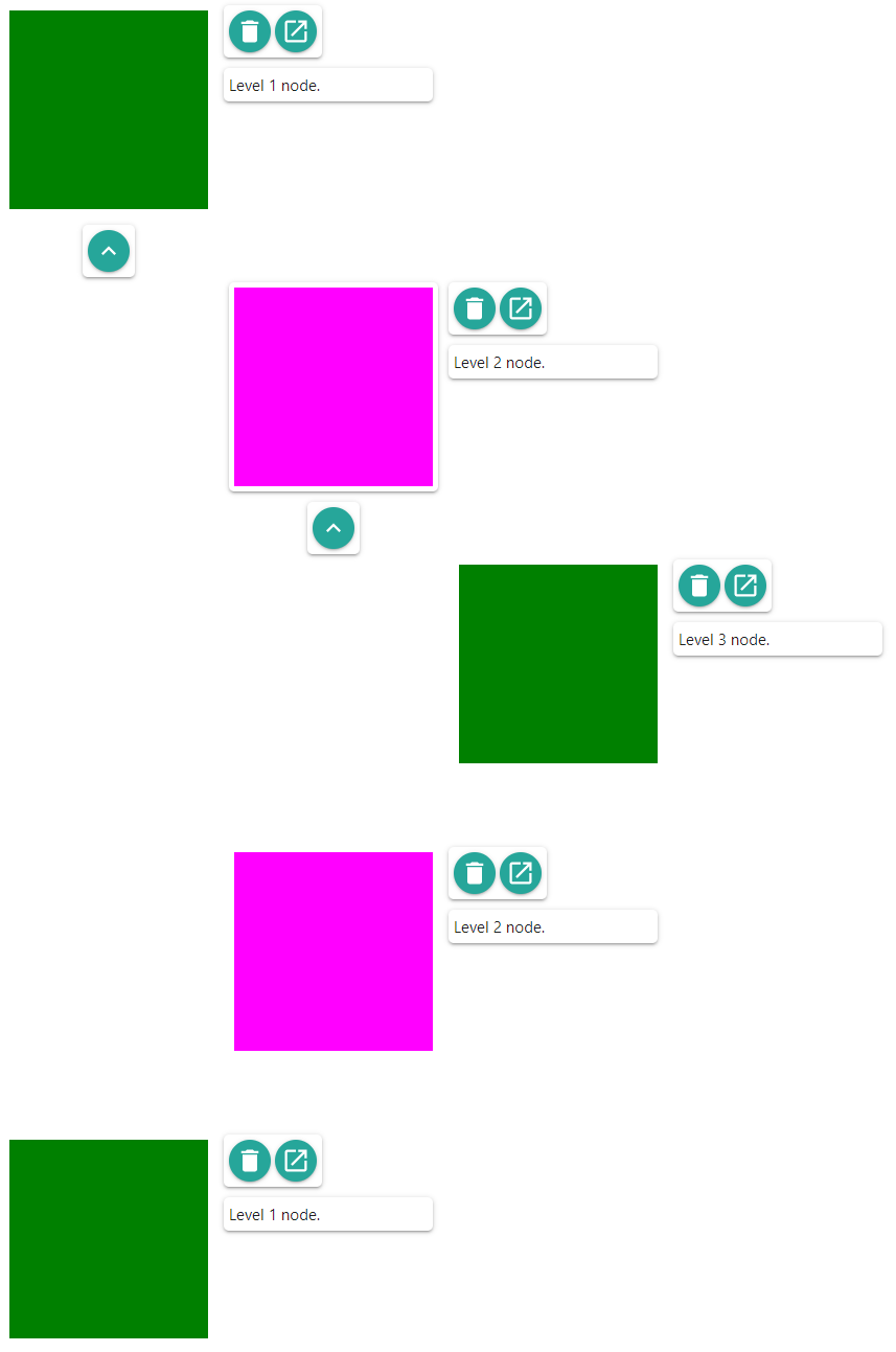
Following code snippets shows a full configuration:
```scss
.green-node {
background-image: none;
background-color: green;
}
.magenta-node {
background-image: none;
background-color: magenta;
}
```
```javascript
import { ExpNode } from 'expandable-node';
const editBtnCb = function(node) {
console.log('editBtnCb');
console.log(node);
};
const deleteBtnCb = function(node) {
console.log('deleteBtnCb');
console.log(node);
};
const expandBtnCb = function(node) {
console.log('expandBtnCb');
console.log(node);
};
const selectCb = function(node) {
console.log('selectCb');
console.log(node);
};
const options = {
container: 'container',
callbacks: {
editBtnCb: editBtnCb,
deleteBtnCb: deleteBtnCb,
expandBtnCb: expandBtnCb,
selectCb: selectCb
},
types: [
{
type: 'greenNode',
cssClass: 'green-node'
},
{
type: 'magentaNode',
cssClass: 'magenta-node'
}
],
nodes: [
{
id: 'node01',
description: 'Level 1 node.',
enableEditBtn: true,
type: 'greenNode',
childNodes: [
{
id: 'node01-childNode01',
description: 'Level 2 node.',
enableEditBtn: true,
type: 'magentaNode',
childNodes: [
{
id: 'node01-childNode01-childNode01',
description: 'Level 3 node.',
enableEditBtn: true,
type: 'greenNode'
}
]
},
{
id: 'node01-childNode02',
description: 'Level 2 node.',
enableEditBtn: true,
type: 'magentaNode'
}
]
},
{
id: 'node02',
description: 'Level 1 node.',
enableEditBtn: true,
type: 'greenNode'
}
]
};
ExpNode.create(options);
```
Using the configuration above you will get the following output:
## Technology used to build this library
- TypeScript Starter ([License](https://github.com/bitjson/typescript-starter/blob/master/LICENSE))
- Material design icons ([License](https://github.com/google/material-design-icons/blob/master/LICENSE))
## License
Released under MIT license.
---
_Source: https://npm.io/package/expandable-node · Machine-readable twin of the npm.io package page. Health data is recomputed on every publish._