# general-basic-form
Latest version **3.0.3** (published 2026-03-09) · ISC license · 0 weekly downloads
## Install
```sh
npm install general-basic-form
pnpm add general-basic-form
yarn add general-basic-form
bun add general-basic-form
```
## Health
**Score 55/100 (C)** — status: stable.
Positive: has types; esm support; no vulnerabilities.
Warnings: low downloads.
## Facts
| | |
|---|---|
| Version | 3.0.3 |
| Published | 2026-03-09 |
| First published | 2021-08-20 |
| Weekly downloads | 0 |
| License | ISC |
| TypeScript types | bundled |
| Module format | ESM + CommonJS |
| Dependencies | 36 |
| Unpacked size | 2.2 MB |
| Known vulnerabilities | 0 |
| Install scripts | no |
| GitHub stars | 0 |
| Author | chendeli419287484@qq.com |
| Maintainers | alan1034 |
| Keywords | general-basic-form, form, vue, vue2, vue3, element-plus, element-ui, react, Ant Design Vue |
## Links
- npm: https://www.npmjs.com/package/general-basic-form
- Repository: https://github.com/Alan1034/GeneralBasicForm
- Homepage: https://github.com/Alan1034/GeneralBasicForm#readme
- Issues: https://github.com/Alan1034/GeneralBasicForm/issues
- npm.io page: https://npm.io/package/general-basic-form
## Dependencies (36)
- [zod](https://npm.io/package/zod.md) ^4.3.6
- [antd](https://npm.io/package/antd.md) ^6.3.1
- [clsx](https://npm.io/package/clsx.md) ^2.1.1
- [cmdk](https://npm.io/package/cmdk.md) ^1.1.1
- [vaul](https://npm.io/package/vaul.md) ^1.1.2
- [sonner](https://npm.io/package/sonner.md) ^2.0.7
- [rc-tree](https://npm.io/package/rc-tree.md) ^5.13.1
- [date-fns](https://npm.io/package/date-fns.md) ^4.1.0
- [radix-ui](https://npm.io/package/radix-ui.md) ^1.4.3
- [recharts](https://npm.io/package/recharts.md) 2.15.4
- [input-otp](https://npm.io/package/input-otp.md) ^1.4.2
- [next-themes](https://npm.io/package/next-themes.md) ^0.4.6
- [tailwindcss](https://npm.io/package/tailwindcss.md) ^4.2.1
- [lucide-react](https://npm.io/package/lucide-react.md) ^0.576.0
- [@base-ui/react](https://npm.io/package/@base-ui/react.md) ^1.2.0
- [tailwind-merge](https://npm.io/package/tailwind-merge.md) ^3.5.0
- [network-spanner](https://npm.io/package/network-spanner.md) 1.2.26
- [react-hook-form](https://npm.io/package/react-hook-form.md) ^7.71.2
- [react-day-picker](https://npm.io/package/react-day-picker.md) ^9.14.0
- [@tailwindcss/vite](https://npm.io/package/@tailwindcss/vite.md) ^4.2.1
- [@hookform/resolvers](https://npm.io/package/@hookform/resolvers.md) ^5.2.2
- [@radix-ui/react-slot](https://npm.io/package/@radix-ui/react-slot.md) ^1.2.4
- [@radix-ui/react-tabs](https://npm.io/package/@radix-ui/react-tabs.md) ^1.1.13
- [embla-carousel-react](https://npm.io/package/embla-carousel-react.md) ^8.6.0
- [@radix-ui/react-label](https://npm.io/package/@radix-ui/react-label.md) ^2.1.8
- [general-basic-indexdb](https://npm.io/package/general-basic-indexdb.md) ^1.0.5
- [@radix-ui/react-dialog](https://npm.io/package/@radix-ui/react-dialog.md) ^1.1.15
- [@radix-ui/react-select](https://npm.io/package/@radix-ui/react-select.md) ^2.2.6
- [@radix-ui/react-switch](https://npm.io/package/@radix-ui/react-switch.md) ^1.2.6
- [react-resizable-panels](https://npm.io/package/react-resizable-panels.md) ^4.7.0
- [@element-plus/icons-vue](https://npm.io/package/@element-plus/icons-vue.md) ^2.3.2
- [@radix-ui/react-popover](https://npm.io/package/@radix-ui/react-popover.md) ^1.1.15
- [@radix-ui/react-checkbox](https://npm.io/package/@radix-ui/react-checkbox.md) ^1.3.3
- [class-variance-authority](https://npm.io/package/class-variance-authority.md) ^0.7.1
- [@radix-ui/react-separator](https://npm.io/package/@radix-ui/react-separator.md) ^1.1.8
- [@custom-react-hooks/use-media-query](https://npm.io/package/@custom-react-hooks/use-media-query.md) ^1.5.1
## Alternatives
- [mobx-react](https://npm.io/package/mobx-react.md) — 2.8M weekly downloads
- [rc-tree](https://npm.io/package/rc-tree.md) — 2.6M weekly downloads
- [@react-oauth/google](https://npm.io/package/@react-oauth/google.md) — 1.3M weekly downloads
- [@wagmi/connectors](https://npm.io/package/@wagmi/connectors.md) — 877.0K weekly downloads
- [vee-validate](https://npm.io/package/vee-validate.md) — 836.4K weekly downloads
## Recent versions
- 3.0.3 (latest) — 2026-03-09
- 2.4.4 (v2-latest) — 2026-01-26
- 3.0.2 — 2026-02-06
- 3.0.1 — 2026-02-06
- 3.0.0 — 2026-01-26
- 2.4.3 — 2026-01-20
- 2.4.2 — 2026-01-20
- 2.4.1 — 2026-01-13
- 2.4.0 — 2026-01-08
- 2.3.3 — 2025-12-24
- 2.3.2 — 2025-12-22
- 2.3.0 — 2025-12-11
- 2.2.6 — 2025-11-29
- 2.2.5 — 2025-11-28
- 2.2.4 — 2025-11-26
- … 138 more at https://npm.io/package/general-basic-form/versions
## README
# GeneralBasicForm
## 一个兼容 Vue2 、Vue3 和 React(未来实现) 的表单组件,支持 typescript,vue2 请使用@1 版本,Vue3 请使用@2 版本,React19 请使用@3 版本。
| 组件\兼容性 | vue2 | vue3 | Ant Design Vue(next) | Element Plus | Element(ui) | React19 | shadcn/ui |
| ------------------------- | ---- | ---- | ---------------------- | ------------ | ------------- | ------- | --------- |
| VGeneralBasicForm | √ | √ | | √ | √ | | |
| VSearchBox | √ | | | | √ | | |
| VInfiniteScrollList | | √ | | √ | | | |
| VDescriptions | √ | √ | √ | √ | √ | | |
| VInputMobilecVerification | | √ | √ | √ | | | |
| VInputGraphicVerification | | √ | √ | √ | | | |
| VTreeTransfer | √ | √ | | √ | √ | | |
| VTabs | √ | | | | √ | | |
| RGeneralBasicForm | | | | | | √ | √ |
| RFormList | | | | | | √ | √ |
| RBaseTabs | | | | | | √ | √ |
| RBaseCombobox | | | | | | √ | √ |
安装:npm i general-basic-form
install: npm i general-basic-form
webpack4 兼容:
加入配置:module.exports = {
transpileDependencies: ['general-basic-form'],
}
示例:
因为兼容性问题,目前只能使用完整引入
```
import { RGeneralBasicForm,RBasicForm } from 'general-basic-form';
```
```
```

在单纯作为表单的时候可以这样使用:
const RGeneralBasicFormRef = useRef(null);
//自定义组件
getList 会传出默认的参数,首次请求时会有页数和分页大小,重置后会传出默认页数 1
async getList(
params = {
page: Number(this.$route.query.page) || 1,
limit: Number(this.$route.query.limit) || 10,
}
) {}
表单数据校验需要拿到内部表单的 ref
RGeneralBasicFormRef.current.formAction(); // 触发表单校验和getList
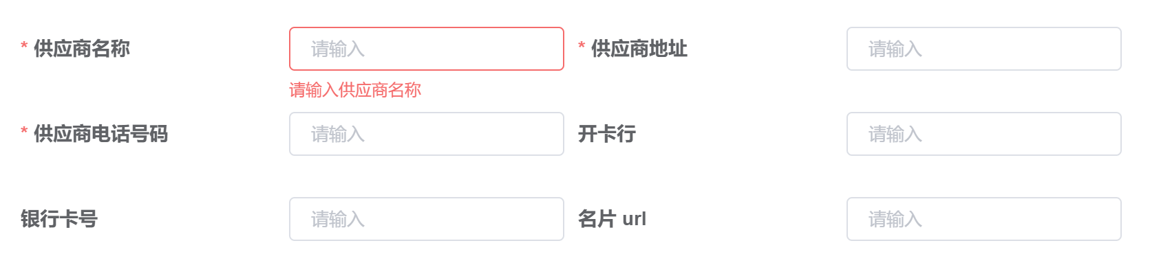
parametersType 类型介绍
| parametersType 形式 | 支持页面刷新 | 参数改变引起路由跳转 | 组件间共享数据 | 存储上限 | 浏览器兼容性 |
| ------------------- | ------------ | -------------------- | -------------- | -------- | ------------ |
| url | 是 | 是 | 是 | 中 | 高 |
| data | 否 | 否 | 否 | 高 | 高 |
| indexDB | 是 | 否 | 是 | 高 | 中 |
数据示例:
formOnly:true // 只展示表单不展示按钮
getList(queryParams); // 请求数据的函数
afterReset(queryParams); // 在重置按钮点击完后但还没重新请求时触发的的函数
formOnly:true // 只展示表单不展示按钮
parametersType:"url" // 见parametersType类型介绍
DBPrimaryKey: user_id // indexDB主键,配合indexDB使用
loading:false // 加载动画
formData:{} // 表单数据不完整
noInputBlank: true //校验input框不能仅输入空格
//例子:formData.value.x=y ✘ | formData.value={...formData.value,x:y} ✔
currentPageKey:"page", //当前页数key
pageSizeKey:"limit", //每页显示个数key
defCurrentPage:1, //默认的页数
defPageSize:10, //默认的每页显示个数
queryWhenReady:false,//初始化完成后自动触发查找数据函数
footFieldSetting: {} // 表单底部按钮设置
fieldGroupSetting: {} // 表单分组设置
fieldLabelSetting: {} // 表单字段label设置
onFormChange(queryParams):表单数据变化时触发的函数
formItem: [
{
label: "普通输入框",
prop: "bsName",
type: "input",
legend: '这是一个可选的标题',
setting: {
placeholder: '请输入手机验证码',
// style: 'width: 100%',
required: true,
// type: 'number',
// min: 1,
// max: 100,
},
fieldSetting: {
className: fieldClassName,
},
rules: [
{
message: "请输入信息",
required: true,
},
{
pattern: /^\w+[\,\,\-\w' '#]+$/,
message: "请输入正确的Invoice单号"
},
{
validator: (rule, value, callback) => {
callback();
},
},
],
separator: true, //分割线
},
{
label: "文本区域",
prop: "Textarea",
type: "textarea",
setting: {
placeholder: '请输入文本区域',
},
fieldSetting: {
className: fieldClassName,
}
},
{
label: "复杂输入框",
prop: "input-group",
type: "input-group",
setting: {
placeholder: '请输入手机验证码',
// style: 'width: 100%',
addons: [
{
text: '前缀,一般和type: input 配合使用',
align: "inline-start",
render: (props) => {
return (
{props}
);
},
},
{
text: '后缀,一般和type: input 配合使用',
align: "inline-end"
},
// {
// text: '底部盒子,一般和type: 'textarea'配合使用',
// align: "block-end"
// },
],
// type: 'textarea',//input|textarea
},
fieldSetting: {
className: fieldClassName,
},
},
{
label: '',
prop: 'description',
type: 'description',
fieldSetting: {
className: fieldClassName,
},
description: [
'AAAAAAAAAAAAAAAAAAAAAAAAAAAAAA',
'段落2',
'XXXXXXXXXXXXXXXXXXXXXXXXXXXXXXXXX',
],
},
{
label: '多维数组',
prop: 'prices',
type: 'form-list',
description: [
'段落1',
'段落2',
],
separator: "text", //文字分割线
setting: {
heading: true, //是否显示标题
dim: 5, // 多维数组,注意要和columns的长度相等,输出为对象数组
itemWidth: 'mean',//itemWidth: 'auto' | 'mean' 自动宽度(满行) | 平均分配宽度
onChange: (value) => {
console.log(value);
setDetail({ ...detail, prices: value })
},
columns: [
{
prop: 'id',
label: '套餐ID',
type: 'input',
setting: {
placeholder: '请输入套餐ID',
disabled: true,
className: 'hidden',
},
},
{
prop: 'days',
label: '套餐名称',
type: 'input',
setting: {
required: true,
placeholder: '请输入套餐名称',
type: 'number'
},
},
{
prop: 'serviceType',
label: '服务类型',
type: 'select',
options: [
{ label: '到家服务', value: 'home_service' },
{ label: '医院陪护', value: 'hospital_care' },
],
setting: {
placeholder: '请选择服务类型',
required: true,
className: 'w-full',
},
},
{
label: '组合分类',
prop: 'expense_category_id',
type: 'combobox',
setting: {
placeholder: '请输入分类',
},
options: [
{
label: '指南',
value: '指南',
separator: true, //分割线
children: [
{
value: 'shejiyuanze',
label: '设计原则',
shortcut: 'ctrl+z', //选项右侧的内容
},
],
},
{
label: '资源',
value: 'resource',
children: [
{
value: 'axure',
label: 'Axure Components',
},
],
},
],
},
{
label: '组合分类-多选',
prop: 'expense_multiple_checkbox_test',
type: 'combobox',
setting: {
placeholder: '请选择等级',
type: 'checkbox-list',
},
options: [
{ label: 'Yysyayayasuydsaiewqnkerwjrklwjlwerjwlejrlj3', value: 'Y3' },
{ label: 'Yysyayayasuydsaiewqnkerwjrklwjlwerjwlejrlj4', value: 'Y4' },
],
},
],
},
fieldSetting: {
className: fieldClassName,
},
rules: [
{
validator: (rule, value, callback) => {
console.log(value);
if (!value) {
callback();
return;
}
for (let i = 0; i < value.length; i++) {
const element = value[i];
if (!Number(element.days)) {
callback(new Error('请输入数字'));
return;
}
}
callback();
},
},
],
removeItemAction: (item, index) => {
// 删除项会触发此函数
console.log(item, index);
},
},
{
label: '1维数组',
prop: 'nursingCare',
type: 'form-list',
setting: {
placeholder: ['请输入服务内容'],
required: true,
dim: 1, // 1维数组,输出为字符串数组
},
fieldSetting: {
className: fieldClassName,
},
rules: [
{
validator: (rule, value, callback) => {
if (!value) {
callback();
return;
}
for (let i = 0; i < value.length; i++) {
const element = value[i];
if (!element) {
callback(new Error('请输入服务内容'));
return;
}
}
callback();
},
},
],
},
{
prop: 'level1',
label: '选择框',
type: 'select',
options: [
{ label: 'Y3', value: 'Y3' },
{ label: 'Y4', value: 'Y4' },
{ label: 'Y5', value: 'Y5' },
],
setting: {
placeholder: '请选择等级',
required: true,
},
fieldSetting: {
className: fieldClassName,
},
},
{
label: "开关",
prop: "switch_test",
type: "switch",
setting: {
},
fieldSetting: {
className: 'col-start-2 col-span-2 mb-8',
},
},
{
label: "创建时间",
prop: "create_time",
type: "date-picker",
setting: {
placeholder: '请选择创建时间',
// timeZone: "Asia/Shanghai",
// locale: ,
},
dataPickerType: "month",//day|month|range
fieldSetting: {
className: fieldClassName,
},
// rules: [
// {
// message: "请输入信息",
// required: true,
// }
// ],
},
// {
// label: '是否必填',
// prop: 'is_optional',
// type: 'radio',
// setting: {
// disabled: true
// },
// options: [
// { value: '是', label: 'true', border: true },
// { value: '否', label: 'false' }
// ],
// fieldSetting: {
// className: fieldClassName,
// },
// rules: [
// {
// required: true,
// message: '请输入标签项名称',
// trigger: 'blur'
// }
// ]
// },
{
prop: 'level',
label: '多选列表',
legend: '标题',
type: 'checkbox-list',
gap: 3,
options: [
{ label: 'Y3', value: 'Y3' },
{ label: 'Y4', value: 'Y4' },
{ label: 'Y5', value: 'Y5' },
],
fieldSetting: {
className: 'col-start-2 col-span-2 mb-8',
},
setting: {
placeholder: '请选择等级',
},
},
{
prop: 'test1',
label: '选择框',
type: 'checkbox',
fieldSetting: {
className: 'col-start-4 col-span-2 mb-8',
},
setting: {
placeholder: '请选择套餐',
},
},
// enum ComTypes {
// "command" = "command",
// "rc-tree" = "rc-tree",
// "ant-tree" = "ant-tree",
// "checkbox-list" = "checkbox-list",
// }
// enum ContainerTypes {
// "Combobox" = "Combobox",
// "Popover" = "Popover",
// "Drawer" = "Drawer",
// "Dialog" = "Dialog",
// "HoverCard" = "HoverCard",
// }
{
label: "分类",
prop: "分类",
type: "command",
setting: {
placeholder: "请输入分类",
empty: "搜索内容为空的提示",
},
fieldSetting: {
className: fieldClassName,
},
options: [
{
label: "指南",
value: "guide",
separator: true, //分割线
children: [
{
value: 'shejiyuanze',
label: '设计原则',
onSelect: (value) => {
console.log('Selected', value);
},
shortcut: 'ctrl+z', //选项右侧的内容
},
],
},
{
label: "资源",
value: "resource",
children: [
{
value: "axure",
label: "Axure Components",
}
],
},
],
},
{
label: '组合分类-多选',
prop: 'expense_multiple_checkbox',
type: 'combobox',
setting: {
placeholder: '请选择等级',
type: 'checkbox-list',
},
fieldSetting: {
className: fieldClassName,
},
options: [
{ label: 'Y3', value: 'Y3' },
{ label: 'Y4', value: 'Y4' },
{ label: 'Y5', value: 'Y5' },
],
},
{
label: '组合分类',
prop: 'expense_category_id',
type: 'combobox',
setting: {
placeholder: '请输入分类',
empty: '搜索内容为空的提示',
},
fieldSetting: {
className: fieldClassName,
},
options: [
{
label: '指南',
value: '指南',
separator: true, //分割线
children: [
{
value: 'shejiyuanze',
label: '设计原则',
shortcut: 'ctrl+z', //选项右侧的内容
},
],
},
{
label: '资源',
value: 'resource',
},
],
},
{
label: '树形选择',
prop: 'select_tree',
type: 'combobox',
setting: {
placeholder: '请输入分类',
empty: '搜索内容为空的提示',
type: 'ant-tree',
width: `300px`,//控制组件宽度
// checkable: true,
// selectable: false
},
container: "Dialog",
fieldSetting: {
className: fieldClassName,
},
options: [
{
label: '指南',
value: '指南',
children: [
{
value: 'shejiyuanze',
label: '设计原则',
setting: {
icon: () => {
return ID
}
},
children: [
{
value: 'leaf',
label: '叶子节点',
shortcut: 'ctrl+z', //选项右侧的内容
},
{
value: 'leaf1',
label: '叶子节点1',
shortcut: 'ctrl+z', //选项右侧的内容
},
],
},
],
},
{
label: '资源',
value: 'resource',
children: [
{
value: 'axure',
label: 'Axure Components',
},
],
},
],
},
]
//rules为表单校验规则,每个组件都可以传入
//input支持template,支持以下几个属性:
//prefix 输入框头部内容,只对 type="text"(默认) 有效
//suffix 输入框尾部内容,只对 type="text" 有效
//prepend 输入框前置内容,只对 type="text" 有效
//append 输入框后置内容,只对 type="text" 有效
//divider支持template:
//default
支持组件 type:
export enum FormType {
/\*\*
- @description: 输入框
- @return {_}
_/
"input" = "input",
/\*\*
- @description: 文本区域
- @return {_}
_/
"textarea" = "textarea",
/\*\*
- @description: 复杂输入框,可自定义前后缀和大小
- @return {_}
_/
"input-group" = "input-group",
/\*\*
- @description: 表单中的多维列表,可增减元素,内部可以使用的数据类型除自身 form-list 外同 FormType
- @return {_}
_/
"form-list" = "form-list",
/\*\*
- @description: 选择器
- @return {_}
_/
"select" = "select",
/\*\*
- @description: 开关
- @return {_}
_/
"switch" = "switch",
/\*\*
- @description: 带搜索的二级菜单
- @return {_}
_/
"command" = "command",
/\*\*
- @description: 响应式下拉框+带搜索的二级菜单/多选
- @return {_}
_/
"combobox" = "combobox",
/\*\*
- @description: 日期选择器
- @return {_}
_/
"date-picker" = "date-picker",
/\*\*
- @description: 单选框
- @return {_}
_/
"radio" = "radio",
// /**
// _ @description: 自定义元素,插槽组件
// _ @return {_}
// _/
// "form-item-slot" = "form-item-slot",
/**
- @description: 多选框
- @return {_}
_/
"checkbox" = "checkbox",
/\*\*
- @description: 多选框列表,输入输出都是字符串列表 ["value1", "value2", "value3"]
- @return {_}
_/
"checkbox-list" = "checkbox-list",
/\*\*
- @description: FieldDescription 描述
- @return {_}
_/
"description" = "description",
}
# RBaseTabs
tab栏,支持parametersType
```
import { RBaseTabs } from 'general-basic-form';
const tabPanes = [
{
value: 'rewards',
label: '配置1',
render: (tabPane, index) => {
return ;
},
}
]
;
```
# RBaseCombobox 单独使用
多功能组合弹出框
```
import { RBaseCombobox } from 'general-basic-form';
{
console.log('queryParams', params);
}}
value='resource'
item={{
options: [
{
label: '指南',
value: '指南',
separator: true, //分割线
children: [
{
value: 'shejiyuanze',
label: '设计原则',
shortcut: 'ctrl+z', //选项右侧的内容
},
],
},
{
label: '资源',
value: 'resource',
},
],
setting: {
placeholder: '请输入分类',
empty: '搜索内容为空的提示',
},
container: 'Dialog',
showClear: true,
}}
/>
```
# RBaseDatePicker 单独使用
日期选择器
```
import { RBaseDatePicker } from 'general-basic-form';
{
console.log('queryParams', params);
}}
// ref={RBaseComboboxRef}
value={new Date()}
item={{
setting: {
placeholder: '请选择创建时间',
},
dataPickerType: "month",//day|month
}}
/>
```
---
_Source: https://npm.io/package/general-basic-form · Machine-readable twin of the npm.io package page. Health data is recomputed on every publish._