# longdropdown
> 适用于iOS和安卓的下拉列表
Latest version **1.0.3** (published 2017-04-27) · MIT license · 0 weekly downloads
## Install
```sh
npm install longdropdown
pnpm add longdropdown
yarn add longdropdown
bun add longdropdown
```
## Health
**Score 15/100 (F)** — status: abandoned.
Positive: no vulnerabilities.
Warnings: low downloads; no types; no esm support.
Negative: abandoned; low maintenance score.
## Facts
| | |
|---|---|
| Version | 1.0.3 |
| Published | 2017-04-27 |
| First published | 2017-04-27 |
| Weekly downloads | 0 |
| License | MIT |
| TypeScript types | none |
| Module format | CommonJS |
| Dependencies | 0 |
| Known vulnerabilities | 0 |
| Install scripts | no |
| Author | lilong |
| Maintainers | lilong0523 |
## Links
- npm: https://www.npmjs.com/package/longdropdown
- Repository: https://registry.npm.taobao.org/
- npm.io page: https://npm.io/package/longdropdown
## Recent versions
- 1.0.3 (latest) — 2017-04-27
- 1.0.2 — 2017-04-27
- 1.0.1 — 2017-04-27
- 1.0.0 — 2017-04-27
## README
##插件说明
- 纯JS组件。
- 一份代码兼容iOS和Android。
- 根据按钮位置自动调整下拉框弹出位置。
- 零配置。 (当然啦,你不传选项的话会显示一个旋转的菊花)
- 高可定制化。
- 可通过API代码控制。 (显示、隐藏和选择)
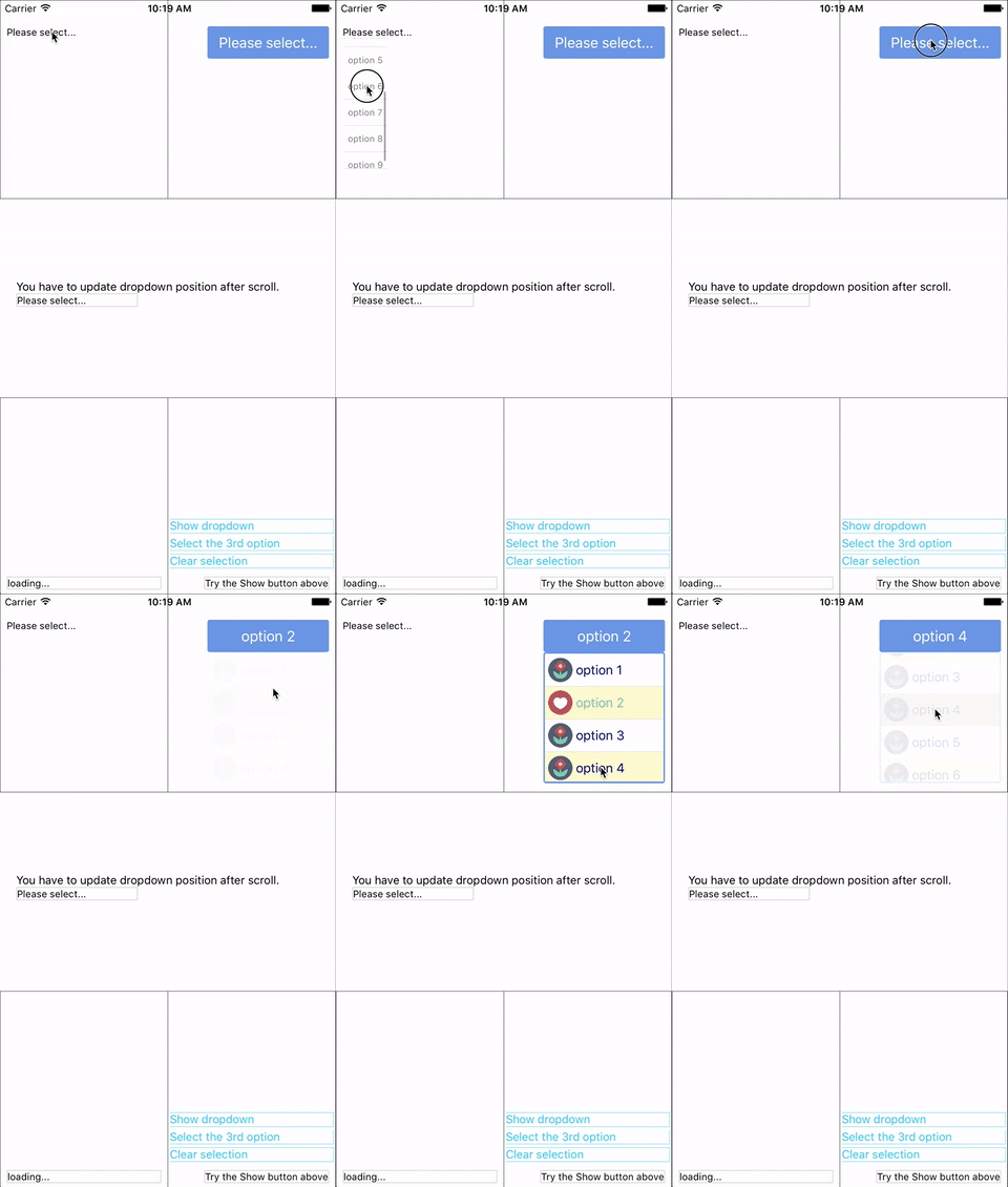
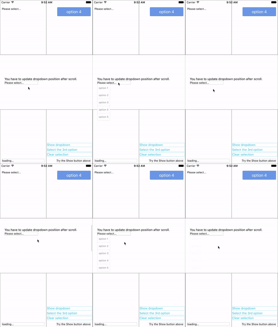
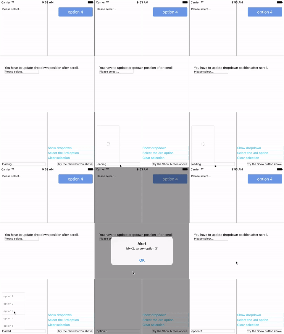
##Demo
在example里可以找到示例代码。
 ##安装
```终端命令输入
npm install longdropdown --save
```
##使用
###基本
先Import组件:
```javascript
import ModalDropdown from 'longdropdown'
```
作为组件使用即可:
```javascript
```
作为容器使用:
```javascript
...
```
###自定义
可以通过传入以下样式属性来自定义样式:
- `style`: 改变按钮的样式。
- `textStyle`: 改变按钮文字样式。
- `dropdownStyle`: 改变下拉框的样式.
可以通过实现`renderRow`方法来自定义下拉框中的选项行。
## API
### 属性(Props)
Prop | Type | Optional | Default | Description
------------------- | -------- | -------- | --------- | -----------
`disabled` | bool | Yes | false | 是否禁用组件
`defaultIndex` | number | Yes | -1 | 初始选择. `-1`: 未选中. **这个只会影响选项展示的高亮与否,不会改变初始的按钮文字。若要改变按钮初始文字请参考`defaultValue`.**
`defaultValue` | string | Yes | Please select... | 按钮初始文字.
`options` | array | Yes | | 选项。 **传`null/undefined`则下拉框会显示一个加载图标。**
`animated` | bool | Yes | true | Disable / enable fade animation.
`showsVerticalScrollIndicator` | bool | Yes | true | Show / hide vertical scroll indicator.
`style` | object | Yes | | 按钮样式。
`textStyle` | object | Yes | | 按钮文字样式。 **Invalid in wrapper mode.**
`dropdownStyle` | object | Yes | | Style of the dropdown list.
`adjustFrame` | func | Yes | | This is a callback after the frame of the dropdown have been calculated and before showing. You will receive a style object as argument with some of the props like `width` `height` `top` `left` and `right`. Change them to appropriate values that accord with your requirement and **make the new style as the return value of this function**.
`renderRow` | func | Yes | | Customize render option rows. **Will render a default row if `null`/`undefined`.**
`renderSeparator` | func | Yes | | Customize render dropdown list separators. **Will render a default thin gray line if `null`/`undefined`.**
`onDropdownWillShow`| func | Yes | | Trigger when dropdown will show by touching the button. **Return `false` can cancel the event.**
`onDropdownWillHide`| func | Yes | | Trigger when dropdown will hide by touching the button. **Return `false` can cancel the event.**
`onSelect` | func | Yes | | Trigger when option row touched with selected `index` and `value`. **Return `false` can cancel the event.**
`accessible` | bool | Yes | true | Set accessibility of dropdown modal and dropdown rows
### Methods
Method | Description
----------------- | -----------
`show()` | Show the dropdown. **Won't trigger `onDropdownWillShow`.**
`hide()` | Hide the dropdown. **Won't trigger `onDropdownWillHide`.**
`select(idx)` | Select the specified option of the `idx`. Select `-1` will reset it to display `defaultValue`. **Won't trigger `onSelect`.**
## Next version
Any suggestion is welcome.
---
_Source: https://npm.io/package/longdropdown · Machine-readable twin of the npm.io package page. Health data is recomputed on every publish._
##安装
```终端命令输入
npm install longdropdown --save
```
##使用
###基本
先Import组件:
```javascript
import ModalDropdown from 'longdropdown'
```
作为组件使用即可:
```javascript
```
作为容器使用:
```javascript
...
```
###自定义
可以通过传入以下样式属性来自定义样式:
- `style`: 改变按钮的样式。
- `textStyle`: 改变按钮文字样式。
- `dropdownStyle`: 改变下拉框的样式.
可以通过实现`renderRow`方法来自定义下拉框中的选项行。
## API
### 属性(Props)
Prop | Type | Optional | Default | Description
------------------- | -------- | -------- | --------- | -----------
`disabled` | bool | Yes | false | 是否禁用组件
`defaultIndex` | number | Yes | -1 | 初始选择. `-1`: 未选中. **这个只会影响选项展示的高亮与否,不会改变初始的按钮文字。若要改变按钮初始文字请参考`defaultValue`.**
`defaultValue` | string | Yes | Please select... | 按钮初始文字.
`options` | array | Yes | | 选项。 **传`null/undefined`则下拉框会显示一个加载图标。**
`animated` | bool | Yes | true | Disable / enable fade animation.
`showsVerticalScrollIndicator` | bool | Yes | true | Show / hide vertical scroll indicator.
`style` | object | Yes | | 按钮样式。
`textStyle` | object | Yes | | 按钮文字样式。 **Invalid in wrapper mode.**
`dropdownStyle` | object | Yes | | Style of the dropdown list.
`adjustFrame` | func | Yes | | This is a callback after the frame of the dropdown have been calculated and before showing. You will receive a style object as argument with some of the props like `width` `height` `top` `left` and `right`. Change them to appropriate values that accord with your requirement and **make the new style as the return value of this function**.
`renderRow` | func | Yes | | Customize render option rows. **Will render a default row if `null`/`undefined`.**
`renderSeparator` | func | Yes | | Customize render dropdown list separators. **Will render a default thin gray line if `null`/`undefined`.**
`onDropdownWillShow`| func | Yes | | Trigger when dropdown will show by touching the button. **Return `false` can cancel the event.**
`onDropdownWillHide`| func | Yes | | Trigger when dropdown will hide by touching the button. **Return `false` can cancel the event.**
`onSelect` | func | Yes | | Trigger when option row touched with selected `index` and `value`. **Return `false` can cancel the event.**
`accessible` | bool | Yes | true | Set accessibility of dropdown modal and dropdown rows
### Methods
Method | Description
----------------- | -----------
`show()` | Show the dropdown. **Won't trigger `onDropdownWillShow`.**
`hide()` | Hide the dropdown. **Won't trigger `onDropdownWillHide`.**
`select(idx)` | Select the specified option of the `idx`. Select `-1` will reset it to display `defaultValue`. **Won't trigger `onSelect`.**
## Next version
Any suggestion is welcome.
---
_Source: https://npm.io/package/longdropdown · Machine-readable twin of the npm.io package page. Health data is recomputed on every publish._