# material-ui-dropzone-edited
> A Material-UI file-upload dropzone
Latest version **2.3.5** (published 2019-05-03) · MIT license · 0 weekly downloads
## Install
```sh
npm install material-ui-dropzone-edited
pnpm add material-ui-dropzone-edited
yarn add material-ui-dropzone-edited
bun add material-ui-dropzone-edited
```
## Health
**Score 20/100 (F)** — status: abandoned.
Positive: esm support; no vulnerabilities.
Warnings: low downloads; no types.
Negative: abandoned; low maintenance score.
## Facts
| | |
|---|---|
| Version | 2.3.5 |
| Published | 2019-05-03 |
| First published | 2019-05-03 |
| Weekly downloads | 0 |
| License | MIT |
| TypeScript types | none |
| Module format | ESM + CommonJS |
| Node | >=8 |
| Dependencies | 2 |
| Unpacked size | 401 KB |
| Known vulnerabilities | 0 |
| Install scripts | no |
| GitHub stars | 479 |
| Author | Yuval |
| Maintainers | lukafurlan |
| Keywords | react, react-component, material design, material-ui, dropzone, upload, react upload |
## Links
- npm: https://www.npmjs.com/package/material-ui-dropzone-edited
- Repository: https://github.com/Yuvaleros/material-ui-dropzone
- Homepage: https://github.com/Yuvaleros/material-ui-dropzone#readme
- Issues: https://github.com/Yuvaleros/material-ui-dropzone/issues
- npm.io page: https://npm.io/package/material-ui-dropzone-edited
## Dependencies (2)
- [react-dropzone](https://npm.io/package/react-dropzone.md) ^7.0.1
- [@material-ui/icons](https://npm.io/package/@material-ui/icons.md) ^3.0.2
## Alternatives
- [mobx-react](https://npm.io/package/mobx-react.md) — 2.8M weekly downloads
- [rc-tree](https://npm.io/package/rc-tree.md) — 2.6M weekly downloads
- [@react-oauth/google](https://npm.io/package/@react-oauth/google.md) — 1.3M weekly downloads
- [@wagmi/connectors](https://npm.io/package/@wagmi/connectors.md) — 877.0K weekly downloads
- [vee-validate](https://npm.io/package/vee-validate.md) — 836.4K weekly downloads
## Recent versions
- 2.3.5 (latest) — 2019-05-03
- 2.3.4 — 2019-05-03
## README
# material-ui-dropzone
Material-UI-dropzone is a [React](https://github.com/facebook/react) component using [Material-UI](https://github.com/callemall/material-ui) and is based on the excellent [react-dropzone](https://github.com/react-dropzone/react-dropzone) library.
This components provide either a file-upload dropzone or a file-upload dropzone inside of a dialog.
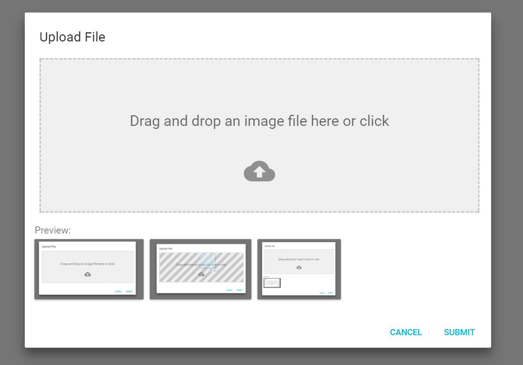
The file-upload dropzone features some snazzy "File Allowed/Not Allowed" effects, previews and alerts.
## Installation
```sh
npm install --save material-ui-dropzone
```
## Screenshots
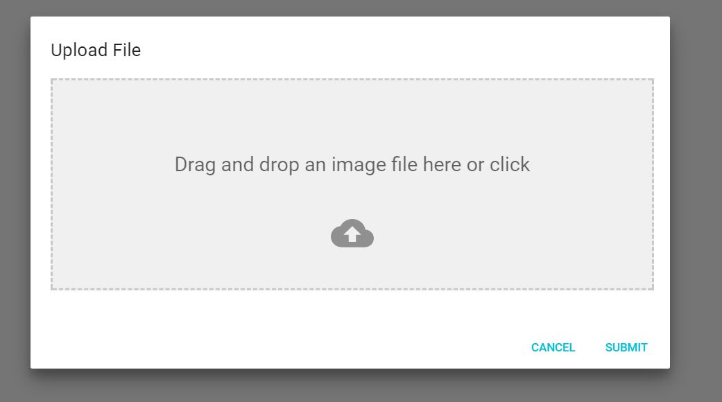
This is the component:
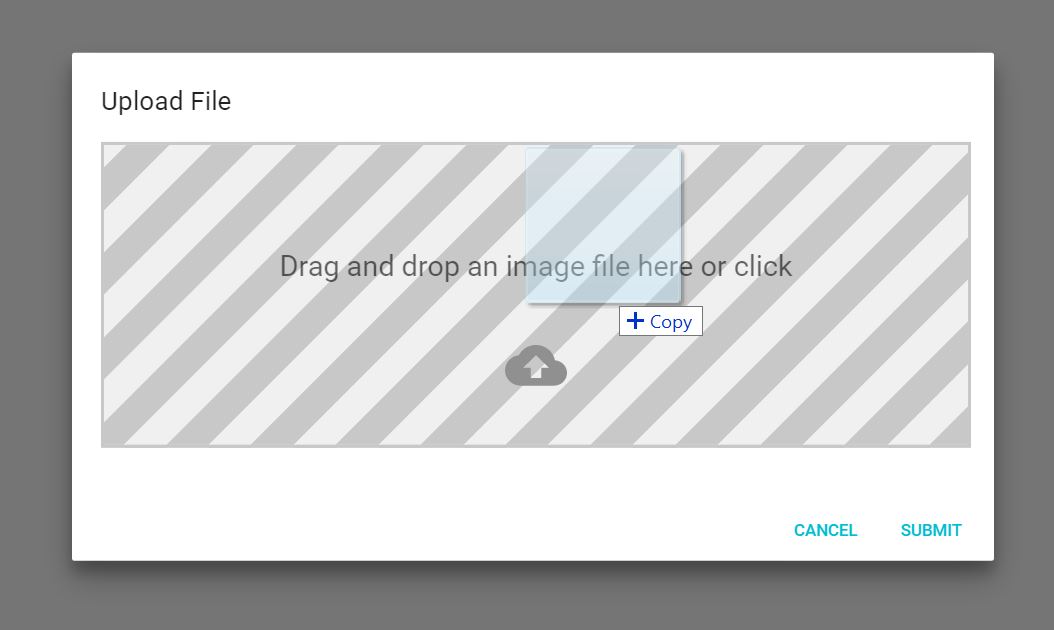
When you drag a file onto the dropzone, you get a neat effect:
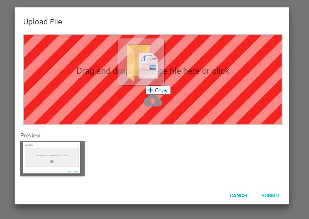
And if you drop in a wrong type of file, you'll get yelled at:
## DropzoneArea Component
This components creates the dropzone, previews and snackbar notifications without a dialog
### Usage
```jsx
import React, {Component} from 'react'
import {DropzoneArea} from 'material-ui-dropzone'
class DropzoneAreaExample extends Component{
constructor(props){
super(props);
this.state = {
files: []
};
}
handleChange(files){
this.setState({
files: files
});
}
render(){
return (
)
}
}
export default DropzoneAreaExample;
```
### DropzoneArea Component Properties
| Name |Type |Default |Description
|----------------|-------------|------------|--------------------------------
| acceptedFiles | Array |\['image/\*', 'video/\*', 'application/\*'] | A list of file mime types to accept. Does support wildcards.
| filesLimit | Number | 3 | Maximum number of files that can be loaded into the dropzone
| maxFileSize | Number | 3000000 | Maximum file size (in bytes) that the dropzone will accept
| dropzoneText | String | 'Drag and drop an image file here or click' | Text in dropzone
| showPreviews | Boolean | false | Shows previews **BELOW** the Dropzone
| showPreviewsInDropzone| Boolean| true | Shows preview **INSIDE** the dropzone
| showAlerts | Boolean | true | shows styled snackbar alerts when files are dropped, deleted or rejected.
| dropZoneClass | String | null | Custom CSS class name for dropzone container.
| dropzoneParagraphClass | String | null | Custom CSS class name for text inside the container.
| showFileNamesInPreview | Boolean | false | Shows file name under the image
### DropzoneArea Component Events
|Name |Return Params|Description
|----------------|-------------|--------------------------------
|onChange |files(array) | Fired when the user drops files into dropzone or deletes a file. Returns all the files currently loaded into the dropzone.
|onDrop |files(array) | Fired when the user drops files into the dropzone. Returns the files dropped
|onDropRejected |files(array) | Fired when a file is rejected because of wrong file type, size or goes beyond the filesLimit. Returns the files that were rejected
|onDelete |file | Fired when a file is deleted from the previews panel.
## DropzoneDialog Component
This component provides the dropzone inside of a dialog.
### Usage
```jsx
import React, { Component } from 'react'
import {DropzoneDialog} from 'material-ui-dropzone'
import Button from '@material-ui/core/Button';
export default class DropzoneDialogExample extends Component {
constructor(props) {
super(props);
this.state = {
open: false,
files: []
};
}
handleClose() {
this.setState({
open: false
});
}
handleSave(files) {
//Saving files to state for further use and closing Modal.
this.setState({
files: files,
open: false
});
}
handleOpen() {
this.setState({
open: true,
});
}
render() {
return (
);
}
}
```
### DropzoneDialog Component Properties
| Name |Type |Default |Description
|----------------|-------------|------------|--------------------------------
| open | Boolean | false | Required. Sets whether the dialog is open or closed
| acceptedFiles | Array |\['image/\*', 'video/\*', 'application/\*'] | A list of file mime types to accept. Does support wildcards.
| filesLimit | Number | 3 | Maximum number of files that can be loaded into the dropzone
| maxFileSize | Number | 3000000 | Maximum file size (in bytes) that the dropzone will accept
| showPreviews | Boolean | false | Shows previews **BELOW** the Dropzone
| showPreviewsInDropzone| Boolean| true | Shows preview **INSIDE** the dropzone
| showAlerts | Boolean | true | shows styled snackbar alerts when files are dropped, deleted or
### DropzoneDialog Component Events
|Name |Return Params|Description
|----------------|-------------|--------------------------------
| onSave | files(array) | Fired when the user clicks the Submit button.
| onClose | event | Fired when the modal is closed
| onChange |files(array) | Fired when the user drops files into dropzone **OR** deletes a file. Returns all the files currently loaded into the dropzone.
| onDrop |files(array) | Fired when the user drops files into the dropzone. Returns the files dropped
| onDropRejected |files(array) | Fired when a file is rejected because of wrong file type, size or goes beyond the filesLimit. Returns the files that were rejected
| onDelete |file | Fired when a file is deleted from the previews panel.
## License
MIT
---
_Source: https://npm.io/package/material-ui-dropzone-edited · Machine-readable twin of the npm.io package page. Health data is recomputed on every publish._
 When you drag a file onto the dropzone, you get a neat effect:
 And if you drop in a wrong type of file, you'll get yelled at:
 ## DropzoneArea Component
This components creates the dropzone, previews and snackbar notifications without a dialog
### Usage
```jsx
import React, {Component} from 'react'
import {DropzoneArea} from 'material-ui-dropzone'
class DropzoneAreaExample extends Component{
constructor(props){
super(props);
this.state = {
files: []
};
}
handleChange(files){
this.setState({
files: files
});
}
render(){
return (
## DropzoneArea Component
This components creates the dropzone, previews and snackbar notifications without a dialog
### Usage
```jsx
import React, {Component} from 'react'
import {DropzoneArea} from 'material-ui-dropzone'
class DropzoneAreaExample extends Component{
constructor(props){
super(props);
this.state = {
files: []
};
}
handleChange(files){
this.setState({
files: files
});
}
render(){
return (