# mur-slider
> A modern, customizable slider built entirely in Vue.js 3 with TypeScript in under 5KB (gzipped) and dependency free. (horizontal, vertical and circular slider)
Latest version **1.6.9** (published 2022-01-10) · MIT license · 0 weekly downloads
## Install
```sh
npm install mur-slider
pnpm add mur-slider
yarn add mur-slider
bun add mur-slider
```
## Health
**Score 20/100 (F)** — status: abandoned.
Positive: has types; no vulnerabilities.
Warnings: low downloads; no esm support.
Negative: abandoned; low maintenance score.
## Facts
| | |
|---|---|
| Version | 1.6.9 |
| Published | 2022-01-10 |
| First published | 2022-01-10 |
| Weekly downloads | 0 |
| License | MIT |
| TypeScript types | bundled |
| Module format | CommonJS |
| Node | >=10 |
| Dependencies | 0 |
| Unpacked size | 886.1 KB |
| Known vulnerabilities | 0 |
| Install scripts | no |
| GitHub stars | 48 |
| Author | Freddie Nelson |
| Maintainers | chris_s |
| Keywords | vue, vue3, vuejs, slider, range, component, ui, keyboard support, customizable, typescript, circular, circle, vertical, horizontal, 0 dependencies |
## Links
- npm: https://www.npmjs.com/package/mur-slider
- Repository: https://github.com/freddie-nelson/vue3-slider
- Issues: https://github.com/freddie-nelson/vue3-slider/issues
- npm.io page: https://npm.io/package/mur-slider
## Alternatives
- [@sindresorhus/slugify](https://npm.io/package/@sindresorhus/slugify.md) — 3.7M weekly downloads
- [solid-js](https://npm.io/package/solid-js.md) — 2.7M weekly downloads
- [expo-glass-effect](https://npm.io/package/expo-glass-effect.md) — 2.5M weekly downloads
- [nanoassert](https://npm.io/package/nanoassert.md) — 780.8K weekly downloads
- [@ffmpeg/ffmpeg](https://npm.io/package/@ffmpeg/ffmpeg.md) — 529.5K weekly downloads
## Recent versions
- 1.6.9 (latest) — 2022-01-10
- 1.6.8 — 2022-01-10
## README
**Horizontal, vertical and circular sliders!**
**Fully responsive, touch screen and keyboard control support!**
## Table of Contents 📰
- [Demo](#demo)
- [Installation](#installation)
- [Getting Started](#getting-started)
- [Import Component](#import-component)
- [How to use](#how-to-use)
- [License](#license)
- [Contact](#contact)
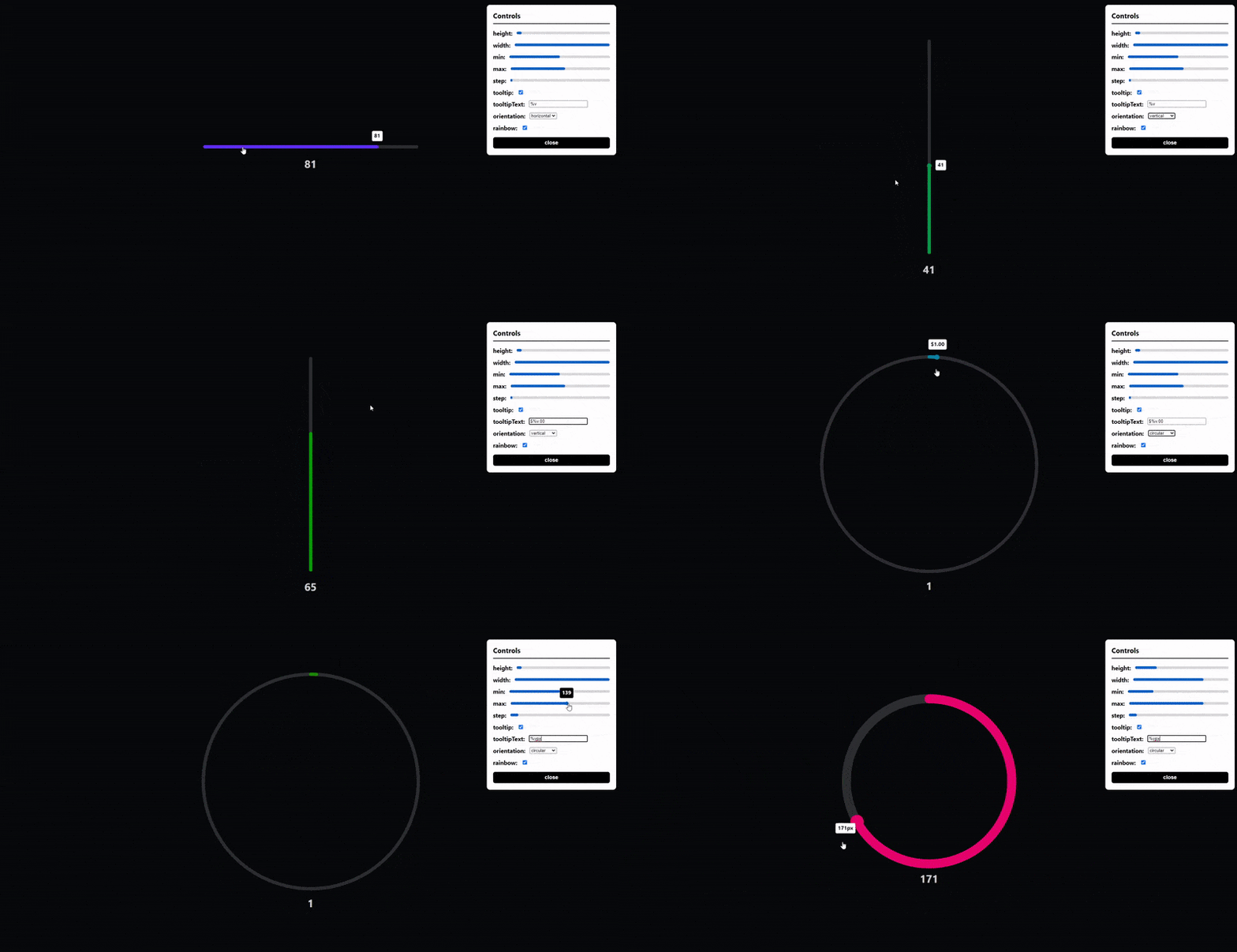
## Demo [(Live Demo)](https://freddie-nelson.github.io/vue3-slider/)
## Installation
```bash
# with npm
npm install vue3-slider
```
```bash
# with yarn
yarn add vue3-slider
```
## Getting Started 👍
### Import component
```js
import slider from "vue3-slider"
export default {
...
components: {
"vue3-slider": slider
}
...
}
```
### How to use
```html
```
## Props
| Name | Type | Required | Default | Rules |
| ---------------- | -------- | -------- | ---------- | ------------------------------------------------------------- |
| v-model | Number | ✔️ | | |
| width | String | | 100% | must be valid css length |
| height | Number | | 6 | |
| color | String | | #FB2727 | must be a valid hex, rgb, rgba or html color value |
| trackColor | String | | #F1F6F8 | ^^^ |
| max | Number | | 100 | cannot be less than min |
| min | Number | | 0 | cannot be greater than max |
| step | Number | | 1 | |
| tooltip | Boolean | | false | |
| tooltipText | String | | "%v" | must contain %v (%v is replaced with slider's value) |
| tooltipColor | String | | #FFFFFF | must be a valid hex, rgb, rgba or html color value |
| tooltipTextColor | String | | #000000 | ^^^ |
| formatTooltip | Function | | null | function must take one parameter (number) and return a string |
| orientation | String | | horizontal | restricted choice (horizontal, vertical, circular) |
| repeat | Boolean | | false | |
| sticky | Boolean | | false | |
| flip | Boolean | | false | |
| circleOffset | Number | | 0 | must be between 0 and 360 (inclusive) |
**NOTE: When using the circular slider width is the diameter of the circle and height is the stroke width**
**NOTE: When using the circular slider it is advised to use absolute units for width to avoid issues**
**NOTE: circleOffset is calculated in degrees clockwise from the top of the circle (anti-clockwise with flip set to true)**
## Events
#### change
- Arguments: `(value: number)`
- Usage: The event is fired when the slider value changes
#### drag-start
- Arguments: `(value: number, event: MouseEvent | TouchEvent)`
- Usage: The event is fired when the user presses the slider
#### drag-end
- Arguments: `(value: number, event: MouseEvent | TouchEvent)`
- Usage: The event is fired when the user releases the slider
#### dragging
- Arguments: `(value: number, event: MouseEvent | TouchEvent)`
- Usage: The event is fired when the user drags the slider
## Contributing
### Prerequisites
- node (latest version)
- yarn (1.^22.10)
### Setup
```bash
# clone repo
git clone https://github.com/freddie-nelson/vue3-slider
cd vue3-slider
# install deps
npm i
# with yarn
yarn
# start dev server
npm run serve
# with yarn
yarn serve
```
## License
[MIT](https://opensource.org/licenses/MIT)
Copyright © 2020 - Present, Freddie Nelson
## Contact
- [Send me an email 📧](mailto:freddie0208@hotmail.com)
- [DM me through twitter](https://twitter.com/freddie_dev)
- [Contact me through my website](https://freddienelson.co.uk)
---
_Source: https://npm.io/package/mur-slider · Machine-readable twin of the npm.io package page. Health data is recomputed on every publish._