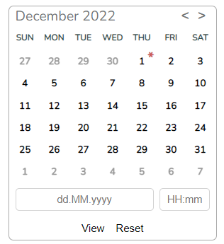
# ngx-compack
> some components/services/directives for angular project
Latest version **16.0.4** (published 2023-08-21) · MIT license · 0 weekly downloads
## Install
```sh
npm install ngx-compack
pnpm add ngx-compack
yarn add ngx-compack
bun add ngx-compack
```
## Health
**Score 25/100 (F)** — status: abandoned.
Positive: has types; esm support; no vulnerabilities.
Warnings: low downloads.
Negative: abandoned; low maintenance score.
## Facts
| | |
|---|---|
| Version | 16.0.4 |
| Published | 2023-08-21 |
| First published | 2021-01-19 |
| Weekly downloads | 0 |
| License | MIT |
| TypeScript types | bundled |
| Module format | ESM + CommonJS |
| Dependencies | 1 |
| Unpacked size | 1.2 MB |
| Known vulnerabilities | 0 |
| Install scripts | no |
| GitHub stars | 1 |
| Author | Kirill |
| Maintainers | krub |
## Links
- npm: https://www.npmjs.com/package/ngx-compack
- Repository: https://github.com/PKkDev/ngx-compack
- Issues: https://github.com/PKkDev/ngx-compack/issues
- npm.io page: https://npm.io/package/ngx-compack
## Dependencies (1)
- [tslib](https://npm.io/package/tslib.md) ^2.3.0
## Recent versions
- 16.0.4 (latest) — 2023-08-21
- 16.0.3 — 2023-08-20
- 16.0.2 — 2023-08-20
- 16.0.1 — 2023-08-20
- 16.0.0 — 2023-08-20
- 2.0.5 — 2022-12-08
- 2.0.4 — 2022-12-05
- 2.0.3 — 2022-12-04
- 2.0.2 — 2022-12-04
- 2.0.1 — 2022-12-01
- 2.0.0 — 2022-12-01
- 1.4.5 — 2022-05-07
- 1.4.3 — 2022-01-29
- 1.4.2 — 2022-01-29
- 1.3.2 — 2021-12-19
- … 15 more at https://npm.io/package/ngx-compack/versions
## README
## Introduction
This library is used in the author's personal works, but if someone likes the implementation and wants to use it too, I will only be glad.
This project was generated with [Angular CLI](https://github.com/angular/angular-cli) version 14.0.0.
Supported 9/10/11+.
You can view [live example](https://pkkdev.github.io/ngx-compack/ "live example")
[]()
## Table of contents
- [Introduction](#introduction)
- [Table of contents](#table-of-contents)
- [Dependency](#dependency)
- [Components](#components)
- [compack-date-picker-range](#compack-date-picker-range)
- [Import in project](#import-in-project)
- [Using](#using)
- [Properties](#properties)
- [Events](#events)
- [CompackRelativeDateModel](#compackrelativedatemodel)
- [compack-date-picker](#compack-date-picker)
- [Import in project](#import-in-project-1)
- [Using](#using-1)
- [Properties](#properties-1)
- [Events:](#events-1)
- [compack-banner](#compack-banner)
- [DisplayMessageConfig](#displaymessageconfig)
- [TypePositions](#typepositions)
- [TypeBanner](#typebanner)
- [Import in project](#import-in-project-2)
- [Using](#using-2)
- [Using api](#using-api)
- [compack-toast](#compack-toast)
- [ToastConfig](#toastconfig)
- [TypeToast](#typetoast)
- [Import in project](#import-in-project-3)
- [Using](#using-3)
- [Using api](#using-api-1)
## Dependency
[BrowserAnimationsModule](https://angular.io/api/platform-browser/animations/BrowserAnimationsModule "BrowserAnimationsModule")
## Components
### compack-date-picker-range
#### Import in project
import { CompackDatepickerModule } from 'ngx-compack';
import { BrowserAnimationsModule } from '@angular/platform-browser/animations';
@NgModule({
...
imports: [
BrowserAnimationsModule,
CompackDatepickerModule
...
})
export class AppModule { }
#### Using
add `compackDatePickerRangeHost` directive to element or create `` in code
Example:
```html
click me
```
#### Properties
parameters with which there is changed data-picker-range behavior
| Name | Default | Description |
| -------------------------------------------- | --------- | ----------------------------------------------------------- |
| @Input() locale: string | 'en' | [Intl.Locale](https://developer.mozilla.org/en-US/docs/Web/JavaScript/Reference/Global_Objects/Intl/Locale "Intl.Locale") |
| @Input() disabled: boolean | false | disabled state |
| @Input() formatOutputDate: string|'dd.mm.yyyy' | after accept date will convert to this format |
| @Input() relativeDateModel: CompackRelativeDateModel[] | undefined | relative date in left side picker|
#### Events
Events generated from date-picker-range
| Name | Default | Description |
| ---------------------------------------------------------- | ------------ | ----------------- |
| @Output() selectLastDateEvent | `EventEmitter` | event after select date |
#### CompackRelativeDateModel
```javascript
export interface CompackRelativeDateModel {
title: string;
dateStartFunc: () => Date;
dateEndFunc: () => Date
}
```
| field | descrption |
| ------------ | ------------ |
| title | displayed name for period in calendar |
| dateStartFunc | func returned start date |
| dateEndFunc | func returned end date |
example:
```javascript
{
title: 'last 7 day',
dateStartFunc: () => {
const date = new Date(new Date().setHours(0, 0, 0, 0));
date.setDate(date.getDate() - 7);
return date;
},
dateEndFunc: () => new Date(new Date().setHours(0, 0, 0, 0))
},
```
### compack-date-picker
#### Import in project
import { CompackDatepickerModule } from 'ngx-compack';
import { BrowserAnimationsModule } from '@angular/platform-browser/animations';
@NgModule({
...
imports: [
BrowserAnimationsModule,
CompackDatepickerModule
...
})
export class AppModule { }
#### Using
add `compackDatePickerHost` directive to element or create `` in code
Example:
```html
```
#### Properties
parameters with which there is changed data-picker behavior
| Name | Default | Description|
| -------------------------------------------- | --------- | ----------------------------------------------------------- |
| @Input() locale: string | 'en' | [Intl.Locale](https://developer.mozilla.org/en-US/docs/Web/JavaScript/Reference/Global_Objects/Intl/Locale "Intl.Locale") |
| @Input() disabled: boolean | false | disabled state |
| @Input() rangeMode: boolean | false | select one date or range |
| @Input() viewFieldSelectedDate: boolean | false | display field with selected date |
| @Input() useTime: boolean | false | add time field or not |
| @Input() autoSelect: boolean | false | auto select date after choose only without **useTime** |
| @Input() maxChoseDay: number | undefined | maximum range for selection |
| @Input() max: Date | undefined | date limit from below |
| @Input() min: Date | undefined | date cut from above |
| @Input() formatOutputDate: string|'dd.mm.yyyy' | after accept date will convert to this format |
#### Events:
Events generated from date picker
| Name | Default | Description |
| ---------------------------------------------------------- | ------------ | ----------------- |
| @Output() selectLastDateEvent | `EventEmitter` | event after select date |
### compack-banner
is the message hanging in the foreground.
#### DisplayMessageConfig
export class DisplayMessageConfig {
public title?: string;
public message: string;
public intervalView?: number;
public typeMessage: TypeMessage;
public position: TypePositionMessage;
constructor() {
this.title = undefined;
this.message = '';
this.intervalView = undefined;
this.typeMessage = 0;
this.position = 0;
}
}
#### TypePositions
export enum TypePositionMessage {
Top = 0,
TopLeft = 1,
TopRight = 2,
Middle = 3,
Bottom = 4,
BottomLeft = 5,
BottomRight = 6
}
#### TypeBanner
export enum TypeMessage {
Info = 0,
Error = 1
}
#### Import in project
import { CompackBannerModule } from 'ngx-compack';
import { BrowserAnimationsModule } from '@angular/platform-browser/animations';
@NgModule({
...
imports: [
CompackBannerModule,
BrowserAnimationsModule
...
})
export class AppModule { }
#### Using
For view banner need call method `viewBanner()` in Injected service `Compackbannerservice`
public viewBanner(typeMessage: TypeMessage, position: TypePositionMessage, message: string, title?: string, intervalView?: number)
import { Component, OnInit } from '@angular/core';
import { TypeMessage, TypePositionMessage } from 'ngx-compack';
import { CompackBannerService, DisplayMessageConfig } from 'ngx-compack';
@Component({
selector: 'app-root',
templateUrl: './app.component.html',
styleUrls: ['./app.component.scss']
})
export class AppComponent implements OnInit {
constructor(private cbs: CompackBannerService ) { }
ngOnInit() {
this.cbs.setInfoColor('#000');
this.cbs.setErrorColor('#fff');
setTimeout(() => this.cbs.viewBanner(TypeMessage.Info, TypePositionMessage.TopRight, 'asdas'), 0);
}
}
#### Using api
add CompackBannerService from DI in constructor.
| Method | Description |
| -------------------------------- | ------------------------------------ |
| viewBanner(typeMessage: TypeMessage, position: TypePositionMessage, message: string, title?: string, intervalView?: number) | add new banner |
| removeBanner() | remove last banner |
| setInfoColor(color: string) | set back color for info type banner |
| setErrorColor(color: string) | set back color for error type banner |
### compack-toast
#### ToastConfig
export class ToastConfig {
public title: string;
public type: TypeToast;
public message?: string;
constructor() {
this.title = '';
this.type = TypeToast.Error
}
}
#### TypeToast
export declare enum TypeToast {
Error = 0,
Info = 1,
Success = 2
}
#### Import in project
import { CompackToastModule } from 'ngx-compack';
import { BrowserAnimationsModule } from '@angular/platform-browser/animations';
@NgModule({
...
imports: [
CompackToastModule,
BrowserAnimationsModule
...
})
export class AppModule { }
#### Using
For view toast message need call method `emitNotife()` in Injected service `CompackToastService`
public emitNotife(type: TypeToast, title: string, message?: string);
import { Component, OnInit } from '@angular/core';
import { CompackToastService, TypeToast } from 'ngx-compack';
@Component({
selector: 'app-root',
templateUrl: './app.component.html',
styleUrls: ['./app.component.scss']
})
export class AppComponent implements OnInit {
constructor(private cts: CompackToastService) { }
ngOnInit() {
this.cts.emitNotife(TypeToast.Error, 'Error Error ErrorError ErrorErrorErrorErrorError vErrorError Error Error');
this.cts.emitNotife(TypeToast.Info, 'Info');
}
}
#### Using api
add CompackToastService from DI in constructor.
| Method | Description |
| ------------------------------------------------------------ | --------------------------------------- |
| emitNotife(type: TypeToast, title: string, message?: string) | add new message |
| setInfoColor(color: string) | set back color for info type message |
| setErrorColor(color: string) | set back color for error type message |
| setSuccessColor(color: string) | set back color for success type message |
| setTimeToAutoRemove(time: number) | set time to auto remove message |
---
_Source: https://npm.io/package/ngx-compack · Machine-readable twin of the npm.io package page. Health data is recomputed on every publish._