# ngx-i24-checkbox
> A lightweight plugin to display a modern checkbox.
Latest version **0.0.4** (published 2022-10-29) · MIT license · 0 weekly downloads
## Install
```sh
npm install ngx-i24-checkbox
pnpm add ngx-i24-checkbox
yarn add ngx-i24-checkbox
bun add ngx-i24-checkbox
```
## Health
**Score 25/100 (F)** — status: abandoned.
Positive: has types; esm support; no vulnerabilities.
Warnings: low downloads; pre 1.0.
Negative: abandoned; low maintenance score.
## Facts
| | |
|---|---|
| Version | 0.0.4 |
| Published | 2022-10-29 |
| First published | 2022-07-16 |
| Weekly downloads | 0 |
| License | MIT |
| TypeScript types | bundled |
| Module format | ESM + CommonJS |
| Dependencies | 1 |
| Unpacked size | 69.7 KB |
| Known vulnerabilities | 0 |
| Install scripts | no |
| GitHub stars | 0 |
| Author | YASEEN ALREFAEE |
| Maintainers | yaseenref |
| Keywords | ngx, checkbox, angular, icode24, i24 |
## Links
- npm: https://www.npmjs.com/package/ngx-i24-checkbox
- Repository: https://github.com/yasref/ngx-checkbox-lib
- Issues: https://github.com/yasref/ngx-checkbox-lib/issues
- npm.io page: https://npm.io/package/ngx-i24-checkbox
## Dependencies (1)
- [tslib](https://npm.io/package/tslib.md) ^2.3.0
## Recent versions
- 0.0.4 (latest) — 2022-10-29
- 0.0.3 — 2022-07-16
- 0.0.2 — 2022-07-16
- 0.0.1 — 2022-07-16
## README
# NgxCheckboxLib
[](https://www.npmjs.com/package/ngx-i24-checkbox)
[](https://www.npmjs.com/package/ngx-i24-checkbox)
> A lightweight plugin to display a modern checkbox.
## Features
* highly customizable
* very easy to implement
## Demo
[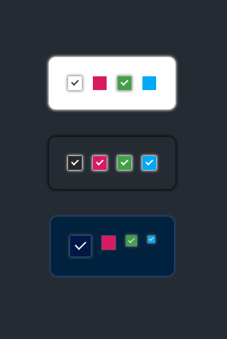](https://stackblitz.com/edit/ngx-checkbox-demo)
* [Link](https://stackblitz.com/edit/ngx-checkbox-demo)
## Get started
#### Installation
```
$ npm i ngx-i24-checkbox
```
#### Example
##### TS
###### Module
```typescript
import { NgxCheckboxModule } from 'ngx-i24-checkbox';
@NgModule({
declarations: [ AppComponent ],
imports: [BrowserModule, NgxCheckboxModule ],
bootstrap: [AppComponent]
})
export class AppModule { }
```
###### Component
```typescript
import { Component } from '@angular/core';
@Component({
selector: 'app-root',
templateUrl: './app.component.html',
styleUrls: ['./app.component.scss']
})
export class AppComponent {
}
```
##### HTML
```html
```
## Options
| Property (Type) | Default | Description|
| - | - | - |
| color | '#3c3c3c' | The color of check |
| backColor| '#fff' | The background of checkbox |
| borderColor| '#c6c6c6' | The border color |
| shadow| '0px 0px 4px 1px #6c6c6c' | The shadow of the checkbox |
| cWidth| '20px' | The width of the checkbox |
| cHeight| '20px' | The height of the checkbox |
| checkWidth| '6px' | The width of the checkbox signal |
| checkHeight| '10px' | The height of the checkbox signal |
| value | true | The default value |
## Events
* `checkedChanged` - triggered on change the value
## Other Projects
| Name | Link | Description|
| - | - | - |
| ngx-i24-circular-progress | [Link](https://www.npmjs.com/package/ngx-i24-circular-progress) | A lightweight plugin to render a simple, animated circular progress bar. |
| ngx-i24-progress-bar | [Link](https://www.npmjs.com/package/ngx-i24-progress-bar) | A lightweight plugin to render a simple, animated progress bar. |
| ngx-weekday-picker | [Link](https://www.npmjs.com/package/ngx-weekday-picker) | Lightweight plugin to a pick weekday. |
| ngx-i24-color-picker | [Link](https://www.npmjs.com/package/ngx-i24-color-picker) | A lightweight plugin to pick a color. |
| ngx-i24-checkbox | [Link](https://www.npmjs.com/package/ngx-i24-checkbox) | A lightweight plugin to display a modern checkbox. |
## Support
[](https://www.buymeacoffee.com/yaseenref)
## Copyright
Copyright (c) 2022 Yaseen Alrefaee, contributors. Released under the MIT
---
_Source: https://npm.io/package/ngx-i24-checkbox · Machine-readable twin of the npm.io package page. Health data is recomputed on every publish._