# oc-p14-simple-react-modale
> A simple react component modal for the OC P14 Whealth Health project
Latest version **0.2.7** (published 2023-03-02) · 0 weekly downloads
## Install
```sh
npm install oc-p14-simple-react-modale
pnpm add oc-p14-simple-react-modale
yarn add oc-p14-simple-react-modale
bun add oc-p14-simple-react-modale
```
## Health
**Score 20/100 (F)** — status: abandoned.
Positive: esm support; no vulnerabilities.
Warnings: low downloads; no types; pre 1.0.
Negative: abandoned; low maintenance score.
## Facts
| | |
|---|---|
| Version | 0.2.7 |
| Published | 2023-03-02 |
| First published | 2023-03-01 |
| Weekly downloads | 0 |
| TypeScript types | none |
| Module format | ESM + CommonJS |
| Dependencies | 5 |
| Unpacked size | 18.7 KB |
| Known vulnerabilities | 0 |
| Install scripts | no |
| GitHub stars | 0 |
| Author | Eric Clermontet |
| Maintainers | the-algar |
| Keywords | react, component, modal, animation, ui |
## Links
- npm: https://www.npmjs.com/package/oc-p14-simple-react-modale
- Repository: https://github.com/The-algar/OC-P14-REACT-MODALE
- Homepage: https://github.com/The-algar/OC-P14-REACT-MODALE#readme
- Issues: https://github.com/The-algar/OC-P14-REACT-MODALE/issues
- npm.io page: https://npm.io/package/oc-p14-simple-react-modale
## Dependencies (5)
- [web-vitals](https://npm.io/package/web-vitals.md) ^1.0.1
- [@babel/polyfill](https://npm.io/package/@babel/polyfill.md) ^7.12.1
- [@testing-library/react](https://npm.io/package/@testing-library/react.md) ^11.1.0
- [@testing-library/jest-dom](https://npm.io/package/@testing-library/jest-dom.md) ^5.11.4
- [@testing-library/user-event](https://npm.io/package/@testing-library/user-event.md) ^12.1.10
## Alternatives
- [@progress/kendo-ooxml](https://npm.io/package/@progress/kendo-ooxml.md) — 152.1K weekly downloads
- [@progress/kendo-react-ripple](https://npm.io/package/@progress/kendo-react-ripple.md) — 8.0K weekly downloads
- [@progress/kendo-react-orgchart](https://npm.io/package/@progress/kendo-react-orgchart.md) — 4.3K weekly downloads
- [@praxisui/dynamic-fields](https://npm.io/package/@praxisui/dynamic-fields.md) — 2.4K weekly downloads
- [@progress/kendo-vue-listbox](https://npm.io/package/@progress/kendo-vue-listbox.md) — 932 weekly downloads
## Recent versions
- 0.2.7 (latest) — 2023-03-02
- 0.2.6 — 2023-03-02
- 0.2.5 — 2023-03-02
- 0.2.4 — 2023-03-02
- 0.2.3 — 2023-03-02
- 0.2.2 — 2023-03-02
- 0.2.1 — 2023-03-02
- 0.2.0 — 2023-03-02
- 0.1.0 — 2023-03-01
## README
# React Modal: A simple react component modal for the OC P14 Whealth Health project
### Overview
The React Modal is a customizable component that renders a pre-formatted modal for use in React projects. This component offers several features and options, such as:
- Customizable background layout
- Customizable container layout
- Customizable content style
- Ability to add custom content inside the modal
- Option to enable or disable modal animation
- Option to display or hide the close button
## Installation
To use the React Modal component, you can install it via npm:
npm install oc-p14-wh-react-modale
## Usage
### Importing the Modal Component
To use the Modal component, simply import it into your React file and define the desired children for the content of your modal. You can also define custom styles if you want to further customize your modal's appearance.
import { Modal } from @the_algar/oc-p14-react-modale
### Example
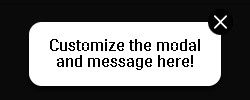
Your modal message here!
Add more text, an image, or an input field.
### State
The Modal component's functionality is controlled by the local state of the parent component. Therefore, the parent component requires **state** to work properly. You can use any variable names you prefer to track the state of the modal. I used modalIsOpen and setModalIsOpen in my example.
const [modalIsOpen, setModalIsOpen] = useState(false)
The initial state of the modal should be set to false. An action on the parent component changes the state to **true**.
const handleSubmit = () => {
setModalIsOpen(true)
}
This will display the Modal component:
{modalIsOpen && (
Customize the modal and message here!
)}
### Props
The following table lists the props available for the Modal component:
Name | Type | Description | Required
------------- | ------------- | ------------- | -------------
*hideModale* | Function | to close modal | **required**
*styleModaleBackground* | Object | inline styles | optional
*styleModale* | Object | inline styles | optional
*styleModaleContent* | Object | inline styles | optional
*animation* | Boolean | to activate or not the animation of the modal appear | **required**
*closeButton* | Boolean | to display or not button close | **required**
**1. *hideModale* prop**
The "hideModal" prop is a function that closes the modal. You should provide a function to hide the modal when the user clicks the button or the background of the modal. This prop is required.
const closeModale = () => {
setModaleIsOpen(false)
}
**2. *styleModaleBackground* prop**
The "styleModaleBackground" prop receives inline styles for customizing the modal background.
**3. *styleModale* prop**
The "styleModaleBackground" prop receives inline styles for customizing the modal background.
**4. *styleModaleContent* prop**
The "styleModaleContent" prop receives inline styles for customizing the modal's content.
**5. *animation* prop**
The "animation" prop is **required** and can be set to **true** to enable the built-in animation effect or **false** to turn it off.
**6. *closeButton* prop**
The "closeButton" prop is required and receives a boolean value to determine whether the close button should be displayed (**true**) or not (**false**).
"*closeButton*" is **required**.
## Contributing
Contributions are always welcome!
To contribute to this project, please follow these steps:
- Fork this repository
- Create a new branch for your feature or bugfix: git checkout -b your-feature-or-bugfix
- Make your changes and commit them: git commit -am 'Add some feature'
- Push your changes to your branch: git push origin your-feature-or-bugfix
- Submit a pull request to the main branch of this repository
## License
This project is licensed under the MIT License - see the LICENSE file for details.
## Acknowledgments
- This project was developed as part of the OpenClassrooms Front-End Developer Path.
- The idea for this project came from the need to create a simple and customizable modal component for React projects.
Thank you for using this modal component! If you have any questions, suggestions or bug reports, please feel free to open an issue.
---
_Source: https://npm.io/package/oc-p14-simple-react-modale · Machine-readable twin of the npm.io package page. Health data is recomputed on every publish._