# otp-input-react
> React functional component for otp input
Latest version **0.3.0** (published 2021-12-28) · MIT license · 0 weekly downloads
## Install
```sh
npm install otp-input-react
pnpm add otp-input-react
yarn add otp-input-react
bun add otp-input-react
```
## Health
**Score 15/100 (F)** — status: abandoned.
Positive: no vulnerabilities.
Warnings: low downloads; no types; no esm support; pre 1.0.
Negative: abandoned; low maintenance score.
## Facts
| | |
|---|---|
| Version | 0.3.0 |
| Published | 2021-12-28 |
| First published | 2019-08-05 |
| Weekly downloads | 0 |
| License | MIT |
| TypeScript types | none |
| Module format | CommonJS |
| Dependencies | 0 |
| Unpacked size | 48.6 KB |
| Known vulnerabilities | 0 |
| Install scripts | no |
| GitHub stars | 60 |
| Author | Shubhanu Sharma |
| Maintainers | shugar |
## Links
- npm: https://www.npmjs.com/package/otp-input-react
- Repository: https://github.com/shubhanus/otp-input-react
- Homepage: https://shubhanus.github.io/otp-input-react
- Issues: https://github.com/shubhanus/otp-input-react/issues
- npm.io page: https://npm.io/package/otp-input-react
## Recent versions
- 0.3.0 (latest) — 2021-12-28
- 0.2.6 — 2021-12-28
- 0.2.5 — 2021-12-28
- 0.2.4 — 2020-02-21
- 0.2.3 — 2020-02-21
- 0.2.2 — 2020-02-21
- 0.2.1 — 2020-02-21
- 0.2.0 — 2019-08-25
- 0.1.1 — 2019-08-24
- 0.1.0 — 2019-08-24
- 0.0.12 — 2019-08-15
- 0.0.11 — 2019-08-13
- 0.0.10 — 2019-08-07
- 0.0.9 — 2019-08-06
- 0.0.8 — 2019-08-06
- … 7 more at https://npm.io/package/otp-input-react/versions
## README
# otp-input-react
A fully customizable, one-time password input with resend OTP component for the web built with React functional component.

[](https://coveralls.io/github/shubhanus/otp-input-react?branch=master)
[](https://badge.fury.io/js/otp-input-react)
[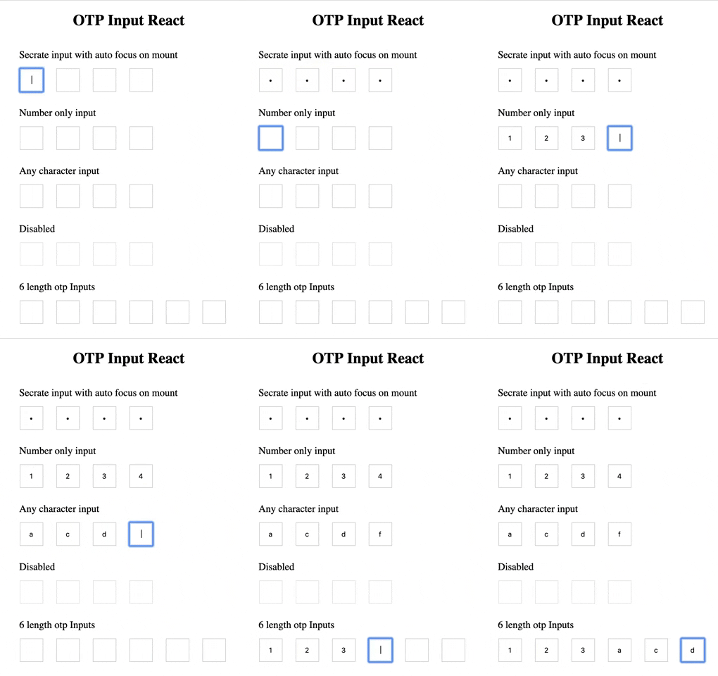](https://shubhanus.github.io/otp-input-react/)
### [Working Demo](https://shubhanus.github.io/otp-input-react/)
## Installation
```
npm install --save otp-input-react
```
## Usage:
```javascript
import OTPInput, { ResendOTP } from "otp-input-react";
function App() {
const [OTP, setOTP] = useState("");
return (
<>
console.log("Resend clicked")} />
);
}
```
## API
### OTP input
| Name | Type | Required | Default | Description | Status |
| -------------- | ---------------------------------------------- | -------- | ------- | ---------------------------------------------------------------------------------------------------------------------------- | ------- |
| OTPLength | Number | false | 4 | Number of input boxes. | Working |
| onChange | Function | **true** | - | Returns OTP code typed in inputs. | Working |
| value | String / Number | **true** | '' | The value of the otp passed into the component. | Working |
| disabled | Boolean | false | false | Disables all the inputs. | Working |
| autoFocus | Boolean | false | false | Auto focuses input on initial page load. | Working |
| otpType | Enum: `any`\|`number`\|`alpha`\|`alphanumeric` | false | any | `any` - allows any value. `number` - allow only numbers. `alpha` - allows only `a-zA-Z`. `alphanumeric` - allows `0-9a-zA-z` | Working |
| secure | Boolean | false | false | Change input type to password. | Working |
| inputClassName | String | - | - | Class for root element. | Working |
| className | String | - | - | Class for root element. | Working |
| inputStyles | Object | - | - | Styles for input element. | Working |
| style | Object | - | - | Styles for root element. | Working |
| placeholder | Array\ | false | - | Placeholder value of each input. | Working |
### Resend OTP
| Name | Type | Required | Default | Description | Status |
| --------------- | ----------------------- | -------- | ------- | --------------------------------------------------------------------------------------------------------------------------------------------------------------------- | ------- |
| maxTime | Number | false | 60 | Timer that user has to wait before resend otp gets active. | Working |
| onResendClick | Function | **true** | - | Function get triggers when user click on resend otp button. But when button is disabled(i.e. time is not completed) it won't get trigger | Working |
| onTimerComplete | Function | false | - | An optional callback when timer completes. | Working |
| timeInterval | Number | false | 1000 | You can change time interval. | Working |
| renderTime | Function - render props | false | - | You can use your own component for seconds. Function will get remainingTime as props you can use it to show timer. | Working |
| renderButton | Function - render props | false | - | You can use your own component for resend button. Function will get `disabled` and `onClick` function and `remainingTime` as props you can pass it to your component. | Working |
| style | Object | false | - | For changing root component inline styles | Working |
| className | string | false | - | For adding class to root component. | Working |
## Custom timer and button component
```javascript
const renderButton = (buttonProps) => {
return ;
};
const renderTime = (remainingTime) => {
return {remainingTime} seconds remaining;
};
;
```
## Hide timer and show sec in button component
```javascript
const renderButton = (buttonProps) => {
return (
);
};
const renderTime = () => React.Fragment;
;
```
### TODO
- [x] Add other type input
- [ ] Change scaffolding
- [ ] Add CI
- [x] Add OTP Timer with resend otp optional type
- [ ] Add Complete callback for otp
### Credits
https://github.com/hotdang-ca - For adding `alpha|alphanumeric` type and updating docs
### Contributing
Feel Free to contributing or feature request
1. Fork it ( https://github.com/shubhanus/otp-input-react/fork )
2. Create your feature branch (`git checkout -b my-new-feature`)
3. Commit your changes (`git commit -am 'Add some feature'`)
4. Push to the branch (`git push origin my-new-feature`)
5. Create a new pull request.
---
_Source: https://npm.io/package/otp-input-react · Machine-readable twin of the npm.io package page. Health data is recomputed on every publish._