# projectzerorn-calendar-picker

> Calendar Picker Component for React Native

Latest version **0.0.1** (published 2016-06-21) · MIT license · 0 weekly downloads

## Install

```sh
npm install projectzerorn-calendar-picker
pnpm add projectzerorn-calendar-picker
yarn add projectzerorn-calendar-picker
bun add projectzerorn-calendar-picker
```

## Health

**Score 15/100 (F)** — status: abandoned.

Positive: no vulnerabilities.

Warnings: low downloads; no types; no esm support; pre 1.0.

Negative: abandoned; low maintenance score.

## Facts

| | |
|---|---|
| Version | 0.0.1 |
| Published | 2016-06-21 |
| First published | 2016-06-21 |
| Weekly downloads | 0 |
| License | MIT |
| TypeScript types | none |
| Module format | CommonJS |
| Dependencies | 1 |
| Known vulnerabilities | 0 |
| Install scripts | no |
| Author | Stephani Alves |
| Maintainers | stephy |
| Keywords | calendar, picker, calendar, picker, date, picker, day, picker |

## Links

- npm: https://www.npmjs.com/package/projectzerorn-calendar-picker
- Repository: https://github.com/stephy/CalendarPicker
- Issues: https://github.com/stephy/CalendarPicker/issues
- npm.io page: https://npm.io/package/projectzerorn-calendar-picker

## Dependencies (1)

- [lodash](https://npm.io/package/lodash.md) ^4.13.1

## Alternatives

- [@js-joda/timezone](https://npm.io/package/@js-joda/timezone.md) — 383.4K weekly downloads
- [chartjs-adapter-moment](https://npm.io/package/chartjs-adapter-moment.md) — 210.8K weekly downloads
- [strftime](https://npm.io/package/strftime.md) — 171.2K weekly downloads
- [vue-flatpickr-component](https://npm.io/package/vue-flatpickr-component.md) — 115.8K weekly downloads
- [timepicker](https://npm.io/package/timepicker.md) — 51.0K weekly downloads

## Recent versions

- 0.0.1 (latest) — 2016-06-21

## README

# react-native-calendar-picker

[![npm version](https://badge.fury.io/js/react-native-calendar-picker.svg)](https://badge.fury.io/js/react-native-calendar-picker) [![npm](https://img.shields.io/npm/dm/localeval.svg)](https://www.npmjs.com/package/react-native-calendar-picker) [![Build Status](https://travis-ci.org/stephy/CalendarPicker.svg?branch=master)](https://travis-ci.org/stephy/CalendarPicker)


This is a Calendar Picker Component for React Native

### Breaking changes in 8.x - replaced moment with date-fns

We've migrated away from [moment.js](https://github.com/moment/moment), in favor of [date-fns](https://date-fns.org/), a modular and lightweight alternative. Users wanting to continue to use Moment should stick with 7.x

# Prerequisites

CalendarPicker requires date-fns >=3.0. Date props may be anything parseable by the [Javascript Date object](https://developer.mozilla.org/en-US/docs/Web/JavaScript/Reference/Global_Objects/Date), such as a Javascript Date, or ISO8601 datetime string.

```
npm install --save date-fns
```

### Scrollable CalendarPicker — New in 7.x

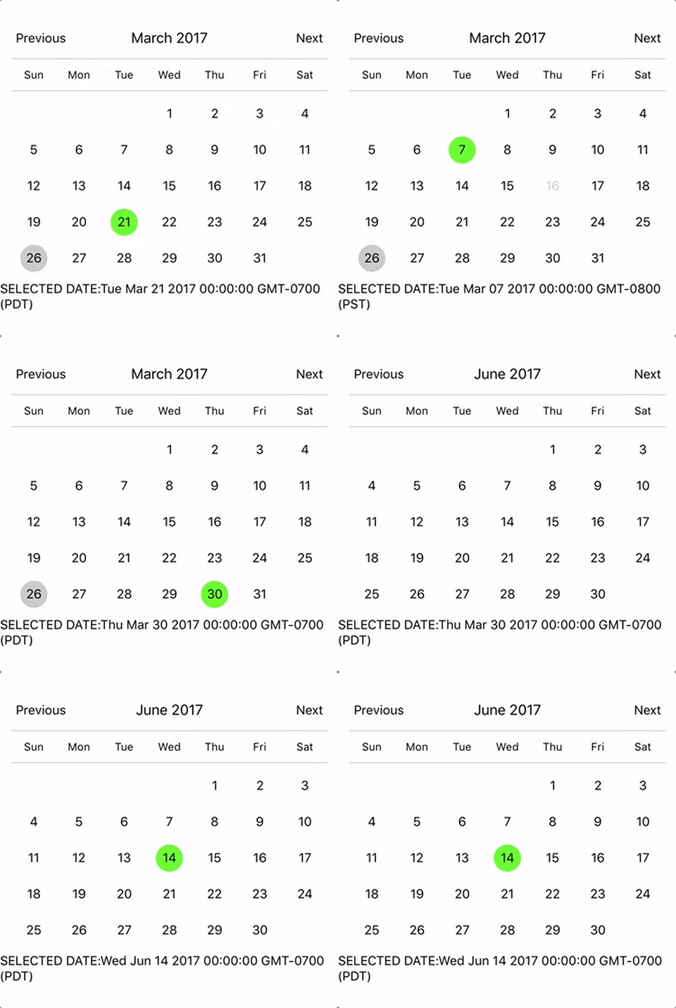
The `scrollable` prop was introduced in 7.0.0 and features a bi-directional infinite scroller. It recycles months using RecyclerListView, shifting them as the ends are reached. If the Chrome debugger is used during development, month shifting may be erratic due to a [RN setTimeout bug](https://github.com/facebook/react-native/issues/4470). To prevent month shifts at the ends of the scroller, set `restrictMonthNavigation`, `minDate`, and `maxDate` range to 5 years or less.
![alt tag](https://user-images.githubusercontent.com/6295083/82028634-87a2b880-965b-11ea-90ce-1bde67f31157.gif)

To use the calendar you just need to:

```sh
npm install --save react-native-calendar-picker
```

# Example

```js
import React, { Component } from "react";
import { StyleSheet, Text, View } from "react-native";
import CalendarPicker from "react-native-calendar-picker";

export default class App extends Component {
  constructor(props) {
    super(props);
    this.state = {
      selectedStartDate: null,
    };
    this.onDateChange = this.onDateChange.bind(this);
  }

  onDateChange(date) {
    this.setState({
      selectedStartDate: date,
    });
  }
  render() {
    const { selectedStartDate } = this.state;
    const startDate = selectedStartDate ? selectedStartDate.toString() : "";
    return (
      <View style={styles.container}>
        <CalendarPicker onDateChange={this.onDateChange} />

        <View>
          <Text>SELECTED DATE:{startDate}</Text>
        </View>
      </View>
    );
  }
}

const styles = StyleSheet.create({
  container: {
    flex: 1,
    backgroundColor: "#FFFFFF",
    marginTop: 100,
  },
});
```

## CalendarPicker Props

| Prop                                 | Type                         | Description                                                                                                                                                                                                                                                                                                                                              |
| :----------------------------------- | :--------------------------- | :------------------------------------------------------------------------------------------------------------------------------------------------------------------------------------------------------------------------------------------------------------------------------------------------------------------------------------------------------- |
| **`weekdays`**                       | `Array`                      | Optional. List of week days. Eg. `['Mon', 'Tue', ...]` Must be 7 days                                                                                                                                                                                                                                                                                    |
| **`months`**                         | `Array`                      | Optional. List of months names. Eg. `['Jan', 'Feb', ...]` Must be 12 months                                                                                                                                                                                                                                                                              |
| **`firstDay`**                       | `Number`                     | Optional. Default first day of week will be Sunday. You can set start of week with number from `0` to `6`. Default is `0` or Sunday                                                                                                                                                                                                                      |
| **`startFromMonday`**                | `Boolean`                    | Optional. Default first day of week will be Sunday. You can set start of week from Monday by setting this to true. Default is `false`                                                                                                                                                                                                                    |
| **`showDayStragglers`**              | `Boolean`                    | Optional. Populate previous & next month days in empty slots. Default is `false`                                                                                                                                                                                                                                                                         |
| **`allowRangeSelection`**            | `Boolean`                    | Optional. Allow to select date ranges. Default is `false`                                                                                                                                                                                                                                                                                                |
| **`allowBackwardRangeSelect`**       | `Boolean`                    | Optional. Allow selecting range in reverse. Default is `false`                                                                                                                                                                                                                                                                                           |
| **`previousTitle`**                  | `String`                     | Optional. Title of button for previous month. Default is `Previous`                                                                                                                                                                                                                                                                                      |
| **`nextTitle`**                      | `String`                     | Optional. Title of button for next month. Default is `Next`                                                                                                                                                                                                                                                                                              |
| **`previousTitleStyle`**             | `TextStyle`                  | Optional. Text styling for Previous text.                                                                                                                                                                                                                                                                                                                |
| **`nextTitleStyle`**                 | `TextStyle`                  | Optional. Text styling for Next text.                                                                                                                                                                                                                                                                                                                    |
| **`previousComponent`**              | `Object`                     | Optional. Component to use in `Previous` button. Overrides `previousTitle` & `previousTitleStyle`.                                                                                                                                                                                                                                                       |
| **`nextComponent`**                  | `Object`                     | Optional. Component to use in `Next` button. Overrides `nextTitle` & `nextTitleStyle`.                                                                                                                                                                                                                                                                   |
| **`selectedDayColor`**               | `String`                     | Optional. Color for selected day                                                                                                                                                                                                                                                                                                                         |
| **`selectedDayStyle`**               | `ViewStyle`                  | Optional. Style for selected day. May override selectedDayColor.                                                                                                                                                                                                                                                                                         |
| **`selectedDayTextColor`**           | `String`                     | Optional. Text color for selected day                                                                                                                                                                                                                                                                                                                    |
| **`selectedDayTextStyle`**           | `Object`                     | Optional. Text style for selected day (including all days in range)                                                                                                                                                                                                                                                                                      |
| **`selectedRangeStartTextStyle`**    | `Object`                     | Optional. Text style for start day of range                                                                                                                                                                                                                                                                                                              |
| **`selectedRangeEndTextStyle`**      | `Object`                     | Optional. Text style for end day of range                                                                                                                                                                                                                                                                                                                |
| **`selectedRangeStartStyle`**        | `ViewStyle`                  | Optional. Container style for start day of range.                                                                                                                                                                                                                                                                                                        |
| **`selectedRangeEndStyle`**          | `ViewStyle`                  | Optional. Container style for end day of range.                                                                                                                                                                                                                                                                                                          |
| **`selectedRangeStyle`**             | `ViewStyle`                  | Optional. Container style for all days in range selection.                                                                                                                                                                                                                                                                                               |
| **`selectedDisabledDatesTextStyle`** | `Object`                     | Optional. Text style for ineligible dates during range selection.                                                                                                                                                                                                                                                                                        |
| **`disabledDates`**                  | `Array` or `Function`        | Optional. Specifies dates that cannot be selected. Array of Dates, or a function that returns true for a given date (apologies for the inverted logic).                                                                                                                                                                                                  |
| **`disabledDatesTextStyle`**         | `TextStyle`                  | Optional. Text styling for disabled dates.                                                                                                                                                                                                                                                                                                               |
| **`selectedStartDate`**              | `Date`                       | Optional. Specifies a selected Start Date.                                                                                                                                                                                                                                                                                                               |
| **`selectedEndDate`**                | `Date`                       | Optional. Specifies a selected End Date.                                                                                                                                                                                                                                                                                                                 |
| **`minRangeDuration`**               | `Number or Array`            | Optional. Specifies a minimum range duration when using allowRangeSelection. Can either pass a number to be used for all dates or an Array of objects if the minimum range duration depends on the date `{date: parsable date, minDuration: Number}`                                                                                                     |
| **`maxRangeDuration`**               | `Number or Array`            | Optional. Specifies a maximum range duration when using allowRangeSelection. Can either pass a number to be used for all dates or an Array of objects if the maximum range duration depends on the date `{date: parsable date, maxDuration: Number}`                                                                                                     |
| **`todayBackgroundColor`**           | `String`                     | Optional. Background color for today. Default is `#cccccc`                                                                                                                                                                                                                                                                                               |
| **`todayTextStyle`**                 | `TextStyle`                  | Optional. Text styling for today.                                                                                                                                                                                                                                                                                                                        |
| **`textStyle`**                      | `TextStyle`                  | Optional. Style overall text. Change fontFamily, color, etc.                                                                                                                                                                                                                                                                                             |
| **`customDatesStyles`**              | `Array` or `Func`            | Optional. Style individual date(s). Supports an array of objects `{date: parseable date, containerStyle: ViewStyle, style: ViewStyle, textStyle: TextStyle, allowDisabled: Boolean}`, or a callback which receives a date param and returns `{containerStyle: ViewStyle, style: ViewStyle, textStyle: TextStyle, allowDisabled: Boolean}` for that date. |
| **`customDayHeaderStyles`**          | `Func`                       | Optional. Style day of week header (Monday - Sunday). Callback that receives ISO `{dayOfWeek, month, year}` and should return `{style: ViewStyle, textStyle: TextStyle}`                                                                                                                                                                                 |
| **`scaleFactor`**                    | `Number`                     | Optional. Default (375) scales to window width                                                                                                                                                                                                                                                                                                           |
| **`minDate`**                        | `Date`                       | Optional. Specifies minimum date to be selected                                                                                                                                                                                                                                                                                                          |
| **`maxDate`**                        | `Date`                       | Optional. Specifies maximum date to be selected                                                                                                                                                                                                                                                                                                          |
| **`initialDate`**                    | `Date`                       | Optional. Date that calendar opens to. Defaults to today.                                                                                                                                                                                                                                                                                                |
| **`width`**                          | `Number`                     | Optional. Width of CalendarPicker's container. Defaults to Dimensions width.                                                                                                                                                                                                                                                                             |
| **`height`**                         | `Number`                     | Optional. Height of CalendarPicker's container. Defaults to Dimensions height.                                                                                                                                                                                                                                                                           |
| **`scrollable`**                     | `Boolean`                    | Optional. Months are scrollable if true. Default is `false`                                                                                                                                                                                                                                                                                              |
| **`horizontal`**                     | `Boolean`                    | Optional. Scroll axis when `scrollable` set. Default is `true`                                                                                                                                                                                                                                                                                           |
| **`scrollDecelarationRate`**         | `Number / "normal" / "fast"` | Optional. Determines how quickly the scroll view decelerates after the user lifts their finger. Default is `normal`                                                                                                                                                                                                                                      |
| **`enableDateChange`**               | `Boolean`                    | Optional. Whether to enable pressing on day. Default is `true`                                                                                                                                                                                                                                                                                           |
| **`restrictMonthNavigation`**        | `Boolean`                    | Optional. Whether to disable Previous month button if it is before minDate or Next month button if it is after MaxDate. Default is `false`                                                                                                                                                                                                               |
| **`onDateChange`**                   | `Function`                   | Optional. Callback when a date is selected. Returns `date` as first param; `START_DATE` or `END_DATE` as second param.                                                                                                                                                                                                                                   |
| **`onMonthChange`**                  | `Function`                   | Optional. Callback when Previous / Next month is pressed. Returns `date` as first parameter.                                                                                                                                                                                                                                                             |
| **`dayShape`**                       | `String`                     | Optional. Shape of the Day component. Default is `circle`. Available options are `circle` and `square`.                                                                                                                                                                                                                                                  |
| **`headingLevel`**                   | `Number`                     | Optional. Sets the aria-level for the calendar title heading when on Web. Default is `1`.                                                                                                                                                                                                                                                                |
| **`selectMonthTitle`**               | `String`                     | Optional. Title of month selector view. Default is "Select Month in " + {year}.                                                                                                                                                                                                                                                                          |
| **`selectYearTitle`**                | `String`                     | Optional. Title of year selector view. Default is "Select Year".                                                                                                                                                                                                                                                                                         |
| **`dayLabelsWrapper`**               | `ViewStyle`                  | Optional. Style for weekdays wrapper. E.g If you want to remove top and bottom divider line.                                                                                                                                                                                                                                                             |
| **`enableSwipe`**                    | `Deprecated`                 | Use `scrollable`.                                                                                                                                                                                                                                                                                                                                        |
| **`swipeConfig`**                    | `Deprecated`                 | Use `scrollable`.                                                                                                                                                                                                                                                                                                                                        |
| **`onSwipe`**                        | `Deprecated`                 | Use `onMonthChange`.                                                                                                                                                                                                                                                                                                                                     |
| **`dayOfWeekStyles`**                | `Deprecated`                 | Use `customDatesStyles` & `customDayHeaderStyles` callbacks to style individual dates, days of week, and/or header.                                                                                                                                                                                                                                      |
| **`customDatesStylesPriority`**      | `Deprecated`                 | Use `customDatesStyles` & `customDayHeaderStyles` callbacks to style individual dates, days of week, and/or header.                                                                                                                                                                                                                                      |
| **`monthYearHeaderWrapperStyle`**    | `ViewStyle`                  | Optional. Style for header MonthYear title wrapper. E.g If you want to change the order of year and month.                                                                                                                                                                                                                                               |
| **`headerWrapperStyle`**             | `ViewStyle`                  | Optional. Style for entire header controls wrapper. This contains the previous / next controls plus month & year.                                                                                                                                                                                                                                        |
| **`monthTitleStyle`**                | `TextStyle`                  | Optional. Text styling for header's month text.                                                                                                                                                                                                                                                                                                          |
| **`yearTitleStyle`**                 | `TextStyle`                  | Optional. Text styling for header's year text.                                                                                                                                                                                                                                                                                                           |
| **`initialView`**                    | `String`                     | Optional. The view that the calendar opens to. Default is `days`. Available options are `years`, `months`, and `days`.                                                                                                                                                                                                                                   |
| **`fontScaling`**                    | `Boolean`                    | Optional. To enable fontScaling. Default is `true`                                                                                                                                                                                                                                                                                                       |

# Styles

Some styles will overwrite some won't. For instance:

- If you provide textStyle with fontFamily and color, out of ranges dates will not apply your color, just fontFamily.

Order of precedence:

- defaultColor => textStyle => selectedDayColor
- defaultTodayBackgroundColor => todayBackgroundColor
- defaultBackgroundColor => selectedDayColor
- defaultTextStyles => textStyle => selectedDayTextColor

# More Examples

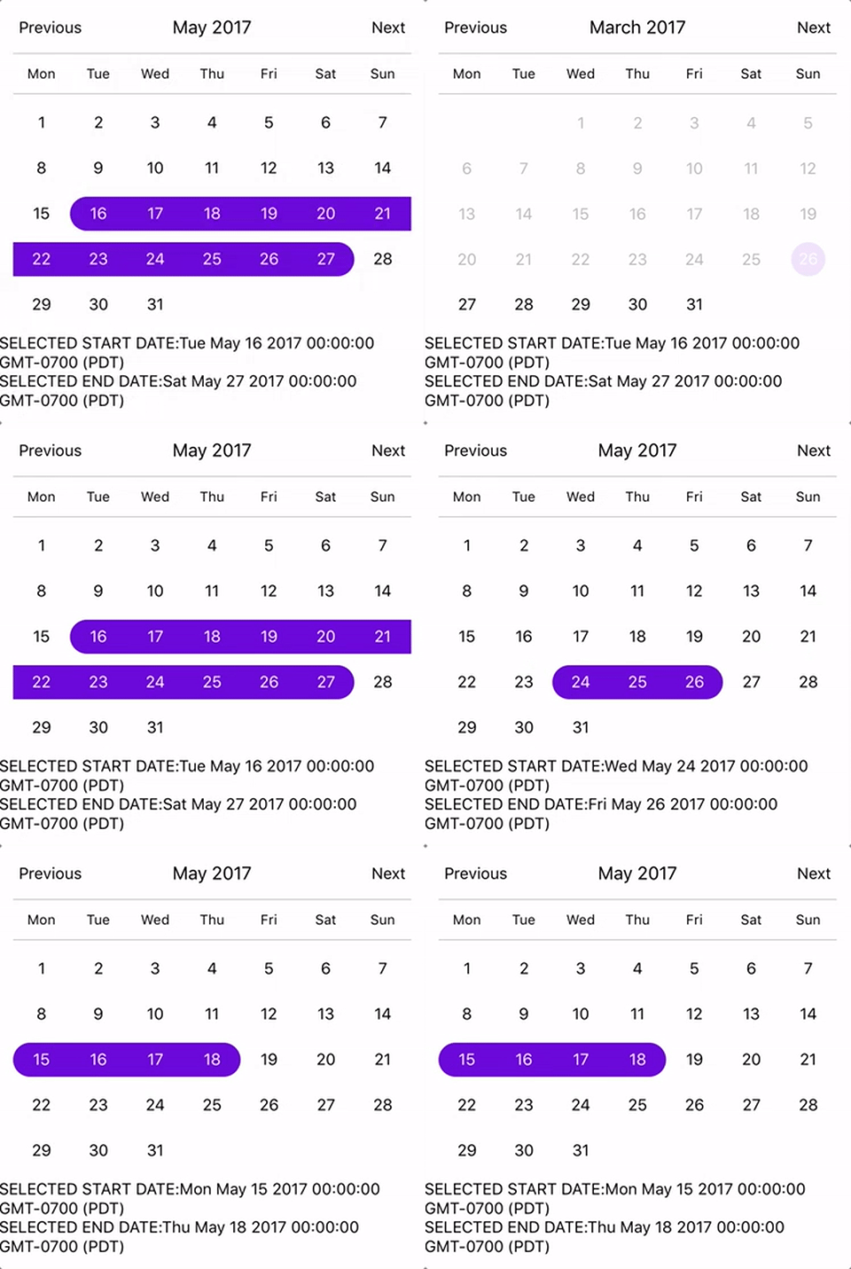
### Start from Monday, allowRangeSelection, Min and Max Dates and Styles Changes Example
![alt tag](https://user-images.githubusercontent.com/6295083/82028654-8f625d00-965b-11ea-8076-45ae609be296.gif)

```js
import React, { Component } from "react";
import { StyleSheet, Text, View } from "react-native";
import CalendarPicker from "react-native-calendar-picker";

export default class App extends Component {
  constructor(props) {
    super(props);
    this.state = {
      selectedStartDate: null,
      selectedEndDate: null,
    };
    this.onDateChange = this.onDateChange.bind(this);
  }

  onDateChange(date, type) {
    if (type === "END_DATE") {
      this.setState({
        selectedEndDate: date,
      });
    } else {
      this.setState({
        selectedStartDate: date,
        selectedEndDate: null,
      });
    }
  }

  render() {
    const { selectedStartDate, selectedEndDate } = this.state;
    const minDate = new Date(); // Today
    const maxDate = new Date(2017, 6, 3);
    const startDate = selectedStartDate ? selectedStartDate.toString() : "";
    const endDate = selectedEndDate ? selectedEndDate.toString() : "";

    return (
      <View style={styles.container}>
        <CalendarPicker
          startFromMonday={true}
          allowRangeSelection={true}
          minDate={minDate}
          maxDate={maxDate}
          todayBackgroundColor="#f2e6ff"
          selectedDayColor="#7300e6"
          selectedDayTextColor="#FFFFFF"
          onDateChange={this.onDateChange}
        />

        <View>
          <Text>SELECTED START DATE:{startDate}</Text>
          <Text>SELECTED END DATE:{endDate}</Text>
        </View>
      </View>
    );
  }
}

const styles = StyleSheet.create({
  container: {
    flex: 1,
    backgroundColor: "#FFFFFF",
    marginTop: 100,
  },
});
```

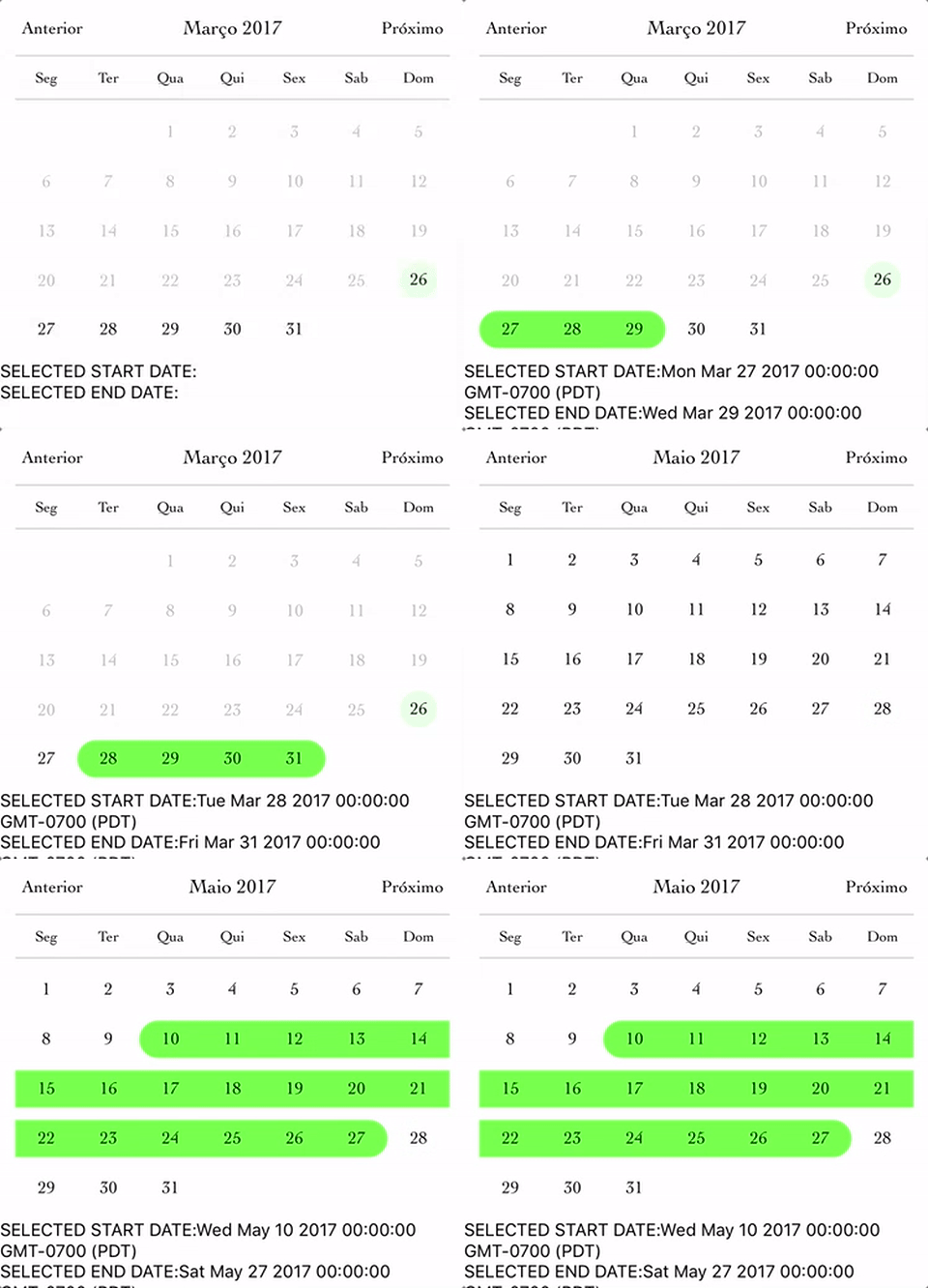
### Complex Example, Changing Fonts and Colors, Language and etc...
![alt tag](https://user-images.githubusercontent.com/6295083/82028709-9c7f4c00-965b-11ea-9705-790ce38929c0.gif)

```js
import React, { Component } from "react";
import { StyleSheet, Text, View } from "react-native";
import CalendarPicker from "react-native-calendar-picker";

export default class App extends Component {
  constructor(props) {
    super(props);
    this.state = {
      selectedStartDate: null,
      selectedEndDate: null,
    };
    this.onDateChange = this.onDateChange.bind(this);
  }

  onDateChange(date, type) {
    if (type === "END_DATE") {
      this.setState({
        selectedEndDate: date,
      });
    } else {
      this.setState({
        selectedStartDate: date,
        selectedEndDate: null,
      });
    }
  }

  render() {
    const { selectedStartDate, selectedEndDate } = this.state;
    const minDate = new Date(); // Today
    const maxDate = new Date(2017, 6, 3);
    const startDate = selectedStartDate ? selectedStartDate.toString() : "";
    const endDate = selectedEndDate ? selectedEndDate.toString() : "";

    return (
      <View style={styles.container}>
        <CalendarPicker
          startFromMonday={true}
          allowRangeSelection={true}
          minDate={minDate}
          maxDate={maxDate}
          weekdays={["Seg", "Ter", "Qua", "Qui", "Sex", "Sab", "Dom"]}
          months={[
            "Janeiro",
            "Fevereiro",
            "Março",
            "Abril",
            "Maio",
            "Junho",
            "Julho",
            "Agosto",
            "Setembro",
            "Outubro",
            "Novembro",
            "Dezembro",
          ]}
          previousTitle="Anterior"
          nextTitle="Próximo"
          todayBackgroundColor="#e6ffe6"
          selectedDayColor="#66ff33"
          selectedDayTextColor="#000000"
          scaleFactor={375}
          textStyle={{
            fontFamily: "Cochin",
            color: "#000000",
          }}
          onDateChange={this.onDateChange}
        />

        <View>
          <Text>SELECTED START DATE:{startDate}</Text>
          <Text>SELECTED END DATE:{endDate}</Text>
        </View>
      </View>
    );
  }
}

const styles = StyleSheet.create({
  container: {
    flex: 1,
    backgroundColor: "#FFFFFF",
    marginTop: 100,
  },
});
```

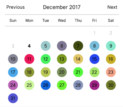
### Custom styling individual dates
![alt tag](https://user-images.githubusercontent.com/6295083/33563899-bf899954-d8de-11e7-85cd-18a15524f008.png)

```js

let today = new Date();
let day = today.clone().startOf('month');
let customDatesStyles = [];
while(day.add(1, 'day').isSame(today, 'month')) {
  customDatesStyles.push({
    date: day.clone(),
    // Random colors
    style: {backgroundColor: '#'+('#00000'+(Math.random()*(1<<24)|0).toString(16)).slice(-6)},
    textStyle: {color: 'black'}, // sets the font color
    containerStyle: [], // extra styling for day container
    allowDisabled: true, // allow custom style to apply to disabled dates
  });
}

render() {
  return (
    <CalendarPicker
      todayTextStyle={{fontWeight: 'bold'}}
      todayBackgroundColor={'transparent'}
      customDatesStyles={customDatesStyles}
      minDate={today}
    />
  );
}
```

### Styling each day of the week and the day name header.

```js

const customDayHeaderStylesCallback = {dayOfWeek, month, year} => {
  switch(dayOfWeek) { // can also evaluate month, year
    case 4: // Thursday
      return {
        style: {
          borderRadius: 12,
          backgroundColor: 'cyan',
        },
        textStyle: {
          color: 'blue',
          fontSize: 22,
          fontWeight: 'bold',
        }
      };
  }
}

const customDatesStylesCallback = date => {
  switch(date.isoWeekday()) {
    case 1: // Monday
      return {
        style:{
          backgroundColor: '#909',
        },
        textStyle: {
          color: '#0f0',
          fontWeight: 'bold',
        }
      };
    case 7: // Sunday
      return {
        textStyle: {
          color: 'red',
        }
      };
  }
}

<CalendarPicker
      customDayHeaderStyles={customDayHeaderStylesCallback}
      customDatesStyles={customDatesStylesCallback}
    />
```

## Methods

These internal methods may be accessed through a ref to the CalendarPicker.

| Name                        | Params                          | Description                                                                                                                                                                  |
| :-------------------------- | :------------------------------ | :--------------------------------------------------------------------------------------------------------------------------------------------------------------------------- |
| **`handleOnPressDay`**      | `{year, month, day} (Integers)` | Programmatically select date. `year`, `month` and `day` are numbers. `day` is the day of the current month. date-fns example for today's day of month: `getDate(new Date())` |
| **`handleOnPressNext`**     |                                 | Programmatically advance to next month. |
| **`handleOnPressPrevious`** |                                 | Programmatically advance to previous month. |
| **`resetSelections`**       |                                 | Clear date selections. Useful for resetting date range selection when user has picked a start date but not an end date. |
| **`goToDate`**              | `date, {isSelected}`            | Goes to the passed `date` and is type of Date. `isSelected` is optional boolean and marks the passed date as selected. Default values are like `goToDate(new Date(), {isSelected: true})` |

## TypeScript

Definitions are available at https://www.npmjs.com/package/@types/react-native-calendar-picker courtesy of [automatensalat](https://github.com/automatensalat).

```
npm install --save @types/react-native-calendar-picker
```

# Suggestions?

Open Issues. Submit PRs.

# Special Thanks

I would like to call out some contributors who have been helping with this project

- [peacechen](https://github.com/peacechen)
- [edvinerikson](https://github.com/edvinerikson)
- [thomaswright](https://github.com/thomaswright)
- [brentvatne](https://github.com/brentvatne)
- [kesha-antonov](https://github.com/kesha-antonov)
- [jthestupidkid](https://github.com/jthestupidkid)
- [adamkrell](https://github.com/adamkrell)
- [joshuapinter](https://github.com/joshuapinter)

# Sample Application

The sample app is an Expo project created with `create-react-native-app`.

```sh
cd example
npm run cp
npm install
npm start
```

## Development

The source files are copied from the project root directory into `example` using `npm run cp`. If a source file is modified, it must be copied over again with `npm run cp`.

---
_Source: https://npm.io/package/projectzerorn-calendar-picker · Machine-readable twin of the npm.io package page. Health data is recomputed on every publish._
