# rc-dialog
> dialog ui component for react
Latest version **10.0.0** (published 2025-01-09) · MIT license · 0 weekly downloads
## Install
```sh
npm install rc-dialog
pnpm add rc-dialog
yarn add rc-dialog
bun add rc-dialog
```
## Health
**Score 55/100 (C)** — status: stable.
Positive: has types; esm support; no vulnerabilities; high maintenance score; high quality score.
Warnings: low downloads.
Negative: stale.
## Facts
| | |
|---|---|
| Version | 10.0.0 |
| Published | 2025-01-09 |
| First published | 2014-12-12 |
| Weekly downloads | 0 |
| License | MIT |
| TypeScript types | bundled |
| Module format | ESM + CommonJS |
| Dependencies | 5 |
| Unpacked size | 75.8 KB |
| Known vulnerabilities | 0 |
| Install scripts | no |
| GitHub stars | 455 |
| Author | yiminghe@gmail.com |
| Maintainers | silentcloud, benjycui, yesmeck, afc163, yiminghe, paranoidjk, jljsj33, ddcat1115, zombiej, chenshuai2144, madccc |
| Keywords | react, react-component, react-dialog, dialog, ui |
## Links
- npm: https://www.npmjs.com/package/rc-dialog
- Repository: https://github.com/react-component/dialog
- Homepage: http://github.com/react-component/dialog
- Issues: http://github.com/react-component/dialog/issues
- npm.io page: https://npm.io/package/rc-dialog
## Dependencies (5)
- [rc-util](https://npm.io/package/rc-util.md) ^5.21.0
- [rc-motion](https://npm.io/package/rc-motion.md) ^2.3.0
- [classnames](https://npm.io/package/classnames.md) ^2.2.6
- [@babel/runtime](https://npm.io/package/@babel/runtime.md) ^7.10.1
- [@rc-component/portal](https://npm.io/package/@rc-component/portal.md) ^1.0.0-8
## Alternatives
- [mobx-react](https://npm.io/package/mobx-react.md) — 2.8M weekly downloads
- [rc-tree](https://npm.io/package/rc-tree.md) — 2.6M weekly downloads
- [@react-oauth/google](https://npm.io/package/@react-oauth/google.md) — 1.3M weekly downloads
- [@wagmi/connectors](https://npm.io/package/@wagmi/connectors.md) — 877.0K weekly downloads
- [vee-validate](https://npm.io/package/vee-validate.md) — 836.4K weekly downloads
## Recent versions
- 10.0.0 (latest) — 2025-01-09
- 9.5.2 (lastest) — 2024-06-06
- 7.5.0-alpha.0 (beta) — 2019-07-11
- 9.6.0 — 2024-08-19
- 9.0.4 — 2024-08-01
- 9.0.3 — 2024-08-01
- 9.5.1 — 2024-06-04
- 9.5.0 — 2024-05-28
- 9.4.0 — 2024-02-29
- 9.3.4 — 2023-10-20
- 9.3.3 — 2023-09-22
- 9.3.2 — 2023-09-22
- 9.3.1 — 2023-09-21
- 9.3.0 — 2023-09-18
- 9.2.0 — 2023-08-08
- … 150 more at https://npm.io/package/rc-dialog/versions
## README
# rc-dialog
react dialog component
[![NPM version][npm-image]][npm-url] [](https://github.com/umijs/dumi) [![build status][github-actions-image]][github-actions-url] [![Test coverage][codecov-image]][codecov-url] [![npm download][download-image]][download-url] [![bundle size][bundlephobia-image]][bundlephobia-url]
[npm-image]: http://img.shields.io/npm/v/rc-dialog.svg?style=flat-square
[npm-url]: http://npmjs.org/package/rc-dialog
[github-actions-image]: https://github.com/react-component/dialog/workflows/CI/badge.svg
[github-actions-url]: https://github.com/react-component/dialog/actions
[circleci-image]: https://img.shields.io/circleci/react-component/dialog/master?style=flat-square
[circleci-url]: https://circleci.com/gh/react-component/dialog
[codecov-image]: https://img.shields.io/codecov/c/github/react-component/dialog/master.svg?style=flat-square
[codecov-url]: https://app.codecov.io/gh/react-component/dialog
[download-image]: https://img.shields.io/npm/dm/rc-dialog.svg?style=flat-square
[download-url]: https://npmjs.org/package/rc-dialog
[bundlephobia-url]: https://bundlephobia.com/result?p=rc-dialog
[bundlephobia-image]: https://badgen.net/bundlephobia/minzip/rc-dialog
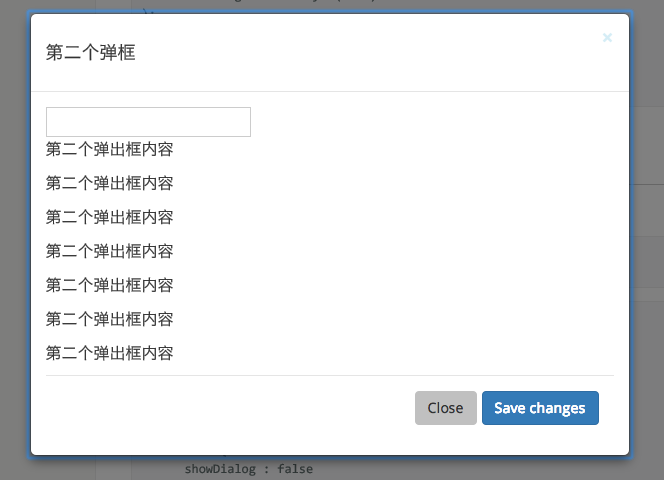
## Screenshot
 ## Example
http://localhost:8007/examples/
online example: https://dialog.react-component.vercel.app/
## Install
[](https://npmjs.org/package/rc-dialog)
## Usage
```js
var Dialog = require('rc-dialog');
ReactDOM.render(
), document.getElementById('t1'));
// use dialog
```
## API
### rc-dialog
| Name | Type | Default | Description | Version |
| ---------------------- | ------------------------------ | --------- | ------------------------------------------------------------------------------- | ------- |
| prefixCls | String | rc-dialog | The dialog dom node's prefixCls | |
| className | String | | additional className for dialog | |
| classNames | { header?: string; body?: string; footer?: string; mask?: string; content?: string; wrapper?: string; } | | pass className to target area | |
| styles | { header?: CSSProperties; body?: CSSProperties; footer?: CSSProperties; mask?: CSSProperties; content?: CSSProperties; wrapper?: CSSProperties; } | | pass styles to target area | |
| style | Object | {} | Root style for dialog element.Such as width, height | |
| zIndex | Number | | | |
| visible | Boolean | false | current dialog's visible status | |
| animation | String | | part of dialog animation css class name | |
| maskAnimation | String | | part of dialog's mask animation css class name | |
| transitionName | String | | dialog animation css class name | |
| maskTransitionName | String | | mask animation css class name | |
| title | String\|React.Element | | Title of the dialog | |
| footer | React.Element | | footer of the dialog | |
| closable | Boolean \| ({ closeIcon?: React.ReactNode; disabled?: boolean } & React.AriaAttributes | true | whether show close button | |
| mask | Boolean | true | whether show mask | |
| maskClosable | Boolean | true | whether click mask to close | |
| keyboard | Boolean | true | whether support press esc to close | |
| mousePosition | {x:number,y:number} | | set pageX and pageY of current mouse(it will cause transform origin to be set). | |
| onClose | function() | | called when click close button or mask | |
| afterClose | function() | | called when close animation end | |
| getContainer | function(): HTMLElement | | to determine where Dialog will be mounted | |
| destroyOnClose | Boolean | false | to unmount child compenents on onClose | |
| closeIcon | ReactNode | | specific the close icon. | |
| forceRender | Boolean | false | Create dialog dom node before dialog first show | |
| focusTriggerAfterClose | Boolean | true | focus trigger element when dialog closed | |
| modalRender | (node: ReactNode) => ReactNode | | Custom modal content render | 8.3.0 |
## Development
```
npm install
npm start
```
## Test Case
```
npm test
npm run chrome-test
```
## Coverage
```
npm run coverage
```
open coverage/ dir
## License
rc-dialog is released under the MIT license.
---
_Source: https://npm.io/package/rc-dialog · Machine-readable twin of the npm.io package page. Health data is recomputed on every publish._
## Example
http://localhost:8007/examples/
online example: https://dialog.react-component.vercel.app/
## Install
[](https://npmjs.org/package/rc-dialog)
## Usage
```js
var Dialog = require('rc-dialog');
ReactDOM.render(
), document.getElementById('t1'));
// use dialog
```
## API
### rc-dialog
| Name | Type | Default | Description | Version |
| ---------------------- | ------------------------------ | --------- | ------------------------------------------------------------------------------- | ------- |
| prefixCls | String | rc-dialog | The dialog dom node's prefixCls | |
| className | String | | additional className for dialog | |
| classNames | { header?: string; body?: string; footer?: string; mask?: string; content?: string; wrapper?: string; } | | pass className to target area | |
| styles | { header?: CSSProperties; body?: CSSProperties; footer?: CSSProperties; mask?: CSSProperties; content?: CSSProperties; wrapper?: CSSProperties; } | | pass styles to target area | |
| style | Object | {} | Root style for dialog element.Such as width, height | |
| zIndex | Number | | | |
| visible | Boolean | false | current dialog's visible status | |
| animation | String | | part of dialog animation css class name | |
| maskAnimation | String | | part of dialog's mask animation css class name | |
| transitionName | String | | dialog animation css class name | |
| maskTransitionName | String | | mask animation css class name | |
| title | String\|React.Element | | Title of the dialog | |
| footer | React.Element | | footer of the dialog | |
| closable | Boolean \| ({ closeIcon?: React.ReactNode; disabled?: boolean } & React.AriaAttributes | true | whether show close button | |
| mask | Boolean | true | whether show mask | |
| maskClosable | Boolean | true | whether click mask to close | |
| keyboard | Boolean | true | whether support press esc to close | |
| mousePosition | {x:number,y:number} | | set pageX and pageY of current mouse(it will cause transform origin to be set). | |
| onClose | function() | | called when click close button or mask | |
| afterClose | function() | | called when close animation end | |
| getContainer | function(): HTMLElement | | to determine where Dialog will be mounted | |
| destroyOnClose | Boolean | false | to unmount child compenents on onClose | |
| closeIcon | ReactNode | | specific the close icon. | |
| forceRender | Boolean | false | Create dialog dom node before dialog first show | |
| focusTriggerAfterClose | Boolean | true | focus trigger element when dialog closed | |
| modalRender | (node: ReactNode) => ReactNode | | Custom modal content render | 8.3.0 |
## Development
```
npm install
npm start
```
## Test Case
```
npm test
npm run chrome-test
```
## Coverage
```
npm run coverage
```
open coverage/ dir
## License
rc-dialog is released under the MIT license.
---
_Source: https://npm.io/package/rc-dialog · Machine-readable twin of the npm.io package page. Health data is recomputed on every publish._