# rc-tabs
> tabs ui component for react
Latest version **15.7.0** (published 2025-07-23) · MIT license · 0 weekly downloads
## Install
```sh
npm install rc-tabs
pnpm add rc-tabs
yarn add rc-tabs
bun add rc-tabs
```
## Health
**Score 55/100 (C)** — status: stable.
Positive: has types; esm support; no vulnerabilities; high maintenance score; high quality score.
Warnings: low downloads.
Negative: stale.
## Facts
| | |
|---|---|
| Version | 15.7.0 |
| Published | 2025-07-23 |
| First published | 2014-12-12 |
| Weekly downloads | 0 |
| License | MIT |
| TypeScript types | bundled |
| Module format | ESM + CommonJS |
| Node | >=8.x |
| Dependencies | 7 |
| Unpacked size | 172.4 KB |
| Known vulnerabilities | 0 |
| Install scripts | no |
| GitHub stars | 572 |
| Author | yiminghe@gmail.com |
| Maintainers | benjycui, yesmeck, afc163, paranoidjk, zombiej, picodoth, madccc |
| Keywords | react, react-component, react-tabs |
## Links
- npm: https://www.npmjs.com/package/rc-tabs
- Repository: https://github.com/react-component/tabs
- Homepage: http://github.com/react-component/tabs
- Issues: http://github.com/react-component/tabs/issues
- npm.io page: https://npm.io/package/rc-tabs
## Dependencies (7)
- [rc-menu](https://npm.io/package/rc-menu.md) ~9.16.0
- [rc-util](https://npm.io/package/rc-util.md) ^5.34.1
- [rc-motion](https://npm.io/package/rc-motion.md) ^2.6.2
- [classnames](https://npm.io/package/classnames.md) 2.x
- [rc-dropdown](https://npm.io/package/rc-dropdown.md) ~4.2.0
- [@babel/runtime](https://npm.io/package/@babel/runtime.md) ^7.11.2
- [rc-resize-observer](https://npm.io/package/rc-resize-observer.md) ^1.0.0
## Alternatives
- [mobx-react](https://npm.io/package/mobx-react.md) — 2.8M weekly downloads
- [rc-tree](https://npm.io/package/rc-tree.md) — 2.6M weekly downloads
- [@react-oauth/google](https://npm.io/package/@react-oauth/google.md) — 1.3M weekly downloads
- [@wagmi/connectors](https://npm.io/package/@wagmi/connectors.md) — 877.0K weekly downloads
- [vee-validate](https://npm.io/package/vee-validate.md) — 836.4K weekly downloads
## Recent versions
- 15.7.0 (latest) — 2025-07-23
- 10.0.0-alpha.1 (beta) — 2019-12-24
- 15.6.1 — 2025-04-28
- 15.6.0 — 2025-04-16
- 15.5.2 — 2025-04-01
- 15.5.1 — 2025-02-07
- 15.5.0 — 2024-12-17
- 15.4.0 — 2024-10-30
- 15.3.0 — 2024-09-29
- 15.2.0 — 2024-08-16
- 15.1.1 — 2024-06-12
- 15.1.0 — 2024-05-17
- 15.0.0 — 2024-04-05
- 14.1.1 — 2024-03-08
- 14.1.0 — 2024-03-08
- … 219 more at https://npm.io/package/rc-tabs/versions
## README
# rc-tabs
---
React Tabs component.
[![NPM version][npm-image]][npm-url] [](https://github.com/umijs/dumi) [![build status][github-actions-image]][github-actions-url] [![Test coverage][codecov-image]][codecov-url] [![npm download][download-image]][download-url] [![bundle size][bundlephobia-image]][bundlephobia-url]
[npm-image]: http://img.shields.io/npm/v/rc-tabs.svg?style=flat-square
[npm-url]: http://npmjs.org/package/rc-tabs
[github-actions-image]: https://github.com/react-component/tabs/workflows/CI/badge.svg
[github-actions-url]: https://github.com/react-component/tabs/actions
[codecov-image]: https://img.shields.io/codecov/c/github/react-component/tabs/master.svg?style=flat-square
[codecov-url]: https://codecov.io/gh/react-component/tabs/branch/master
[download-image]: https://img.shields.io/npm/dm/rc-tabs.svg?style=flat-square
[download-url]: https://npmjs.org/package/rc-tabs
[bundlephobia-url]: https://bundlephobia.com/result?p=rc-tabs
[bundlephobia-image]: https://badgen.net/bundlephobia/minzip/rc-tabs
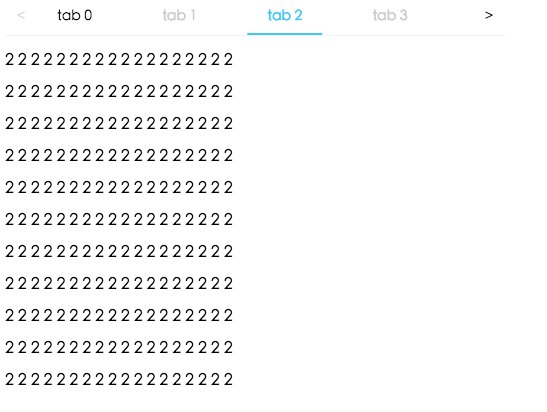
## Screenshot
 ## Example
http://localhost:8000/examples
online example: https://tabs.react-component.now.sh/
## install
[](https://npmjs.org/package/rc-tabs)
## Feature
### Keyboard
- left and up: tabs to previous tab
- right and down: tabs to next tab
## Usage
```tsx | pure
import Tabs from 'rc-tabs';
import ReactDom from 'react-dom';
const callback = (key) => {
console.log(key);
};
const items = [
{
key: '1',
label: 'Google',
children: (
## Example
http://localhost:8000/examples
online example: https://tabs.react-component.now.sh/
## install
[](https://npmjs.org/package/rc-tabs)
## Feature
### Keyboard
- left and up: tabs to previous tab
- right and down: tabs to next tab
## Usage
```tsx | pure
import Tabs from 'rc-tabs';
import ReactDom from 'react-dom';
const callback = (key) => {
console.log(key);
};
const items = [
{
key: '1',
label: 'Google',
children: (
Lorem Ipsum is simply dummy text of the printing and typesetting
),
},
{
key: '2',
label: Amazon
,
children:
'Neque porro quisquam est qui dolorem ipsum quia dolor sit amet, consectetur, adipisci velit...',
disabled: true,
},
{
key: '3',
label: Twitter
,
children: (
"There is no one who loves pain itself, who seeks after it and wants to have it, simply
because it is pain..."
),
},
];
ReactDom.render(
,
root,
);
```
## API
### Tabs
| name | type | default | description |
| --- | --- | --- | --- |
| prefixCls | string | `'rc-tabs'` | prefix class name, use to custom style |
| className | string | - | to define a class name for an element |
| style | CSS properties | - | object with css properties for styling |
| items | TabItem[] | [] | configure tab content |
| id | string | - | unique identifier |
| defaultActiveKey | string | - | initial active tabPanel's key if activeKey is absent |
| activeKey | string | - | current active tabPanel's key |
| direction | `'ltr' or 'rtl'` | `'ltr'` | Layout direction of tabs component |
| animated | boolean \| { inkBar: boolean, tabPane: boolean } | `{ inkBar: true, tabPane: false }` | config animation |
| renderTabBar | (props, TabBarComponent) => ReactElement | - | How to render tab bar |
| tabBarExtraContent | ReactNode \| `{ left: ReactNode, right: ReactNode }` | - | config extra content |
| tabBarGutter | number | 0 | config tab bar gutter |
| tabBarPosition | `'left' \| 'right' \| 'top' \| 'bottom'` | `'top'` | tab nav 's position |
| tabBarStyle | style | - | tab nav style |
| tabPosition | `'left' or 'right' or 'top' or 'bottom'` | `'top'` | tab nav 's position |
| destroyInactiveTabPane | boolean | false | whether destroy inactive TabPane when change tab |
| onChange | (key) => void | - | called when tabPanel is changed |
| onTabClick | (key) => void | - | called when tab click |
| onTabScroll | ({ direction }) => void | - | called when tab scroll |
| editable | { onEdit(type: 'add' \| 'remove', info: { key, event }), showAdd: boolean, removeIcon: ReactNode, addIcon: ReactNode } | - | config tab editable |
| locale | { dropdownAriaLabel: string, removeAriaLabel: string, addAriaLabel: string } | - | Accessibility locale help text |
| moreIcon | ReactNode | - | collapse icon |
### TabItem
| name | type | default | description |
| --- | --- | --- | --- |
| key | string | - | corresponding to activeKey, should be unique |
| label | string | - | TabPane's head display text |
| tab | ReactNode | - | current tab's title corresponding to current tabPane |
| className | string | - | to define a class name for an element |
| style | CSS properties | - | object with css properties for styling |
| disabled | boolean | false | set TabPane disabled |
| children | ReactNode | - | TabPane's head display content |
| forceRender | boolean | false | forced render of content in tabs, not lazy render after clicking on tabs |
| closable | boolean | false | closable feature of tab item |
| closeIcon | ReactNode | - | Config close icon |
| prefixCls | string | `'rc-tabs-tab'` | prefix class name, use to custom style |
| id | string | - | unique identifier |
| animated | boolean \| { inkBar: boolean, tabPane: boolean } | `{ inkBar: true, tabPane: false }` | config animation |
| destroyInactiveTabPane | boolean | false | whether destroy inactive TabPane when change tab |
| active | boolean | false | active feature of tab item |
| tabKey | string | - | key linked to tab |
### TabPane(support in older versions)
| name | type | default | description |
| --- | --- | --- | --- |
| destroyInactiveTabPane | boolean | false | whether destroy inactive TabPane when change tab |
| key | string | - | corresponding to activeKey, should be unique |
| forceRender | boolean | false | forced render of content in tabs, not lazy render after clicking on tabs |
| tab | ReactNode | - | current tab's title corresponding to current tabPane |
| closeIcon | ReactNode | - | Config close icon |
## Development
```
npm install
npm start
```
## Test Case
```
npm test
npm run chrome-test
```
## Coverage
```
npm run coverage
```
open coverage/ dir
## License
rc-tabs is released under the MIT license.
## FAQ
### Responsive Tabs
There are 3 cases when handling responsive tabs:
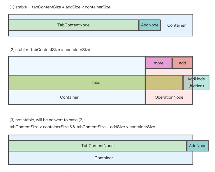
We get hidden tabs through [useVisibleRange.ts](https://github.com/react-component/tabs/blob/master/src/hooks/useVisibleRange.ts).
If enconter the third case, in order to make tabs responsive, some tabs should be hidden.
So we minus `addSize` when calculating `basicSize` manully, even though there's no addNode in container.
In this way, case 3 turns to case 2, tabs become stable again.
---
_Source: https://npm.io/package/rc-tabs · Machine-readable twin of the npm.io package page. Health data is recomputed on every publish._