# rc-tooltip-sooth-sayer-fork

> React Tooltip

Latest version **3.7.4** (published 2019-02-18) · MIT license · 0 weekly downloads

## Install

```sh
npm install rc-tooltip-sooth-sayer-fork
pnpm add rc-tooltip-sooth-sayer-fork
yarn add rc-tooltip-sooth-sayer-fork
bun add rc-tooltip-sooth-sayer-fork
```

## Health

**Score 20/100 (F)** — status: abandoned.

Positive: esm support; no vulnerabilities.

Warnings: low downloads; no types.

Negative: abandoned; low maintenance score.

## Facts

| | |
|---|---|
| Version | 3.7.4 |
| Published | 2019-02-18 |
| First published | 2019-02-18 |
| Weekly downloads | 0 |
| License | MIT |
| TypeScript types | none |
| Module format | ESM + CommonJS |
| Dependencies | 4 |
| Unpacked size | 686 KB |
| Known vulnerabilities | 0 |
| Install scripts | no |
| GitHub stars | 0 |
| Maintainers | dm.che |
| Keywords | react, react-component, react-tooltip, tooltip |

## Links

- npm: https://www.npmjs.com/package/rc-tooltip-sooth-sayer-fork
- Repository: https://github.com/sooth-sayer/tooltip
- Issues: http://github.com/react-component/tooltip/issues
- npm.io page: https://npm.io/package/rc-tooltip-sooth-sayer-fork

## Dependencies (4)

- [positions](https://npm.io/package/positions.md) ^1.6.2
- [prop-types](https://npm.io/package/prop-types.md) ^15.5.8
- [rc-trigger](https://npm.io/package/rc-trigger.md) ^2.2.2
- [babel-runtime](https://npm.io/package/babel-runtime.md) 6.x

## Alternatives

- [mobx-react](https://npm.io/package/mobx-react.md) — 2.8M weekly downloads
- [rc-tree](https://npm.io/package/rc-tree.md) — 2.6M weekly downloads
- [@react-oauth/google](https://npm.io/package/@react-oauth/google.md) — 1.3M weekly downloads
- [@wagmi/connectors](https://npm.io/package/@wagmi/connectors.md) — 877.0K weekly downloads
- [vee-validate](https://npm.io/package/vee-validate.md) — 836.4K weekly downloads

## Recent versions

- 3.7.4 (latest) — 2019-02-18

## README

# rc-tooltip
---

React Tooltip

[![NPM version][npm-image]][npm-url]
[![build status][travis-image]][travis-url]
[![Test coverage][coveralls-image]][coveralls-url]
[![gemnasium deps][gemnasium-image]][gemnasium-url]
[![node version][node-image]][node-url]
[![npm download][download-image]][download-url]

[npm-image]: https://img.shields.io/npm/v/rc-tooltip.svg?style=flat-square
[npm-url]: https://npmjs.org/package/rc-tooltip
[travis-image]: https://img.shields.io/travis/react-component/tooltip.svg?style=flat-square
[travis-url]: https://travis-ci.org/react-component/tooltip
[coveralls-image]: https://img.shields.io/coveralls/react-component/tooltip.svg?style=flat-square
[coveralls-url]: https://coveralls.io/r/react-component/tooltip?branch=master
[gemnasium-image]: https://img.shields.io/gemnasium/react-component/tooltip.svg?style=flat-square
[gemnasium-url]: https://gemnasium.com/react-component/tooltip
[node-image]: https://img.shields.io/badge/node.js-%3E=_0.10-green.svg?style=flat-square
[node-url]: https://nodejs.org/download/
[download-image]: https://img.shields.io/npm/dm/rc-tooltip.svg?style=flat-square
[download-url]: https://npmjs.org/package/rc-tooltip

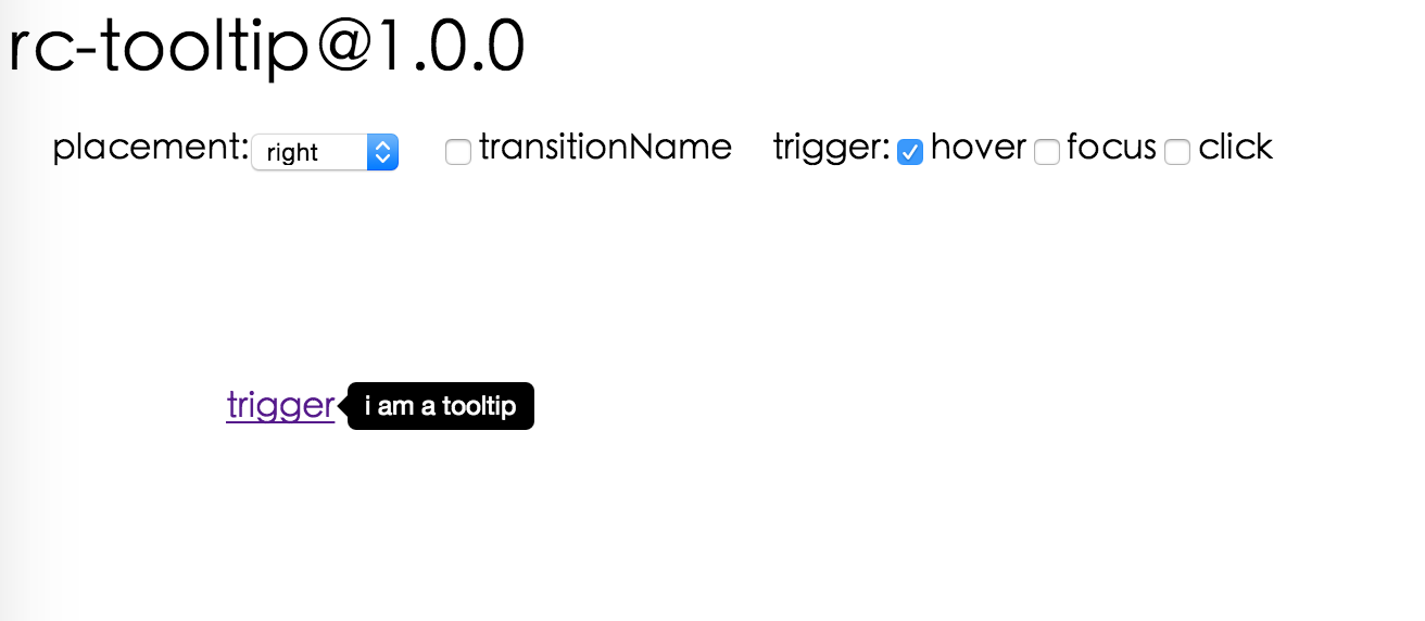
## Screenshot

<img src="https://gtms03.alicdn.com/tps/i3/TB1NQUSHpXXXXaUXFXXlQqyZXXX-1312-572.png" width="600"/>

## Browsers support

| [<img src="https://raw.githubusercontent.com/alrra/browser-logos/master/src/edge/edge_48x48.png" alt="IE / Edge" width="24px" height="24px" />](http://godban.github.io/browsers-support-badges/)</br>IE / Edge | [<img src="https://raw.githubusercontent.com/alrra/browser-logos/master/src/firefox/firefox_48x48.png" alt="Firefox" width="24px" height="24px" />](http://godban.github.io/browsers-support-badges/)</br>Firefox | [<img src="https://raw.githubusercontent.com/alrra/browser-logos/master/src/chrome/chrome_48x48.png" alt="Chrome" width="24px" height="24px" />](http://godban.github.io/browsers-support-badges/)</br>Chrome | [<img src="https://raw.githubusercontent.com/alrra/browser-logos/master/src/safari/safari_48x48.png" alt="Safari" width="24px" height="24px" />](http://godban.github.io/browsers-support-badges/)</br>Safari | [<img src="https://raw.githubusercontent.com/alrra/browser-logos/master/src/opera/opera_48x48.png" alt="Opera" width="24px" height="24px" />](http://godban.github.io/browsers-support-badges/)</br>Opera |
| --------- | --------- | --------- | --------- | --------- |
| IE 8 + ✔ | Firefox 31.0+ ✔ | Chrome 31.0+ ✔ | Safari 7.0+ ✔ | Opera 30.0+ ✔ |


## Install

[![rc-tooltip](https://nodei.co/npm/rc-tooltip.png)](https://npmjs.org/package/rc-tooltip)

## Usage

```js
var Tooltip = require('rc-tooltip');
var React = require('react');
var ReactDOM = require('react-dom');

// By default, the tooltip has no style.
// Consider importing the stylesheet it comes with:
// 'rc-tooltip/assets/bootstrap_white.css'

ReactDOM.render(
  <Tooltip placement="left" trigger={['click']} overlay={<span>tooltip</span>}>
    <a href="#">hover</a>
  </Tooltip>,
  container
);
```

## Examples

`npm start` and then go to
<http://localhost:8007/examples>

Online examples: <https://react-component.github.io/tooltip/examples/>

## API

### Props

<table class="table table-bordered table-striped">
    <thead>
    <tr>
        <th style="width: 100px;">name</th>
        <th style="width: 50px;">type</th>
        <th style="width: 50px;">default</th>
        <th>description</th>
    </tr>
    </thead>
    <tbody>
        <tr>
          <td>overlayClassName</td>
          <td>string</td>
          <td></td>
          <td>additional className added to popup overlay</td>
        </tr>
        <tr>
          <td>trigger</td>
          <td>string[]</td>
          <td>['hover']</td>
          <td>which actions cause tooltip shown. enum of 'hover','click','focus'</td>
        </tr>
        <tr>
          <td>mouseEnterDelay</td>
          <td>number</td>
          <td>0</td>
          <td>delay time to show when mouse enter.unit: s.</td>
        </tr>
        <tr>
          <td>mouseLeaveDelay</td>
          <td>number</td>
          <td>0.1</td>
          <td>delay time to hide when mouse leave.unit: s.</td>
        </tr>
        <tr>
          <td>overlayStyle</td>
          <td>Object</td>
          <td></td>
          <td>additional style of overlay node</td>
        </tr>
        <tr>
          <td>prefixCls</td>
          <td>String</td>
          <td>rc-tooltip</td>
          <td>prefix class name</td>
        </tr>
        <tr>
          <td>transitionName</td>
          <td>String|Object</td>
          <td></td>
          <td>same as https://github.com/react-component/animate</td>
        </tr>
        <tr>
          <td>onVisibleChange</td>
          <td>Function</td>
          <td></td>
          <td>call when visible is changed</td>
        </tr>
        <tr>
          <td>afterVisibleChange</td>
          <td>Function</td>
          <td></td>
          <td>call after visible is changed</td>
        </tr>
        <tr>
          <td>visible</td>
          <td>boolean</td>
          <td></td>
          <td>whether tooltip is visible</td>
        </tr>
        <tr>
          <td>defaultVisible</td>
          <td>boolean</td>
          <td></td>
          <td>whether tooltip is visible initially</td>
        </tr>
        <tr>
          <td>placement</td>
          <td>String</td>
          <td></td>
          <td>one of ['left','right','top','bottom', 'topLeft', 'topRight', 'bottomLeft', 'bottomRight']</td>
        </tr>
        <tr>
          <td>align</td>
          <td>Object: alignConfig of [dom-align](https://github.com/yiminghe/dom-align)</td>
          <td></td>
          <td>value will be merged into placement's config</td>
        </tr>
        <tr>
          <td>onPopupAlign</td>
          <td>function(popupDomNode, align)</td>
          <td></td>
          <td>callback when popup node is aligned</td>
        </tr>
        <tr>
          <td>overlay</td>
          <td>React.Element | () => React.Element</td>
          <td></td>
          <td>popup content</td>
        </tr>
        <tr>
          <td>arrowContent</td>
          <td>React.Node</td>
          <td>null</td>
          <td>arrow content</td>
        </tr>
        <tr>
          <td>getTooltipContainer</td>
          <td>function</td>
          <td></td>
          <td>Function returning html node which will act as tooltip container. By default the tooltip attaches to the body. If you want to change the container, simply return a new element.</td>
        </tr>
        <tr>
          <td>destroyTooltipOnHide</td>
          <td>boolean</td>
          <td>false</td>
          <td>whether destroy tooltip when tooltip is hidden</td>
        </tr>
        <tr>
          <td>id</td>
          <td>String</td>
          <td></td>
          <td>Id which gets attached to the tooltip content. Can be used with aria-describedby to achieve Screenreader-Support.</td>
        </tr>
    </tbody>
</table>

## Note

`Tooltip` requires child node accepts `onMouseEnter`, `onMouseLeave`, `onFocus`, `onClick` event.

## Accessibility

For accessibility purpose you can use the `id` prop to link your tooltip with another element. For example attaching it to an input element:
```jsx
<Tooltip
    ...
    id={this.props.name}>
    <input type="text"
           ...
           aria-describedby={this.props.name}/>
</Tooltip>
```
If you do it like this, a screenreader would read the content of your tooltip if you focus the input element.

**NOTE:** `role="tooltip"` is also added to expose the purpose of the tooltip element to a screenreader.

## Development

```bash
npm install
npm start
```

## Test Case

```bash
npm test
npm run chrome-test
```

## Coverage

```bash
npm run coverage
```

## License

`rc-tooltip` is released under the MIT license.

---
_Source: https://npm.io/package/rc-tooltip-sooth-sayer-fork · Machine-readable twin of the npm.io package page. Health data is recomputed on every publish._