# rc-tooltip
> React Tooltip
Latest version **6.4.0** (published 2025-01-07) · MIT license · 0 weekly downloads
## Install
```sh
npm install rc-tooltip
pnpm add rc-tooltip
yarn add rc-tooltip
bun add rc-tooltip
```
## Health
**Score 55/100 (C)** — status: stable.
Positive: has types; esm support; no vulnerabilities; high maintenance score; high quality score.
Warnings: low downloads.
Negative: stale.
## Facts
| | |
|---|---|
| Version | 6.4.0 |
| Published | 2025-01-07 |
| First published | 2015-04-09 |
| Weekly downloads | 0 |
| License | MIT |
| TypeScript types | bundled |
| Module format | ESM + CommonJS |
| Dependencies | 4 |
| Unpacked size | 54.9 KB |
| Known vulnerabilities | 0 |
| Install scripts | no |
| GitHub stars | 944 |
| Maintainers | silentcloud, benjycui, yesmeck, afc163, yiminghe, paranoidjk, zombiej, madccc |
| Keywords | react, react-component, react-tooltip, tooltip |
## Links
- npm: https://www.npmjs.com/package/rc-tooltip
- Repository: https://github.com/react-component/tooltip
- Homepage: http://github.com/react-component/tooltip
- Issues: http://github.com/react-component/tooltip/issues
- npm.io page: https://npm.io/package/rc-tooltip
## Dependencies (4)
- [rc-util](https://npm.io/package/rc-util.md) ^5.44.3
- [classnames](https://npm.io/package/classnames.md) ^2.3.1
- [@babel/runtime](https://npm.io/package/@babel/runtime.md) ^7.11.2
- [@rc-component/trigger](https://npm.io/package/@rc-component/trigger.md) ^2.0.0
## Alternatives
- [mobx-react](https://npm.io/package/mobx-react.md) — 2.8M weekly downloads
- [rc-tree](https://npm.io/package/rc-tree.md) — 2.6M weekly downloads
- [@react-oauth/google](https://npm.io/package/@react-oauth/google.md) — 1.3M weekly downloads
- [@wagmi/connectors](https://npm.io/package/@wagmi/connectors.md) — 877.0K weekly downloads
- [vee-validate](https://npm.io/package/vee-validate.md) — 836.4K weekly downloads
## Recent versions
- 6.4.0 (latest) — 2025-01-07
- 6.3.2 — 2024-12-19
- 6.3.1 — 2024-12-04
- 6.3.0 — 2024-11-29
- 6.2.1 — 2024-09-19
- 6.2.0 — 2024-03-08
- 6.1.3 — 2023-12-18
- 6.1.2 — 2023-10-26
- 6.1.1 — 2023-10-10
- 6.1.0 — 2023-09-22
- 6.0.1 — 2023-02-09
- 6.0.0 — 2023-02-08
- 5.3.1 — 2023-01-18
- 5.3.0 — 2023-01-15
- 5.2.2 — 2022-07-19
- … 84 more at https://npm.io/package/rc-tooltip/versions
## README
# rc-tooltip
React Tooltip
[![NPM version][npm-image]][npm-url]
[![npm download][download-image]][download-url]
[![build status][github-actions-image]][github-actions-url]
[![Codecov][codecov-image]][codecov-url]
[![bundle size][bundlephobia-image]][bundlephobia-url]
[![dumi][dumi-image]][dumi-url]
[npm-image]: http://img.shields.io/npm/v/rc-tooltip.svg?style=flat-square
[npm-url]: http://npmjs.org/package/rc-tooltip
[travis-image]: https://img.shields.io/travis/react-component/tooltip/master?style=flat-square
[travis-url]: https://travis-ci.com/react-component/tooltip
[github-actions-image]: https://github.com/react-component/tooltip/workflows/CI/badge.svg
[github-actions-url]: https://github.com/react-component/tooltip/actions
[codecov-image]: https://img.shields.io/codecov/c/github/react-component/tooltip/master.svg?style=flat-square
[codecov-url]: https://app.codecov.io/gh/react-component/tooltip
[david-url]: https://david-dm.org/react-component/tooltip
[david-image]: https://david-dm.org/react-component/tooltip/status.svg?style=flat-square
[david-dev-url]: https://david-dm.org/react-component/tooltip?type=dev
[david-dev-image]: https://david-dm.org/react-component/tooltip/dev-status.svg?style=flat-square
[download-image]: https://img.shields.io/npm/dm/rc-tooltip.svg?style=flat-square
[download-url]: https://npmjs.org/package/rc-tooltip
[bundlephobia-url]: https://bundlephobia.com/package/rc-tooltip
[bundlephobia-image]: https://badgen.net/bundlephobia/minzip/rc-tooltip
[dumi-url]: https://github.com/umijs/dumi
[dumi-image]: https://img.shields.io/badge/docs%20by-dumi-blue?style=flat-square
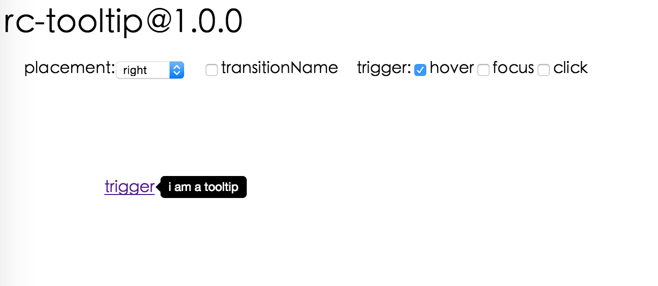
## Screenshot
 ## Browsers support
| [
## Browsers support
| [ ](http://godban.github.io/browsers-support-badges/)IE / Edge | [
 ](http://godban.github.io/browsers-support-badges/)Firefox | [
 ](http://godban.github.io/browsers-support-badges/)Chrome | [
 ](http://godban.github.io/browsers-support-badges/)Safari | [
 ](http://godban.github.io/browsers-support-badges/)Opera |
| --------------------------------------------------------------------------------------------------------------------------------------------------------------------------------------------------------------- | ----------------------------------------------------------------------------------------------------------------------------------------------------------------------------------------------------------------- | ------------------------------------------------------------------------------------------------------------------------------------------------------------------------------------------------------------- | ------------------------------------------------------------------------------------------------------------------------------------------------------------------------------------------------------------- | --------------------------------------------------------------------------------------------------------------------------------------------------------------------------------------------------------- |
| IE 8 + ✔ | Firefox 31.0+ ✔ | Chrome 31.0+ ✔ | Safari 7.0+ ✔ | Opera 30.0+ ✔ |
## Install
[](https://npmjs.org/package/rc-tooltip)
## Usage
```js
var Tooltip = require('rc-tooltip');
var React = require('react');
var ReactDOM = require('react-dom');
// By default, the tooltip has no style.
// Consider importing the stylesheet it comes with:
// 'rc-tooltip/assets/bootstrap_white.css'
ReactDOM.render(
tooltip}>
hover
,
container,
);
```
## Examples
`npm start` and then go to
Online demo:
## API
### Props
| name | type | default | description |
| -------------------- | ----------------------------------------- | ------------------- | ---------------------------------------------------------------------------------------------------------------------------------------------------------------- |
| trigger | string \| string\[] | 'hover' | which actions cause tooltip shown. enum of 'hover','click','focus' |
| visible | boolean | false | whether tooltip is visible |
| defaultVisible | boolean | false | whether tooltip is visible by default |
| placement | string | 'right' | tooltip placement. enum of 'top','left','right','bottom', 'topLeft', 'topRight', 'bottomLeft', 'bottomRight', 'leftTop', 'leftBottom', 'rightTop', 'rightBottom' |
| motion | object | | Config popup motion. Please ref demo for example |
| onVisibleChange | (visible: boolean) => void; | | Callback when visible change |
| afterVisibleChange | (visible: boolean) => void; | | Callback after visible change |
| overlay | ReactNode \| () => ReactNode | | tooltip overlay content |
| overlayStyle | object | | deprecated, Please use `styles={{ root: {} }}` |
| overlayClassName | string | | deprecated, Please use `classNames={{ root: {} }}` |
| prefixCls | string | 'rc-tooltip' | prefix class name of tooltip |
| mouseEnterDelay | number | 0 | delay time (in second) before tooltip shows when mouse enter |
| mouseLeaveDelay | number | 0.1 | delay time (in second) before tooltip hides when mouse leave |
| getTooltipContainer | (triggerNode: HTMLElement) => HTMLElement | () => document.body | get container of tooltip, default to body |
| destroyTooltipOnHide | boolean | false | destroy tooltip when it is hidden |
| align | object | | align config of tooltip. Please ref demo for usage example |
| showArrow | boolean \| object | false | whether to show arrow of tooltip |
| zIndex | number | | config popup tooltip zIndex |
| classNames | classNames?: { root?: string; body?: string;}; | | Semantic DOM class |
| styles | styles?: {root?: React.CSSProperties;body?: React.CSSProperties;}; | | Semantic DOM styles |
## Important Note
`Tooltip` requires a child node that accepts an `onMouseEnter`, `onMouseLeave`, `onFocus`, `onClick` event. This means the child node must be a built-in component like `div` or `span`, or a custom component that passes its props to its built-in component child.
## Accessibility
For accessibility purpose you can use the `id` prop to link your tooltip with another element. For example attaching it to an input element:
```js
```
If you do it like this, a screenreader would read the content of your tooltip if you focus the input element.
**NOTE:** `role="tooltip"` is also added to expose the purpose of the tooltip element to a screenreader.
## Development
```bash
npm install
npm start
```
## Test Case
```bash
npm test
npm run chrome-test
```
## Coverage
```bash
npm run coverage
```
## License
`rc-tooltip` is released under the MIT license.
---
_Source: https://npm.io/package/rc-tooltip · Machine-readable twin of the npm.io package page. Health data is recomputed on every publish._
](http://godban.github.io/browsers-support-badges/)Opera |
| --------------------------------------------------------------------------------------------------------------------------------------------------------------------------------------------------------------- | ----------------------------------------------------------------------------------------------------------------------------------------------------------------------------------------------------------------- | ------------------------------------------------------------------------------------------------------------------------------------------------------------------------------------------------------------- | ------------------------------------------------------------------------------------------------------------------------------------------------------------------------------------------------------------- | --------------------------------------------------------------------------------------------------------------------------------------------------------------------------------------------------------- |
| IE 8 + ✔ | Firefox 31.0+ ✔ | Chrome 31.0+ ✔ | Safari 7.0+ ✔ | Opera 30.0+ ✔ |
## Install
[](https://npmjs.org/package/rc-tooltip)
## Usage
```js
var Tooltip = require('rc-tooltip');
var React = require('react');
var ReactDOM = require('react-dom');
// By default, the tooltip has no style.
// Consider importing the stylesheet it comes with:
// 'rc-tooltip/assets/bootstrap_white.css'
ReactDOM.render(
tooltip}>
hover
,
container,
);
```
## Examples
`npm start` and then go to
Online demo:
## API
### Props
| name | type | default | description |
| -------------------- | ----------------------------------------- | ------------------- | ---------------------------------------------------------------------------------------------------------------------------------------------------------------- |
| trigger | string \| string\[] | 'hover' | which actions cause tooltip shown. enum of 'hover','click','focus' |
| visible | boolean | false | whether tooltip is visible |
| defaultVisible | boolean | false | whether tooltip is visible by default |
| placement | string | 'right' | tooltip placement. enum of 'top','left','right','bottom', 'topLeft', 'topRight', 'bottomLeft', 'bottomRight', 'leftTop', 'leftBottom', 'rightTop', 'rightBottom' |
| motion | object | | Config popup motion. Please ref demo for example |
| onVisibleChange | (visible: boolean) => void; | | Callback when visible change |
| afterVisibleChange | (visible: boolean) => void; | | Callback after visible change |
| overlay | ReactNode \| () => ReactNode | | tooltip overlay content |
| overlayStyle | object | | deprecated, Please use `styles={{ root: {} }}` |
| overlayClassName | string | | deprecated, Please use `classNames={{ root: {} }}` |
| prefixCls | string | 'rc-tooltip' | prefix class name of tooltip |
| mouseEnterDelay | number | 0 | delay time (in second) before tooltip shows when mouse enter |
| mouseLeaveDelay | number | 0.1 | delay time (in second) before tooltip hides when mouse leave |
| getTooltipContainer | (triggerNode: HTMLElement) => HTMLElement | () => document.body | get container of tooltip, default to body |
| destroyTooltipOnHide | boolean | false | destroy tooltip when it is hidden |
| align | object | | align config of tooltip. Please ref demo for usage example |
| showArrow | boolean \| object | false | whether to show arrow of tooltip |
| zIndex | number | | config popup tooltip zIndex |
| classNames | classNames?: { root?: string; body?: string;}; | | Semantic DOM class |
| styles | styles?: {root?: React.CSSProperties;body?: React.CSSProperties;}; | | Semantic DOM styles |
## Important Note
`Tooltip` requires a child node that accepts an `onMouseEnter`, `onMouseLeave`, `onFocus`, `onClick` event. This means the child node must be a built-in component like `div` or `span`, or a custom component that passes its props to its built-in component child.
## Accessibility
For accessibility purpose you can use the `id` prop to link your tooltip with another element. For example attaching it to an input element:
```js
```
If you do it like this, a screenreader would read the content of your tooltip if you focus the input element.
**NOTE:** `role="tooltip"` is also added to expose the purpose of the tooltip element to a screenreader.
## Development
```bash
npm install
npm start
```
## Test Case
```bash
npm test
npm run chrome-test
```
## Coverage
```bash
npm run coverage
```
## License
`rc-tooltip` is released under the MIT license.
---
_Source: https://npm.io/package/rc-tooltip · Machine-readable twin of the npm.io package page. Health data is recomputed on every publish._