# rc-year-calendar
> Official react wrapper for the year-calendar widget
Latest version **1.0.2** (published 2020-04-29) · Apache-2.0 license · 0 weekly downloads
## Install
```sh
npm install rc-year-calendar
pnpm add rc-year-calendar
yarn add rc-year-calendar
bun add rc-year-calendar
```
## Health
**Score 15/100 (F)** — status: abandoned.
Positive: no vulnerabilities.
Warnings: low downloads; no types; no esm support.
Negative: abandoned; low maintenance score.
## Facts
| | |
|---|---|
| Version | 1.0.2 |
| Published | 2020-04-29 |
| First published | 2019-03-13 |
| Weekly downloads | 0 |
| License | Apache-2.0 |
| TypeScript types | none |
| Module format | CommonJS |
| Dependencies | 1 |
| Unpacked size | 334.2 KB |
| Known vulnerabilities | 0 |
| Install scripts | no |
| GitHub stars | 49 |
| Author | Paul-DS |
| Maintainers | paul-ds |
| Keywords | calendar, year, javascript, widget, react |
## Links
- npm: https://www.npmjs.com/package/rc-year-calendar
- Repository: https://github.com/year-calendar/rc-year-calendar
- Homepage: https://year-calendar.github.io/
- Issues: https://github.com/year-calendar/rc-year-calendar/issues
- npm.io page: https://npm.io/package/rc-year-calendar
## Dependencies (1)
- [js-year-calendar](https://npm.io/package/js-year-calendar.md) ^1.0.2
## Alternatives
- [mobx-react](https://npm.io/package/mobx-react.md) — 2.8M weekly downloads
- [rc-tree](https://npm.io/package/rc-tree.md) — 2.6M weekly downloads
- [@react-oauth/google](https://npm.io/package/@react-oauth/google.md) — 1.3M weekly downloads
- [@wagmi/connectors](https://npm.io/package/@wagmi/connectors.md) — 877.0K weekly downloads
- [vee-validate](https://npm.io/package/vee-validate.md) — 836.4K weekly downloads
## Recent versions
- 1.0.2 (latest) — 2020-04-29
- 1.0.1 — 2020-03-29
- 1.0.0-alpha.8 — 2019-08-13
- 1.0.0-alpha.7 — 2019-06-07
- 1.0.0-alpha.6 — 2019-03-25
- 1.0.0-alpha.5 — 2019-03-25
- 1.0.0-alpha.4 — 2019-03-25
- 1.0.0-alpha.3 — 2019-03-14
- 1.0.0-alpha.2 — 2019-03-14
- 1.0.0-alpha.1 — 2019-03-13
## README
# rc-year-calendar
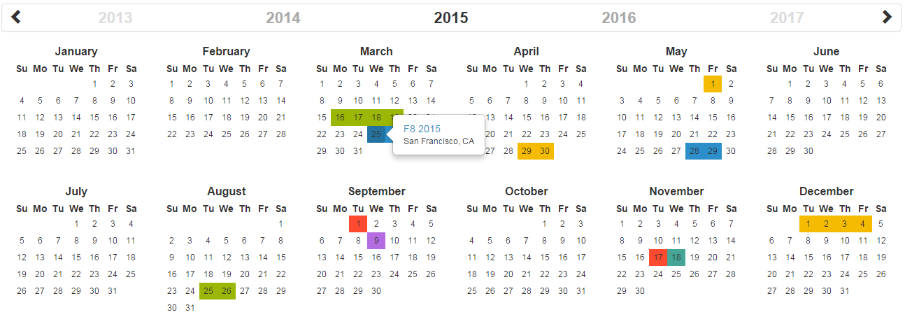
Official React.js wrapper for the year-calendar widget. https://year-calendar.github.io/
[](https://circleci.com/gh/year-calendar/rc-year-calendar/tree/master)
[](https://www.npmjs.com/package/rc-year-calendar)
This library is also available for:
[](https://github.com/year-calendar/js-year-calendar)
[](https://github.com/year-calendar/v-year-calendar)
## Installation
You can get the widget using the following methods:
- From the [GitHub repository](https://github.com/year-calendar/rc-year-calendar/releases)
- From the Node package manager, using the following command: `npm install rc-year-calendar`
- From Yarn, using the following command: `yarn add rc-year-calendar`
- From the CDN, using the following script: ``
## Usage
You can create a calendar using the following javascript code :
```
// Import (only if not using the CDN installation option)
import Calendar from 'rc-year-calendar';
// Render
render() {
return ();
}
```
## Using options
You can specify props to customize the calendar:
```
render() {
return (
);
}
```
The props are the following
| Option name | Description | Type | Default value |
| ----------- | ----------- | ---- | ------------- |
| allowOverlap | Specifies whether the user can select a range which overlapping an other element present in the datasource. | boolean | `true` |
| alwaysHalfDay | Specifies whether the beginning and the end of each range should be displayed as half selected day. | boolean | `false` |
| contextMenuItems | Specifies the items of the default context menu. | array | `[]` |
| customDayRenderer | Specify a custom renderer for data source. Works only with the style set to "custom". This function is called duringender for each day containing at least one event. | Render function | `null` |
| customDataSourceRenderer | Specify a custom renderer for days. This function is called during render for each day. | Render function | `null` |
| dataSource | The elements that must be displayed on the calendar. | array or function | `[]` |
| disabledDays | The days that must be displayed as disabled. | array | `[]` |
| disabledWeekDays | The days of the week that must be displayed as disabled (0 for Sunday, 1 for Monday, etc.). | array | `[]` |
| displayDisabledDataSource | Specifies whether the data source must be rendered on disabled days. | boolean | `false` |
| displayHeader | Specifies whether the calendar header is displayed. | boolean | `true` |
| displayWeekNumber | Specifies whether the weeks number are displayed. | boolean | `false` |
| enableContextMenu | Specifies whether the default context menu must be displayed when right clicking on a day. | boolean | `false` |
| enableRangeSelection | Specifies whether the range selection is enabled. | boolean | `false` |
| hiddenWeekDays | The days of the week that must not be displayed (0 for Sunday, 1 for Monday, etc.). | array | `[]` |
| language | The language/culture used for calendar rendering. | String | `en` |
| loadingTemplate | A custom loading template | String | `null` |
| maxDate | The date until which days are enabled. | Date | `null` |
| minDate | The date from which days are enabled. | Date | `null` |
| roundRangeLimits | Specifies whether the beginning and the end of each range should be displayed as rounded cells. | boolean | `false` |
| style | Specifies the style used for displaying datasource ("background", "border" or "custom"). | string | `border` |
| weekStart | The starting day of the week. This option overrides the parameter define in the language file. | number | `0` |
| year | The year displayed by the calendar. | number | Current year |
| defaultYear | The year on which the calendar should be opened. | number | Current year |
| Event name | Description | Parameter |
| ---------- | ----------- | --------- |
| onDayClick | Function fired when a day is clicked. | `{ date, events }` |
| onDayContextMenu | Function fired when a day is right clicked. | `{ date, events }` |
| onDayEnter | Function fired when the mouse enter on a day. | `{ date, events }` |
| onDayLeave | Function fired when the mouse leaves a day. | `{ date, events }` |
| onRangeSelected | Function fired when a date range is selected. | `{ startDate, endDate }` |
| onRenderEnd | Function fired when the calendar rendering is ended. | `{ currentYear }` |
| onYearChanged | Function fired when the visible year of the calendar is changed. | `{ currentYear }` |
## Language
If you want to use the calendar in a different language, you should import the locale file corresponding to the language you want to use, and then set the `language` prop of the calendar:
```
import Calendar from 'rc-year-calendar';
import 'rc-year-calendar/locales/rc-year-calendar.fr';
```
OR
```
```
Then
```
render() {
return (
);
}
```
The list of available languages is available [here](https://github.com/year-calendar/js-year-calendar/tree/master/locales)
## What next
Check the [examples](https://year-calendar.github.io/rc-year-calendar/examples) page to discover all the functionalities.
---
_Source: https://npm.io/package/rc-year-calendar · Machine-readable twin of the npm.io package page. Health data is recomputed on every publish._