# react-arc-progress
> react arc-progress circular-progress progress
Latest version **1.0.2** (published 2020-04-16) · ISC license · 0 weekly downloads
## Install
```sh
npm install react-arc-progress
pnpm add react-arc-progress
yarn add react-arc-progress
bun add react-arc-progress
```
## Health
**Score 15/100 (F)** — status: abandoned.
Positive: no vulnerabilities.
Warnings: low downloads; no types; no esm support.
Negative: abandoned; low maintenance score.
## Facts
| | |
|---|---|
| Version | 1.0.2 |
| Published | 2020-04-16 |
| First published | 2019-09-25 |
| Weekly downloads | 0 |
| License | ISC |
| TypeScript types | none |
| Module format | CommonJS |
| Dependencies | 0 |
| Unpacked size | 19.3 KB |
| Known vulnerabilities | 0 |
| Install scripts | no |
| Author | Hzy0913 |
| Maintainers | hzy0913 |
| Keywords | react, react-arc-progress, arc-progress, circular-progress, progress |
## Links
- npm: https://www.npmjs.com/package/react-arc-progress
- Homepage: https://github.com/Hzy0913/arc-progress#readme
- Issues: https://github.com/Hzy0913/arc-progress/issues
- npm.io page: https://npm.io/package/react-arc-progress
## Alternatives
- [mobx-react](https://npm.io/package/mobx-react.md) — 2.8M weekly downloads
- [rc-tree](https://npm.io/package/rc-tree.md) — 2.6M weekly downloads
- [@react-oauth/google](https://npm.io/package/@react-oauth/google.md) — 1.3M weekly downloads
- [@wagmi/connectors](https://npm.io/package/@wagmi/connectors.md) — 877.0K weekly downloads
- [vee-validate](https://npm.io/package/vee-validate.md) — 836.4K weekly downloads
## Recent versions
- 1.0.2 (latest) — 2020-04-16
- 1.0.1 — 2019-12-10
- 1.0.0 — 2019-09-25
## README
# react-arc-progress.js
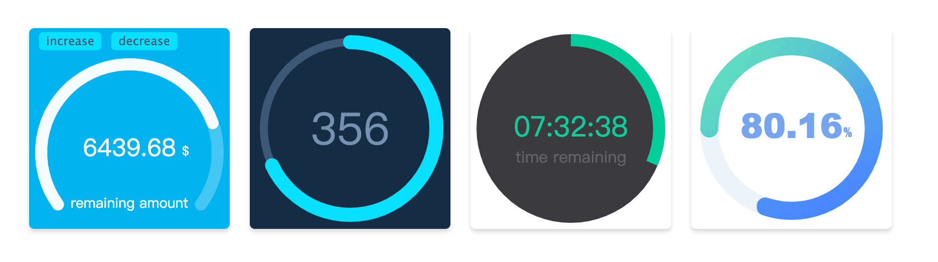
#### Arc animation progress bar drawn by canvas for react component [中文文档](https://github.com/Hzy0913/arc-progress/blob/react-arc-progress/README_zh.md "中文文档"),because of the use the React Hook, dependent React version need tobe >= 16.8.0
## Installation
```shell
npm install react-arc-progress -S
```
## Usage
```javascript
import ArcProgress from 'react-arc-progress';
export default class MyArcProgress extends Component {
state = {
progress: .782,
text: '6439.68',
}
render() {
const {progress, text} = this.state;
return (
{
const { percentage, currentText } = current;
console.log('observer:', percentage, currentText);
}}
animationEnd={({ progress, text }) => {
console.log('animationEnd', progress, text);
}}
/>
);
}
}
```
## Props options
| Option | type |Description |
| ------------ | ------------ | ------------ |
| progress | number (required)| Set progress value, the range is 0 - 1 |
| size | number | Generate progress bar canvas container, size by default of 200 |
| text | string | Set the text of progress bar|
| arcStart | number |Start point of the arc, specific usage see below|
| arcEnd | number |End point of the arc, specific usage see below|
| thickness | number |Set the thickness of the arc progress bar|
| fillThickness | number |Set the thickness of the arc progress bar fill content,the default value is same as with `thickness` param when this option is not set|
| emptyColor | string | Set the color of the empty part for the arc progress bar |
| fillColor | string or object | Set the style of the fill part for the arc progress bar, specific usage see below.|
| lineCap | string | Set the style at the end of the arc progress bar, there are three optional values, namely `butt`, `round`, `square`. The default value is `round` |
| speed | number | Set the animation speed threshold, ranging from -100 to 100, default is 0 |
| animation | boolean or number | The duration of the animation in milliseconds. When the value is `false`, there is no transitional animation |
| textStyle | object |Set the style of `text`, specific usage see below|
| customText | array | Custom Text Contents, specific usage see below|
| animationEnd | function | Callback at the end of progress bar animation |
| onError | function | Catch the error callback |
| observer | function | Callback to observer progress bar animation changes |
## Options Description
##### arcStart and arcEnd
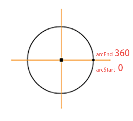 The start point and end point of the arc are marked as show in the picture, direction is clockwise. If you want to draw a circular progress bar, you can set `arcStart` to `90`, `arcEnd` to `270`. Or if you want to draw a semicircle, you can set `arcStart'to`180', `arcEnd` to `360`. Start and end angles can be adjusted as needed.
##### fillColor
`fillColor` is the progress bar color of the filled part, which can be passed in as its defined color(for example `#ffee3c`).
If want used the **gradient**, the option need to be set to the object type, such as `{gradient: [color 1, color2, color 2]}`, it will be have three colors of the radial gradients.
If you want use **image** filled, you need to set the option to the object type, the format is `{image: url}`, and the `url` is address of the picture.
##### textStyle
Set the style of the `text` content, which needs to be the object type. The optional content is as follows
| Name |Type |Description |
| ------------ | ------------ |------------ |
| size |string| The text size, for example `18px`|
| color |string| The text color, for example `#fa0556`|
| font |string| The text font-family, for example `Microsoft YaHei`|
| x |number |X-axis of text position|
| y |number |Y-axis of text position|
##### customText
`customText` option to custom the some text contents, It is an array type. You can define more than one text. Each usage is consistent with the `textStyle` option, but it have one more item is `text`, this is used show you definition text content.
| Name |Type |Description |
| ------------ | ------------ |------------ |
| text |string|Set the text content|
| others || Other parameters are same as with the usage of `textStyle` |
---
_Source: https://npm.io/package/react-arc-progress · Machine-readable twin of the npm.io package page. Health data is recomputed on every publish._
The start point and end point of the arc are marked as show in the picture, direction is clockwise. If you want to draw a circular progress bar, you can set `arcStart` to `90`, `arcEnd` to `270`. Or if you want to draw a semicircle, you can set `arcStart'to`180', `arcEnd` to `360`. Start and end angles can be adjusted as needed.
##### fillColor
`fillColor` is the progress bar color of the filled part, which can be passed in as its defined color(for example `#ffee3c`).
If want used the **gradient**, the option need to be set to the object type, such as `{gradient: [color 1, color2, color 2]}`, it will be have three colors of the radial gradients.
If you want use **image** filled, you need to set the option to the object type, the format is `{image: url}`, and the `url` is address of the picture.
##### textStyle
Set the style of the `text` content, which needs to be the object type. The optional content is as follows
| Name |Type |Description |
| ------------ | ------------ |------------ |
| size |string| The text size, for example `18px`|
| color |string| The text color, for example `#fa0556`|
| font |string| The text font-family, for example `Microsoft YaHei`|
| x |number |X-axis of text position|
| y |number |Y-axis of text position|
##### customText
`customText` option to custom the some text contents, It is an array type. You can define more than one text. Each usage is consistent with the `textStyle` option, but it have one more item is `text`, this is used show you definition text content.
| Name |Type |Description |
| ------------ | ------------ |------------ |
| text |string|Set the text content|
| others || Other parameters are same as with the usage of `textStyle` |
---
_Source: https://npm.io/package/react-arc-progress · Machine-readable twin of the npm.io package page. Health data is recomputed on every publish._