# react-element-spinner
> An npm package that provides a spinner to block elements.
Latest version **1.0.4** (published 2020-07-25) · MIT license · 0 weekly downloads
## Install
```sh
npm install react-element-spinner
pnpm add react-element-spinner
yarn add react-element-spinner
bun add react-element-spinner
```
## Health
**Score 20/100 (F)** — status: abandoned.
Positive: esm support; no vulnerabilities.
Warnings: low downloads; no types.
Negative: abandoned; low maintenance score.
## Facts
| | |
|---|---|
| Version | 1.0.4 |
| Published | 2020-07-25 |
| First published | 2020-01-23 |
| Weekly downloads | 0 |
| License | MIT |
| TypeScript types | none |
| Module format | ESM + CommonJS |
| Dependencies | 0 |
| Unpacked size | 59.6 KB |
| Known vulnerabilities | 0 |
| Install scripts | no |
| GitHub stars | 3 |
| Author | https://github.com/fergomap |
| Maintainers | fergomap |
| Keywords | react, loader, loading, spinner, overlay, block |
## Links
- npm: https://www.npmjs.com/package/react-element-spinner
- Repository: https://github.com/fergomap/react-element-spinner
- Issues: https://github.com/fergomap/react-element-spinner/issues
- npm.io page: https://npm.io/package/react-element-spinner
## Alternatives
- [mobx-react](https://npm.io/package/mobx-react.md) — 2.8M weekly downloads
- [rc-tree](https://npm.io/package/rc-tree.md) — 2.6M weekly downloads
- [@react-oauth/google](https://npm.io/package/@react-oauth/google.md) — 1.3M weekly downloads
- [@wagmi/connectors](https://npm.io/package/@wagmi/connectors.md) — 877.0K weekly downloads
- [vee-validate](https://npm.io/package/vee-validate.md) — 836.4K weekly downloads
## Recent versions
- 1.0.4 (latest) — 2020-07-25
- 1.0.3 — 2020-04-27
- 1.0.2 — 2020-02-18
- 1.0.1 — 2020-01-23
## README
# React element spinner
A customizable loading spinner for React that overlays divs and blocks buttons.
## Demo
There is a demo with some examples [here](https://fergomap.github.io/react-element-spinner-demo/).
The repo with the code is [this one](https://github.com/fergomap/react-element-spinner-demo).
## Quick start
This code would create a global spinner, it would block all the page.
```typescript
import { SpinnerComponent } from 'react-element-spinner';
```
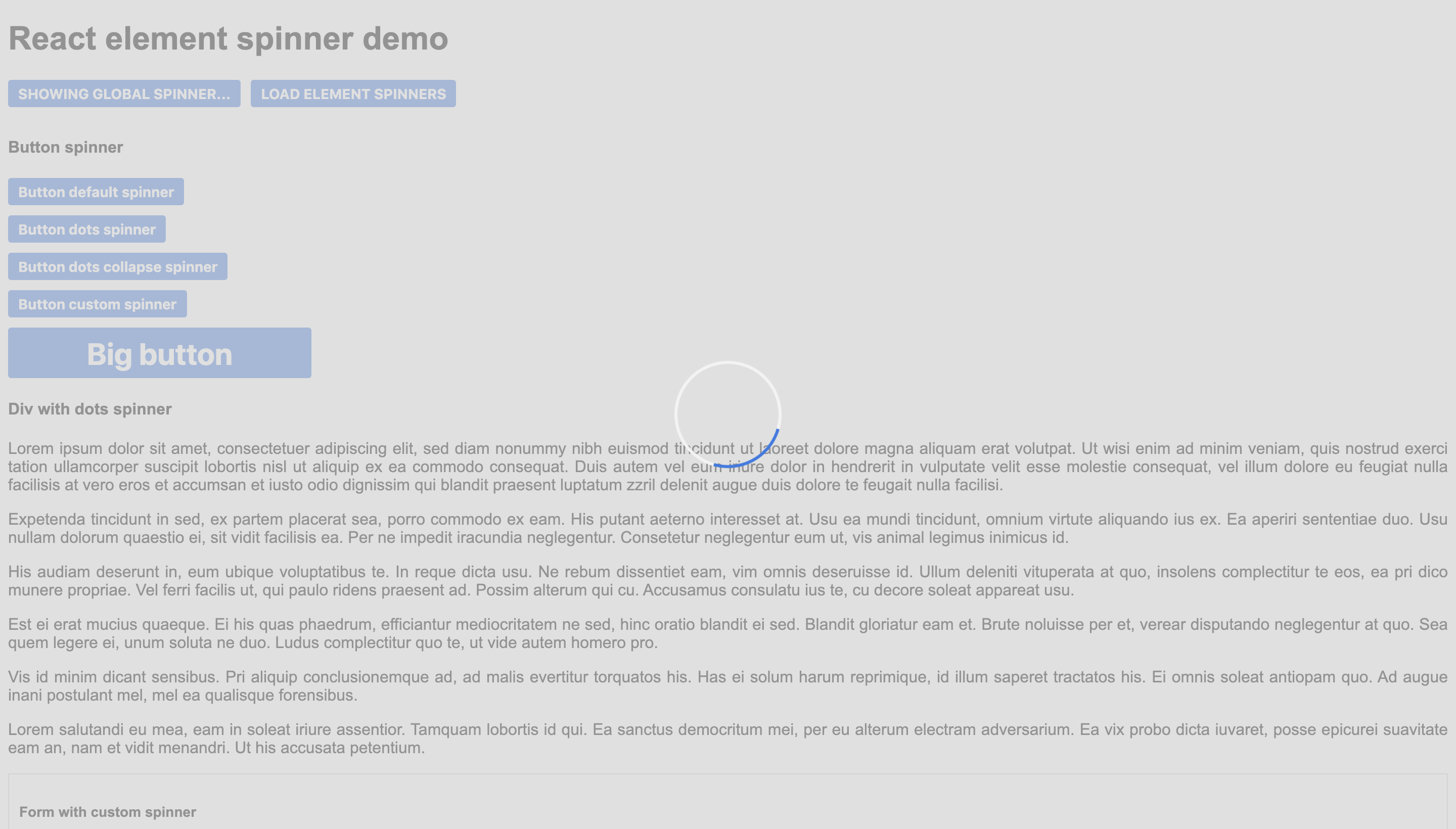
This code would create a spinner that blocks the form.
```typescript
import { SpinnerComponent } from 'react-element-spinner';
```
This code would create a spinner that blocks the button.
```typescript
import { SpinnerComponent } from 'react-element-spinner';
```

## Properties
| Name | Type | Required | Default | Description |
| --- | --- | --- | --- | --- |
| loading | boolean | true | - | Whether the spinner has to be shown or not. |
| position | string | true | - | Position of the spinner: **"global"** for all the page, **"centered"** to overlay a div and **"inline"** to be next to the content (for example a button). |
| color | string | false | #3578e5 | Color of the spinner |
| secondaryColor | string | false | #f3f3f3 | Secondary color of the default spinner. |
| backgroundColor | string | false | #d3d3d3 | Color of the background div (only for **"centered"** and **"global"**). |
| resize | boolean | false | false | Whether to resize the overlay div or not when dimensions change (only for **"centered"**). |
| spinnerType | string | false | "default" | Choose one of the three available spinners: **"default"**, **"circle-dots"** or **"circle-dots-collapse"**. |
| customSpinner | ReactElement | false | undefined | Custom spinner to use instead of the default ones. |
| message | string | false | undefined | Message to show under the spinner. |
## Custom styling
The spinner component is easily customizable by overriding its css classes.
| Class | Element |
| --- | --- |
| loader-container | The main div. |
| loader | The spinner div. |
| background | The background div. |
| span | The message. |
---
_Source: https://npm.io/package/react-element-spinner · Machine-readable twin of the npm.io package page. Health data is recomputed on every publish._