);
}
```
The trigger.svg file:
```svg
```
## API
### Chatbox
| Prop Name | Type | Description |
| --- | --- | --- |
| `onMessageSend` | `(text: string) => void` | Callback function to be called when the user submits a message. |
| `messages` | `Array` | An array of `Message` objects to display in the chatbox. |
| `participants` | `Array` | An array of `Participant` objects representing the participants in the chat. |
| `autoScrollDown?` | `boolean` | If true, the container will scroll down automatically (default: true). |
| `className` | `string` | Additional CSS classes to apply to the component. |
| `style` | `React.CSSProperties` | Inline styles to apply to the component. |
| `ref` | `React.Ref` | ref object to the HTML container element. |
### Chatbox.Messages:
| Prop Name | Type | Description |
| --- | --- | --- |
| `className` | `string` | Additional CSS classes to apply to the component. |
| `style` | `React.CSSProperties` | Inline styles to apply to the component. |
### Chatbox.Message:
| Prop Name | Type | Description |
| --- | --- | --- |
| `message` | `Message` | The message object being rendered |
| `className` | `string \| ((participant: Participant) => string);` | Additional CSS classes to apply to the component. You can also use the function to style each message based on the participant |
| `style` | `React.CSSProperties` | Inline styles to apply to the component. |
### Chatbox.Textbox:
| Prop Name | Type | Description |
| --- | --- | --- |
| `ref` | `React.Ref` | ref object to the textarea element. |
| `className` | `string` | Additional CSS classes to apply to the component. |
| `style` | `React.CSSProperties` | Inline styles to apply to the component. |
| `placeholder` | `string` | Placeholder text to display in the textarea. |
| `maxLength` | `number` | Maximum number of characters allowed in the textarea. |
| `onChange` | `ChangeEventHandler` | Callback function to be called when the value of the textarea changes. |
| `aria-label` | `string` | ARIA label for the textarea (default: "Message to send"). |
### Chatbox.Trigger
| Prop Name | Type | Description |
| --- | --- | --- |
| `ref` | `React.Ref` | ref object to the button element. |
| `className` | `string` | Additional CSS classes to apply to the component. |
| `style` | `React.CSSProperties` | Inline styles to apply to the component. |
| `aria-label` | `string` | ARIA label for the button (default: "Send Message"). |
---
_Source: https://npm.io/package/react-headless-chatbox · Machine-readable twin of the npm.io package page. Health data is recomputed on every publish._
 ## Install
```bash
npm install react-headless-chatbox
```
```bash
yarn add react-headless-chatbox
```
## Code Example
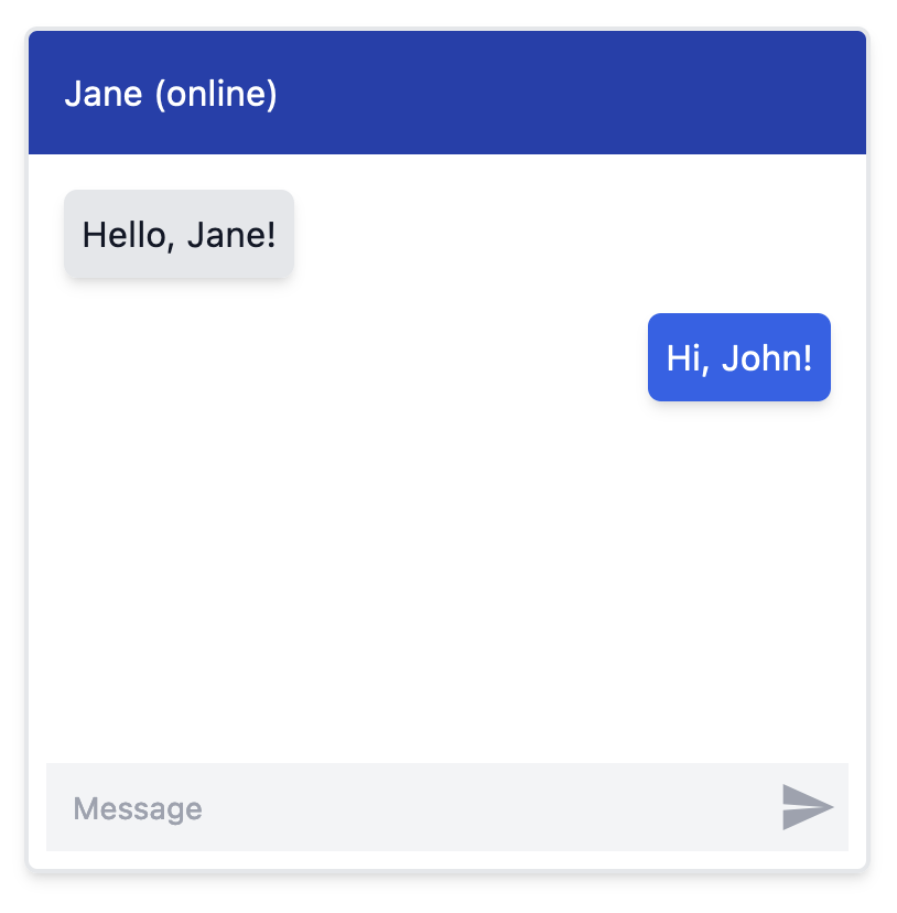
The following code example uses tailwind to style the chatbox, as shown in the image above:
```jsx
import { useState } from "react";
import { Chatbox, Message as ChatboxMessage, Participant as ChatboxParticipant } from "react-headless-chatbox";
import { ReactComponent as TriggerSVG } from "./trigger.svg";
interface Participant extends ChatboxParticipant {
// Add custom properties here
}
interface Message extends ChatboxMessage {
id: string;
text: string;
// Add more properties here
}
const PARTICIPANTS = [
{ id: "john", side: "left"},
{ id: "jane", side: "right" },
] satisfies Participant[];
const MESSAGES = [
{
id: "1",
participantId: "john",
text: "Hello, Jane!",
},
{
id: "2",
participantId: "jane",
text: "Hi, John!",
},
] satisfies Message[];
function MyChatbox() {
const [messages, setMessages] = useState(MESSAGES);
const onMessageSend = (text: string) => {
const newMessage = {
id: Math.random().toString(),
participantId: "jane",
text,
};
setMessages((prevMessages) => [...prevMessages, newMessage]);
};
return (
## Install
```bash
npm install react-headless-chatbox
```
```bash
yarn add react-headless-chatbox
```
## Code Example
The following code example uses tailwind to style the chatbox, as shown in the image above:
```jsx
import { useState } from "react";
import { Chatbox, Message as ChatboxMessage, Participant as ChatboxParticipant } from "react-headless-chatbox";
import { ReactComponent as TriggerSVG } from "./trigger.svg";
interface Participant extends ChatboxParticipant {
// Add custom properties here
}
interface Message extends ChatboxMessage {
id: string;
text: string;
// Add more properties here
}
const PARTICIPANTS = [
{ id: "john", side: "left"},
{ id: "jane", side: "right" },
] satisfies Participant[];
const MESSAGES = [
{
id: "1",
participantId: "john",
text: "Hello, Jane!",
},
{
id: "2",
participantId: "jane",
text: "Hi, John!",
},
] satisfies Message[];
function MyChatbox() {
const [messages, setMessages] = useState(MESSAGES);
const onMessageSend = (text: string) => {
const newMessage = {
id: Math.random().toString(),
participantId: "jane",
text,
};
setMessages((prevMessages) => [...prevMessages, newMessage]);
};
return (