# react-motion-menu-button
> 一个react的折叠按钮
Latest version **0.0.4** (published 2019-03-15) · MIT license · 0 weekly downloads
## Install
```sh
npm install react-motion-menu-button
pnpm add react-motion-menu-button
yarn add react-motion-menu-button
bun add react-motion-menu-button
```
## Health
**Score 15/100 (F)** — status: abandoned.
Positive: no vulnerabilities.
Warnings: low downloads; no types; no esm support; pre 1.0.
Negative: abandoned; low maintenance score.
## Facts
| | |
|---|---|
| Version | 0.0.4 |
| Published | 2019-03-15 |
| First published | 2019-03-15 |
| Weekly downloads | 0 |
| License | MIT |
| TypeScript types | none |
| Module format | CommonJS |
| Dependencies | 3 |
| Unpacked size | 99 KB |
| Known vulnerabilities | 0 |
| Install scripts | no |
| GitHub stars | 1 |
| Author | sunday |
| Maintainers | oldcow |
| Keywords | react-motion-menu-button, button, motion button, floating button, menu button, react button, fly out button, fold button, path button |
## Links
- npm: https://www.npmjs.com/package/react-motion-menu-button
- Repository: https://github.com/hst-Sunday/react-motion-menu-button
- Homepage: https://github.com/hst-Sunday/react-motion-menu-button#readme
- Issues: https://github.com/hst-Sunday/react-motion-menu-button/issues
- npm.io page: https://npm.io/package/react-motion-menu-button
## Dependencies (3)
- [react](https://npm.io/package/react.md) ^16.8.4
- [prop-types](https://npm.io/package/prop-types.md) ^15.7.2
- [react-motion](https://npm.io/package/react-motion.md) ^0.5.2
## Alternatives
- [base64url](https://npm.io/package/base64url.md) — 6.1M weekly downloads
- [get-installed-path](https://npm.io/package/get-installed-path.md) — 502.9K weekly downloads
- [@uppy/url](https://npm.io/package/@uppy/url.md) — 185.8K weekly downloads
- [@d3fc/d3fc-shape](https://npm.io/package/@d3fc/d3fc-shape.md) — 16.2K weekly downloads
- [localizer](https://npm.io/package/localizer.md) — 226 weekly downloads
## Recent versions
- 0.0.4 (latest) — 2019-03-15
## README
# react-motion-menu-button
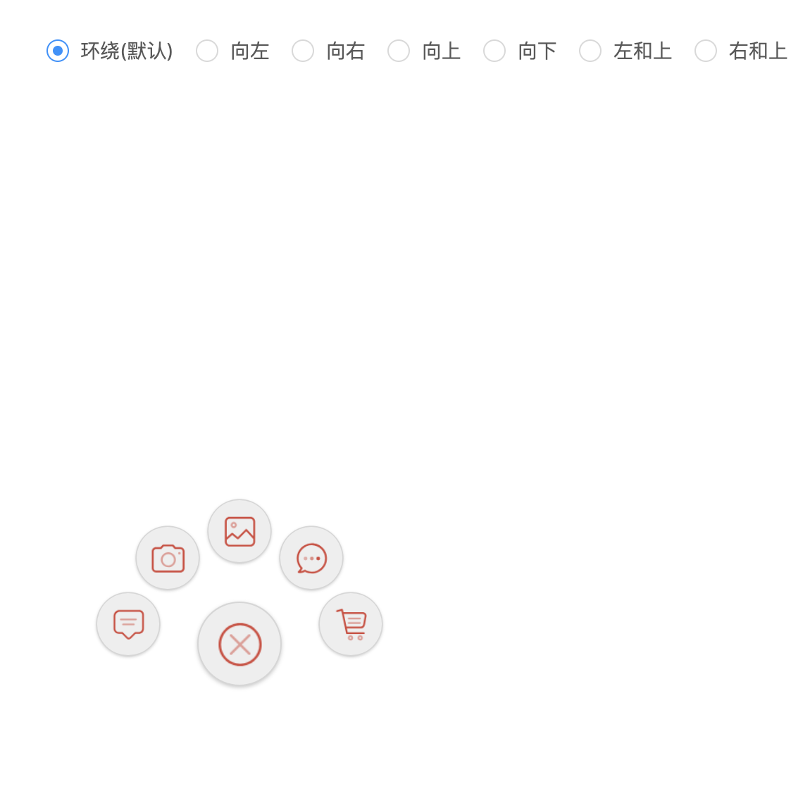
一个react的折叠按钮
## Demo
[https://hst-sunday.github.io/react-motion-menu-button/](https://hst-sunday.github.io/react-motion-menu-button/)
 ## Development
```
npm install
npm start
打开 http://localhost:3001
```
## Install
```
npm i react-motion-menu-button --save
```
## Usage
```js
import reactMotionMenuButton from 'react-motion-menu-button';
class App extends React.Component {
constructor(props) {
super(props)
this.state = {
open: false,
}
this.toggle = this.toggle.bind(this);
}
toggle(event) {
event.preventDefault()
this.setState({
open: !this.state.open
})
}
render() {
return (
## Development
```
npm install
npm start
打开 http://localhost:3001
```
## Install
```
npm i react-motion-menu-button --save
```
## Usage
```js
import reactMotionMenuButton from 'react-motion-menu-button';
class App extends React.Component {
constructor(props) {
super(props)
this.state = {
open: false,
}
this.toggle = this.toggle.bind(this);
}
toggle(event) {
event.preventDefault()
this.setState({
open: !this.state.open
})
}
render() {
return (
message.info('i am message'), imgAlt: "1", bgColor: "#eee" },
{ imgSrc: cameraPNG, onClick: (e) => message.info('i am camera'), imgAlt: "2", bgColor: "#eee" },
{ imgSrc: photoPNG, onClick: (e) => message.info('i am photo'), imgAlt: "3", bgColor: "#eee" },
{ imgSrc: opinionPNG, onClick: (e) => message.info('i am opinion'), imgAlt: "4", bgColor: "#eee" },
{ imgSrc: shoppingPNG, onClick: (e) => message.info('i am shopping'), imgAlt: "5", bgColor: "#eee" },
]
}
buttonSize={60}
backgroundColor={"#eee"}
isOpen={this.state.open}
onClick={(e) => this.toggle(e)}
/>
)
}
}
ReactDOM.render(, document.getElementById("root"));
```
## 组件Option
| 选项 | 描述 | 类型 | 默认值 |
|-----|------|-----|-------|
| mode | 子按钮飞出模式:`sur` `left` `right` `up` `down` `LT` `RT`7种模式 | String | `sur`|
| isOpen | 按钮是否打开 | Bool | `false` |
| buttonSize | 主按钮的大小`px` | Number | `60` |
| backgroundColor | 主按钮的背景颜色 | color | `#eee`|
| left | 按钮距离左边的位置`px` | Number | `155` |
| top | 按钮距离顶部的位置`px` | Number | `450` |
| mainButtonImgSrc | 主按钮的图片 | img.src | 内置home图片 |
| closeImgSrc | 主按钮打开时的图片 | img.src | 内置一张打叉的图片 |
| ChildButtonToMainButtonSpacingDistance | 子按钮到主按钮的两圆心距离 | Number | `80` |
| SeparationAngle | 仅在`sur`模式下生效,两个子按钮的形成的夹角角度 | Number | `40` |
| childrenButtonData | 显示子按钮的数据,格式为`[{ imgSrc: messagePNG, onClick: (e) => message.info('i am message'), imgAlt: "1", bgColor: "#eee" }, ...]`,其中`imgSrc`为子按钮的图片、 `onClick`为点击该按钮的方法, `imgAlt`为元素`img`的属性`alt`可不填, `bgColor`为子按钮的背景颜色 | Array | `[]` |
### 参考资料
[A gentle introduction to React Motion](https://medium.com/@nashvail/a-gentle-introduction-to-react-motion-dc50dd9f2459)
## License
MIT
---
_Source: https://npm.io/package/react-motion-menu-button · Machine-readable twin of the npm.io package page. Health data is recomputed on every publish._