# react-native-accordion-list-view
> Animated accordion collapsable List for react native.
Latest version **2.0.3** (published 2023-11-25) · MIT license · 0 weekly downloads
## Install
```sh
npm install react-native-accordion-list-view
pnpm add react-native-accordion-list-view
yarn add react-native-accordion-list-view
bun add react-native-accordion-list-view
```
## Health
**Score 25/100 (F)** — status: abandoned.
Positive: has types; no vulnerabilities; high quality score.
Warnings: low downloads; no esm support.
Negative: abandoned; low maintenance score.
## Facts
| | |
|---|---|
| Version | 2.0.3 |
| Published | 2023-11-25 |
| First published | 2022-06-03 |
| Weekly downloads | 0 |
| License | MIT |
| TypeScript types | bundled |
| Module format | CommonJS |
| Dependencies | 1 |
| Unpacked size | 54 KB |
| Known vulnerabilities | 0 |
| Install scripts | no |
| GitHub stars | 13 |
| Author | Louay Sleman |
| Maintainers | louay12 |
| Keywords | react, react-native, Accordion, Collapse, show, hide, click to show/hide, android, ios, react-native-component, react native, mobile, expand, expandable-listview, react-native-expandable-listview, customizable, react-native-accordion-list-view, react-native-accordion-listview, react-native-accordion, animated, RTL accordion, RTL |
## Links
- npm: https://www.npmjs.com/package/react-native-accordion-list-view
- Repository: https://github.com/louaySleman/react-native-accordion-list-view
- Issues: https://github.com/louaySleman/react-native-accordion-list-view/issues
- npm.io page: https://npm.io/package/react-native-accordion-list-view
## Dependencies (1)
- [react-native-vector-icons](https://npm.io/package/react-native-vector-icons.md) *
## Alternatives
- [mobx-react](https://npm.io/package/mobx-react.md) — 2.8M weekly downloads
- [rc-tree](https://npm.io/package/rc-tree.md) — 2.6M weekly downloads
- [@react-oauth/google](https://npm.io/package/@react-oauth/google.md) — 1.3M weekly downloads
- [@wagmi/connectors](https://npm.io/package/@wagmi/connectors.md) — 877.0K weekly downloads
- [vee-validate](https://npm.io/package/vee-validate.md) — 836.4K weekly downloads
## Recent versions
- 2.0.3 (latest) — 2023-11-25
- 2.0.2 — 2023-09-08
- 2.0.1 — 2023-01-10
- 2.0.0 — 2022-12-28
- 1.0.4 — 2022-06-08
- 1.0.3 — 2022-06-04
- 1.0.2 — 2022-06-03
- 1.0.1 — 2022-06-03
- 1.0.0 — 2022-06-03
## README
## react-native-accordion-list-view
A high performance, beautiful and fully customizable Accordion list for React Native.
Implemented using [react-native-vector-icons](https://github.com/oblador/react-native-vector-icons).




## Getting started
```js
npm install react-native-accordion-list-view --save
```
or
```js
yarn add react-native-accordion-list-view
```
Now we need to install [react-native-vector-icons](https://github.com/oblador/react-native-vector-icons).
```js
npm install react-native-vector-icons --save
```
or
```js
yarn add react-native-vector-icons
```
## Platforms Supported
- [x] iOS
- [x] Android
## Important Note
This plugin work with Layout Animation and In order to get this to work on Android you need to set the following flags via UIManager:
```javascript
if (Platform.OS === 'android') {
if (UIManager.setLayoutAnimationEnabledExperimental) {
UIManager.setLayoutAnimationEnabledExperimental(true);
}
}
```
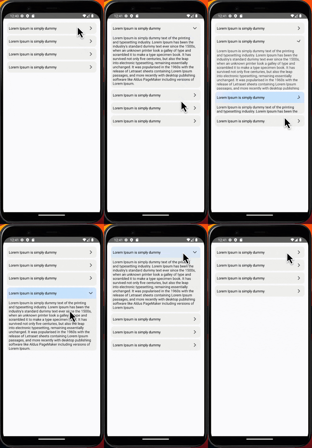
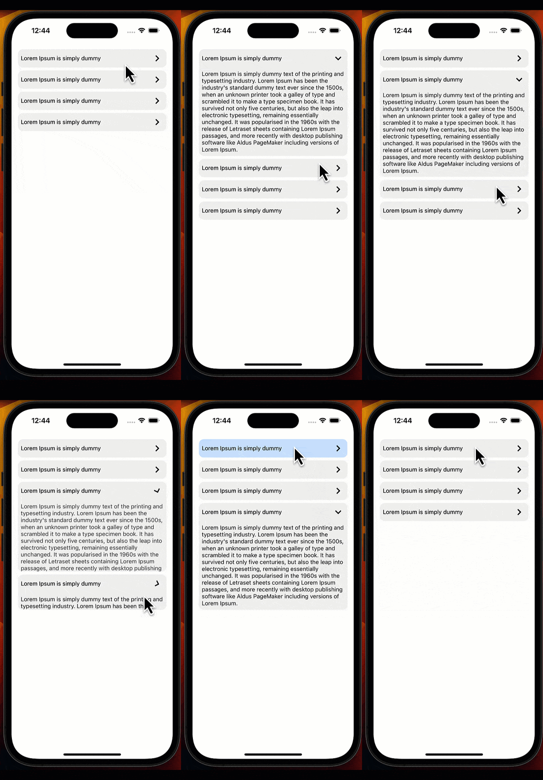
### Demo
## Versioning
This project follows semantic versioning. We do not hesitate to release breaking changes but they will be in a major version.
### Breaking History:
- [2.0.3](https://www.npmjs.com/package/react-native-accordion-list-view/v/2.0.3) - New Features
We've enhanced the Accordion list by adding support for the index parameter in the customTitle, customBody, and customIcon functions. This enables greater customization possibilities, allowing you to dynamically adjust the rendering of elements based on the index of each accordion item. Explore these new parameters to tailor your accordion items more precisely to your application's requirements.
- [2.0.2](https://www.npmjs.com/package/react-native-accordion-list-view/v/2.0.2) - New Features
**defaultOpenIndices**: You can now specify an array of indices in the `defaultOpenIndices` prop for the accordion list. These indices indicate which sections should be expanded by default, allowing you to control the initial state of the accordion.
**pressableProps**: We've added a new prop called `pressableProps` to both the accordion list and accordion item components. This allows you to customize the styles and ripple effects for the pressable component, giving you more control over the user interaction experience.
- [2.0.1](https://www.npmjs.com/package/react-native-accordion-list-view/v/2.0.1) - Allow single/multiple expanding, allow `AccordionItem` to be opened by default using `isOpen` property, add `onPress` for `AccordionItem`.
- [2.0.0](https://www.npmjs.com/package/react-native-accordion-list-view/v/2.0.0) - Change library code to typescript and Replacing `TouchableOpacity` with `Pressable`.
- [1.0.4](https://www.npmjs.com/package/react-native-accordion-list-view/v/1.0.4) - Support RTL and update `README`.
- [1.0.3](https://www.npmjs.com/package/react-native-accordion-list-view/v/1.0.3) - Accordion list `FlatList` props bug fixes.
- [1.0.2](https://www.npmjs.com/package/react-native-accordion-list-view/v/1.0.2) - Accordion Item Bug fixes.
- [1.0.1](https://www.npmjs.com/package/react-native-accordion-list-view/v/1.0.1) - Update `README`.
- [1.0.0](https://www.npmjs.com/package/react-native-accordion-list-view/v/1.0.0) - First release.
### Accordion list
| Props | Params | isRequire | Default | Description |
|--------------------|-------------------------------------------------------------------|-----------|---------------------|--------------------------------------------------------------------------------------------------------------------------------------------------|
| data | Array | Yes | | For simplicity, data is a plain array. If you want to use something else, like an immutable list |
| customTitle | (item, index) => JSX.Element | Yes | | Function that returns a React element to display as Accordion title |
| customBody | (item, index) => JSX.Element | Yes | | Function that returns a React element to display as Accordion body |
| customIcon | (index) => JSX.Element | No | keyboard-arrow-left | Function that returns a React element to display as Accordion icon |
| containerItemStyle | ViewStyle | No | {} | Styling for Accordion item container view |
| style | ViewStyle | No | {} | Styling for container view |
| animationDuration | Number | No | 300 | Accordion animation duration |
| isRTL | Boolean | No | false | Support RTL |
| expandMultiple | Boolean | No | false | Allow more than one section to be expanded |
| defaultOpenIndices | number[] | No | [] | An array of indices indicating which sections should be expanded by default. If `expandMultiple` is set to `false`, it can only contain a single index. |
| pressableProps | [AccordionPressableProps](https://reactnative.dev/docs/pressable) | No | {} | Additional props for configuring the Pressable component. |
### More props
This is a wrapper around `Flatlist`, all their props works well and the inherited props too (from `ScrollView` and `VirtualizedList`).
### Example
#### Without Custom Styles
```javascript
import React, { useEffect } from 'react';
import {View, SafeAreaView, StyleSheet, Text, Platform, UIManager} from 'react-native';
import {AccordionList} from 'react-native-accordion-list-view';
const App = () => {
const data = [
{
id: 0,
title: 'Lorem Ipsum is simply dummy',
body: "Lorem Ipsum is simply dummy text of the printing and typesetting industry. Lorem Ipsum has been the industry's standard dummy text ever since the 1500s, when an unknown printer took a galley of type and scrambled it to make a type specimen book. It has survived not only five centuries, but also the leap into electronic typesetting, remaining essentially unchanged. It was popularised in the 1960s with the release of Letraset sheets containing Lorem Ipsum passages, and more recently with desktop publishing software like Aldus PageMaker including versions of Lorem Ipsum.",
},
{
id: 1,
title: 'Lorem Ipsum is simply dummy',
body: "Lorem Ipsum is simply dummy text of the printing and typesetting industry. Lorem Ipsum has been the industry's standard dummy text ever since the 1500s, when an unknown printer took a galley of type and scrambled it to make a type specimen book. It has survived not only five centuries, but also the leap into electronic typesetting, remaining essentially unchanged. It was popularised in the 1960s with the release of Letraset sheets containing Lorem Ipsum passages, and more recently with desktop publishing software like Aldus PageMaker including versions of Lorem Ipsum.",
},
];
useEffect(() => {
if (Platform.OS === 'android') {
if (UIManager.setLayoutAnimationEnabledExperimental) {
UIManager.setLayoutAnimationEnabledExperimental(true);
}
}
}, []);
return (
{item.title}}
customBody={item => {item.body}}
animationDuration={400}
expandMultiple={true}
/>
);
};
export default App;
const styles = StyleSheet.create({
container: {
paddingVertical: '2%',
paddingHorizontal: '3%',
height: '100%',
backgroundColor: '#e7e7e7',
},
});
```
#### With Custom Styles
```javascript
import React, { useEffect } from 'react';
import {View, SafeAreaView, StyleSheet, Text, Platform, UIManager} from 'react-native';
import {AccordionList} from 'react-native-accordion-list-view';
const App = () => {
const data = [
{
id: 0,
title: 'Lorem Ipsum is simply dummy',
body: "Lorem Ipsum is simply dummy text of the printing and typesetting industry. Lorem Ipsum has been the industry's standard dummy text ever since the 1500s, when an unknown printer took a galley of type and scrambled it to make a type specimen book. It has survived not only five centuries, but also the leap into electronic typesetting, remaining essentially unchanged. It was popularised in the 1960s with the release of Letraset sheets containing Lorem Ipsum passages, and more recently with desktop publishing software like Aldus PageMaker including versions of Lorem Ipsum.",
},
{
id: 1,
title: 'Lorem Ipsum is simply dummy',
body: "Lorem Ipsum is simply dummy text of the printing and typesetting industry. Lorem Ipsum has been the industry's standard dummy text ever since the 1500s, when an unknown printer took a galley of type and scrambled it to make a type specimen book. It has survived not only five centuries, but also the leap into electronic typesetting, remaining essentially unchanged. It was popularised in the 1960s with the release of Letraset sheets containing Lorem Ipsum passages, and more recently with desktop publishing software like Aldus PageMaker including versions of Lorem Ipsum.",
},
{
id: 2,
title: 'Lorem Ipsum is simply dummy',
body: "Lorem Ipsum is simply dummy text of the printing and typesetting industry. Lorem Ipsum has been the industry's standard dummy text ever since the 1500s, when an unknown printer took a galley of type and scrambled it to make a type specimen book. It has survived not only five centuries, but also the leap into electronic typesetting, remaining essentially unchanged. It was popularised in the 1960s with the release of Letraset sheets containing Lorem Ipsum passages, and more recently with desktop publishing software like Aldus PageMaker including versions of Lorem Ipsum.",
},
{
id: 3,
title: 'Lorem Ipsum is simply dummy',
body: "Lorem Ipsum is simply dummy text of the printing and typesetting industry. Lorem Ipsum has been the industry's standard dummy text ever since the 1500s, when an unknown printer took a galley of type and scrambled it to make a type specimen book. It has survived not only five centuries, but also the leap into electronic typesetting, remaining essentially unchanged. It was popularised in the 1960s with the release of Letraset sheets containing Lorem Ipsum passages, and more recently with desktop publishing software like Aldus PageMaker including versions of Lorem Ipsum.",
},
];
useEffect(() => {
if (Platform.OS === 'android') {
if (UIManager.setLayoutAnimationEnabledExperimental) {
UIManager.setLayoutAnimationEnabledExperimental(true);
}
}
}, []);
return (
{item.title}}
customBody={(item, index) => {item.body}}
animationDuration={400}
defaultOpenIndices={[0, 2]}
expandMultiple={true}
containerItemStyle={{padding: 0}}
pressableProps={{
style: ({pressed}) => [
{
padding: '2%',
backgroundColor:
pressed && Platform.OS == 'ios'
? 'rgb(210, 230, 255)'
: 'transparent',
},
],
android_ripple: {
color: 'rgb(210, 230, 255)',
},
}}
/>
);
};
export default App;
const styles = StyleSheet.create({
container: {
paddingVertical: '2%',
paddingHorizontal: '3%',
height: '100%',
backgroundColor: '#e7e7e7',
},
});
```
### Accordion Item
This component allows you to use `Accordion Item` component in any place if you have your own wrapper or if you have a problem with using `FlatList` in your screen.
| Props | Params | isRequire | Default | Description |
|-------------------|------------------|-----------|---------------------|-----------------------------------------------------------------------------------------------------------------------------------|
| customTitle | () => JSX.Element | Yes | | Function that returns a React element to display as Accordion title |
| customBody | () => JSX.Element | Yes | | Function that returns a React element to display as Accordion body |
| customIcon | () => JSX.Element | No | keyboard-arrow-left | Function that returns a React element to display as Accordion icon |
| containerStyle | ViewStyle | No | {} | Styling for Accordion item container view |
| animationDuration | Number | No | 300 | Accordion animation duration |
| isRTL | Boolean | No | false | Support RTL |
| isOpen | Boolean | No | false | An optional param to make accordion item already open |
| onPress | (isOpen: boolean) => void | No | - | An optional callback function called when a click happen to the accordion item and return the current state (if it's open or not) |
| pressableProps | [AccordionPressableProps](https://reactnative.dev/docs/pressable) | No | {} | Additional props for configuring the Pressable component. |
### Example
```javascript
import React, {useEffect} from 'react';
import {View, SafeAreaView, StyleSheet, Text, ScrollView, Platform, UIManager} from 'react-native';
import {AccordionItem} from 'react-native-accordion-list-view';
const App = () => {
const data = [
{
id: 0,
title: 'Lorem Ipsum is simply dummy',
body: "Lorem Ipsum is simply dummy text of the printing and typesetting industry. Lorem Ipsum has been the industry's standard dummy text ever since the 1500s, when an unknown printer took a galley of type and scrambled it to make a type specimen book. It has survived not only five centuries, but also the leap into electronic typesetting, remaining essentially unchanged. It was popularised in the 1960s with the release of Letraset sheets containing Lorem Ipsum passages, and more recently with desktop publishing software like Aldus PageMaker including versions of Lorem Ipsum.",
},
{
id: 1,
title: 'Lorem Ipsum is simply dummy',
body: "Lorem Ipsum is simply dummy text of the printing and typesetting industry. Lorem Ipsum has been the industry's standard dummy text ever since the 1500s, when an unknown printer took a galley of type and scrambled it to make a type specimen book. It has survived not only five centuries, but also the leap into electronic typesetting, remaining essentially unchanged. It was popularised in the 1960s with the release of Letraset sheets containing Lorem Ipsum passages, and more recently with desktop publishing software like Aldus PageMaker including versions of Lorem Ipsum.",
},
];
useEffect(() => {
if (Platform.OS === 'android') {
if (UIManager.setLayoutAnimationEnabledExperimental) {
UIManager.setLayoutAnimationEnabledExperimental(true);
}
}
}, []);
return (
{data.map(item => (
{item.title}}
customBody={() => {item.body}}
animationDuration={400}
isOpen={false}
onPress={(isOpen) => console.log(isOpen)}
/>
))}
);
};
export default App;
const styles = StyleSheet.create({
container: {
paddingVertical: '2%',
paddingHorizontal: '3%',
height: '100%',
backgroundColor: '#e7e7e7',
},
});
```
### Common Issues and Errors
Error: You have multiple items opened by default, but expandMultiple is disabled, If you encounter the following error message in your console:
```javascript
console.error('Error: You have multiple items opened by default, but expandMultiple is disabled.');
```
This error occurs when you have set expandMultiple to false and provided an array with multiple indices in the defaultOpenIndices prop. Remember that when expandMultiple is set to false, you can only specify a single index in the defaultOpenIndices array.
To resolve this issue, make sure that defaultOpenIndices contains only one index when expandMultiple is false.
### License
MIT
---
_Source: https://npm.io/package/react-native-accordion-list-view · Machine-readable twin of the npm.io package page. Health data is recomputed on every publish._