# react-native-alphabetlistview
> A Listview with a sidebar to jump to sections directly, based on johanneslumpe's react-native-selectablesectionlistview
Latest version **0.3.1** (published 2019-03-19) · MIT license · 0 weekly downloads
## Install
```sh
npm install react-native-alphabetlistview
pnpm add react-native-alphabetlistview
yarn add react-native-alphabetlistview
bun add react-native-alphabetlistview
```
## Health
**Score 15/100 (F)** — status: abandoned.
Positive: no vulnerabilities.
Warnings: low downloads; no types; no esm support; pre 1.0.
Negative: abandoned; low maintenance score.
## Facts
| | |
|---|---|
| Version | 0.3.1 |
| Published | 2019-03-19 |
| First published | 2015-10-30 |
| Weekly downloads | 0 |
| License | MIT |
| TypeScript types | none |
| Module format | CommonJS |
| Dependencies | 2 |
| Unpacked size | 27.8 KB |
| Known vulnerabilities | 0 (+1 in 1 direct dependencies) |
| Install scripts | no |
| GitHub stars | 453 |
| Author | Johannes Lumpe |
| Maintainers | i6mi6, sunnylqm |
| Keywords | react-component, react-native, ios, android |
## Links
- npm: https://www.npmjs.com/package/react-native-alphabetlistview
- Repository: https://github.com/sunnylqm/react-native-alphabetlistview
- Homepage: https://github.com/sunnylqm/react-native-alphabetlistview#readme
- Issues: https://github.com/sunnylqm/react-native-alphabetlistview/issues
- npm.io page: https://npm.io/package/react-native-alphabetlistview
## Dependencies (2)
- [merge](https://npm.io/package/merge.md) ^1.2.0
- [prop-types](https://npm.io/package/prop-types.md) ^15.6.0
## Alternatives
- [@sindresorhus/slugify](https://npm.io/package/@sindresorhus/slugify.md) — 3.7M weekly downloads
- [solid-js](https://npm.io/package/solid-js.md) — 2.7M weekly downloads
- [expo-glass-effect](https://npm.io/package/expo-glass-effect.md) — 2.5M weekly downloads
- [nanoassert](https://npm.io/package/nanoassert.md) — 780.8K weekly downloads
- [@ffmpeg/ffmpeg](https://npm.io/package/@ffmpeg/ffmpeg.md) — 529.5K weekly downloads
## Recent versions
- 0.3.1 (latest) — 2019-03-19
- 0.3.0 — 2018-06-21
- 0.2.0 — 2016-05-10
- 0.1.2 — 2016-03-21
- 0.1.1 — 2015-11-12
- 0.1.0 — 2015-10-30
- 0.5.0 — 2015-10-30
## README
## Based on johanneslumpe's react-native-selectablesectionlistview, thanks to him for the awesome component!
99% of this component was done by @johanneslumpe, and I just replaced the deprecated API for newer react native version(>=0.13), and used a little trick to support both iOS and Android platforms.
You can find this component on npm:
```
npm install react-native-alphabetlistview --save
```
## Changelog
- **v2.0.0**
+ Support RN 0.25+.(Thanks [@mbernardeau](https://github.com/mbernardeau)). If you have problem with an earlier version of RN, try v0.1.3.
# Following is the original readme
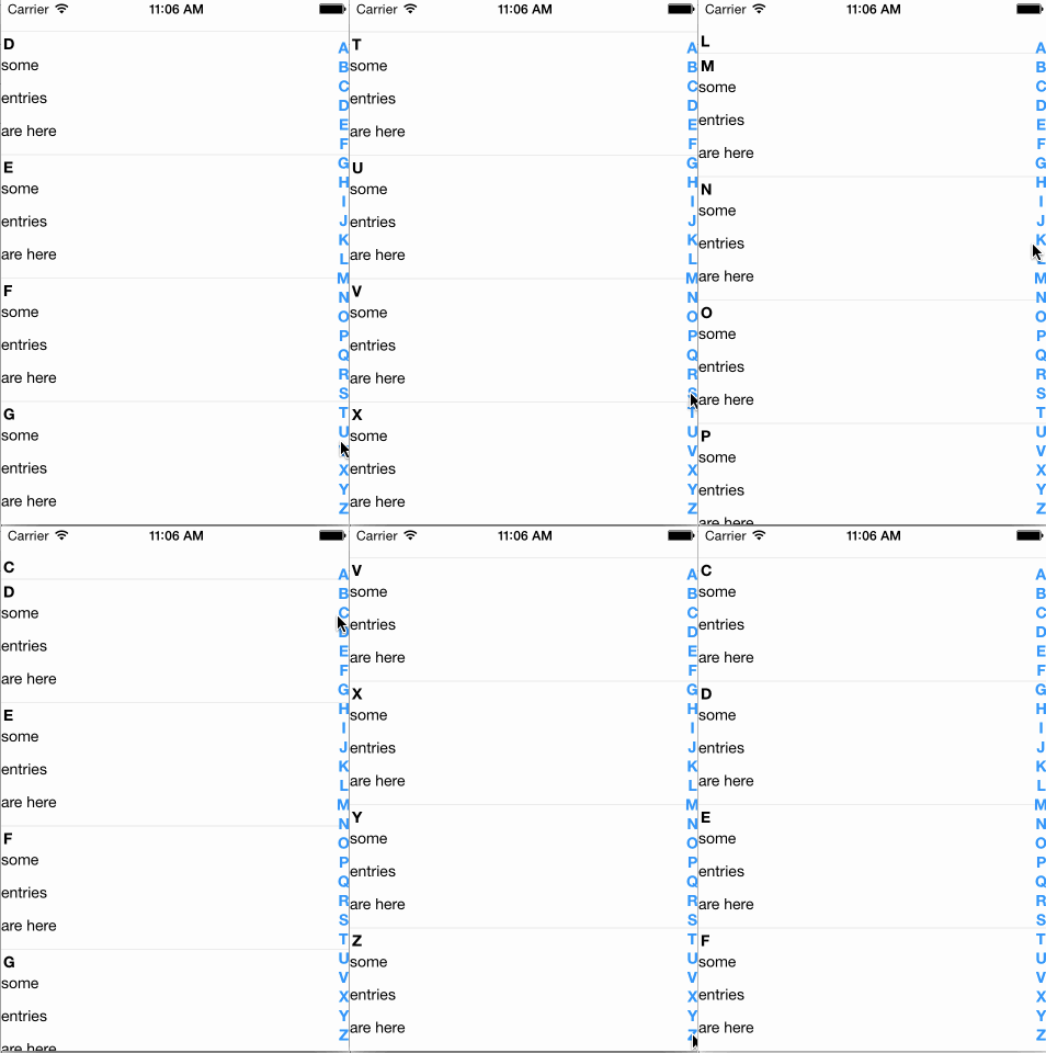
A Listview with a sidebar to directly jump to sections.
Please file issues for missing features or bugs.
I apologize for the bad name.
## Usage
The most basic way to use this component is as follows:
```javascript
var AlphabetListView = require('react-native-alphabetlistview');
// inside your render function
```
You can find a more complete example below
## Props
### SelectableSectionsListView
All props are passed through to the underlying `ListView`, so you can specify all the available props for `ListView` normally - except the following, which are defined internally and will be overwritten:
* `onScroll`
* `onScrollAnimationEnd`
* `dataSource`
* `renderRow`
* `renderSectionHeader`
#### data
`array|object`, **required**
The data to render in the listview
#### hideSectionList
`boolean`
Whether to show the section listing or not. *Note: If the data your are providing to
the component is an array, the section list will automatically be hidden.*
#### getSectionTitle
`function`
Function to provide titles for the section headers
#### getSectionListTitle
`function`
Function to provide titles for the section list items
#### onCellSelect
`function`
Callback which should be called when a cell has been selected
#### onScrollToSection
`function`
Callback which should be called when the user scrolls to a section
#### cell
`function` **required**
The cell component to render for each row
#### sectionListItem
`function`
A custom component to render for each section list item
#### sectionHeader
`function`
A custom component to render for each section header
#### footer
`function`
A custom component to render as footer
**This props takes precedence over `renderFooter`**
#### renderFooter
`function`
A custom function which has to return a valid React element, which will be
used as footer.
#### header
`function`
A custom component to render as header
**This props takes precedence over `renderHeader`**
#### renderHeader
`function`
A custom function which has to return a valid React element, which will be used as header.
#### headerHeight
`number`
The height of the rendered header element.
**Is required if a header element is used, so the positions can be calculated correctly**
#### cellProps
`object`
An object containing additional props, which will be passed to each cell component
#### sectionHeaderHeight
`number` **required**
The height of the section header component
#### cellHeight
`number` **required**
The height of the cell component
#### useDynamicHeights
`boolean`
Whether to determine the y position to scroll to by calculating header and cell heights or by using the UIManager to measure the position of the destination element. Defaults to `false`
**This is an experimental feature. For it to work properly you will most likely have to experiment with different values for `scrollRenderAheadDistance`, depending on the size of your data set.**
#### updateScrollState
`boolean`
Whether to set the current y offset as state and pass it to each cell during re-rendering
#### style
`object|number`
Styles to pass to the container
#### sectionListStyle
`object|number`
Styles to pass to the section list container
#### sectionListFontStyle
`object|number`
Styles to pass to the section list letters
---
### Cell component
These props are automatically passed to your component. In addition to these, your cell will receive all props which you specified in the object you passed as `cellProps` prop to the listview.
#### index
`number`
The index of the cell inside the current section
#### sectionId
`string`
The id of the parent section
#### isFirst
`boolean`
Whether the cell is the first in the section
#### isLast
`boolean`
Whether the cell is the last in the section
#### item
`mixed`
The item to render
#### offsetY
`number`
The current y offset of the list view
**If you do not specify `updateScrollState={true}` for the list component, this props will always be 0**
#### onSelect
`function`
The function which should be called when a cell is being selected
---
### Section list item component
These props are automatically passed to your component
#### sectionId
`string`
The id of the parent section
#### title
`string`
The title for this section. Either the return value of `getSectionListTitle` or the same value as `sectionId`
## Example
```javascript
class SectionHeader extends Component {
render() {
// inline styles used for brevity, use a stylesheet when possible
var textStyle = {
textAlign:'center',
color:'#fff',
fontWeight:'700',
fontSize:16
};
var viewStyle = {
backgroundColor: '#ccc'
};
return (
{this.props.title}
);
}
}
class SectionItem extends Component {
render() {
return (
{this.props.title}
);
}
}
class Cell extends Component {
render() {
return (
{this.props.item}
);
}
}
class MyComponent extends Component {
constructor(props, context) {
super(props, context);
this.state = {
data: {
A: ['some','entries','are here'],
B: ['some','entries','are here'],
C: ['some','entries','are here'],
D: ['some','entries','are here'],
E: ['some','entries','are here'],
F: ['some','entries','are here'],
G: ['some','entries','are here'],
H: ['some','entries','are here'],
I: ['some','entries','are here'],
J: ['some','entries','are here'],
K: ['some','entries','are here'],
L: ['some','entries','are here'],
M: ['some','entries','are here'],
N: ['some','entries','are here'],
O: ['some','entries','are here'],
P: ['some','entries','are here'],
Q: ['some','entries','are here'],
R: ['some','entries','are here'],
S: ['some','entries','are here'],
T: ['some','entries','are here'],
U: ['some','entries','are here'],
V: ['some','entries','are here'],
W: ['some','entries','are here'],
X: ['some','entries','are here'],
Y: ['some','entries','are here'],
Z: ['some','entries','are here'],
}
};
}
render() {
return (
);
}
}
```
---
_Source: https://npm.io/package/react-native-alphabetlistview · Machine-readable twin of the npm.io package page. Health data is recomputed on every publish._