# react-native-dialog-input-custom
> React native dialog input customizable
Latest version **1.0.3** (published 2019-06-01) · MIT license · 0 weekly downloads
## Install
```sh
npm install react-native-dialog-input-custom
pnpm add react-native-dialog-input-custom
yarn add react-native-dialog-input-custom
bun add react-native-dialog-input-custom
```
## Health
**Score 15/100 (F)** — status: abandoned.
Positive: no vulnerabilities.
Warnings: low downloads; no types; no esm support.
Negative: abandoned; low maintenance score.
## Facts
| | |
|---|---|
| Version | 1.0.3 |
| Published | 2019-06-01 |
| First published | 2019-06-01 |
| Weekly downloads | 0 |
| License | MIT |
| TypeScript types | none |
| Module format | CommonJS |
| Dependencies | 0 |
| Unpacked size | 24.7 KB |
| Known vulnerabilities | 0 |
| Install scripts | no |
| GitHub stars | 1 |
| Author | Vincenzo Carlino |
| Maintainers | vincenzocarlino |
| Keywords | react-native, ios, android, mobile, react-native-dialog, dialog, input |
## Links
- npm: https://www.npmjs.com/package/react-native-dialog-input-custom
- Repository: https://github.com/VincenzoCarlino/react-native-dialog-input-custom
- Homepage: https://github.com/VincenzoCarlino/react-native-dialog-input-custom#readme
- Issues: https://github.com/VincenzoCarlino/react-native-dialog-input-custom/issues
- npm.io page: https://npm.io/package/react-native-dialog-input-custom
## Alternatives
- [react-native-root-siblings](https://npm.io/package/react-native-root-siblings.md) — 102.9K weekly downloads
- [@praxisui/dialog](https://npm.io/package/@praxisui/dialog.md) — 2.0K weekly downloads
- [easy-toggle-state](https://npm.io/package/easy-toggle-state.md) — 350 weekly downloads
- [ngx-lightbox-evp](https://npm.io/package/ngx-lightbox-evp.md) — 19 weekly downloads
- [react-native-modal-translucent-axton](https://npm.io/package/react-native-modal-translucent-axton.md) — 4 weekly downloads
## Recent versions
- 1.0.3 (latest) — 2019-06-01
- 1.0.0 — 2019-06-01
## README
# react-native-dialog-input-custom
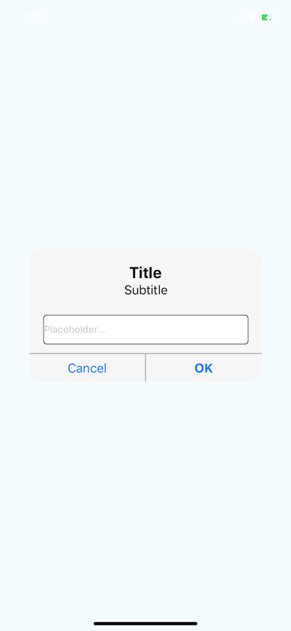
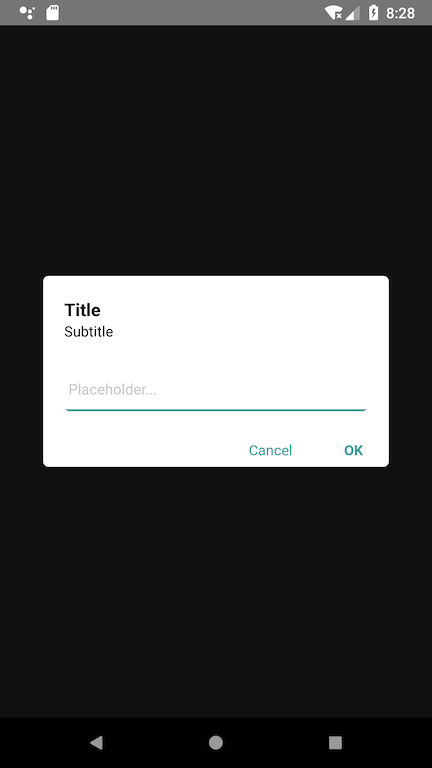
This is a dialog input for react native, it's really customizable.
It works fine in Android and iOS.
## Setup
```bash
npm install --save react-native-dialog-input
```
## Basic Usage
```javascript
import React, {Component} from 'react';
import {Platform, StyleSheet, Text, View} from 'react-native';
import DialogInput from 'react-native-dialog-input-custom';
export default class App extends Component<> {
constructor(props){
super(props);
this.state = {
dialogIsVisible: true
}
}
render() {
return (
this.setState({dialogIsVisible: false})}
submitInput={(textValue) => console.warn(textValue)}
/>
);
}
}
const styles = StyleSheet.create({
container: {
flex: 1,
justifyContent: 'center',
alignItems: 'center',
backgroundColor: '#F5FCFF',
},
});
```
## Example (Basic)
## Custom Usage
```javascript
import React, { Component } from 'react';
import { Platform, StyleSheet, Text, View } from 'react-native';
import DialogInput from 'react-native-dialog-input-custom';
export default class App extends Component<> {
constructor(props) {
super(props);
this.state = {
dialogIsVisible: true
}
}
render() {
return (
this.setState({ dialogIsVisible: false })}
submitInput={(textValue) => console.warn(textValue)}
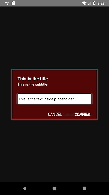
outerContainerStyle={{ backgroundColor: 'rgba(0,0,0, 0.75)' }}
containerStyle={{ backgroundColor: 'rgba(255,0,0, 0.2)', borderColor: 'red', borderWidth: 5 }}
titleStyle={{ color: 'white' }}
title="This is the title"
subTitleStyle={{ color: 'white' }}
subtitle="This is the subtitle"
placeholderInput="This is the text inside placeholder..."
placeholderTextColor="black"
textInputStyle={{ borderColor: 'black', borderWidth: 2 }}
secureTextEntry={false}
buttonsStyle={{ borderColor: 'white' }}
textCancelStyle={{ color: 'white' }}
submitTextStyle={{ color: 'white', fontStyle: 'italic' }}
cancelButtonText="CANCEL"
submitButtonText="CONFIRM"
/>
);
}
}
const styles = StyleSheet.create({
container: {
flex: 1,
justifyContent: 'center',
alignItems: 'center',
backgroundColor: '#F5FCFF',
},
});
```
## Example (Custom)

## Properties
name | description | type
:--------------------- |:------------------------------------------- | --------
dialogIsVisible | Value to show the dialog | Boolean
outerContainerStyle | Style for the background of the component | Object (OPTIONAL)
containerStyle | Style for the container of the component | Object (OPTIONAL)
titleStyle | Style for the title | Object (OPTIONAL)
title | Value of the title | String (OPTIONAL)
subTitleStyle | Value of the subtitle | String (OPTIONAL)
placeholderInput | Value of the placeholder | String (OPTIONAL)
placeholderTextColor | Color of the placeholder | String (OPTIONAL)
textInputStyle | Style for the TextInput component | Object (OPTIONAL)
secureTextEntry | Value for the secure text property | Boolean (OPTIONAL), default FALSE
buttonsStyle | Style for the two buttons | Object (OPTIONAL)
textCancelStyle | Style for the "Cancel" Button | Object (OPTIONAL)
submitTextStyle | Style for the "Submit" Button | Object (OPTIONAL)
cancelButtonText | Value of the "Cancel" Button | String (OPTIONAL)
submitButtonText | Value of the "Submit" Button | String (OPTIONAL)
## Methods
name | description | returns
:-------------- |:-------------------------------------------------- | -------:
closeDialogInput() | Event fired when the user press the Cancel Button and Submit Button, used to close the dialog | -
submitInput() | Event fired when the user press the Submit button, it will also invoke closeDialogInput(), and returns the value of the text input | String
---
_Source: https://npm.io/package/react-native-dialog-input-custom · Machine-readable twin of the npm.io package page. Health data is recomputed on every publish._