# react-native-jalali-calendar-picker
> Calendar Picker Component for React Native (Jalali)
Latest version **0.2.6** (published 2017-11-04) · GPLv3 license · 0 weekly downloads
## Install
```sh
npm install react-native-jalali-calendar-picker
pnpm add react-native-jalali-calendar-picker
yarn add react-native-jalali-calendar-picker
bun add react-native-jalali-calendar-picker
```
## Health
**Score 15/100 (F)** — status: abandoned.
Positive: no vulnerabilities.
Warnings: low downloads; no types; no esm support; pre 1.0.
Negative: abandoned; low maintenance score.
## Facts
| | |
|---|---|
| Version | 0.2.6 |
| Published | 2017-11-04 |
| First published | 2017-10-24 |
| Weekly downloads | 0 |
| License | GPLv3 |
| TypeScript types | none |
| Module format | CommonJS |
| Node | >=7.6.0 |
| Dependencies | 3 |
| Known vulnerabilities | 0 (+1 in 1 direct dependencies) |
| Install scripts | no |
| Author | Afshin Mehrabani |
| Maintainers | afshinmeh |
| Keywords | calendar, picker, calendar, picker, date, picker, day, picker, jalali, persian, farsi |
## Links
- npm: https://www.npmjs.com/package/react-native-jalali-calendar-picker
- Repository: https://github.com/afshinm/JalaliCalendarPicker
- Issues: https://github.com/afshinm/JalaliCalendarPicker/issues
- npm.io page: https://npm.io/package/react-native-jalali-calendar-picker
## Dependencies (3)
- [expo](https://npm.io/package/expo.md) ^15.1.0
- [prop-types](https://npm.io/package/prop-types.md) ^15.6.0
- [moment-jalaali](https://npm.io/package/moment-jalaali.md) ^0.7.2
## Alternatives
- [@js-joda/timezone](https://npm.io/package/@js-joda/timezone.md) — 383.4K weekly downloads
- [chartjs-adapter-moment](https://npm.io/package/chartjs-adapter-moment.md) — 210.8K weekly downloads
- [strftime](https://npm.io/package/strftime.md) — 171.2K weekly downloads
- [vue-flatpickr-component](https://npm.io/package/vue-flatpickr-component.md) — 115.8K weekly downloads
- [timepicker](https://npm.io/package/timepicker.md) — 51.0K weekly downloads
## Recent versions
- 0.2.6 (latest) — 2017-11-04
- 0.2.5 — 2017-11-04
- 0.2.4 — 2017-11-01
- 0.2.3 — 2017-11-01
- 0.2.2 — 2017-11-01
- 0.2.1 — 2017-11-01
- 0.2.0 — 2017-10-30
- 0.1.1 — 2017-10-24
- 0.1.0 — 2017-10-24
## README
# react-native-jalali-calendar-picker
This is the Jalali (and Farsi) version of "react-native-calendar-picker" (https://github.com/stephy/CalendarPicker), Calendar Picker Component for React Native
I have tried to cast the `Date` object to `moment-jalali` (https://github.com/jalaali/moment-jalaali) but this is somehow ugly.
It was a 5-hour work and there are still many issues (i.e `minDate` and `maxDate` does not work properly and might raise error)
Following features work at the moment:
- Date picker grid
- Single selection
- Multi selection
Please refer to the original author's README (https://github.com/stephy/CalendarPicker) for more options and examples.
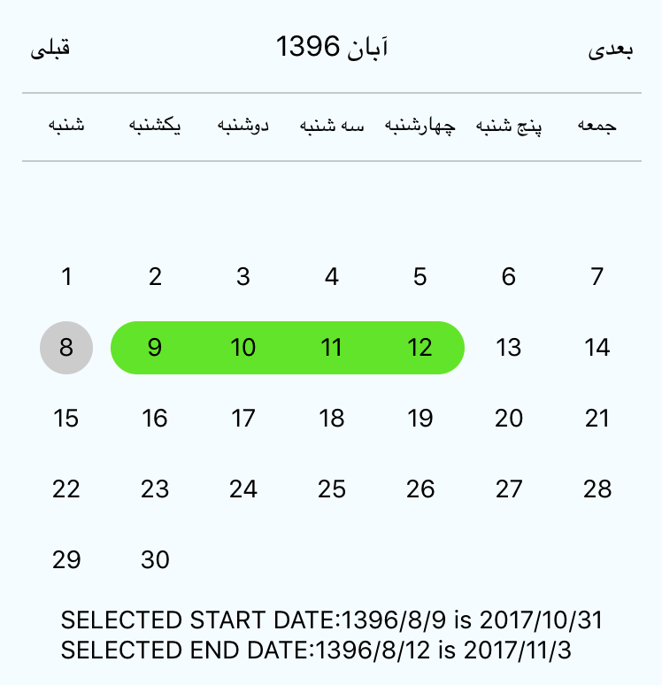
To use the calendar you just need to:
```sh
npm install --save react-native-jalali-calendar-picker
```
# How to use it
```js
import React, { Component } from 'react';
import {
StyleSheet,
Text,
View
} from 'react-native';
import JalaliCalendarPicker from 'react-native-jalali-calendar-picker';
export default class App extends Component {
constructor(props) {
super(props);
this.state = {
selectedStartDate: null,
};
this.onDateChange = this.onDateChange.bind(this);
}
onDateChange(date) {
this.setState({
selectedStartDate: date,
});
}
render() {
const { selectedStartDate } = this.state;
const startDate = selectedStartDate ? selectedStartDate.format('jYYYY/jM/jD [is] YYYY/M/D') : '';
return (
SELECTED DATE:{ startDate }
);
}
}
const styles = StyleSheet.create({
container: {
flex: 1,
backgroundColor: '#FFFFFF',
marginTop: 100,
},
});
```
## JalaliCalendarPicker Props
| Prop | Type | Description |
:------------ |:---------------| :-----|
| **`weekdays`** | `Array` | Optional. List of week days. Eg. `['Mon', 'Tue', ...]` Must be 7 days |
| **`months`** | `Array` | Optional. List of months names. Eg. `['Jan', 'Feb', ...]` Must be 12 months |
| **`startFromMonday`** | `Boolean` | Optional. Default first day of week will be Sunday. You can set start of week from Monday by setting this to true. Default is `false` |
| **`allowRangeSelection`** | `Boolean` | Optional. Allow to select date ranges. Default is `false` |
| **`previousTitle`** | `String` | Optional. Title of button for previous month. Default is `Previous` |
| **`nextTitle`** | `String` | Optional. Title of button for next month. Default is `Next` |
| **`selectedDayColor`** | `String` | Optional. Color for selected day |
| **`selectedDayTextColor`** | `String` | Optional. Text color for selected day |
| **`todayBackgroundColor`** | `String` | Optional. Background color for today. Default is `#cccccc` |
| **`textStyle`** | `Object` | Optional. Style overall text. Change fontFamily, color, etc. |
| **`scaleFactor`** | `Number` | Optional. Default (375) scales to window width |
| **`minDate`** | `Date` | Optional. Specifies minimum date to be selected |
| **`maxDate`** | `Date` | Optional. Specifies maximum date to be selected |
| **`initialDate`** | `Date` | Optional. Date that calendar opens to. Defaults to today. |
| **`width`** | `Number` | Optional. Width of CalendarPicker's container. Defaults to Dimensions width.|
| **`height`** | `Number` | Optional. Height of CalendarPicker's container. Defaults to Dimensions height.|
# Styles
Some styles will overwrite some won't. For instance:
- If you provide textStyle with fontFamily and color, out of ranges dates will not apply your color, just fontFamily.
Order of precedence:
- defaultColor => textStyle => selectedDayColor
- defaultTodayBackgroundColor => todayBackgroundColor
- defaultBackgroundColor => selectedDayColor
- defaultTextStyles => textStyle => selectedDayTextColor
# Mutli select
```js
import React, { Component } from 'react';
import {
StyleSheet,
Text,
View
} from 'react-native';
import JalaliCalendarPicker from 'react-native-calendar-picker';
export default class App extends Component {
constructor(props) {
super(props);
this.state = {
selectedStartDate: null,
selectedEndDate: null,
};
this.onDateChange = this.onDateChange.bind(this);
}
onDateChange(date, type) {
if (type === 'END_DATE') {
this.setState({
selectedEndDate: date,
});
} else {
this.setState({
selectedStartDate: date,
selectedEndDate: null,
});
}
}
render() {
const { selectedStartDate, selectedEndDate } = this.state;
const startDate = selectedStartDate ? selectedStartDate.format('jYYYY/jM/jD [is] YYYY/M/D') : '';
const endDate = selectedEndDate ? selectedEndDate.format('jYYYY/jM/jD [is] YYYY/M/D') : '';
return (
SELECTED START DATE:{ startDate }
SELECTED END DATE:{ endDate }
);
}
}
const styles = StyleSheet.create({
container: {
flex: 1,
backgroundColor: '#FFFFFF',
marginTop: 100,
},
});
```
# Suggestions?
Open Issues. Submit PRs.
#### Running on device
```sh
npm start
```
#### Running on iOS Simulator
```sh
npm run ios
```
---
_Source: https://npm.io/package/react-native-jalali-calendar-picker · Machine-readable twin of the npm.io package page. Health data is recomputed on every publish._