# react-native-modal-popover
> Pure JS popover component for react-native
Latest version **2.1.3** (published 2022-12-30) · MIT license · 0 weekly downloads
## Install
```sh
npm install react-native-modal-popover
pnpm add react-native-modal-popover
yarn add react-native-modal-popover
bun add react-native-modal-popover
```
## Health
**Score 20/100 (F)** — status: abandoned.
Positive: has types; no vulnerabilities.
Warnings: low downloads; no esm support.
Negative: abandoned; low maintenance score.
## Facts
| | |
|---|---|
| Version | 2.1.3 |
| Published | 2022-12-30 |
| First published | 2017-06-18 |
| Weekly downloads | 0 |
| License | MIT |
| TypeScript types | bundled |
| Module format | CommonJS |
| Dependencies | 2 |
| Unpacked size | 96.2 KB |
| Known vulnerabilities | 0 |
| Install scripts | no |
| GitHub stars | 321 |
| Author | Konstantin Kuznetsov |
| Maintainers | doomsower |
| Keywords | react, react-native, popover, modal |
## Links
- npm: https://www.npmjs.com/package/react-native-modal-popover
- Repository: https://github.com/doomsower/react-native-modal-popover
- Homepage: https://github.com/doomsower/react-native-modal-popover#readme
- Issues: https://github.com/doomsower/react-native-modal-popover/issues
- npm.io page: https://npm.io/package/react-native-modal-popover
## Dependencies (2)
- [lodash](https://npm.io/package/lodash.md) >4.17.0
- [prop-types](https://npm.io/package/prop-types.md) ^15.8.1
## Alternatives
- [mobx-react](https://npm.io/package/mobx-react.md) — 2.8M weekly downloads
- [rc-tree](https://npm.io/package/rc-tree.md) — 2.6M weekly downloads
- [@react-oauth/google](https://npm.io/package/@react-oauth/google.md) — 1.3M weekly downloads
- [@wagmi/connectors](https://npm.io/package/@wagmi/connectors.md) — 877.0K weekly downloads
- [vee-validate](https://npm.io/package/vee-validate.md) — 836.4K weekly downloads
## Recent versions
- 2.1.3 (latest) — 2022-12-30
- 2.1.0 — 2021-08-24
- 2.0.1 — 2021-06-04
- 2.0.0 — 2021-04-25
- 1.0.0 — 2020-11-22
- 0.0.12 — 2018-10-14
- 0.0.11 — 2018-09-14
- 0.0.10 — 2018-05-14
- 0.0.9 — 2018-05-14
- 0.0.8 — 2018-05-12
- 0.0.7 — 2018-03-31
- 0.0.6 — 2018-03-04
- 0.0.5 — 2018-01-23
- 0.0.4 — 2018-01-23
- 0.0.3 — 2017-11-12
- … 2 more at https://npm.io/package/react-native-modal-popover/versions
## README
# react-native-modal-popover
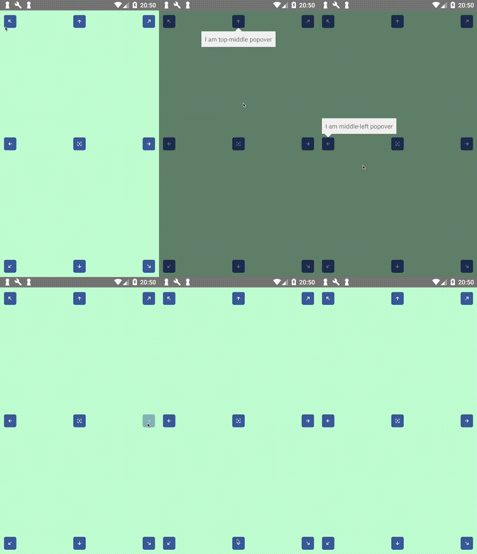
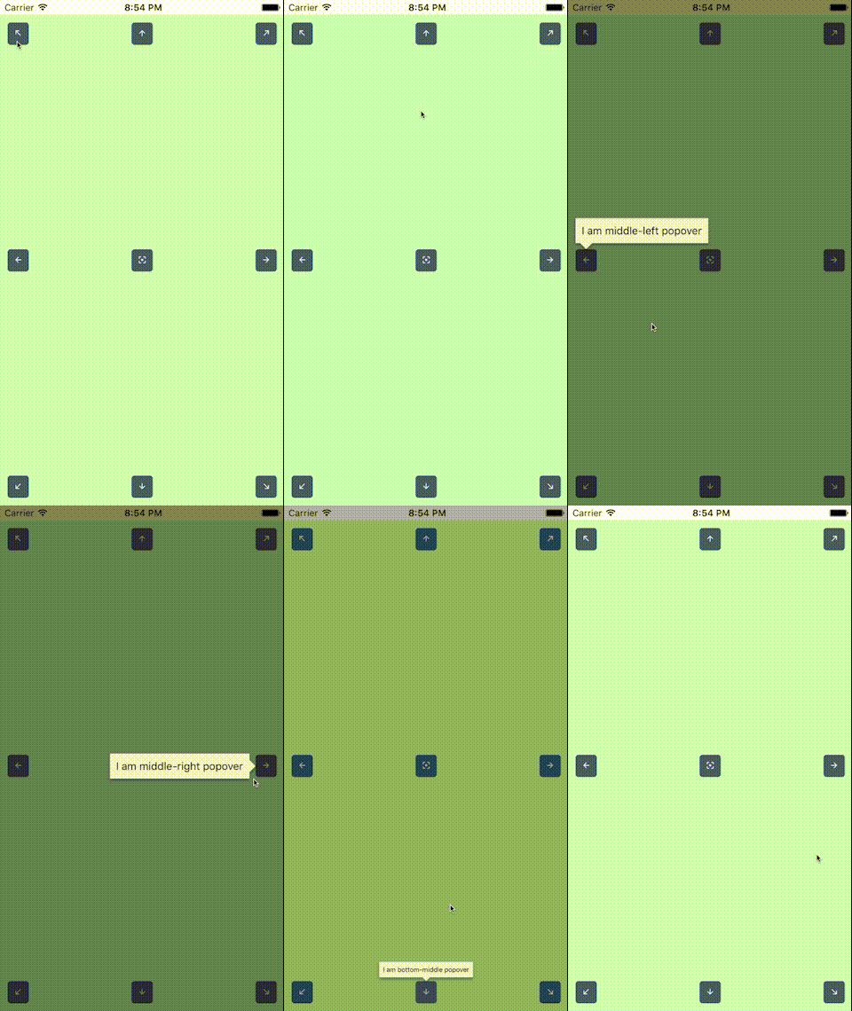
Pure JS popover component for react-native
## About this module
The original [react-native-popover](https://github.com/jeanregisser/react-native-popover) is now outdated,
so I decided to publish my own module to avoid using github url in my package.json. Something got lost in
the process of rewriting, but now it uses `Modal` and native animation drivers, and also has cool helper
to use with Touchables. Thanks to @jeanregisser and to the authors of hanging PRs for their code.
## Requirements
Previously (version `0.0.6`) this module required react version `>16.2.0` to work (which corresponds to react-native version `>0.52.0`).
Version `0.0.7` does not reqire `React.Fragment` anymore, so you can use with reasonably old versions of react and react-native.
## Install
```sh
yarn add react-native-modal-popover
```
## Usage
This module exports two react components, `Popover` and `PopoverController`, and one react hook, `usePopover`.
`Popover` works pretty much like original `Popover`, and `PopoverController` is a convenience component that uses [React Render Props](https://github.com/jaredpalmer/awesome-react-render-props) pattern.
**Important** this example uses `React.Fragment` to wrap children, but if you use `react-native` version older than `0.52`, then you should reaplce `React.Fragment` with `View`
### Using hook
`usePopover` is preferred modern way to have popover in your app.
```jsx
import React from 'react';
import { Button, StyleSheet, Text, View } from 'react-native';
import { Popover, usePopover } from 'react-native-modal-popover';
const styles = StyleSheet.create({
app: {
...StyleSheet.absoluteFillObject,
alignItems: 'center',
justifyContent: 'center',
backgroundColor: '#c2ffd2',
},
content: {
padding: 16,
backgroundColor: 'pink',
borderRadius: 8,
},
arrow: {
borderTopColor: 'pink',
},
background: {
backgroundColor: 'rgba(0, 0, 255, 0.5)',
},
});
const App = () => {
const {
openPopover,
closePopover,
popoverVisible,
touchableRef,
popoverAnchorRect,
} = usePopover();
return (
Hello from inside popover!
);
};
export default App;
```
### Using PopoverController
Use `PopoverController` if you cannot use hooks for some reason.
```jsx
import React from 'react';
import { Button, StyleSheet, Text, View } from 'react-native';
import { Popover, PopoverController } from 'react-native-modal-popover';
const styles = StyleSheet.create({
app: {
...StyleSheet.absoluteFillObject,
alignItems: 'center',
justifyContent: 'center',
backgroundColor: '#c2ffd2',
},
content: {
padding: 16,
backgroundColor: 'pink',
borderRadius: 8,
},
arrow: {
borderTopColor: 'pink',
},
background: {
backgroundColor: 'rgba(0, 0, 255, 0.5)',
},
});
const App = () => (
{({
openPopover,
closePopover,
popoverVisible,
setPopoverAnchor,
popoverAnchorRect,
}) => (
Hello from inside popover!
)}
);
export default App;
```
## Props
### `Popover`
| Prop | Type | Optional | Default | Description |
| --------------------- | --------------------------------------------------------------------------------------------------- | -------- | --------------------------------------------------------------------------- | ----------------------------------------------------------------------------------------------------------------------------------------------------------------------------------------------------------------------------------------------------- |
| visible | bool | Yes | false | Show/Hide the popover |
| fromRect | Rect | No\* | | Rectangle at which to anchor the popover. **Optional** when used inside `PopoverTouchable`, **required** when used standalone. If you set this property, you should also change it when screen orientation changes. |
| displayArea | Rect | Yes | Screen - 10px padding | Area where the popover is allowed to be displayed. **Important note:** if you use non-default value here and you want to handle screen orientation changes, it is your responsibility to change this value when screen orientation changes. |
| placement | string | Yes | 'auto' | How to position the popover - top | bottom | start | end | auto. When 'auto' is specified, it will determine the ideal placement so that the popover is fully visible within `displayArea`. |
| onClose | function | Yes | | Callback to be fired when the user closes the popover |
| onDismiss | function | Yes | | Callback to be fired after the popup closes |
| backgroundStyle | ViewStyle | Yes | | Custom style to be applied to background overlay |
| contentStyle | ViewStyle | Yes | | Custom style to be applied to popover reactangle. Use it to set round corners, background color, etc. |
| arrowStyle | ViewStyle | Yes | | Custom style to be applied to popover arrow. Use `borderTopColor` to match content backgroundColor |
| duration | number | Yes | 300 | Animation duration |
| easing | (show: boolean) => (value: number) => number | Yes | show => show ? Easing.out(Easing.back(1.70158)) : Easing.inOut(Easing.quad) | Function that returns easing function for show or hide animation, depending on `show` argument |
| useNativeDriver | bool | Yes | false | Defines if animations should use native driver |
| supportedOrientations | array of enum('portrait', 'portrait-upside-down', 'landscape', 'landscape-left', 'landscape-right') | Yes | | This prop is passed to react-native `Modal`, see [react-native docs](https://facebook.github.io/react-native/docs/modal.html#supportedorientations). Set this to `['portrait', 'landscape']` if you want your popover to resprect screen orientation. |
| calculateStatusBar | bool | Yes | false | Defines if while use status bar height while calculating "Y" origin of anchor. |
### `PopoverController` and `usePopover` hook
`PopoverController` accepts function as children. This function is called with one argument of type `PopoverControllerRenderProps` and returns react element. The children of this element are your UI handle to open popover (`Button`, `Toggle`, whatever) and `Popover` element itself. Pass properties to you handle and `Popover`, and `PopoverController` will make them work together behind the scenes. All the props are required to make controller work.
`usePopover` returns object with same props as `PopoverControllerRenderProps`, except that ref has different name: `touchableRef`.
#### `PopoverControllerRenderProps`:
| Prop | Type | Description |
| -------------------------------------------------------------------- | ------------ | -------------------------------------------------------------------------------------------------------------------------------------------------------------------------------------------------------------------------------------------------------------------- |
| openPopover | () => void | Call this function when you want to open popover, e.g. pass to `onPress` of a `Button` |
| closePopover | () => void | Call this function when you want to close popover. Typically you pass this as `onClose` prop of `Popover`, which will make popover close when tapped outside. If you have a button inside popover which should close the popover, pass this function to this button. |
| popoverVisible | boolean | Pass this to `visible` prop of `Popover` component |
| setPopoverAnchor (`PopoverController`) / touchableRef (`usePopover`) | ref function | Pass this as `ref` to popover UI handle. This will bind popover display position to the position of this UI handle. |
| popoverAnchorRect | Rect | Pass this as `fromRect` prop of `Popover` component |
### `Rect`
Rect is an object with the following properties: `{x: number, y: number, width: number, height: number}`
## Using without `PopoverController`
In this case you have to handle refs, measure UI handle and manage popover visibility manually:
```jsx
import React from 'react';
import {
findNodeHandle,
NativeModules,
StyleSheet,
Text,
View,
} from 'react-native';
import Button from './Button';
import Popover from './popover';
const styles = StyleSheet.create({
app: {
...StyleSheet.absoluteFillObject,
padding: 10,
backgroundColor: '#c2ffd2',
alignItems: 'center',
},
});
export default class App2 extends React.Component {
state = {
showPopover: false,
popoverAnchor: { x: 0, y: 0, width: 0, height: 0 },
};
setButton = (e) => {
const handle = findNodeHandle(this.button);
if (handle) {
NativeModules.UIManager.measure(handle, (x0, y0, width, height, x, y) => {
this.setState({ popoverAnchor: { x, y, width, height } });
});
}
};
openPopover = () => {
this.setState({ showPopover: true });
};
closePopover = () => this.setState({ showPopover: false });
render() {
return (
);
}
}
```
## Contributing
If you want to add some features, feel free to submit PR.
---
_Source: https://npm.io/package/react-native-modal-popover · Machine-readable twin of the npm.io package page. Health data is recomputed on every publish._