# react-native-pagination
> The best Pagination component for React Native.
Latest version **1.5.5** (published 2018-06-24) · MIT license · 0 weekly downloads
## Install
```sh
npm install react-native-pagination
pnpm add react-native-pagination
yarn add react-native-pagination
bun add react-native-pagination
```
## Health
**Score 30/100 (F)** — status: abandoned.
Positive: no vulnerabilities; high maintenance score.
Warnings: low downloads; no types; no esm support.
Negative: abandoned.
## Facts
| | |
|---|---|
| Version | 1.5.5 |
| Published | 2018-06-24 |
| First published | 2017-07-17 |
| Weekly downloads | 0 |
| License | MIT |
| TypeScript types | none |
| Module format | CommonJS |
| Dependencies | 1 |
| Unpacked size | 457.8 KB |
| Known vulnerabilities | 0 |
| Install scripts | no |
| GitHub stars | 419 |
| Author | Garrett Mac |
| Maintainers | garrettmac |
| Keywords | react, react-native, pagination, scroll, tabs, list, flatlist, native, listview, flatlist, sectionlist, react-component, react-native-component, list, ui, profile-page |
## Links
- npm: https://www.npmjs.com/package/react-native-pagination
- Repository: https://github.com/garrettmac/react-native-pagination
- Homepage: https://github.com/garrettmac/react-native-pagination#readme
- Issues: https://github.com/garrettmac/react-native-pagination/issues
- npm.io page: https://npm.io/package/react-native-pagination
## Dependencies (1)
- [react-native-vector-icons](https://npm.io/package/react-native-vector-icons.md) ^4.3.0
## Alternatives
- [mobx-react](https://npm.io/package/mobx-react.md) — 2.8M weekly downloads
- [rc-tree](https://npm.io/package/rc-tree.md) — 2.6M weekly downloads
- [@react-oauth/google](https://npm.io/package/@react-oauth/google.md) — 1.3M weekly downloads
- [@wagmi/connectors](https://npm.io/package/@wagmi/connectors.md) — 877.0K weekly downloads
- [vee-validate](https://npm.io/package/vee-validate.md) — 836.4K weekly downloads
## Recent versions
- 1.5.5 (latest) — 2018-06-24
- 1.2.8 — 2017-08-01
- 1.2.7 — 2017-08-01
- 1.2.6 — 2017-08-01
- 1.2.5 — 2017-07-31
- 1.2.4 — 2017-07-31
- 1.2.3 — 2017-07-31
- 1.2.2 — 2017-07-31
- 1.2.1 — 2017-07-31
- 1.2.0 — 2017-07-31
- 1.1.4 — 2017-07-31
- 1.0.4 — 2017-07-30
- 1.0.2 — 2017-07-29
- 1.0.0 — 2017-07-17
## README
The best Pagination component for React Native.







# React Native Pagination
## Roadmap
> see: [ROADMAP.md](ROADMAP.md)
### Horizontal
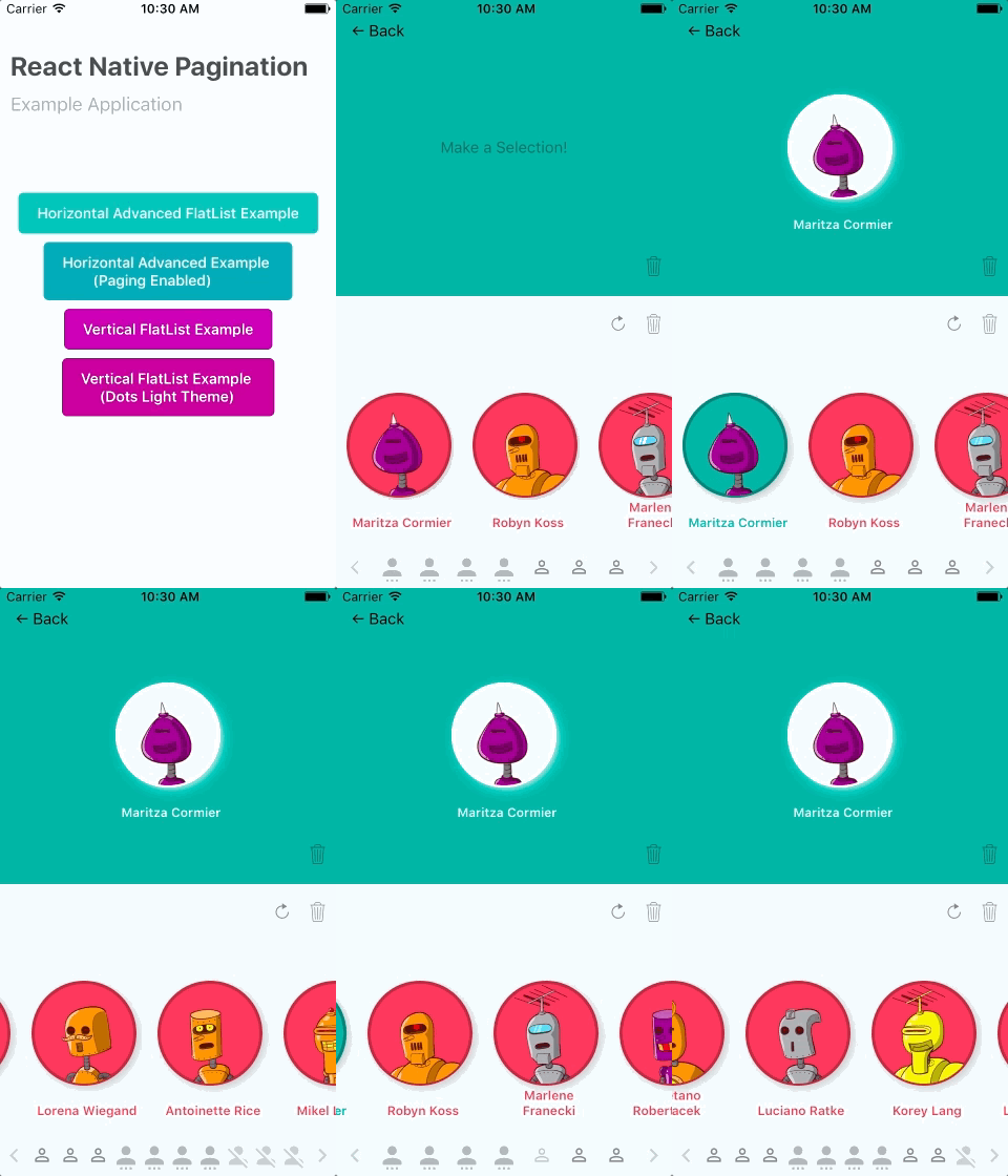
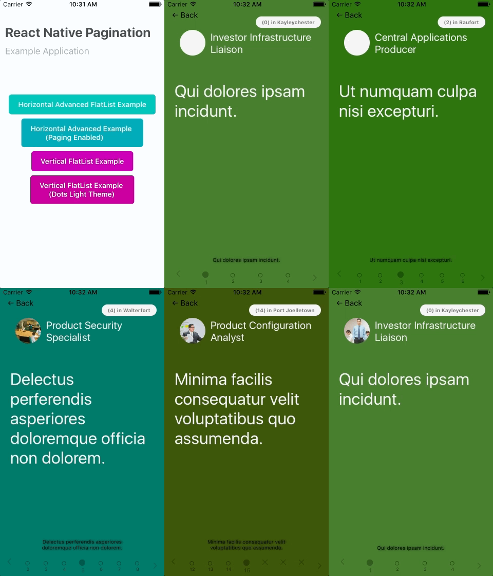
> To try these out yourself its prudy easy, Just open `examples/ios/*.xcodeproj` in Xcode, then press `Cmd + R`; you may edit `examples/index.ios.js` for switch cases.
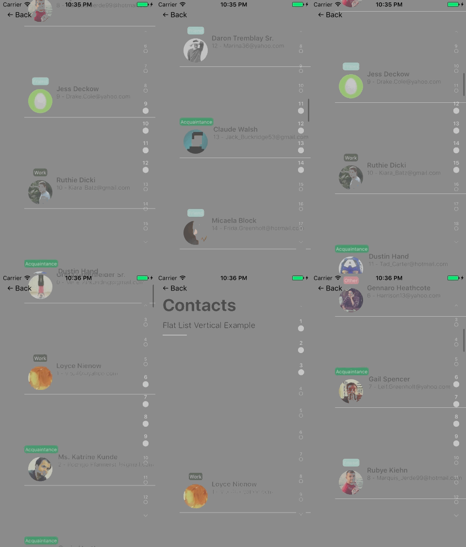
### Vertical
## Getting Started
- [React Native Pagination](#react-native-pagination)
* [ROADMAP.md](#roadmap)
* [Show Cases](#show-cases)
+ [Horizontal](#horizontal)
+ [Vertical](#vertical)
* [Getting Started](#getting-started)
* [Installation](#installation)
+ [Example](#example)
+ [Development](#development)
* [Basic Usage](#basic-usage)
* [Properties](#properties)
+ [Basic](#basic)
- [Basic Props](#basic-props)
- [Basic Styles](#basic-styles)
+ [Start/End Dots](#start-end-dots)
- [Start/End Dot Basic Props](#start-end-dot-basic-props)
- [Start/End Dot Text](#start-end-dot-text)
+ [Pagination Dots](#pagination-dots)
- [Pagination Dots Basic Props](#pagination-dots-basic-props)
- [Dot Text](#dot-text)
- [Pagination Dots](#pagination-dots-1)
+ [Advanced Positioning](#advanced-positioning)
+ [Visibility](#visibility)
+ [Methods](#methods)
+ [Other](#other)
* [Components](#components)
* [Issues](#issues)
## Installation
- Install `react-native` first
```bash
$ npm i react-native -g
$ yarn add react-native-pagination
$ cd ReactNativePaginationExample
$ yarn install #(or with npm "npm i react-native-pagination —save")
$ react-native run-ios
```
- Initialization of a react-native project
```bash
$ react-native init myReactNativePaginationExample
$ cd myReactNativePaginationExample
$ yarn install #(or with npm "npm i && npm i react-native-pagination —save")
$ yarn add react-native-pagination
$ react-native link
$ react-native run-ios
```
### Example
or clone the repo and play with the example project
```bash
$ git clone https://github.com/garrettmac/react-native-pagination
$ cd react-native-pagination/ReactNativePaginationExample
$ yarn install
$ react-native link
$ react-native run-ios
```
one liner
```bash
git clone https://github.com/garrettmac/react-native-pagination && cd react-native-pagination/ReactNativePaginationExample && yarn install && react-native link && react-native run-ios
```
> Quick start with [ReactNativePaginationExample](https://github.com/garrettmac/react-native-pagination/tree/master/ReactNativePaginationExample/).
### Development
in your project
```bash
$ yarn add react-native-pagination
$ react-native link #this makes sure react-native-vector-icons load correctly
$ react-native run-ios
```
## Basic Usage
- In your `myApp/index.ios.js`, use:
```jsx
import React, { Component } from 'react';
import {AppRegistry,StyleSheet,View,FlatList,} from 'react-native';
import ContactItem from './Pages/widgets/ContactItem'; // https://github.com/garrettmac/react-native-pagination/blob/master/ReactNativePaginationExample/Pages/widgets/ContactItem.js
import faker from 'faker';//assuming you have this.
import _ from 'lodash';
import Pagination,{Icon,Dot} from 'react-native-pagination';//{Icon,Dot} also available
//lets use faker to create mock data
let MockPersonList = new _.times(35,(i)=>{
return {
id:i,
index:i,
name:faker.name.findName(),
avatar:faker.internet.avatar(),
group:_.sample(["Family","Friend","Acquaintance","Other"]),
email:faker.internet.email(),
}
})
export default class ReactNativePaginationExample extends Component {
constructor(props){
super(props);
this.state = {
items: MockPersonList,
};
}
//create each list item
_renderItem = ({item}) => {
return ()
};
//pressed an item
onPressItem = (item) => console.log("onPressItem:item ",item);
//map to some od. We use the "id" attribute of each item in our list created in our MockPersonList
_keyExtractor = (item, index) => item.id;
// REQUIRED for ReactNativePagination to work correctly
onViewableItemsChanged = ({ viewableItems, changed }) =>this.setState({viewableItems})
render() {
return (
this.refs=r}//create refrence point to enable scrolling
keyExtractor={this._keyExtractor}//map your keys to whatever unique ids the have (mine is a "id" prop)
renderItem={this._renderItem}//render each item
onViewableItemsChanged={this.onViewableItemsChanged.bind(this)}//need this
/>
this.refs=r}" to your list)
paginationVisibleItems={this.state.viewableItems}//needs to track what the user sees
paginationItems={this.state.items}//pass the same list as data
paginationItemPadSize={3} //num of items to pad above and below your visable items
/>
)
}
};
const s = StyleSheet.create({
container: {
flex: 1,
// backgroundColor:"grey",//<-- use with "dotThemeLight"
},
});
AppRegistry.registerComponent('ReactNativePaginationExample', () => App);
```
Currently only supported for FlatList's
## Properties
All properties took text editors auto completion into consideration and follow the basic structure
[`prefix`][`body`][`suffix` ] where
[`component name` ][`component attribute`][`continued component attribute / component change`] to provide users with the full list of options when working with `prefix`'s without having to revisit the official docs.
*Most Common Component Prefix Options*:`dot`, `startDot`,`endDot`
*Most Common Component Body Options*:`Icon`, `Font`,`Style` ,`Color`
*Most Common Component Suffix Options*:`Hide`, `Size`,`IconFamily` ,or `NotActive`,`Active` `Empty`
Resulting props like
`dotIconHide` ,`startDotIconHide`, or `startFontSize`,`endDotStyle` ect.
### Basic
#### Basic Props
| Prop | Default | Type | Description |
|------------------|------------------|------------------|------------------|
| paginationItems | `[]` | `array` |an array pagination Items|
|paginationVisibleItems|`[]`|`array`|an array pagination visible items obtained by using React Native List Components `onViewableItemsChanged` callback function (see example) |
|dotThemeLight |`false`|`bool`| if you pass in the `dotThemeLight` prop (setting it to `true`) the pagination dots swaps to a a light theme. By default they are dark. |
|horizontal |`false`|`bool`| use to alternate between horizontal and vertical (just like you do with your list component) |
|dotAnimation|`LayoutAnimation.Presets.easeInEaseOut`|`Animation`|dot Animation triggered when navigating|
|paginationStyle|`{}`|`style`|pagination Styles|
|pagingEnabled|`false`|`bool`| Enable Paging. This is a prop that is also used in React Native List Components (like `FlatList`) that gives you that paging effect that stops the scroll on every new page. |
|hideEmptyDots|`false`|`bool`| Hide Empty Dots Icons|
|paginationItemPadSize|`3`|`number`|pagination Item Pad Size|
#### Basic Styles
| Prop | Default | Type | Description |
|------------------|------------------|------------------|------------------|
|`paginationStyle` when horizontal|`{height, alignItems:"center" , justifyContent: 'space-between', position:"absolute", top:0, margin:0, bottom:0, right:0, bottom:0, padding:0, flex:1, }` | `style`| default when horizontal|
|`paginationStyle` when not horizontal|`{width, alignItems:"center", justifyContent: 'space-between', position:"absolute", margin:0, bottom:10, left:0, right:0, padding:0, flex:1,}` | `style`| default when not horizontal|
|textStyle|`{}`|`style object`| global style object. Tread lightly it may overlay if you plan to use my default Light/Dark Themes |
|dotStyle|`{}`|`style object`| addition style to use for pagination dots |
|startDotStyle|`{}`|`style object`| addition style to use for start dots |
|endDotStyle`|`{}`|`style object`| addition style to use for end dots |
> this uses react-native-vector-icons [checkout here] (https://github.com/oblador/react-native-vector-icons)
### Start/End Dots
#### Start/End Dot Basic Props
| Prop | Default | Type | Description |
|------------------|------------------|------------------|------------------|
|`startDotIconName` (when `horizontal`)|`”chevron-left”`|`icon name`| Icon shown for dot at start of list |
|`startDotIconName` (when `vertical`)|`”chevron-up”`|`icon name`| Icon shown for dot at start of list |
|`endDotIconName` (when `horizontal`)|`”chevron-right”`|`icon name`| Icon shown for dot at start of list |
|`endDotIconName` (when `vertical` )|`”chevron-down”`|`icon name`| Icon shown for dot at start of list |
|`startDotIconSize` |`15`|`number`| end icon dot size|
|`endDotIconSize`|`15`|`number`| end icon dot size|
|`startDotIconFamily` / `endDotIconFamily`|`MaterialCommunityIcons`|`string` of font family name | Font Family for Icon. options: `Entypo`, `EvilIcons`, `FontAwesome`, `Foundation`, `Ionicons`, `MaterialIcons`, `MaterialCommunityIcons`, `Octicons`, `Zocial`, `SimpleLineIcons` (available in react-native-vector-icons package)|
#### Start/End Dot Text
| Prop | Default | Type | Description |
|------------------|------------------|------------------|------------------|
|startDotFontSize|`11`|`number`|start Dot Font Size |
|endDotFontSize|`11`|`number`|end Dot Font Size |
### Pagination Dots
These are the list of dots that represent each item in your paginationItems
#### Pagination Dots Basic Props
| Prop | Default | Type | Description |
|------------------|------------------|------------------|------------------|
|`dotIconFamily`|`”MaterialCommunityIcons”`|`string` of font family name | Font Family for Icon. options: `Entypo`, `EvilIcons`, `FontAwesome`, `Foundation`, `Ionicons`, `MaterialIcons`, `MaterialCommunityIcons`, `Octicons`, `Zocial`, `SimpleLineIcons` (available in react-native-vector-icons package) |
|dotIconNameEmpty|`”close”`|`icon name`| Icon Shown when pagination dot is Empty |
|dotIconNameActive|`”checkbox-blank-circle”`|`icon name`| Icon Shown when pagination dot is Active|
|dotIconNameNotActive|`”checkbox-blank-circle-outline”`|`icon name`| Icon Shown when pagination dot is Not Active|
|dotIconSizeActive|`15`|`number`| size of pagination icon when active |
|dotIconSizeNotActive|`10`|`number`| size of pagination iconwhen vertical |
|dotIconColorNotActive|`”rgba(0,0,0,.5)”`|`color`|dot Icon Font Size when on page but Not Active|
|dotIconColorActive|`”rgba(0,0,0,.3)”`|`color`|dot Icon Font Size when on page but Not Active|
|dotIconColorEmpty|`”rgba(0,0,0,.2)”`|`color`|dot Icon Font Size when on page but Not Active|
**when using dotThemeLight**
| Prop | Default | Type | Description |
|------------------|------------------|------------------|------------------|
|dotIconColorNotActive| `”rgba(255,255,255,.4)”`|`color`|dot Icon Font Size when on page but Not Active|
|dotIconColorActive| `”rgba(255,255,255,.5)”`|`color`|dot Icon Font Size when on page but Not Active|
|dotIconColorEmpty| `”rgba(255,255,255,.2)”`|`color`|dot Icon Font Size when on page but Not Active|
#### Dot Text
by default it displays `index+1`, if you'd like display text add the `paginationDotText` property to each one of your items before passing it into the `Pagination`
Component. Example:
```javascript
paginationItems=paginationItems.map(o=>{
o.paginationDotText=o.name;
return o
})
```
#### Pagination Dots
| Prop | Default | Type | Description |
|------------------|------------------|------------------|------------------|
|dotFontSizeActive|11|`number`|dot Text Font Size when Active on page |
|dotFontSizeEmpty|11|`number`|dot Text Font Size when empty on page |
|dotFontSizeNotActive|9|`number`|dot Text Font Size when on page but Not Active |
|dotTextColorNotActive|`”rgba(0,0,0,.5)”` |`color`|dot Text Color when Not Active|
|dotTextColorActive|`”rgba(0,0,0,.3)”` |`color`| dot Text Color when Active|
|dotTextColorEmpty|`”rgba(0,0,0,.2)”` |`color`|dot Text Color when Empty|
**when using dotThemeLight**
| Prop | Default | Type | Description |
|------------------|------------------|------------------|------------------|
|dotTextColorNotActive| `”rgba(255,255,255,.4)”` |`color`|dot Text Color when Not Active|
|dotTextColorActive| `”rgba(255,255,255,.5)”` |`color`| dot Text Color when Active|
|dotTextColorEmpty| `”rgba(255,255,255,.2)”`|`color`|dot Text Color when Empty|
### Advanced Positioning
| Prop | Default | Type | Description |
|------------------|------------------|------------------|------------------|
|`dotSwapAxis` (all pagination dots)/ `startDotSwapAxis` / `endDotSwapAxis`|false|`bool`|keeps the lists in the correct position (horizontal or vertical) by swaps how dots display |
|`dotPositionSwap` (all pagination dots)/`startDotPositionSwap` / `endDotPositionSwap`|false|`bool`| Swaps the dots `flexDirection` default style property. |
Wanna move anything to the left, right, top, or bottom of something? Then use `dotSwapAxis` in combination until you find the right mix `startDotPositionSwap`.
### Visibility
| Prop | Default | Type | Description |
|------------------|------------------|------------------|------------------|
|`dotIconHide` / `startDotIconHide` / `endDotIconHide` |false |`bool`| hide the dots icon |
|`dotIconHide` / `startDotIconHide` / `endDotIconHide` |false|`bool`| hide the dots icon |
|`dotTextHide` / `startDotTextHide` / `endDotTextHide` |false|`bool`| hide the dots text |
|`dotEmptyHide` |false|`bool`| hide the dots text |
### Methods
| Method Name | Description |
|---------------------------------------------------|----------------------------------------------------------------------------------------------------------------------------------------------------------------------------------|
| `dotOnPress` / `startDotOnPress` /`endDotOnPress` | by default it will scroll to the pagination dot pressed (`disableDotOnPressNavigation` to turn off), if you'd like a callback you can pass in the `dotOnPress` callback function |
### Other
| Prop | Default | Type | Description |
|------------------|------------------|------------------|------------------|
|`debugMode` | false |`bool`| show console log results of list items |
## Components
| Components | Required Params | Other Params | Description |
|------------------|------------------|------------------|------------------|
|`Pagination` | `paginationItems`,`paginationVisibleItems` |see above| main pagination Component |
|`Dot` | `` |see above| Pagination Dot Component |
|`Icon` | `name` | `iconFamily`,`size`,`color` | same as 'react-native-vector-icons' but with a `iconFamily` option|
## Issues
Feel free to [contact me](mailto:garrett@vyga.io) or [create an issue](https://github.com/garrettmac/react-native-pagination/issues/new)
---
_Source: https://npm.io/package/react-native-pagination · Machine-readable twin of the npm.io package page. Health data is recomputed on every publish._