# react-native-responsive-ui
> Responsive UIs for React Native
Latest version **2.1.5** (published 2021-05-09) · MIT license · 0 weekly downloads
## Install
```sh
npm install react-native-responsive-ui
pnpm add react-native-responsive-ui
yarn add react-native-responsive-ui
bun add react-native-responsive-ui
```
## Health
**Score 30/100 (F)** — status: abandoned.
Positive: has types; esm support; no vulnerabilities; high quality score.
Warnings: low downloads.
Negative: abandoned; low maintenance score.
## Facts
| | |
|---|---|
| Version | 2.1.5 |
| Published | 2021-05-09 |
| First published | 2017-05-28 |
| Weekly downloads | 0 |
| License | MIT |
| TypeScript types | bundled |
| Module format | ESM + CommonJS |
| Dependencies | 1 |
| Unpacked size | 45.4 KB |
| Known vulnerabilities | 0 |
| Install scripts | no |
| GitHub stars | 621 |
| Author | William Candillon |
| Maintainers | wcandillon, crutchcorn |
| Keywords | react-native, ios, android |
## Links
- npm: https://www.npmjs.com/package/react-native-responsive-ui
- Repository: https://github.com/wcandillon/react-native-responsive-ui
- Homepage: https://github.com/wcandillon/react-native-responsive-ui#readme
- Issues: https://github.com/wcandillon/react-native-responsive-ui/issues
- npm.io page: https://npm.io/package/react-native-responsive-ui
## Dependencies (1)
- [lodash](https://npm.io/package/lodash.md) ^4.17.21
## Alternatives
- [@sindresorhus/slugify](https://npm.io/package/@sindresorhus/slugify.md) — 3.7M weekly downloads
- [solid-js](https://npm.io/package/solid-js.md) — 2.7M weekly downloads
- [expo-glass-effect](https://npm.io/package/expo-glass-effect.md) — 2.5M weekly downloads
- [nanoassert](https://npm.io/package/nanoassert.md) — 780.8K weekly downloads
- [@ffmpeg/ffmpeg](https://npm.io/package/@ffmpeg/ffmpeg.md) — 529.5K weekly downloads
## Recent versions
- 2.1.5 (latest) — 2021-05-09
- 2.1.4 — 2021-05-09
- 2.1.3 — 2021-05-09
- 2.1.2 — 2021-05-08
- 2.1.1 — 2019-06-20
- 2.1.0 — 2019-06-20
- 2.0.2 — 2019-06-16
- 2.0.1 — 2019-06-16
- 2.0.0 — 2019-06-16
- 1.1.1 — 2017-09-06
- 1.1.0 — 2017-06-04
- 1.0.1 — 2017-06-04
- 1.0.0 — 2017-05-28
## README
# React Native Reponsive UI
[](https://circleci.com/gh/wcandillon/react-native-responsive-ui)
[](https://badge.fury.io/js/react-native-responsive-ui)
Building responsive UIs in React Native.
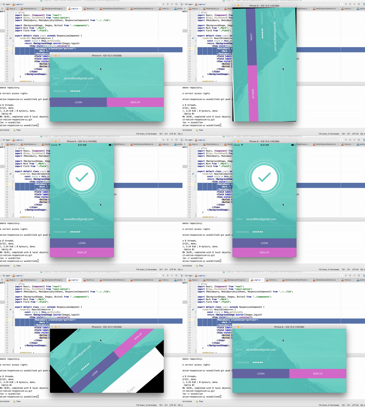
An example is available via expo [here](https://expo.io/@wcandillon/react-native-responsive-ui).
## Installation
```bash
npm install react-native-responsive-ui --save
```
## Usage
The `MediaQuery` component renders its children only if the query evaluates to true (see list of properties below).
This component listens to changes in the window dimensions.
In the example below, we render the `Logo` component if the window's height has a minimum size of `450dp` and if the device orientation is in portrait mode (height is larger than width).
### Media Queries
```jsx
// @flow
import React, {Component} from "react";
import {View} from "react-native";
import {MediaQuery} from "react-native-responsive-ui";
export default class Login extends Component {
render(): React$Element<*> {
return
;
}
}
```
#### Properties
| Name | Type | Description |
|----------------|--------|--------------------------------------------------------------------------------------|
| minHeight | dp | Minimum height of the window. |
| maxHeight | dp | Maximum height of the window. |
| minWidth | dp | Minimum width of the window. |
| maxWidth | dp | Maximum width of the window. |
| minAspectRatio | number | Minimum aspect ration of the window (ratio of horizontal pixels to vertical pixels). |
| maxAspectRatio | number | Maximum aspect ration of the window (ratio of horizontal pixels to vertical pixels). |
| minPixelRatio | number | Minimum device pixel density. See [PixelRatio](https://facebook.github.io/react-native/docs/pixelratio.html). |
| maxPixelRatio | number | Maximum device pixel density. See [PixelRatio](https://facebook.github.io/react-native/docs/pixelratio.html). |
| orientation | `portrait` or `landspace` | Indicates whether the viewport is in landscape (the display is wider than it is tall) or portrait (the display is square or taller than it is wide) mode. |
| platform | string | Platform of the device. See [Platform](https://facebook.github.io/react-native/docs/platform-specific-code.html#platform-module). |
| condition | boolean | Abritrary boolean value that must be true for the media query to pass. |
### useDimensions
```jsx
import React from "react";
import {useDimensions} from "react-native-responsive-ui";
export default ({ children }) => {
const {width, height} = useDimensions();
console.log(`New window dimensions: ${width}x${height}`);
return children;
};
```
### useStylesheet
```jsx
import React from "react";
import {useStylesheet} from "react-native-responsive-ui";
export default class Buttons extends ResponsiveComponent {
render() {
const style = useStylesheet(staticStyle)
return
;
}
}
const staticStyle = [
{
query: { orientation: "landscape" },
style: {
btns: {
flexDirection: "row"
},
btn: {
flex: 1
}
}
},
{
query: { orientation: "portrait" },
style: {
btns: {
alignSelf: "stretch"
},
btn: {
flex: 0
}
}
}
];
```
### Media Query
`mediaQuery()` evaluates a media query and return true or false.
See example below.
```jsx
import {mediaQuery, useDimensions} from "react-native-responsive-ui";
const {width, height} = useDimensions();
mediaQuery({ orientation: "portrait", minHeight: 450 }, width, height)
```
### ResponsiveComponent
`ResponsiveComponents` extends `React.Component` and add the window dimensions to the state of the component.
```jsx
import React from "react";
import {ResponsiveComponent} from "react-native-responsive-ui";
export default class Debug extends ResponsiveComponent {
render() {
const {width, height} = this.state.window;
console.log(`New window dimensions: ${width}x${height}`);
return null;
}
}
```
### getStylesheet
```jsx
import React from "react";
import {ResponsiveComponent, getStylesheet} from "react-native-responsive-ui";
export default class Debug extends ResponsiveComponent {
render() {
const {width, height} = this.state.window;
const styles = [
{
query: { minHeight: 500 },
style: { container: { backgroundColor: "red" } }
}
];
const style = getStylesheet({width, height}, styles)
return
}
}
```
---
_Source: https://npm.io/package/react-native-responsive-ui · Machine-readable twin of the npm.io package page. Health data is recomputed on every publish._